For our assignment, each class member suggested names for four companies based on prompts from our instructor. We voted to decide the names for each company, and then our task was to design black and white logos that matched each company's brand identity. Here are the companies and their names:
1. The Seat – A furniture store specializing in seats near Grand Rapids.
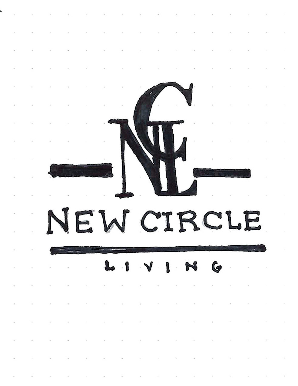
2. New Circle Living – a 55+ community in Charleston
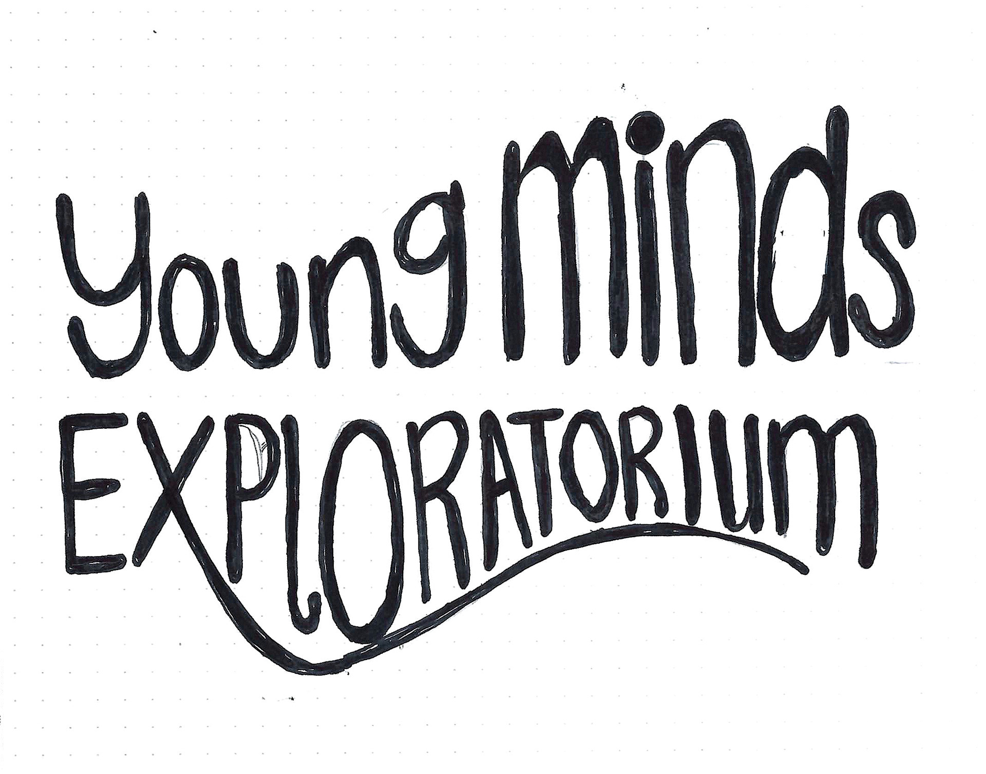
3. Young Minds Exploratorium – A children's museum in Portland.
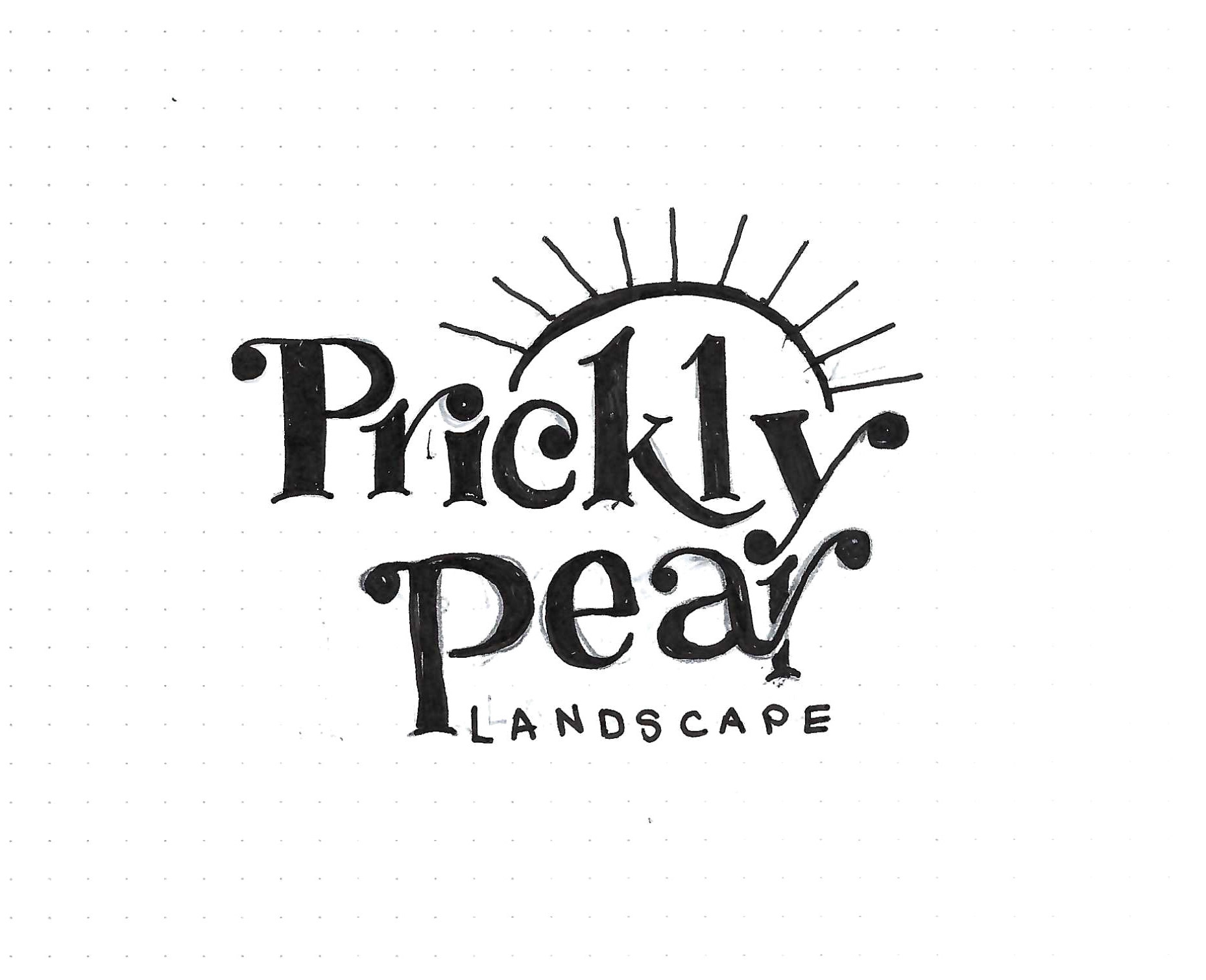
4. Prickly Pear Landscapes – Landscaping company in Phoenix that specializes in Xeriscape.
2. New Circle Living – a 55+ community in Charleston
3. Young Minds Exploratorium – A children's museum in Portland.
4. Prickly Pear Landscapes – Landscaping company in Phoenix that specializes in Xeriscape.
After creating eight logos (two for each company), I selected the most successful ones and refined them into intermediate hand comps. From there, I chose the most successful design and created a final hand comp. Once the final design was chosen, I translated it to the computer and, after several revisions, arrived at the ultimate final design.
The objective of this assignment was to create a black-and-white logo for one of four fictional companies. When creating the logo, starting in black and white is important. If it works in black and white, it will work in color. Also, it's vital to keep in mind how a logo will look in all sizes—from a billboard to a business card. Below is my final design followed by the design process. Research & Brainstorming
I started my research by looking into the demographics and landscape of the four towns to envision my target audience and better guide my design. I created a brain map and gathered inspiration on Pinterest and created a board for each of the brands.
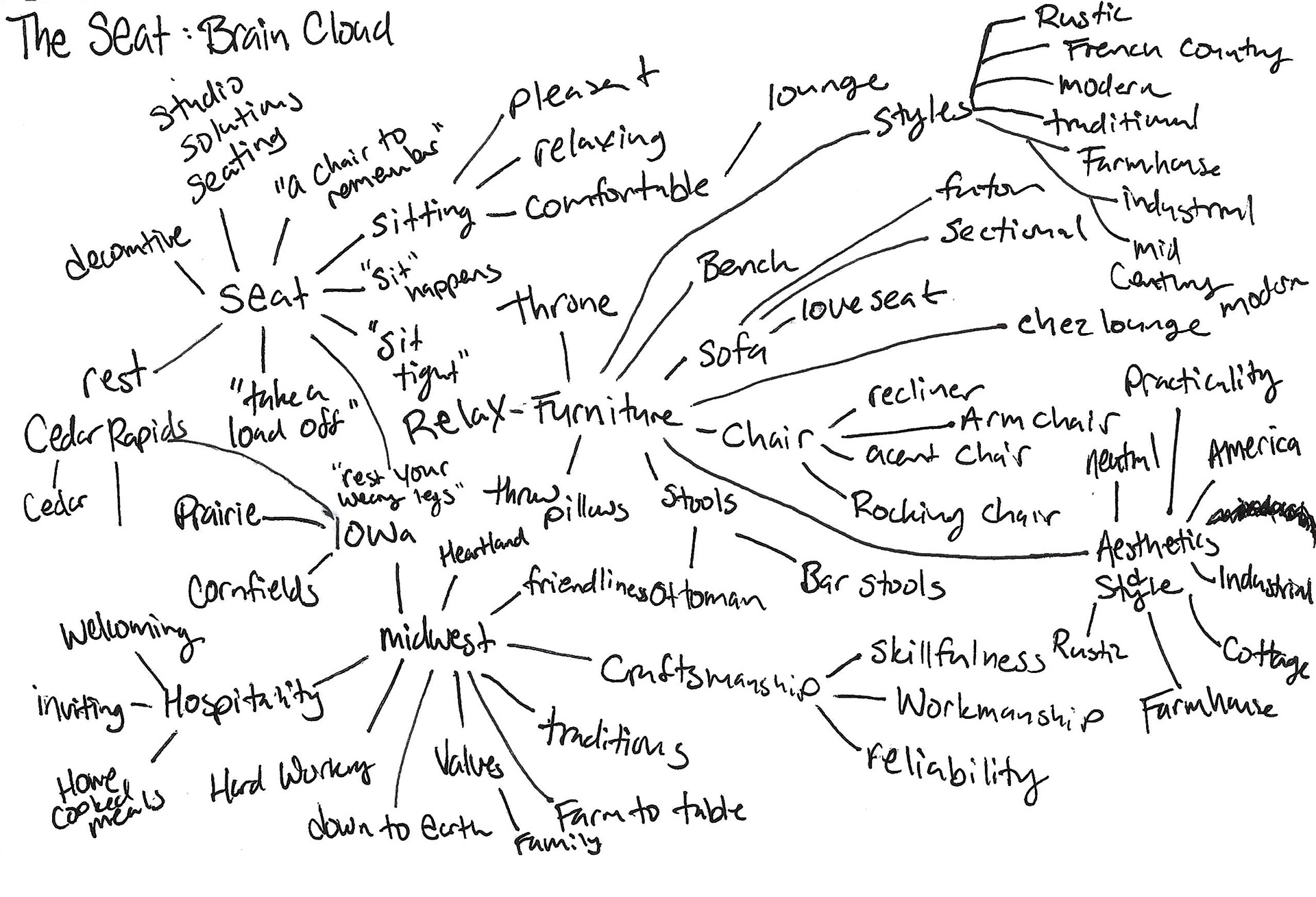

The Seat Furniture Store: Bold, Masculine, No nonsense logo for the blue collar worker who wants to relax and rest after a hard day of working at the factory in Cedar Rapids, Iowa
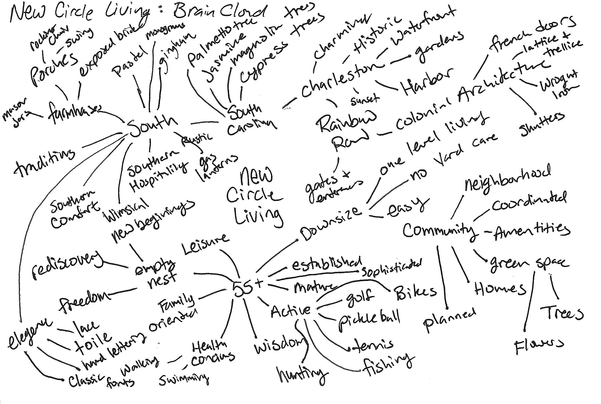
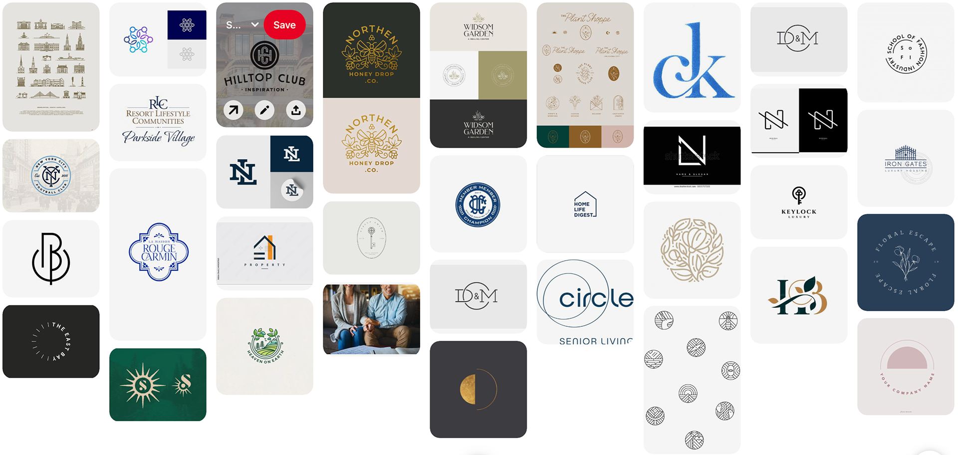
New Circle Living: Welcoming, exclusive and inspired by southern charm. Designed with a 55+ empty nesters who are downsizing.
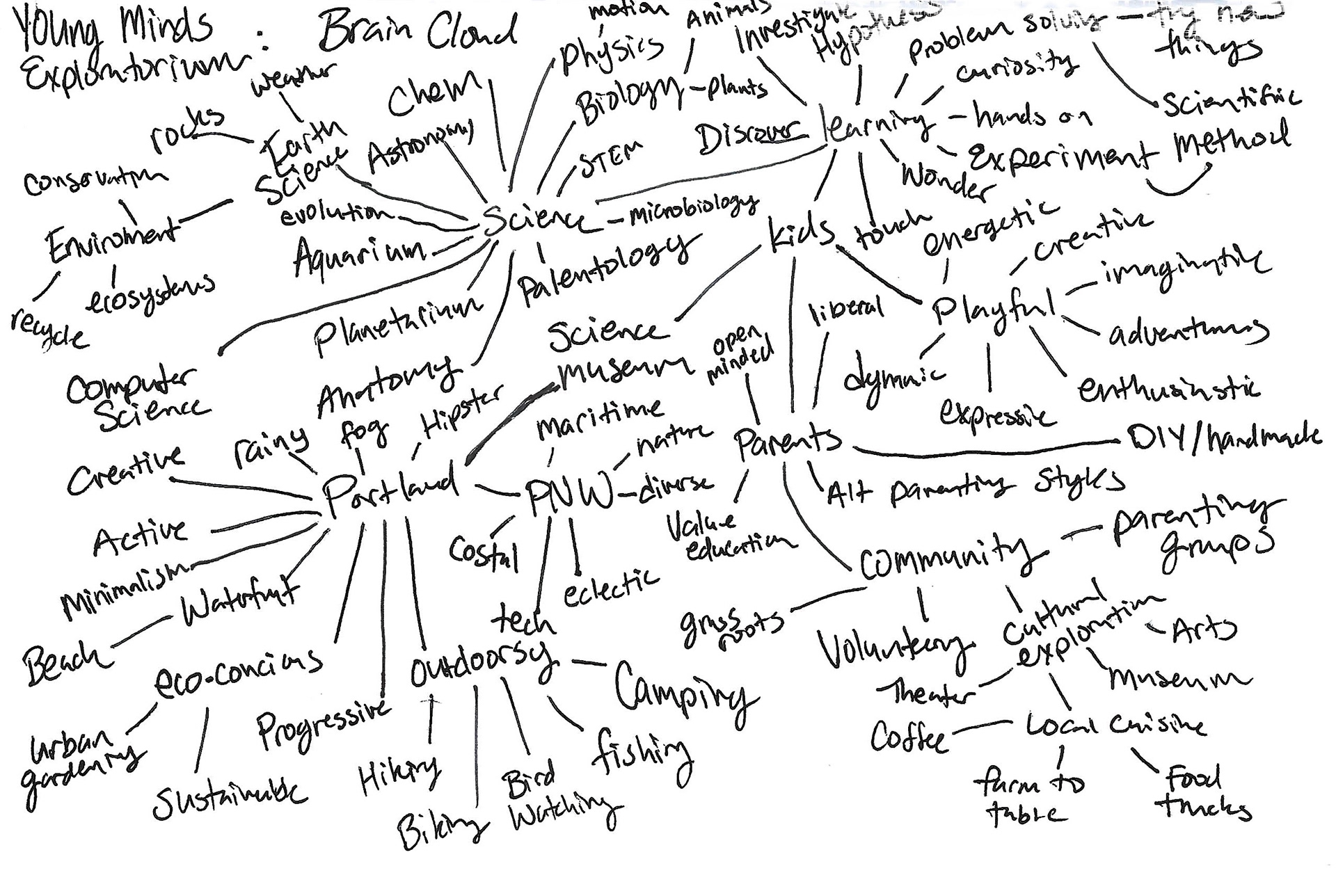
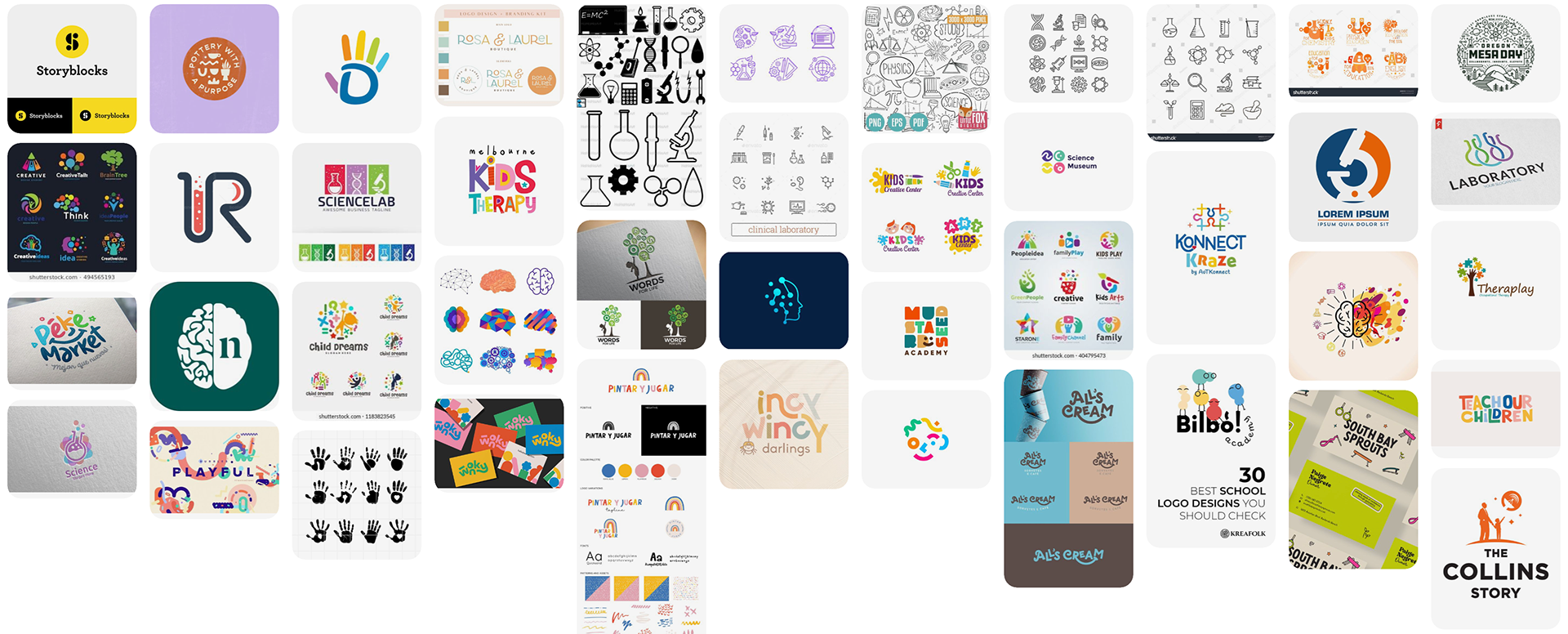
Young Minds Exploratorium: Fun, Science, Bold. Including lots of hand drawn elements and fun graphics for the children and parents of Portland.
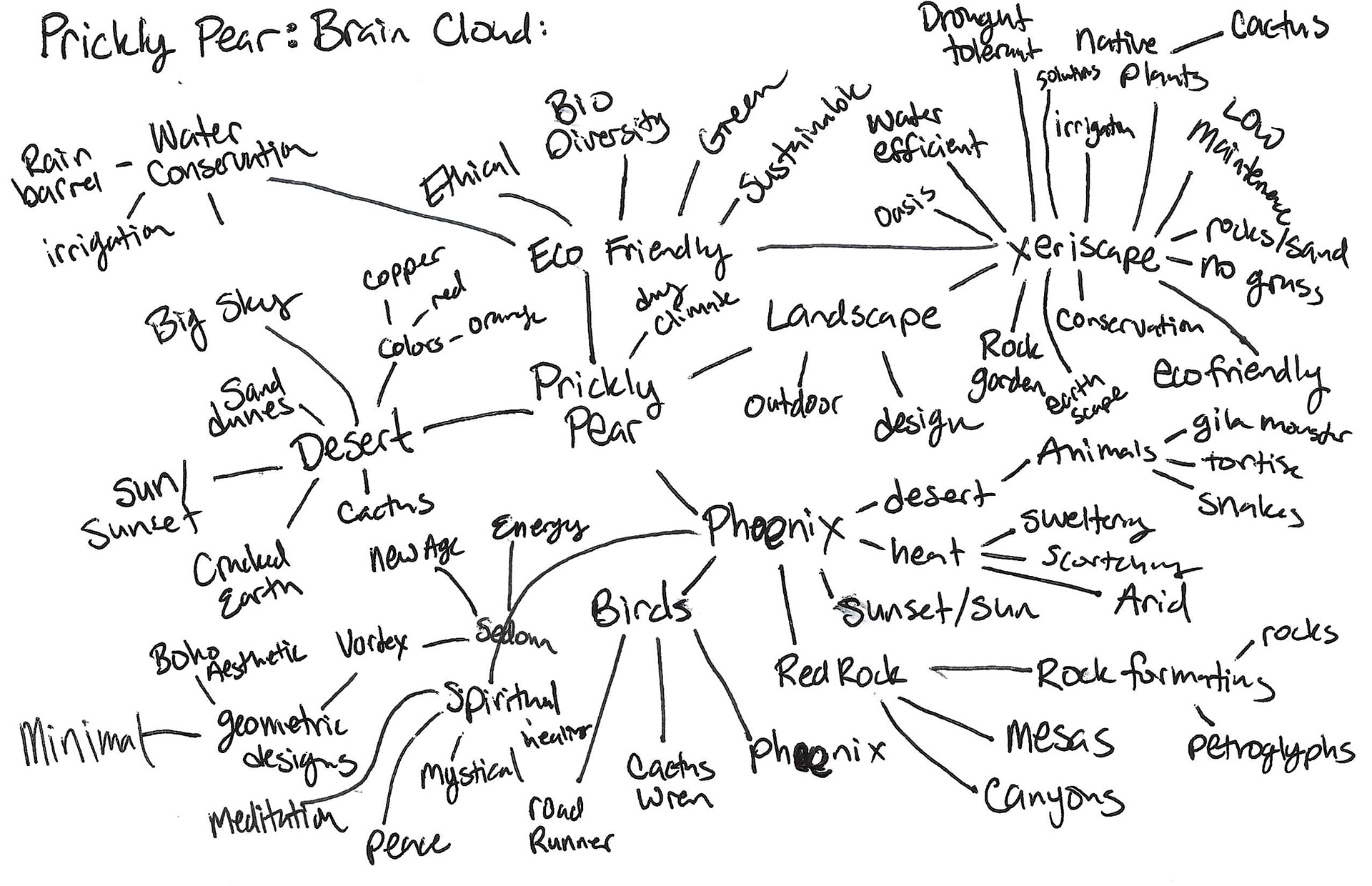
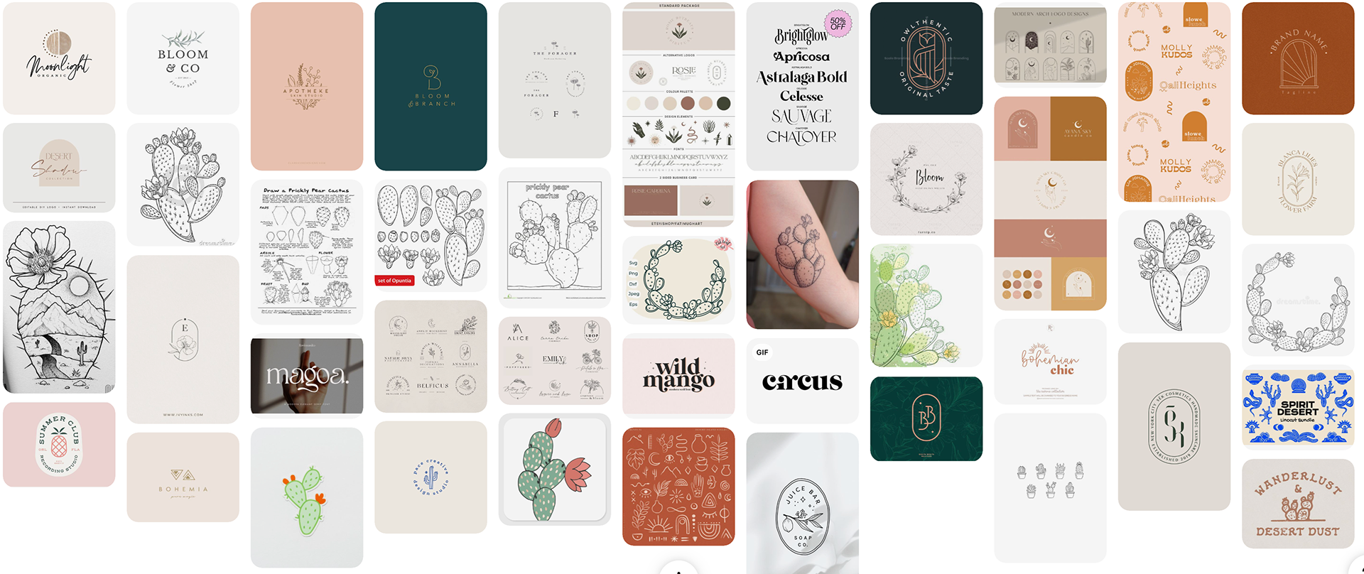
Prickly Pear Landscaping: Feminine, Eco-concious, and earthy. These design will appeal to customers who want to use native and drought-resistant plants enhancing both beauty and sustainability.
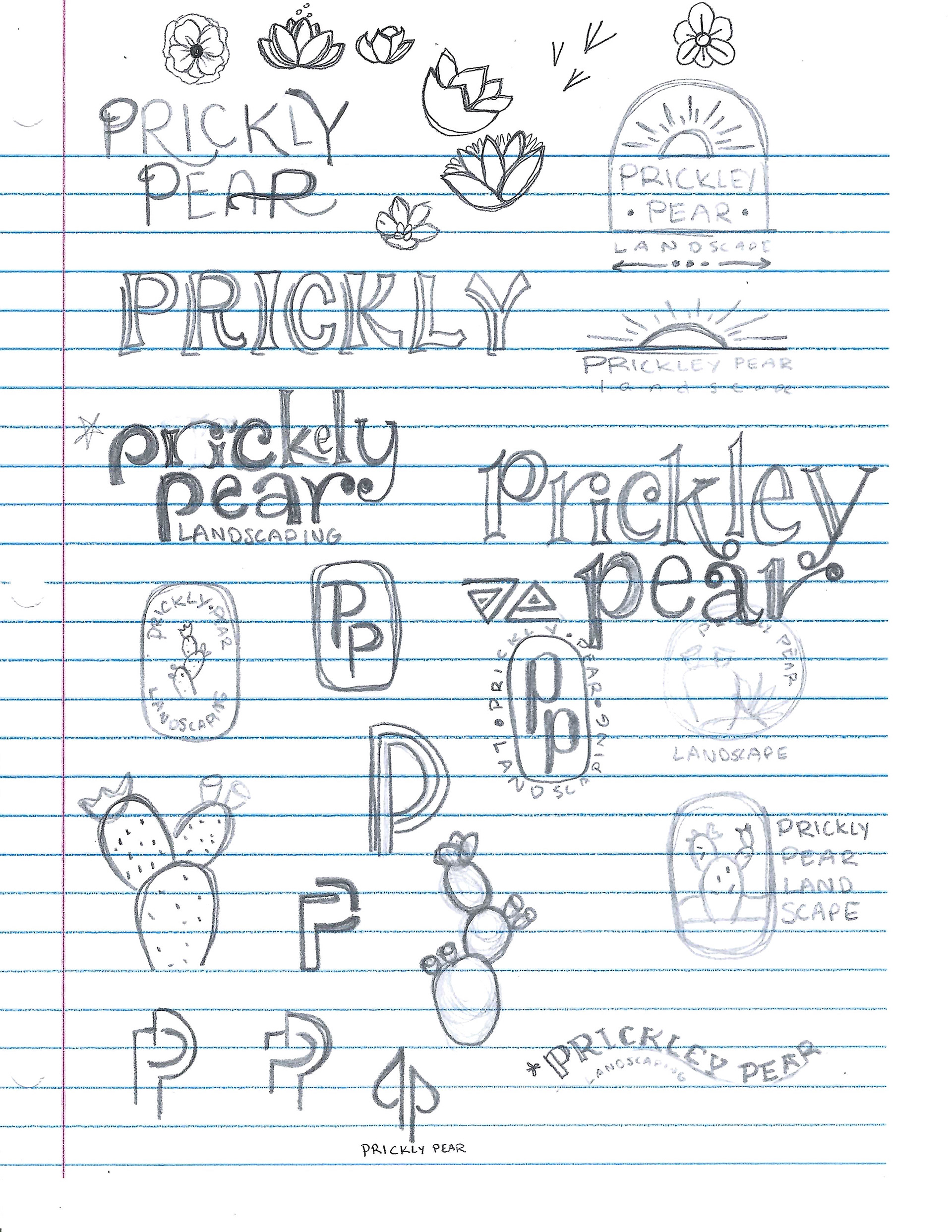
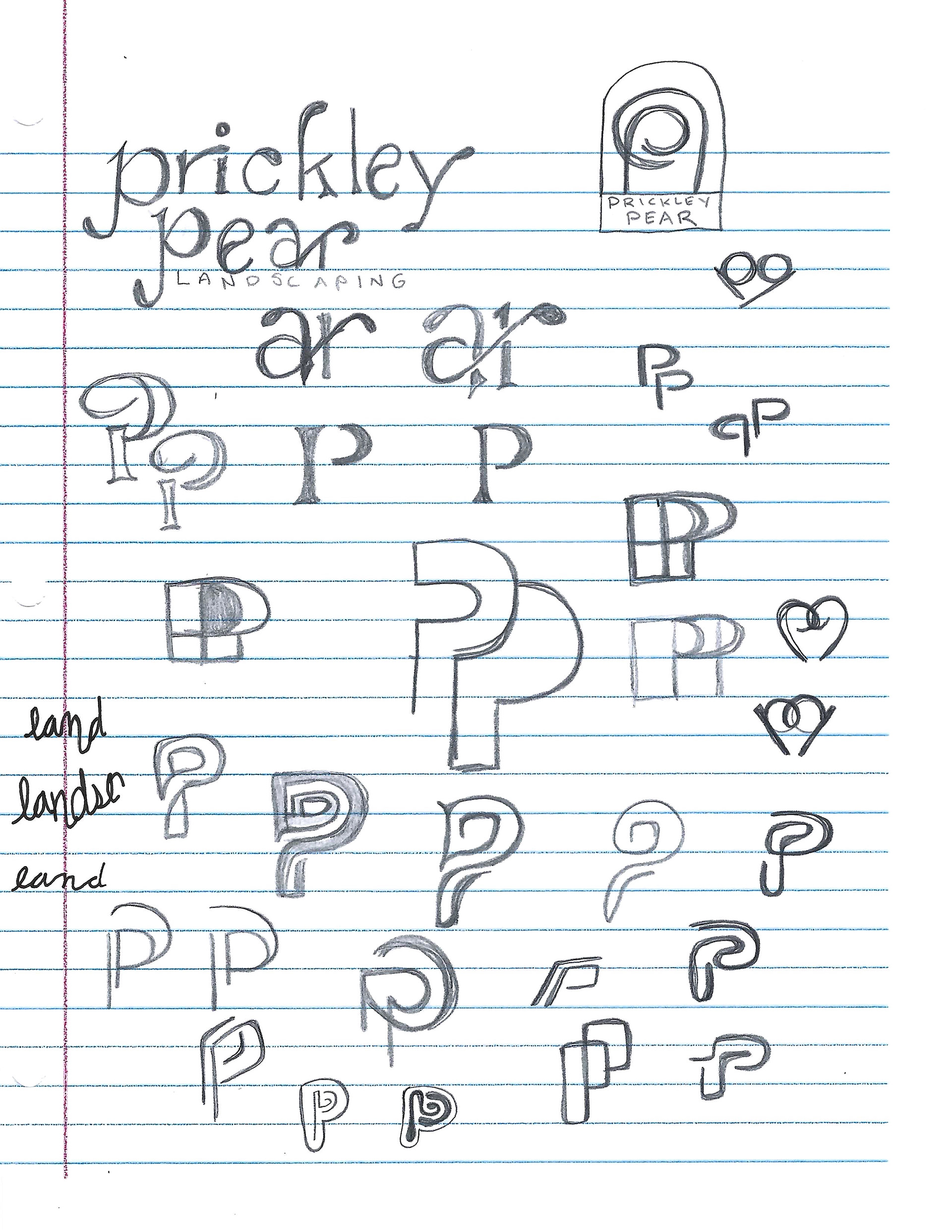
Doodles and Sketches
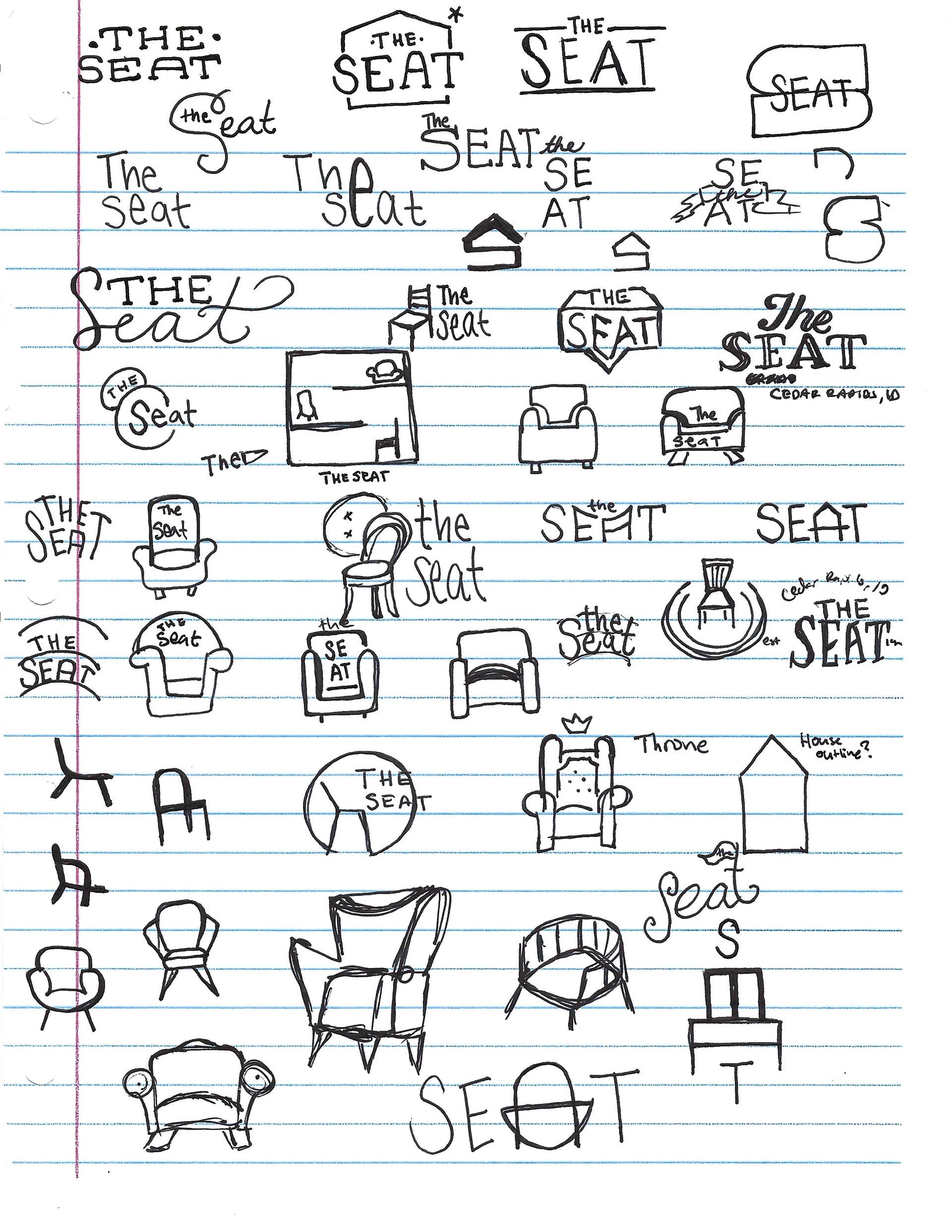
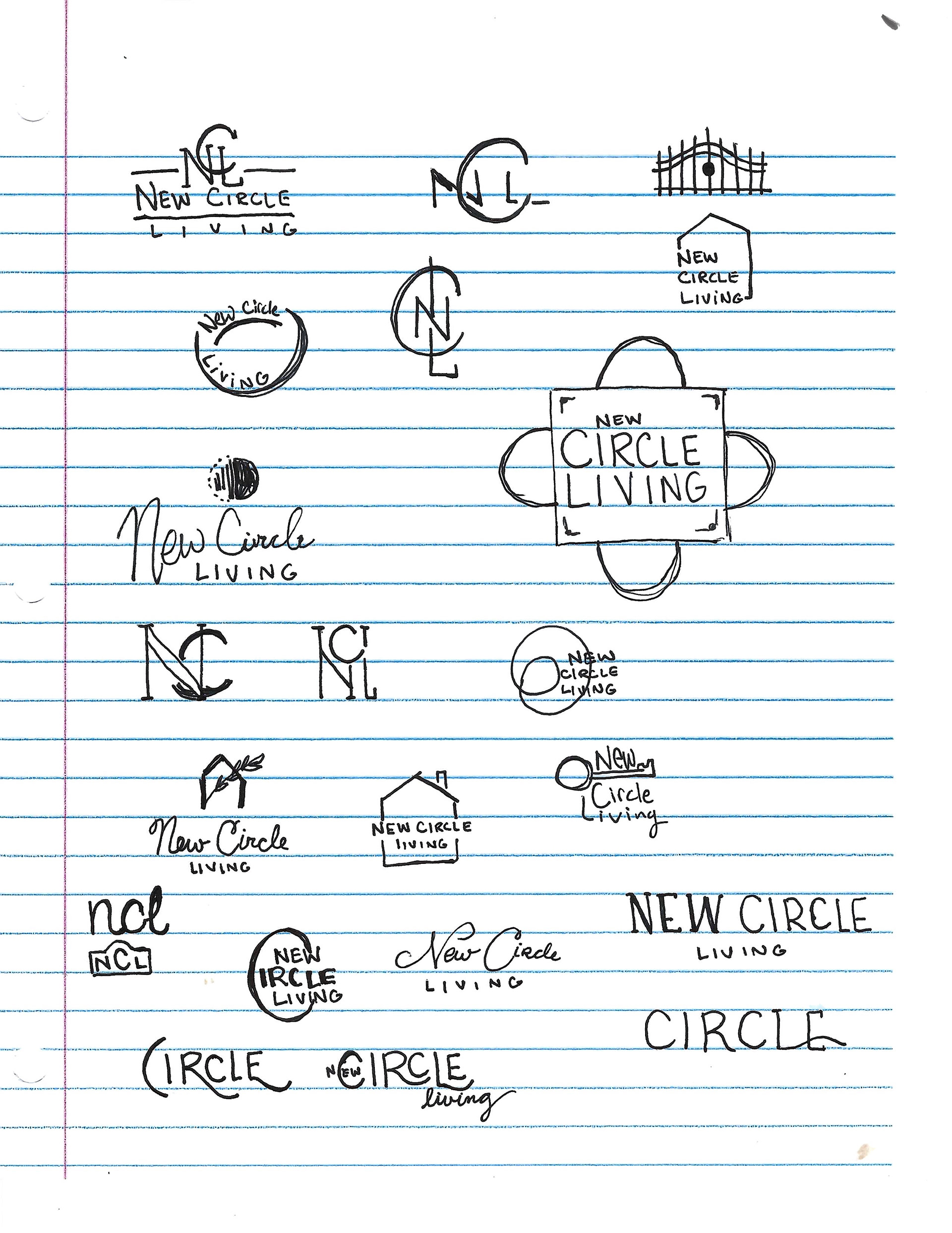
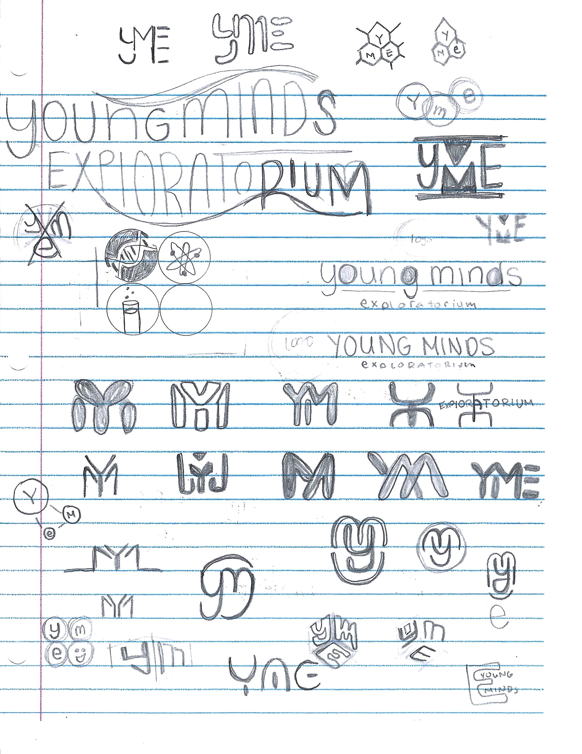
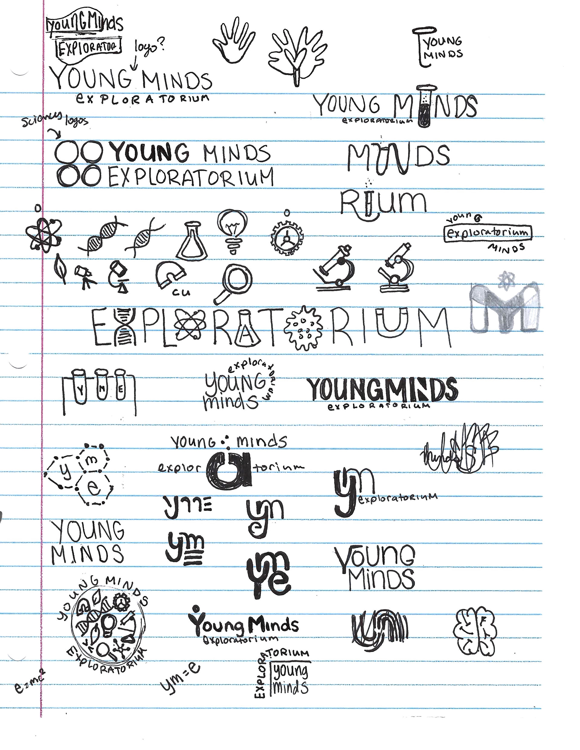
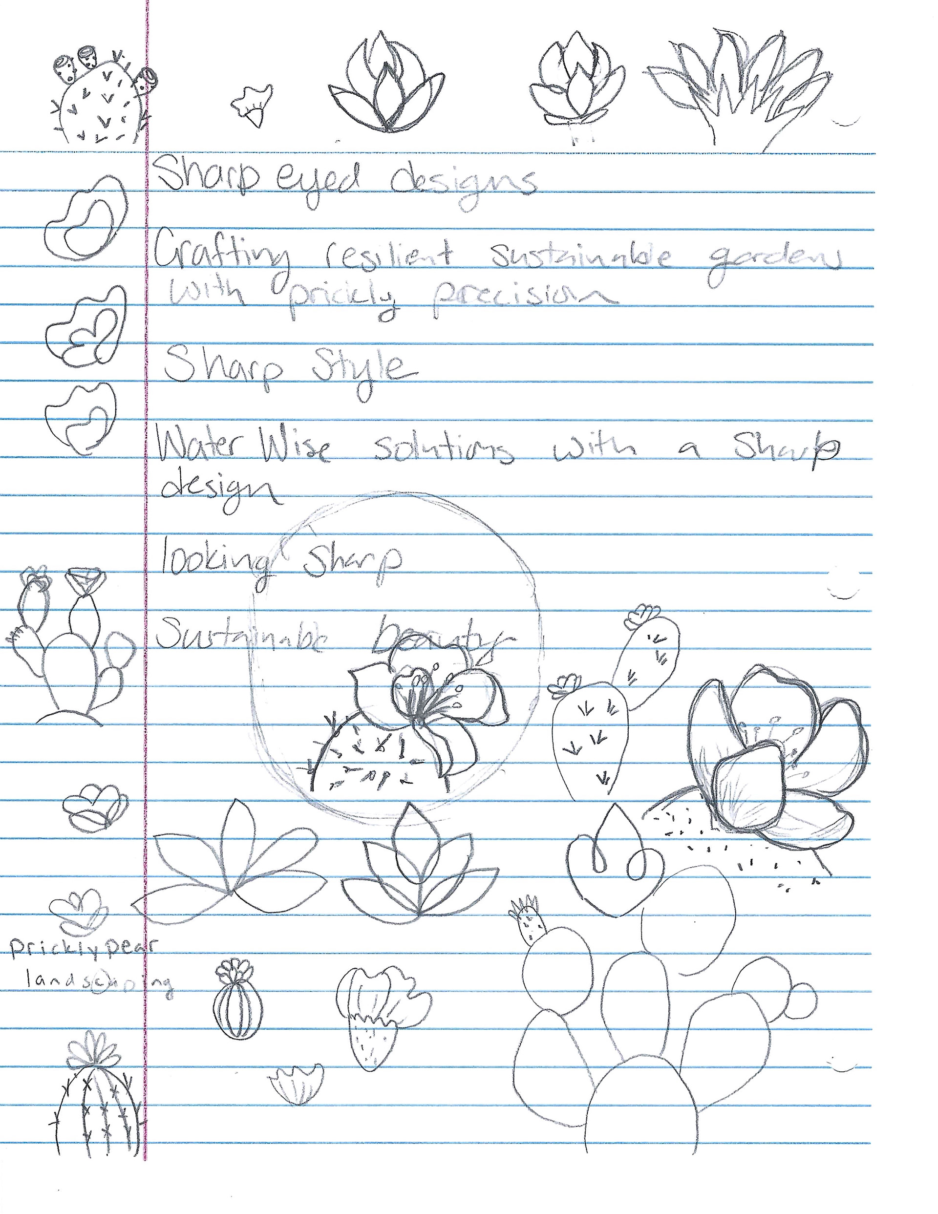
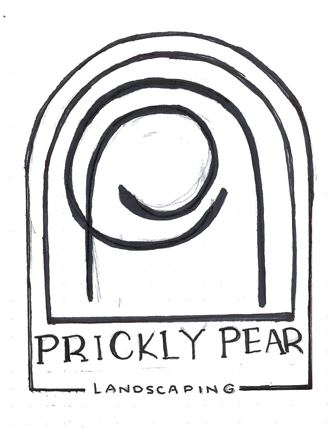
The next step was to create doodles and sketches of logo ideas. The purpose of this step is to generate multiple initial ideas and explore different motifs and aesthetics for each company. In this stage, I'd often remind myself that there are no bad ideas, which allowed me the freedom to visually brainstorm and experiment with various shapes, types, layouts, and images. I explored using negative space with letters and icons as well as just using the initials of the company in the form of monograms or as a logo
Thumbnails
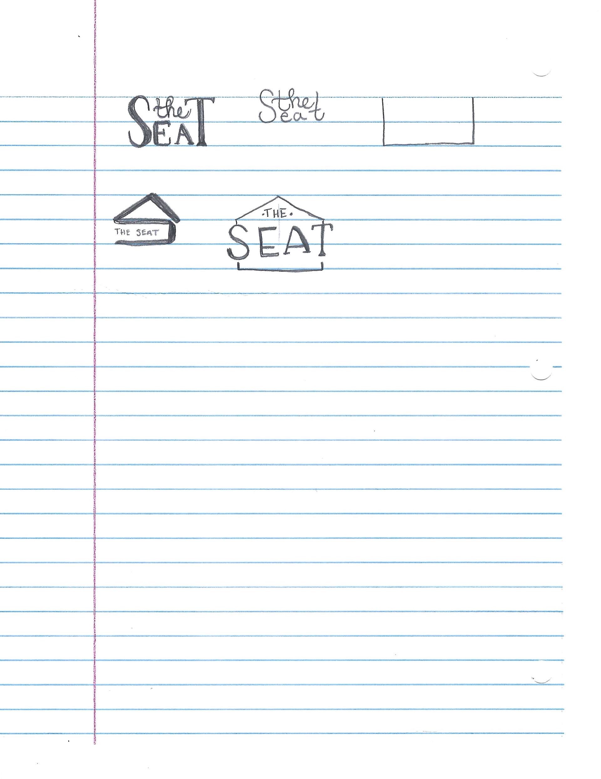
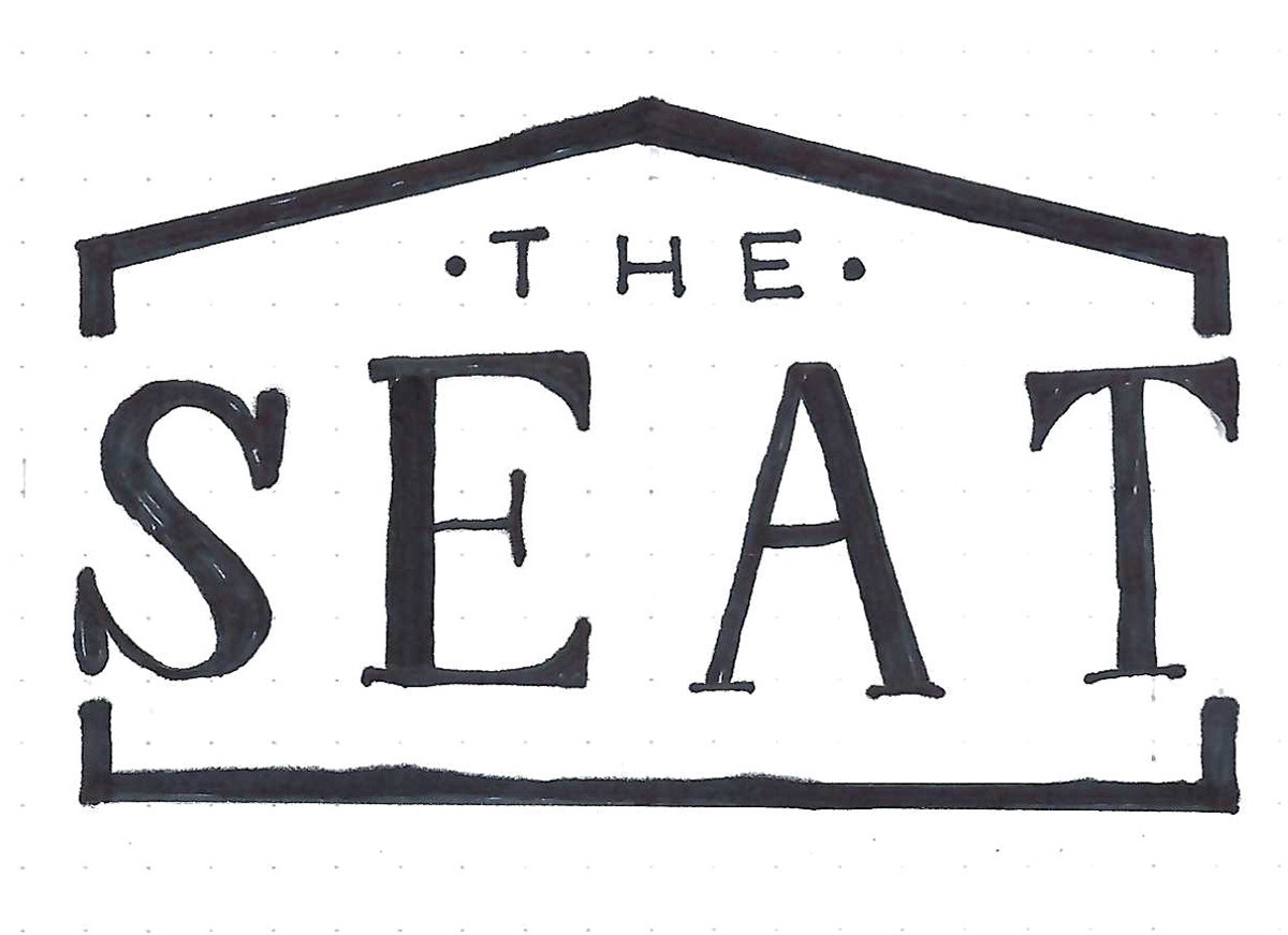
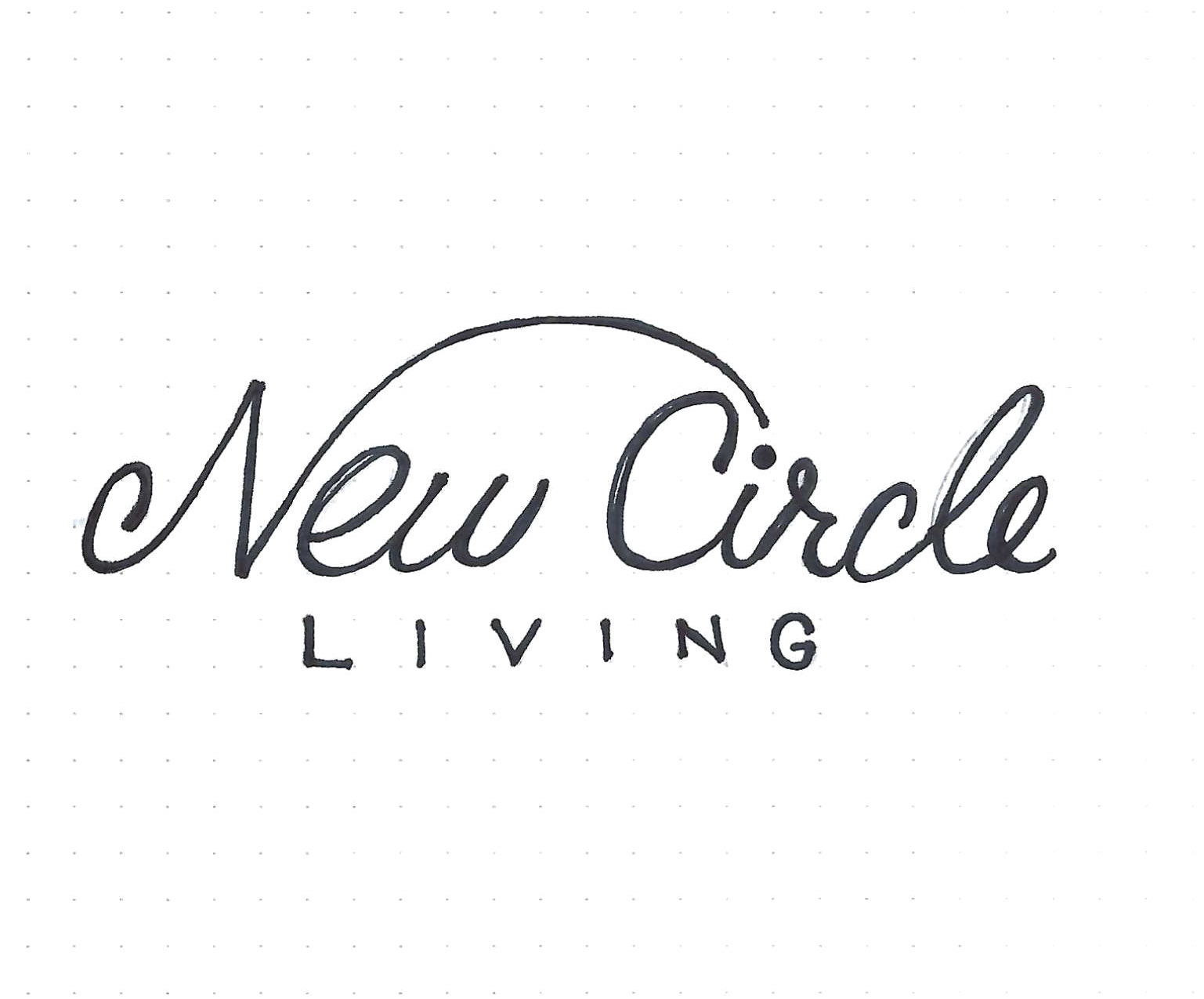
For this stage of the design process, the objective was to generate a total of eight distinct logo concepts, aiming for two unique ideas for each of the four companies. I reviewed my sketches and selected the designs that resonated most strongly with the brand identity I wanted to create for each company.

Intermediates
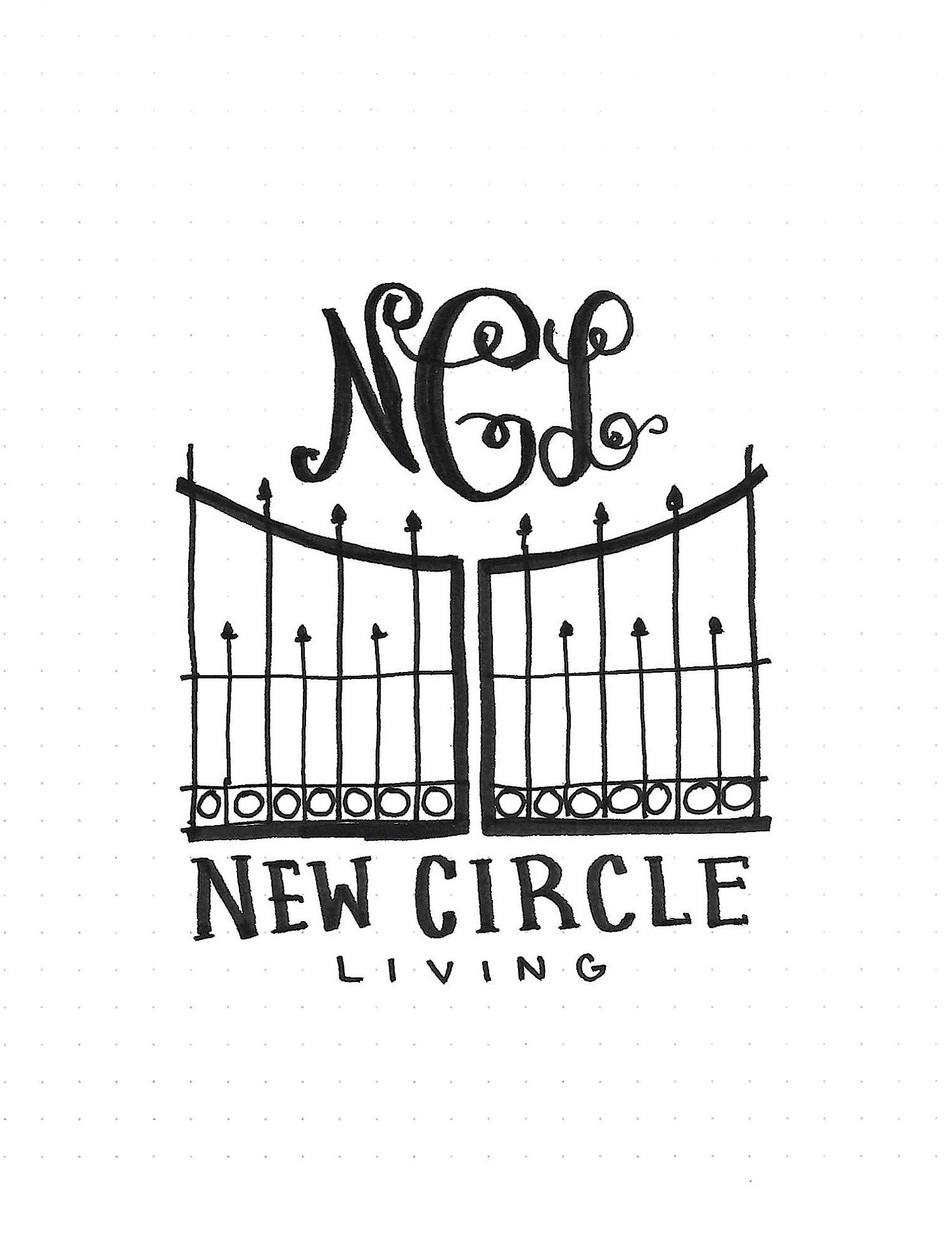
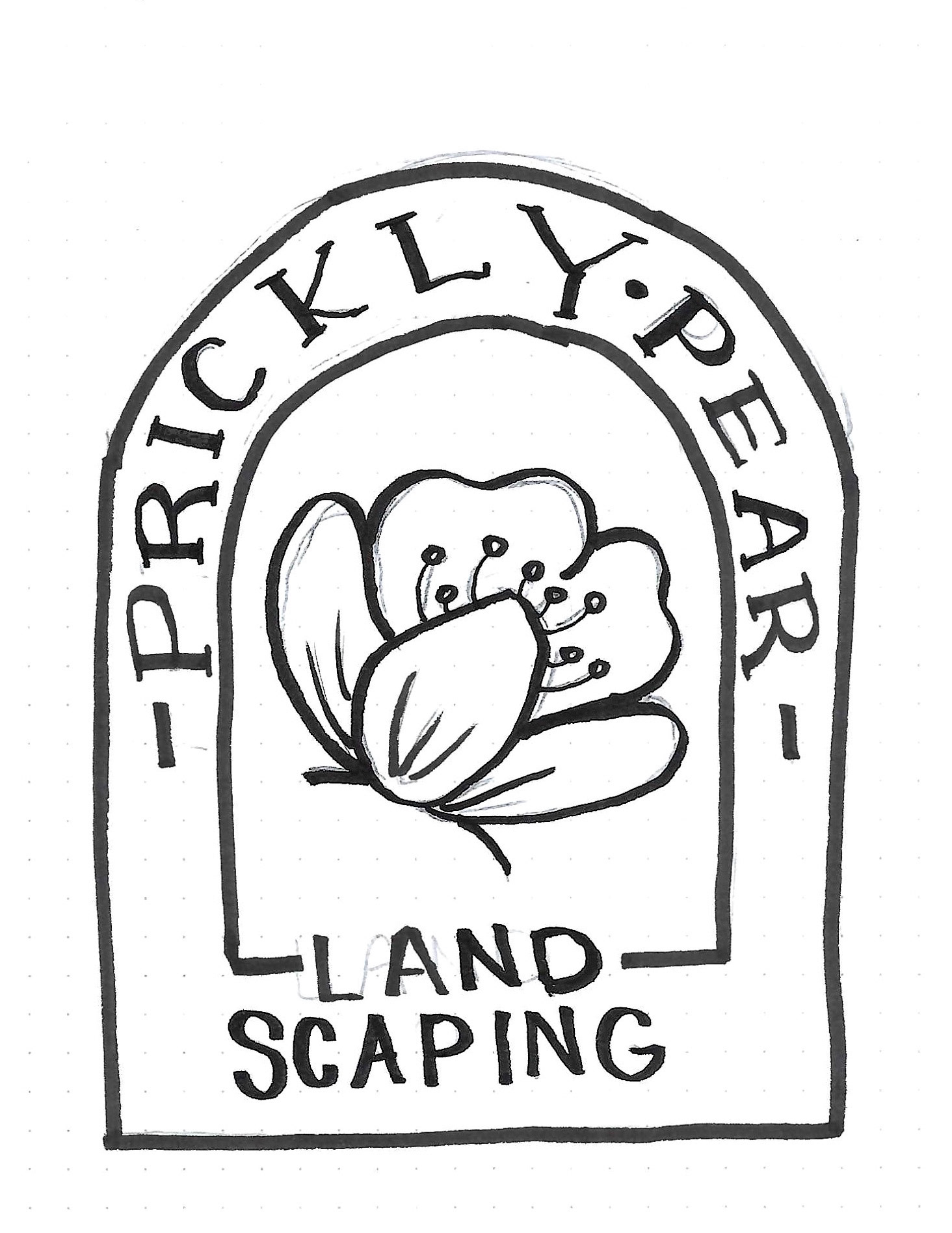
For this stage of the design process, I had to create two full-size hand comps for two different companies. For New Circle Living, a 55+ community in South Carolina, I wanted to include some Charleston-specific architectural elements. I chose to use a Wrought Iron gate which also gives a feeling of exclusivity like a gated community but also conveys a sense of security and welcoming. I like how the gate looks, but I was concerned it would look like heaven's gates and we were decidedly trying to stay away from any "you're nearing death" motifs or any connotations of aging or mortality. For Prickly Pear Landscaping I wanted to include the arched shape of southwestern architecture for the frame of the logo. I love the idea of arched text and using a Prickly Pear flower to compliment the feminine and natural vibe of the brand I'm hoping to build.
Final Hand Comp
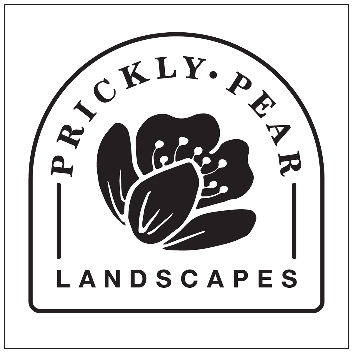
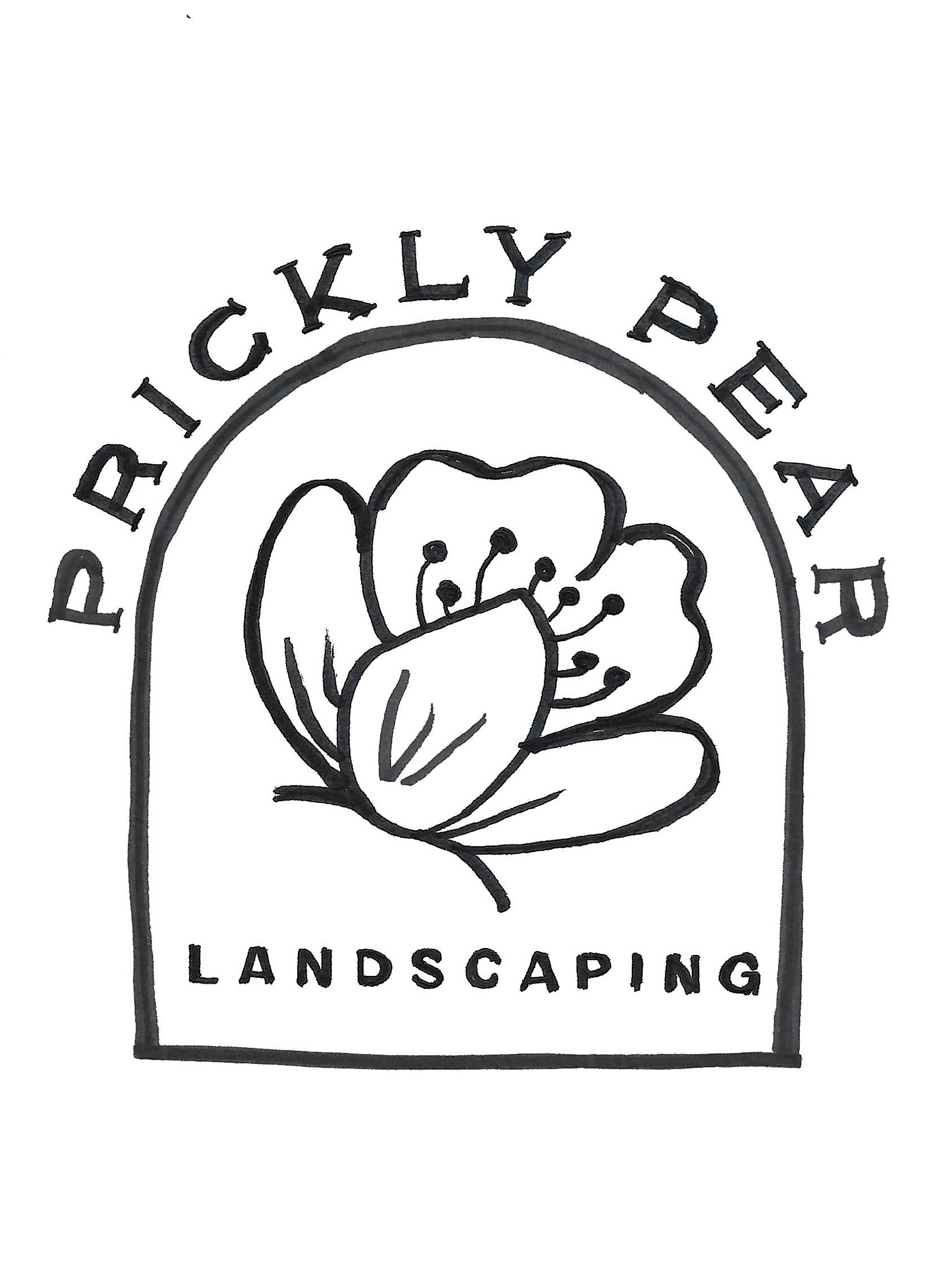
I chose to pursue Prickly Pear Landscaping for my branding project. I was more excited about the possibilities. simplifying the design by featuring a single, elegant arch that gracefully framed the captivating Prickly Pear flower. The word "Landscaping" is now a single word within the frame of the arch. I intend to use Didot for "Prickly Pear" and then have "landscaping" in a sans serif type with some spacing.
Black and White Computer Progressions
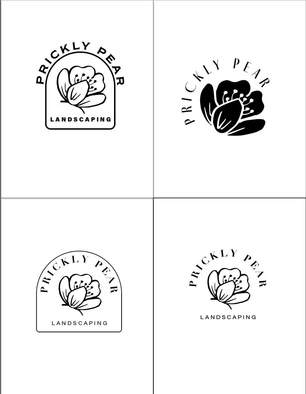
I recreated the final hand comp on the computer and then made some improvements. I experimented with changing the flower to black to add more contrast and make it stand out more. I also rounded the corners of the arc shape for a softer and smoother look. I also tried eliminating the arch altogether. I experimented with several feminine-looking typefaces but it was brought to my attention that the high contrast type will not be readable when scaled super small. So I will have to reevaluate my type choices as I move into the final design.
FINAL
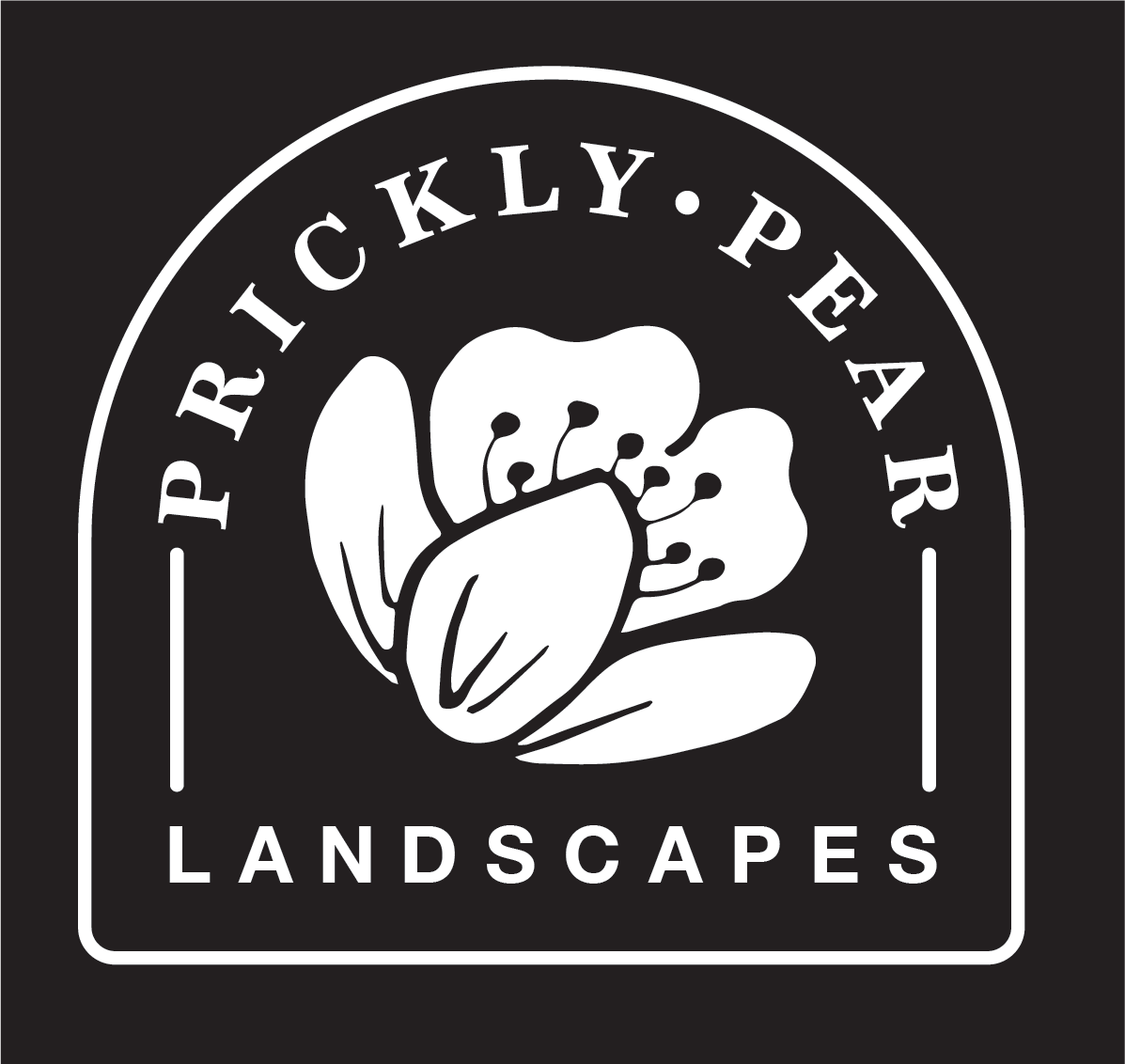
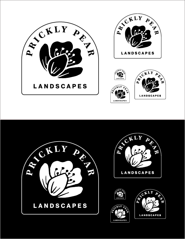
For the final design, I opted to retain the arch as it captured the Southwestern atmosphere that I wanted to convey. I also chose to make the flower black to heighten the contrast. I created the design in reverse as well as several smaller variations. A lot of time was spent trying to figure out a formation for them. No matter what I did they looked off balance since they were all different sizes.
In the final hour, it was brought to my attention that the company was Prickly Pear Landscapes, not Prickly Pear Landscaping. I had to go back and modify everything I had created to accurately reflect the correct company name. (which is important). Finally, I printed and mounted my designs for the class presentation and here it is! The Prickly Pear Landscapes logo.
First REvision

Second REvision

