Color Study
Choose Colors:
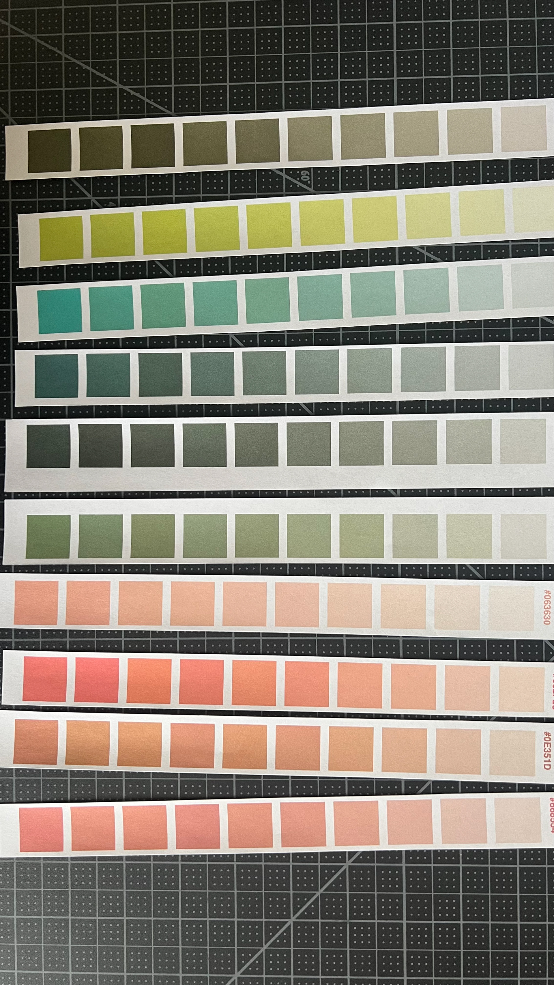
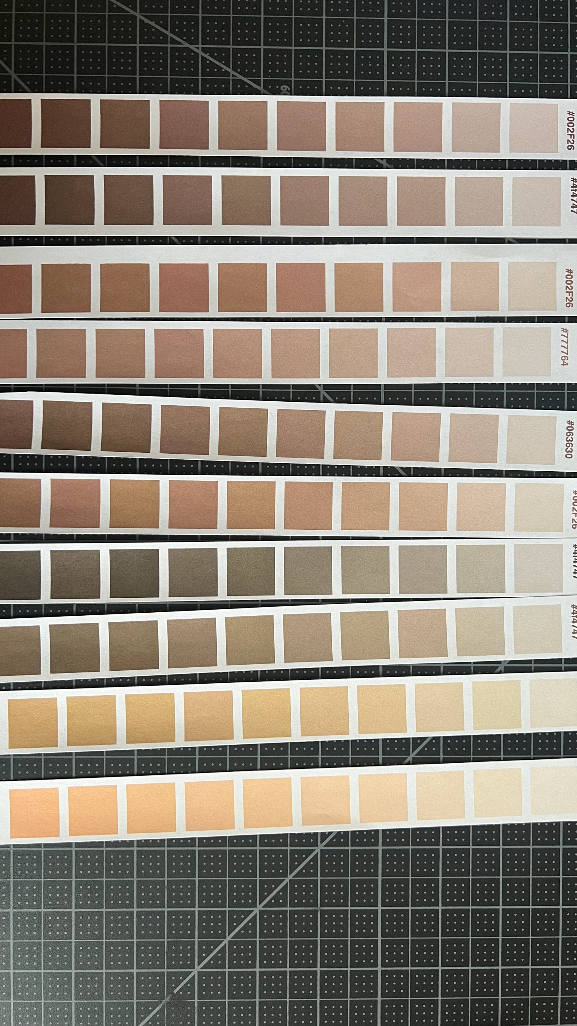
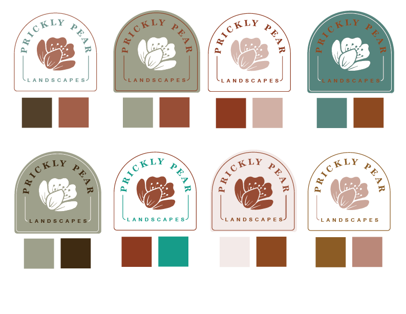
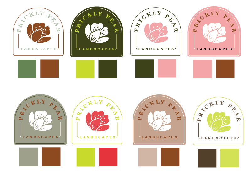
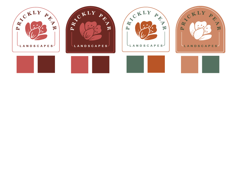
I had two initial ideas for my color scheme. One was inspired by the Prickly Pear Cactus itself which incorporated Bright Pink, Deep vibrant green, and neon green just for fun with some neutral sandy tones to mellow it out. I was actually inspired by a backpack that Auri had in class. So I took a picture of it and used it for inspiration. The second idea was to use a more muted neutral palette in the colors of the desert such as sage green, a coppery sienna color, dusty pink, and sandy neutrals. I created several color strips and cut them out to help me come up with as many ideas as possible. Below are my initial color studies.
Narrow Colors
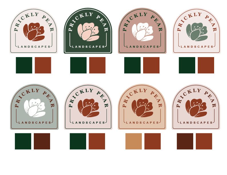
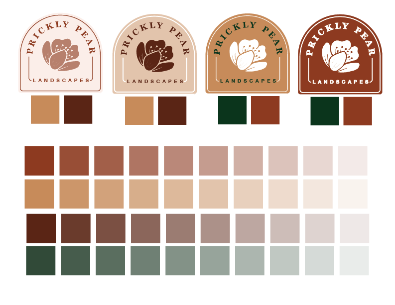
While I really loved the bright color palette. I decided to go with the desert scheme to fit in with the desert and stand out from typical green landscape logos. Below are some ideas.
Output Color Tests
After copious testing and agonizing, I narrowed it down to a Sage Green and Burnt Sienna palette. I created several icons using the two colors in combination with white. I'm really happy with this color palette. I think it will look really beautiful in my branding projects.
Final Color Output
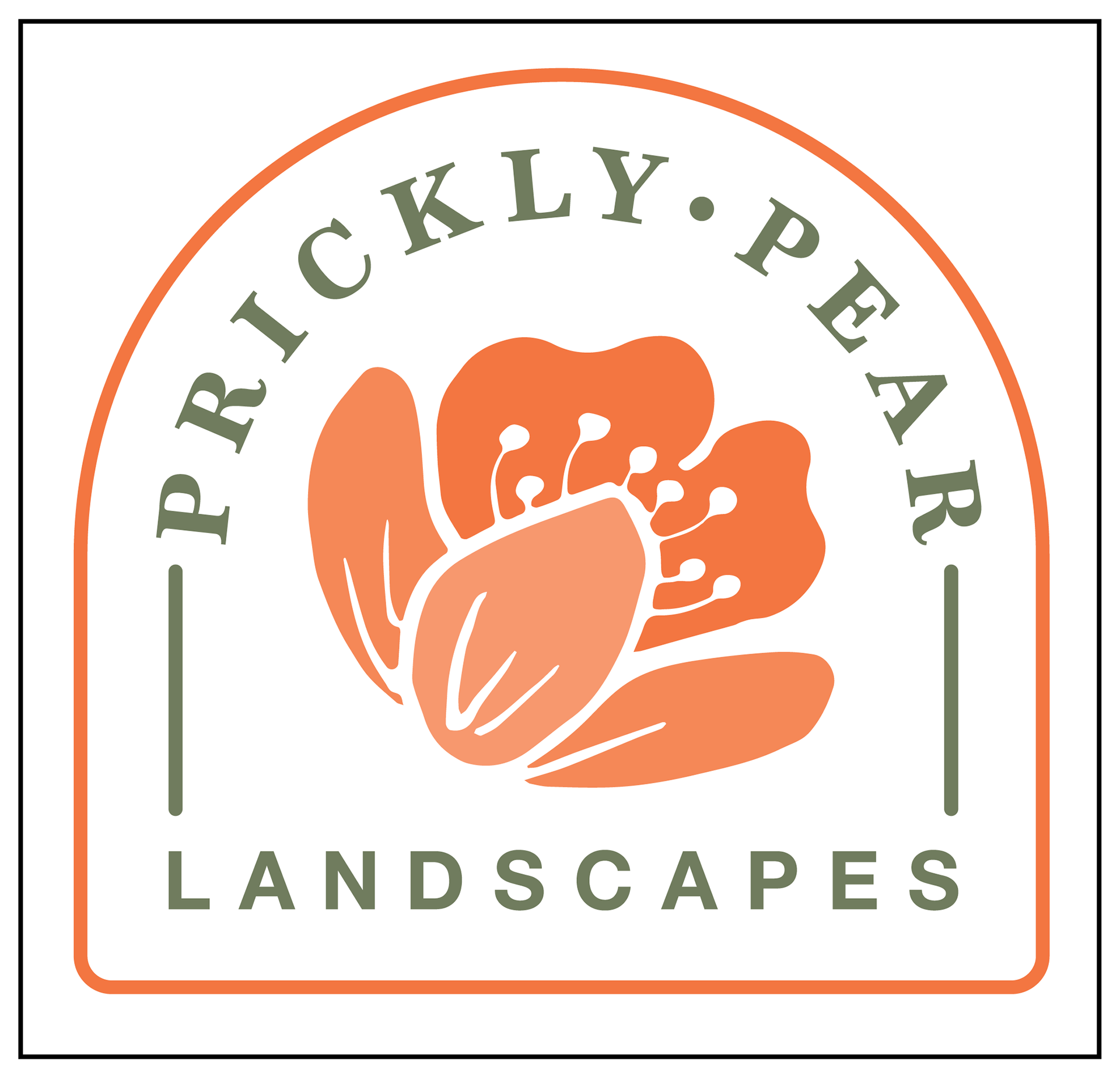
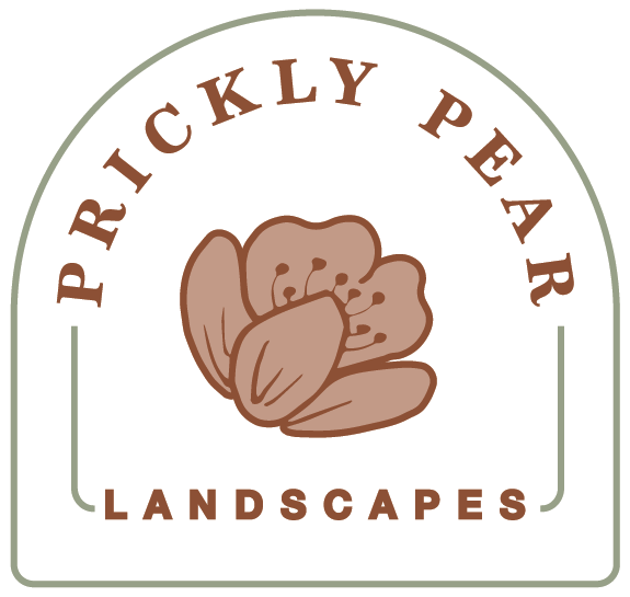
Here is my final design. I went with the white background I thought the higher contrast would show up more clearly on the smaller sizes. I also modified my original design to outline the flower and make it look more interesting.
revision
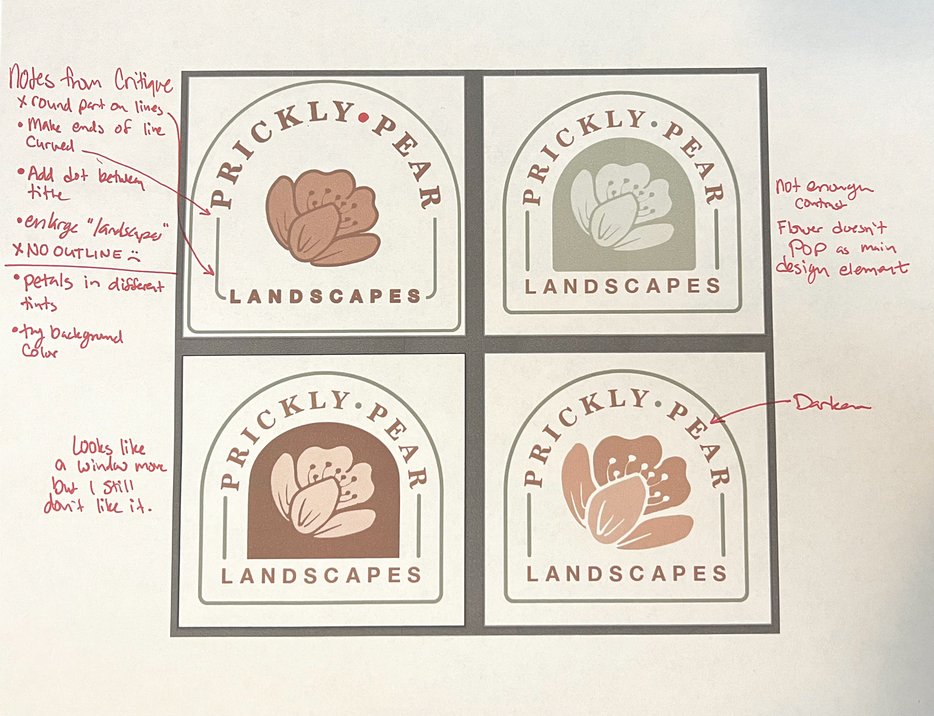
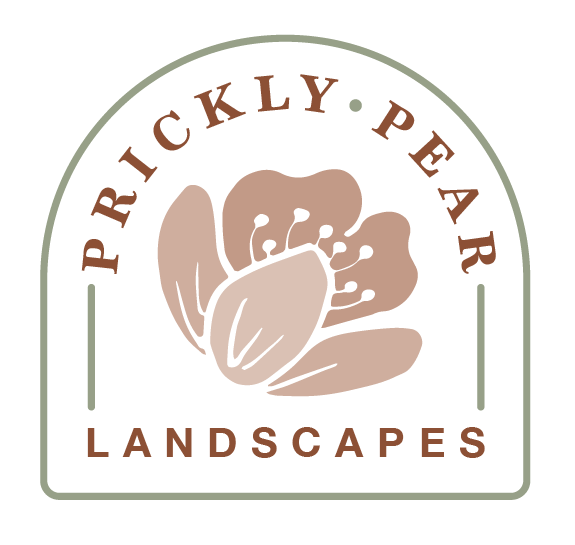
In my critique, the consensus was that I should make 'landscapes' larger and do away with the curves on the inside lines and round the ends. It was also suggested that I add a dot between 'Prickly' and 'Pear'. It was brought to my attention that I couldn't outline the flower since it was not outlined in the black-and-white version. It was suggested that I try a background color in the center which I didn't like but enlarging the flower and adding three tints to the different petals made a big difference.
Revision 2
After re-creating the brochure I had to re-color the 2 color logo. Here is the final.

