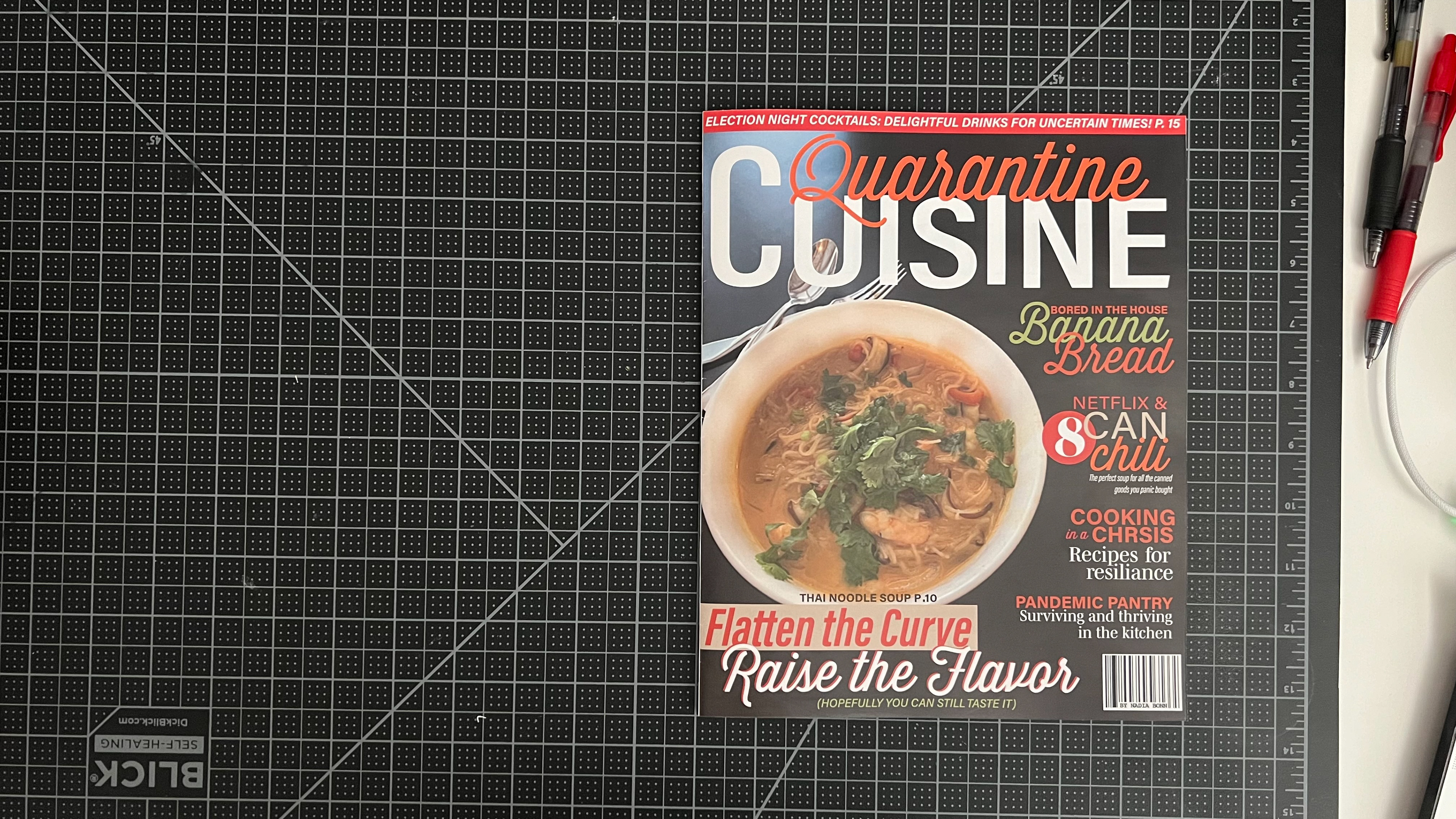
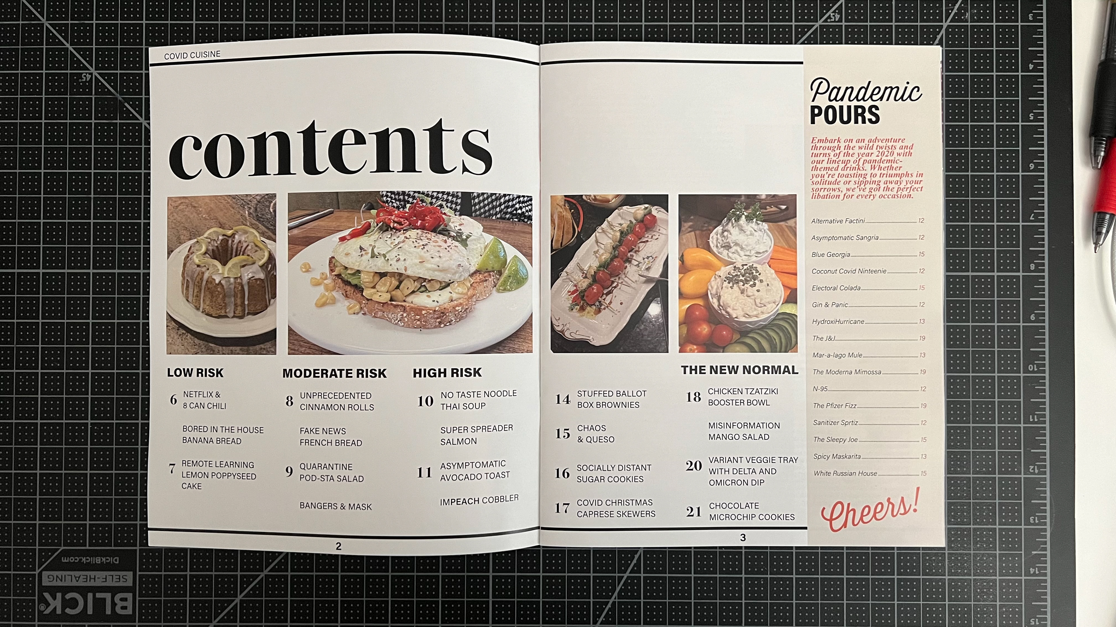
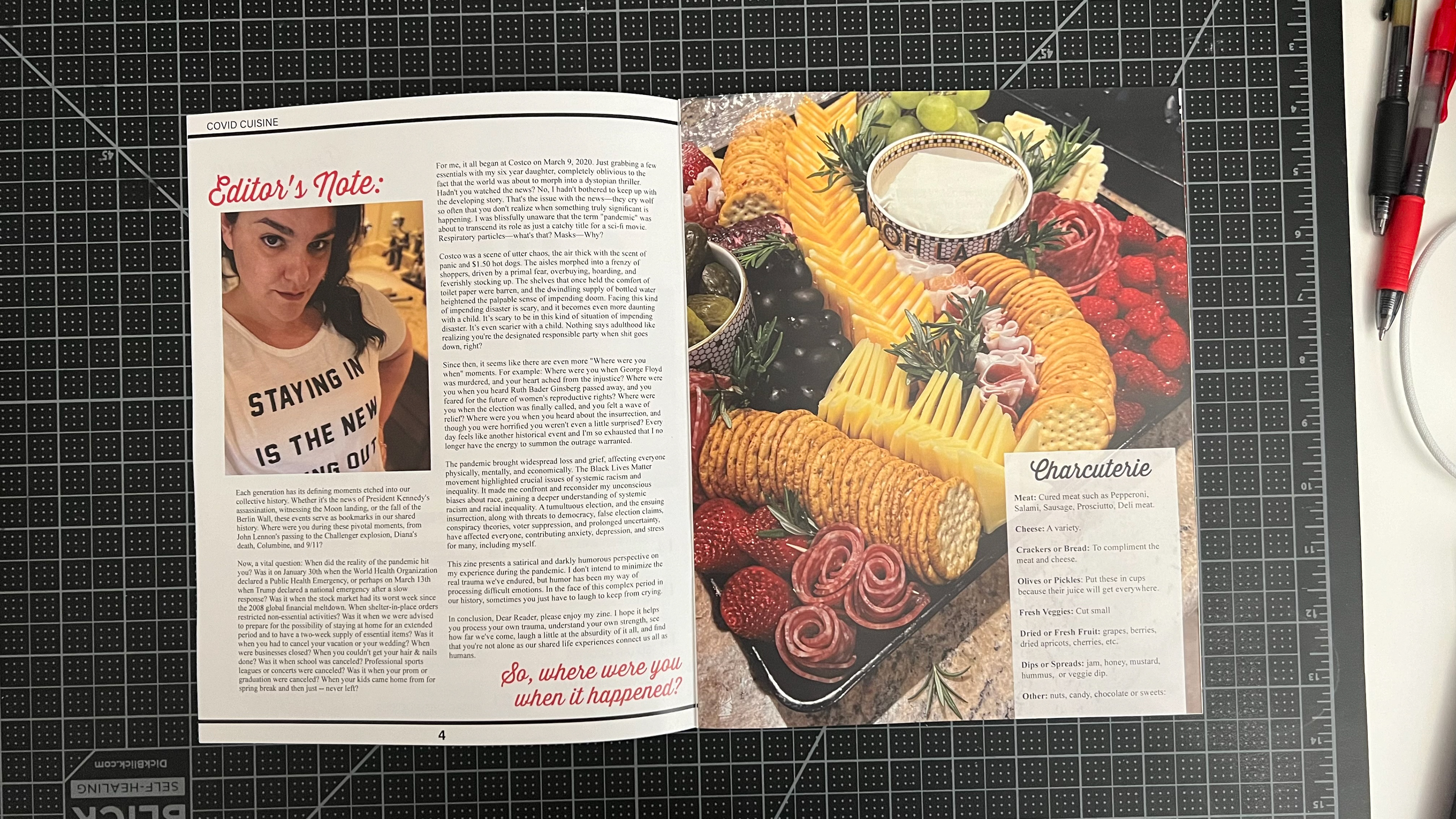
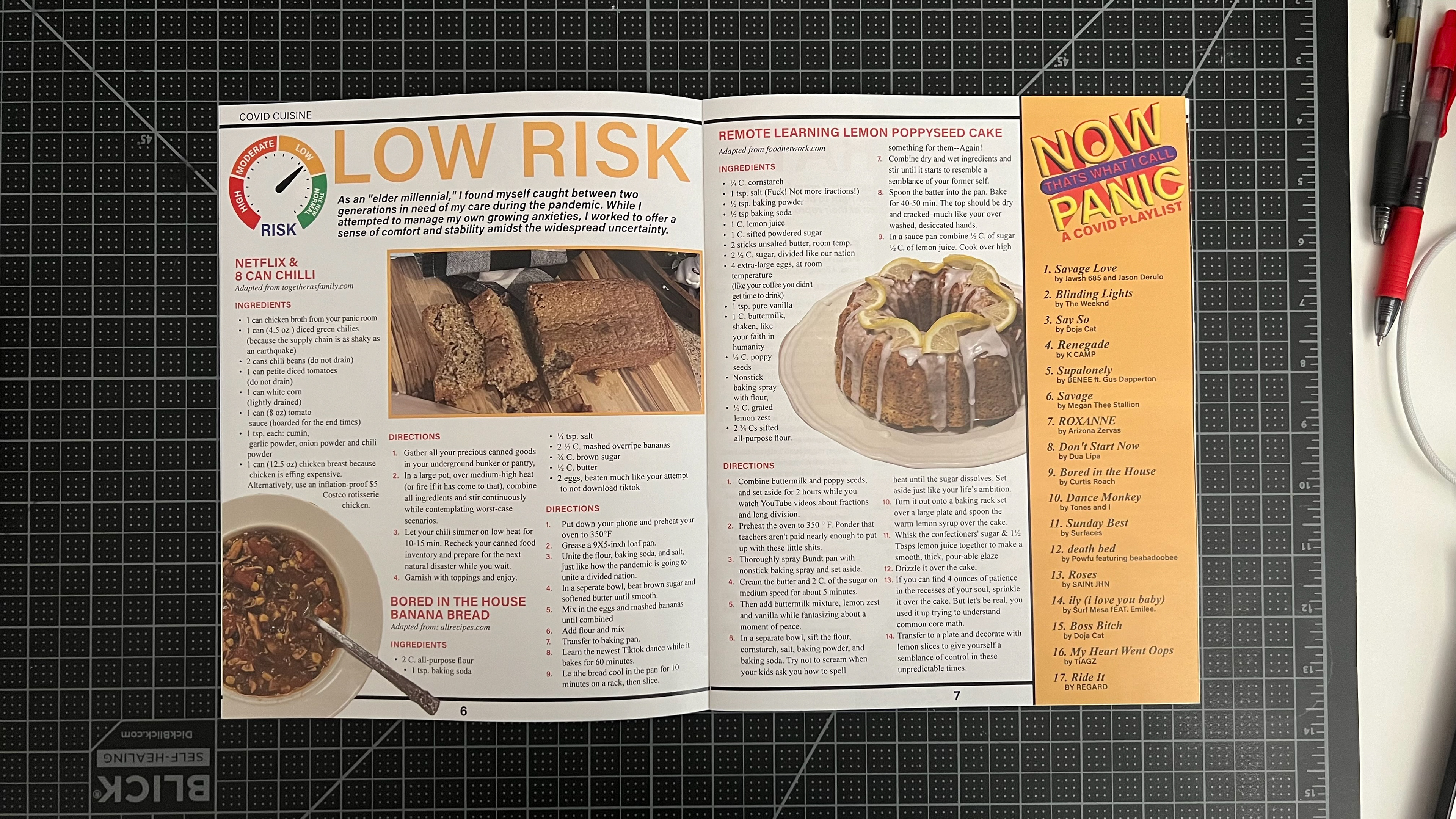
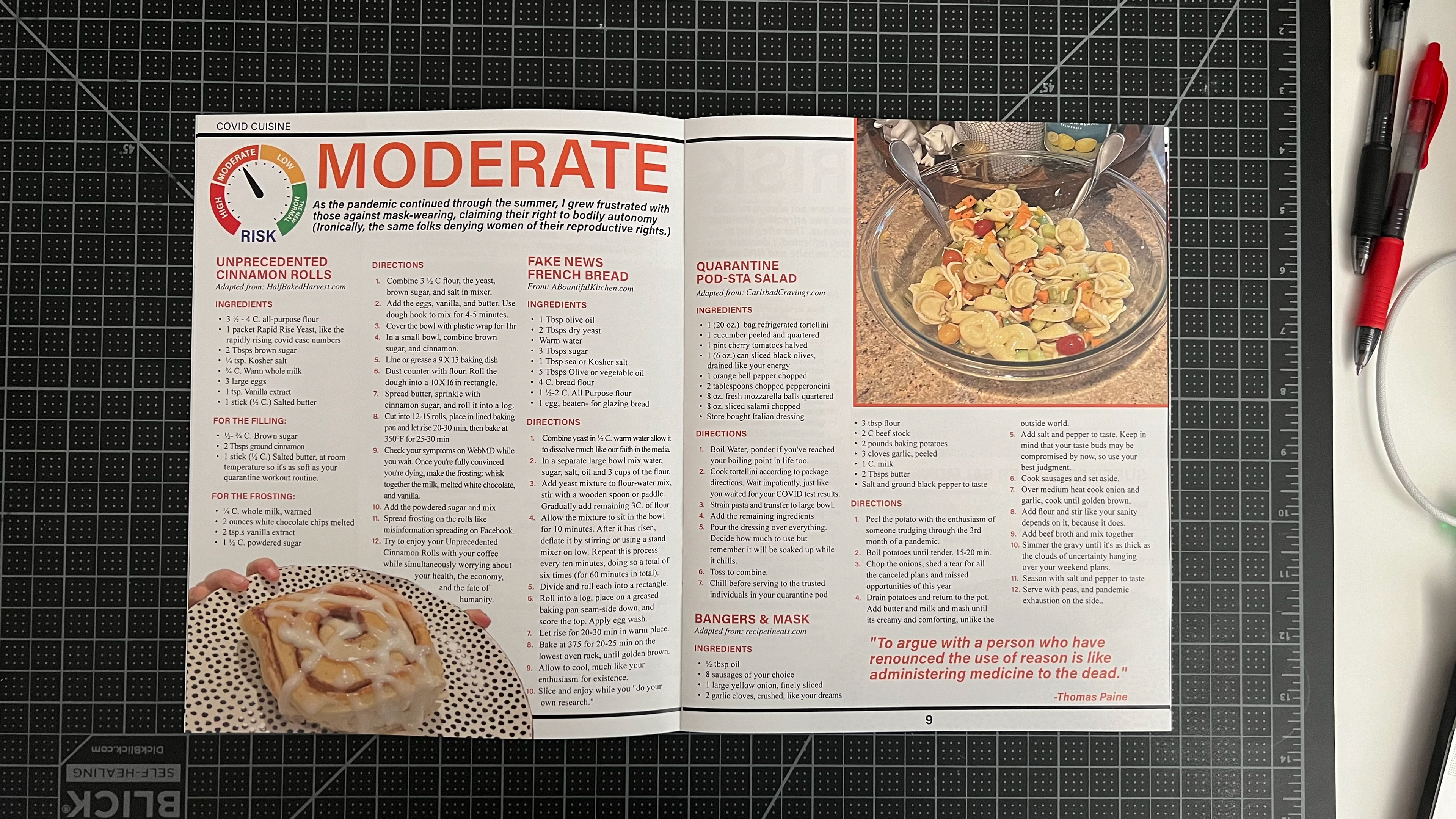
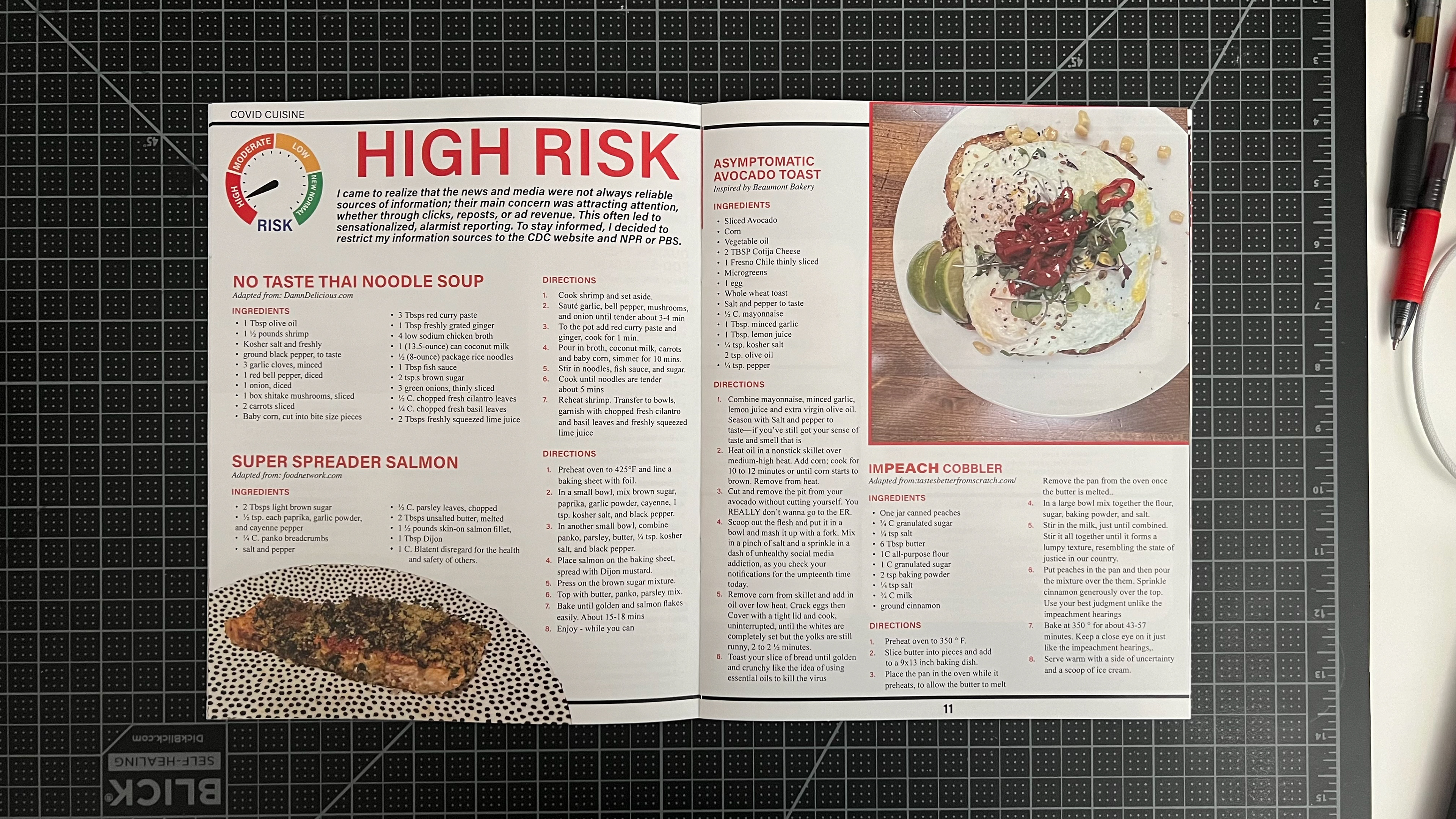
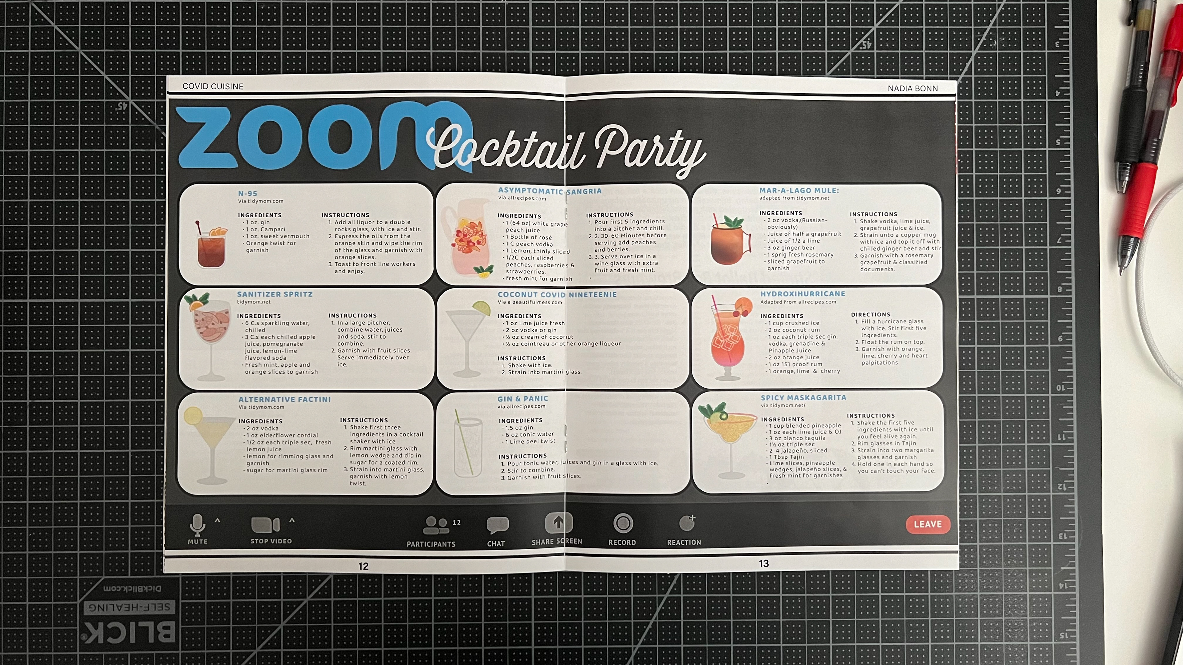
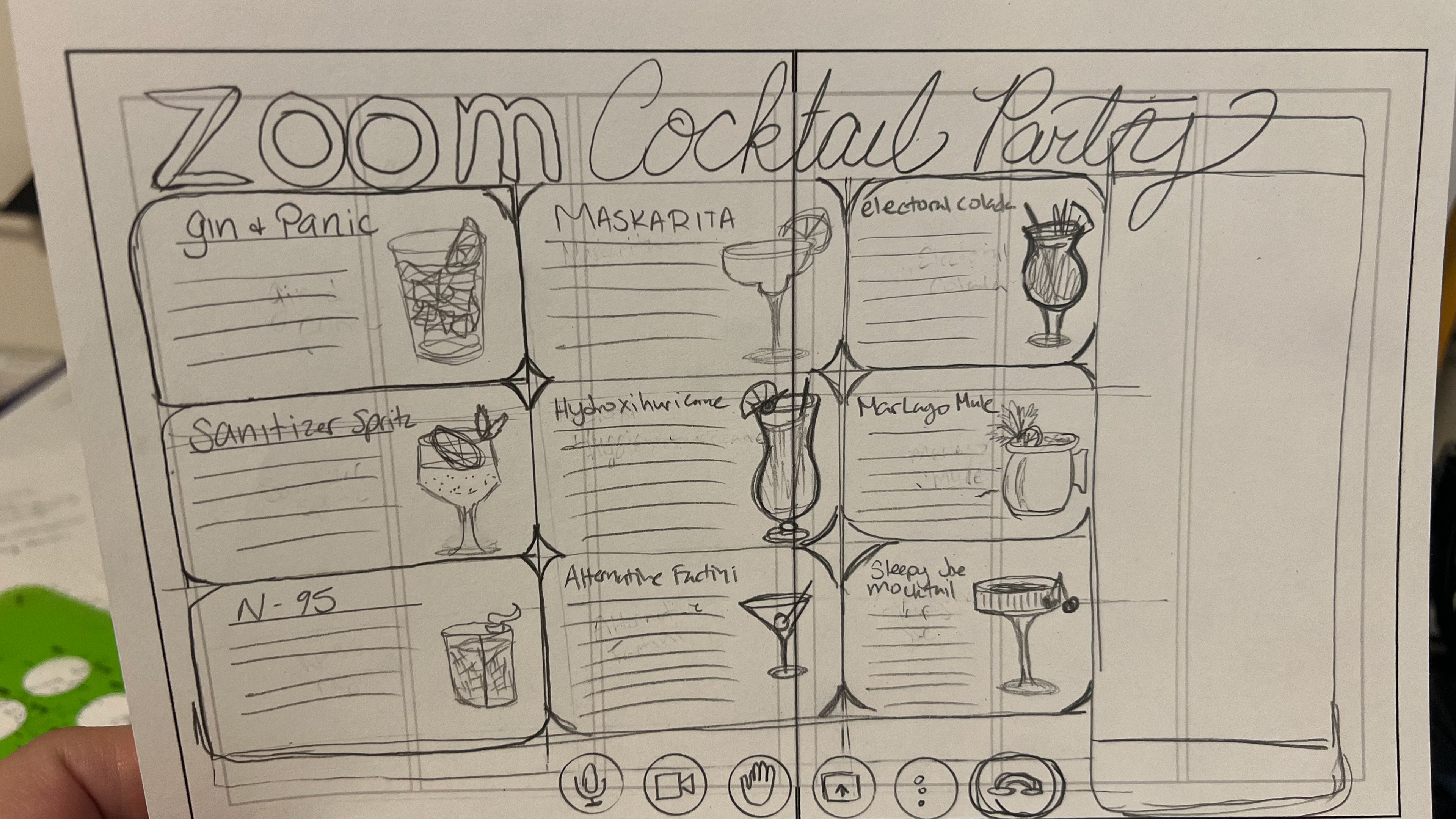
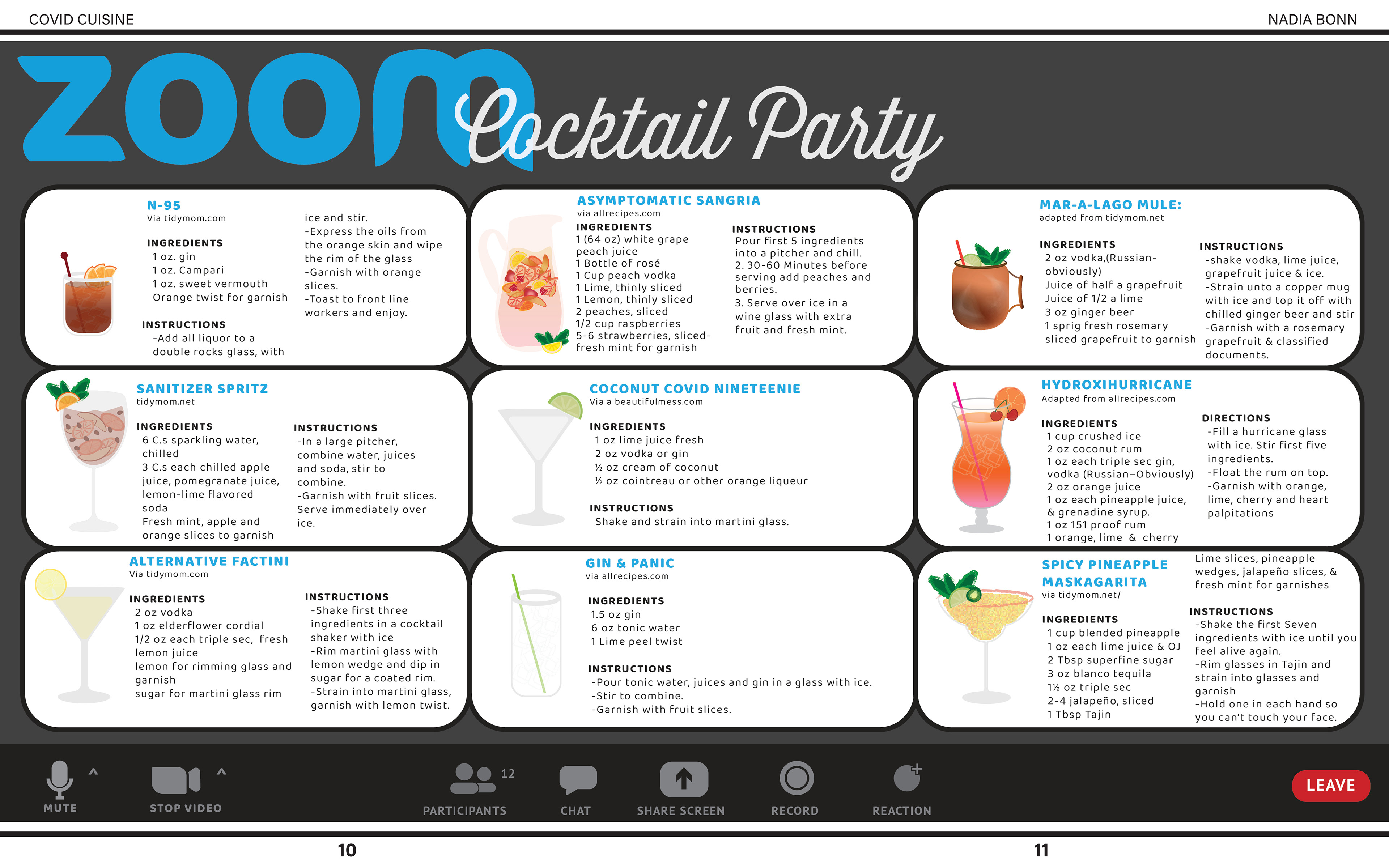
I'm really happy with how my zine turned out. I successfully printed it at the print center on campus. I printed it on Sterling 80# paper and it looks just like a real magazine. The colors, recipes, and photos all came together nicely, and I'm proud of the result. It took a lot of time and effort, but looking at it now, I think it was all worth it. The colors I chose worked well together and made the overall design more interesting. The recipes I picked added some humor and matched the theme perfectly. The pictures I took added a personal touch and blended well with the text. I am most proud of the Zoom cocktail party page. I created each cocktail in Illustrator and I think they look awesome.
Except for a few small mistakes in the justification and widows, I wouldn't change anything about the project. I learned a lot about formatting text for publishing and solving design problems along the way. These lessons will help me in the future. Overall, I'm happy with how everything turned out. This project means a lot to me, and I'm excited to use what I learned in future design projects.
FINAL ASSEMBLED IMAGES
Click to Enlarge
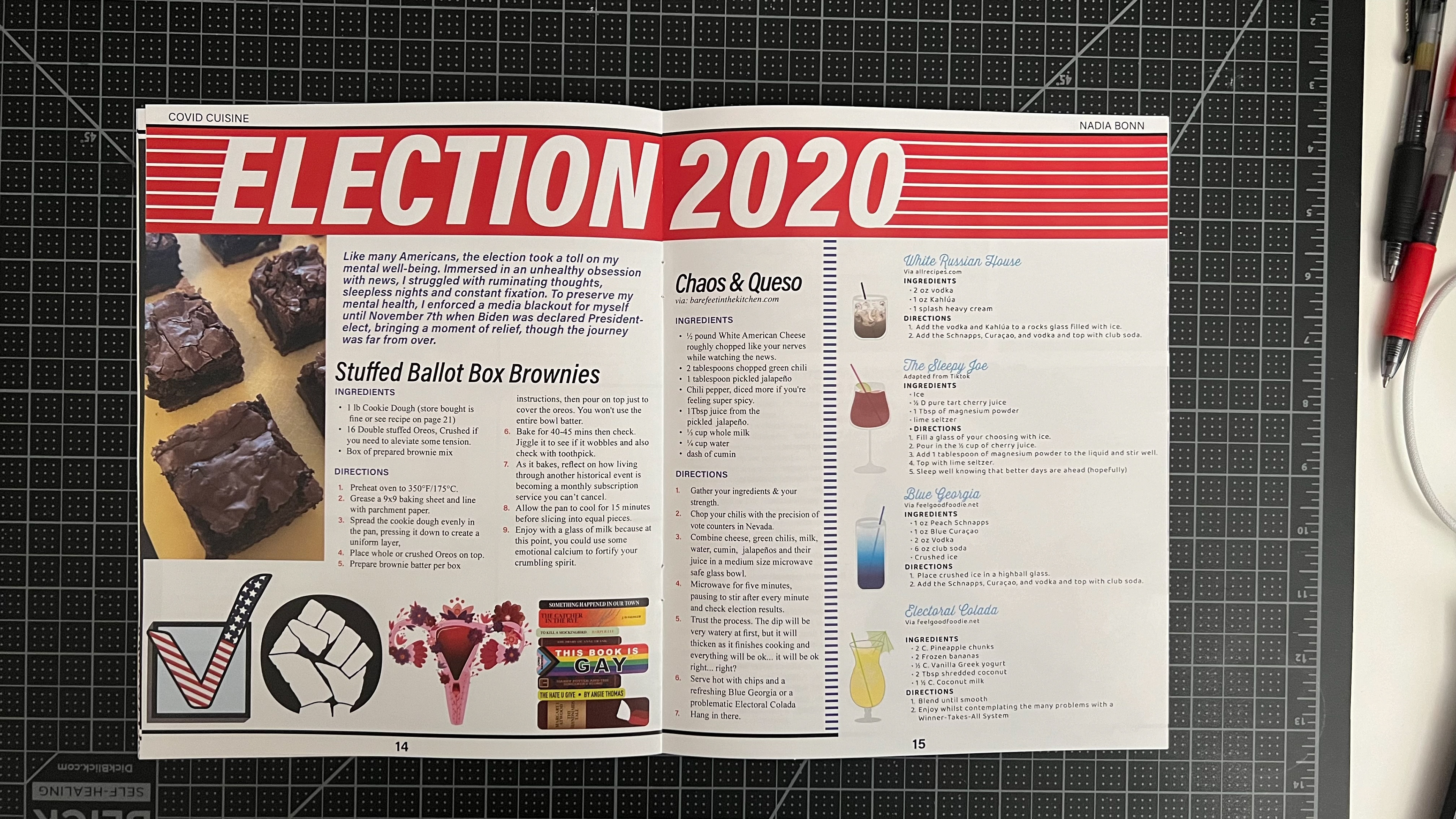
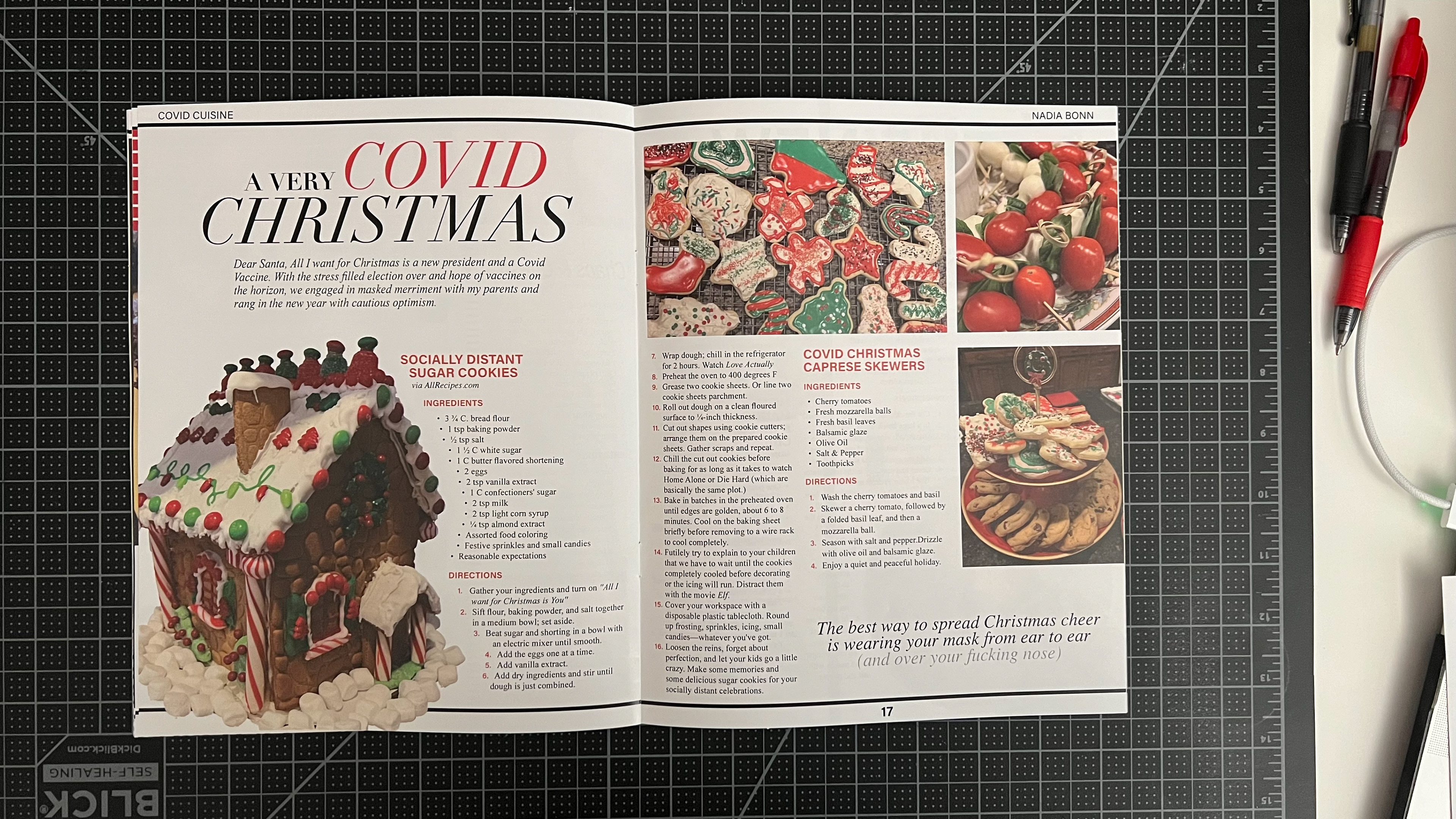
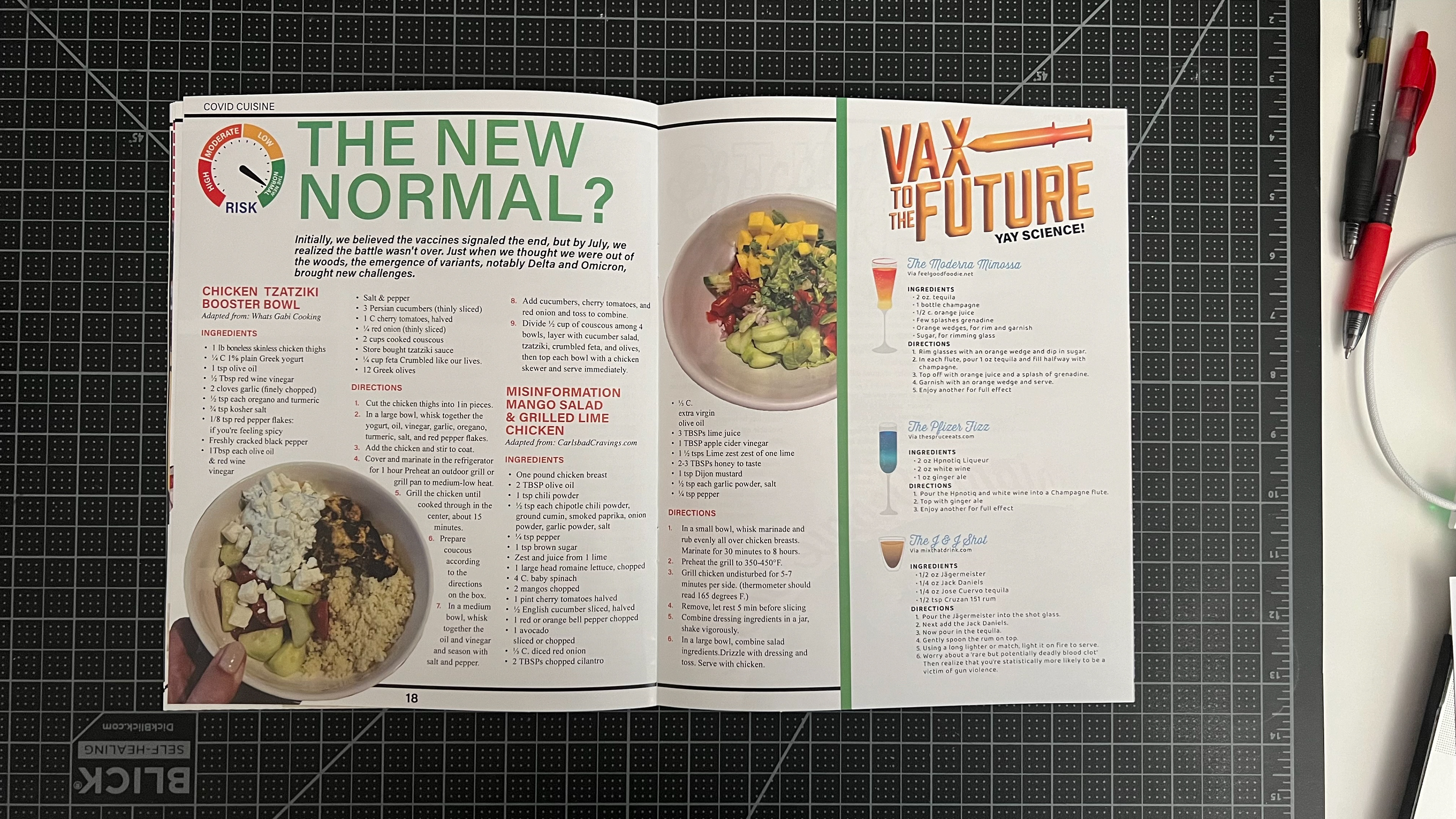
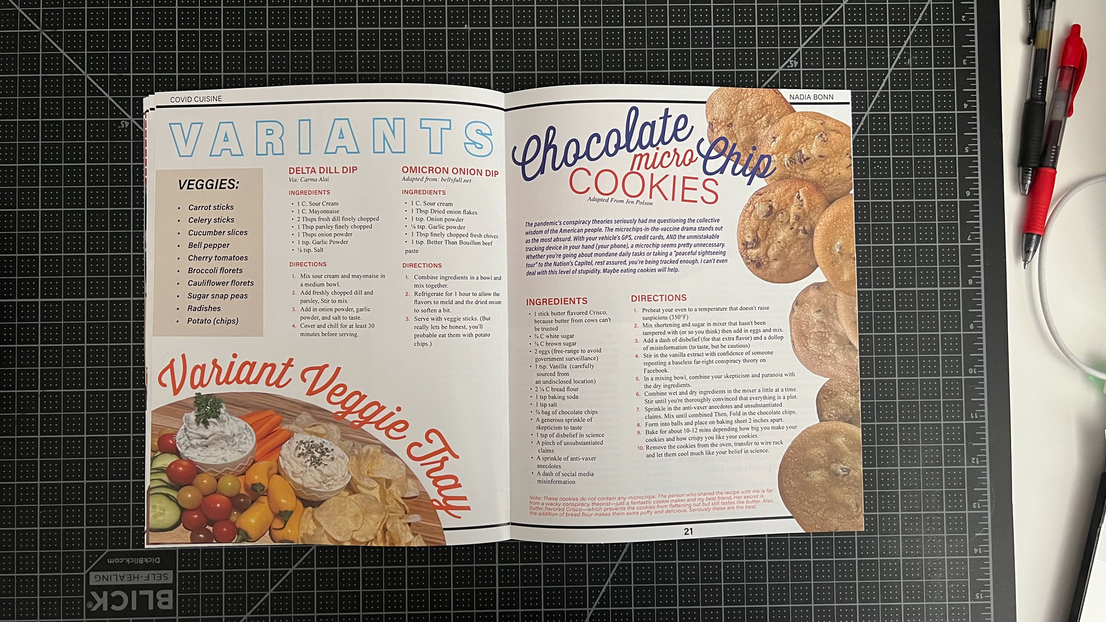
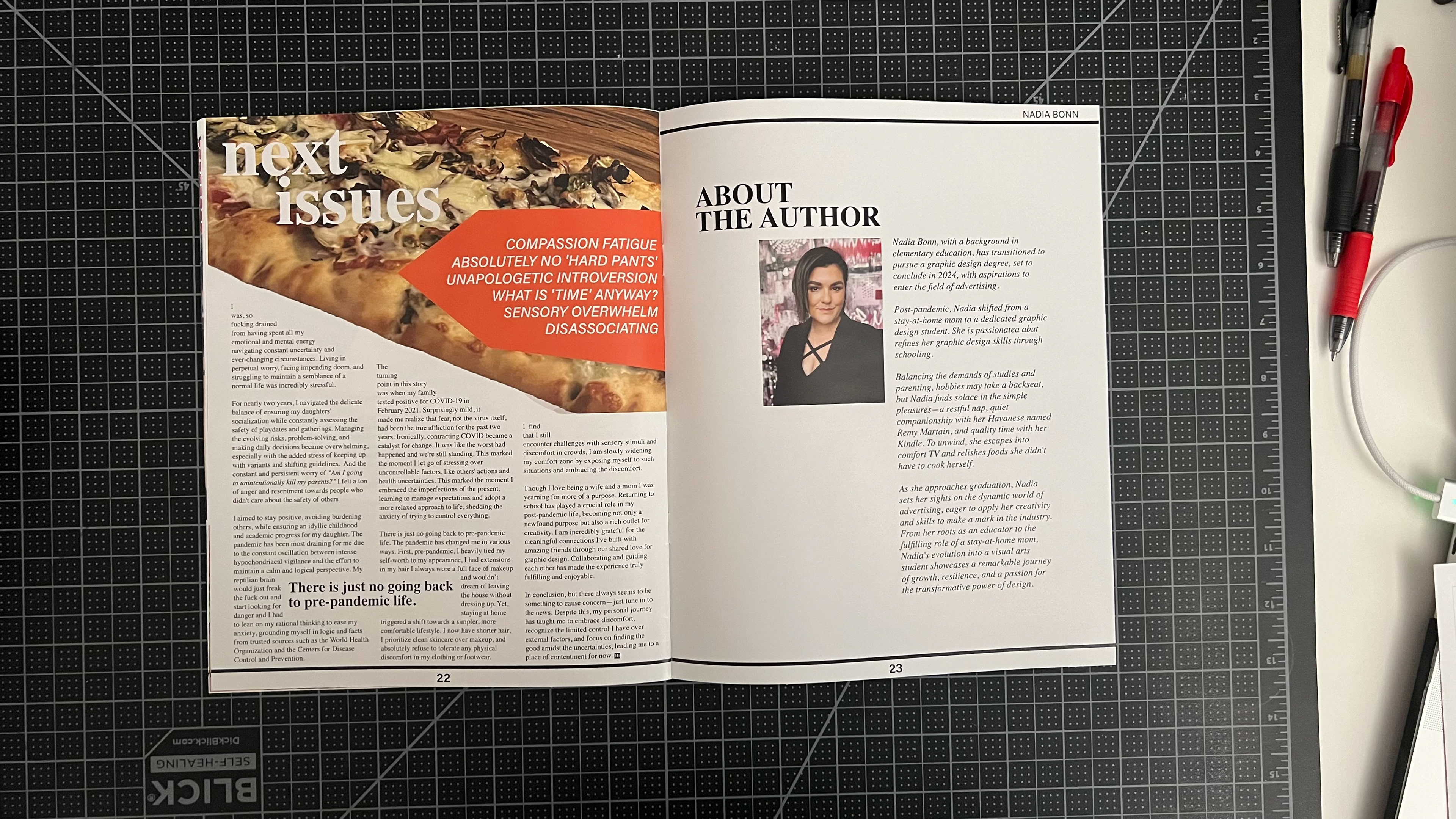
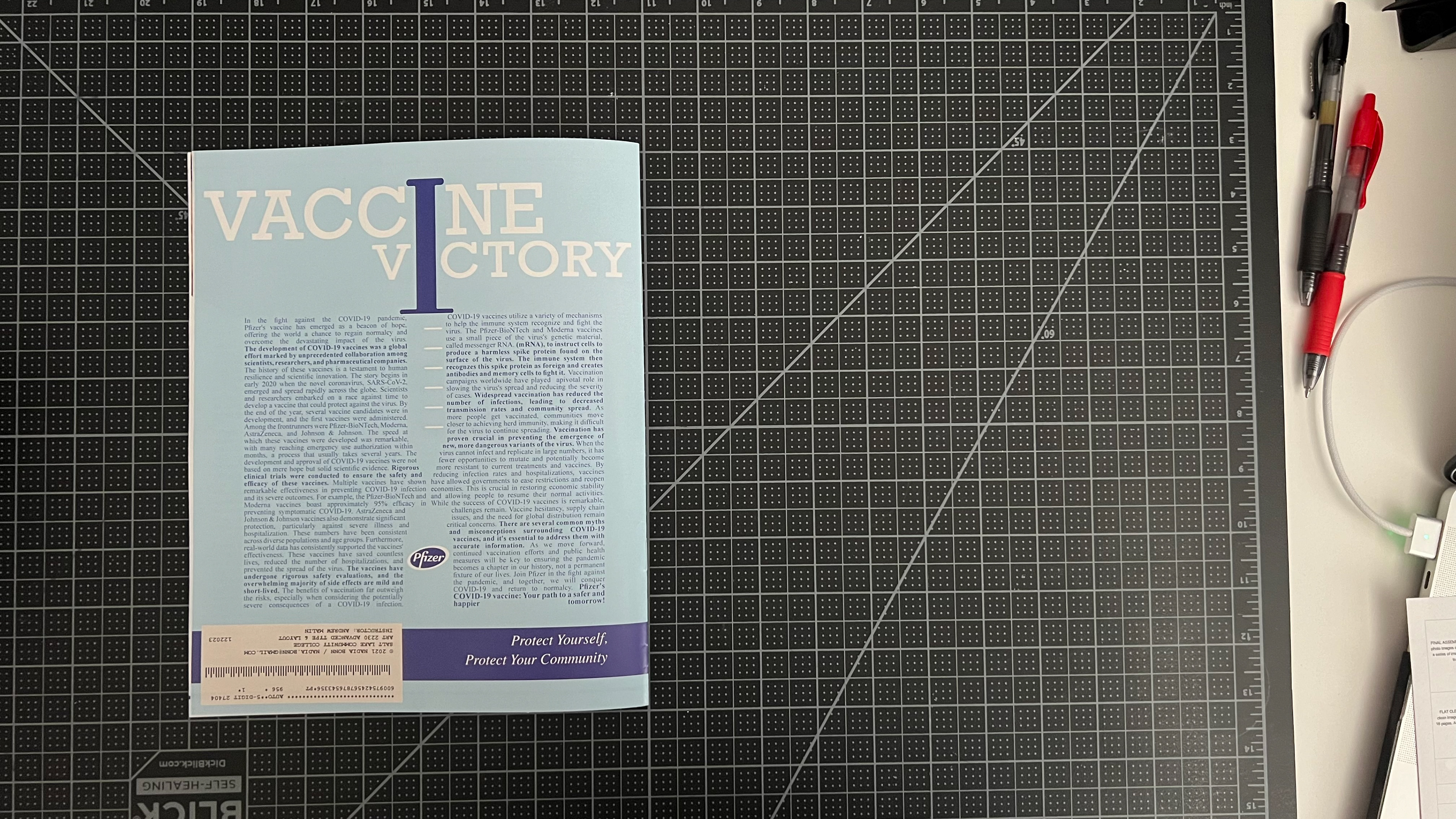
Video
FLAT CLEAN DIGITAL READER SPREADS
click to enlarge
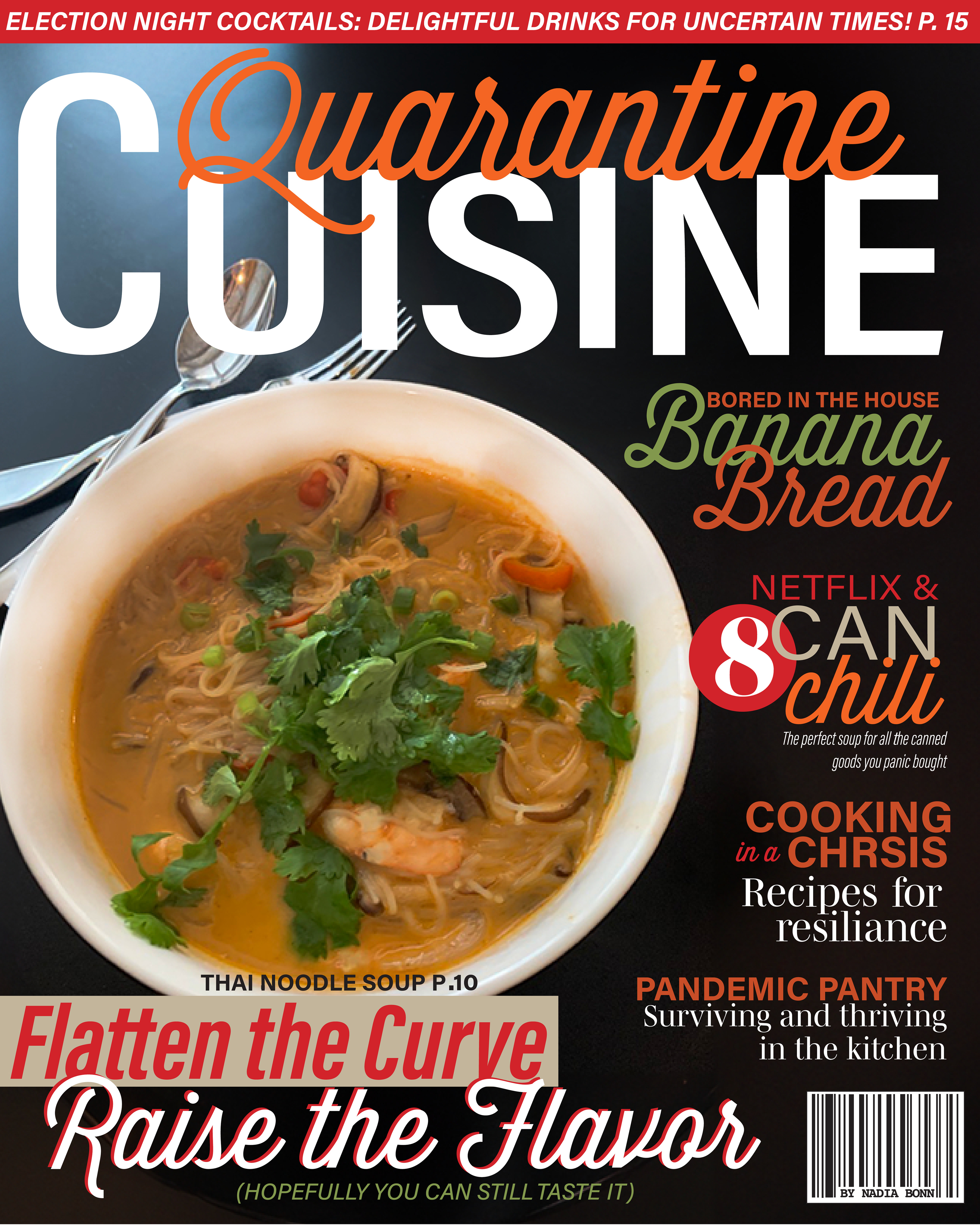
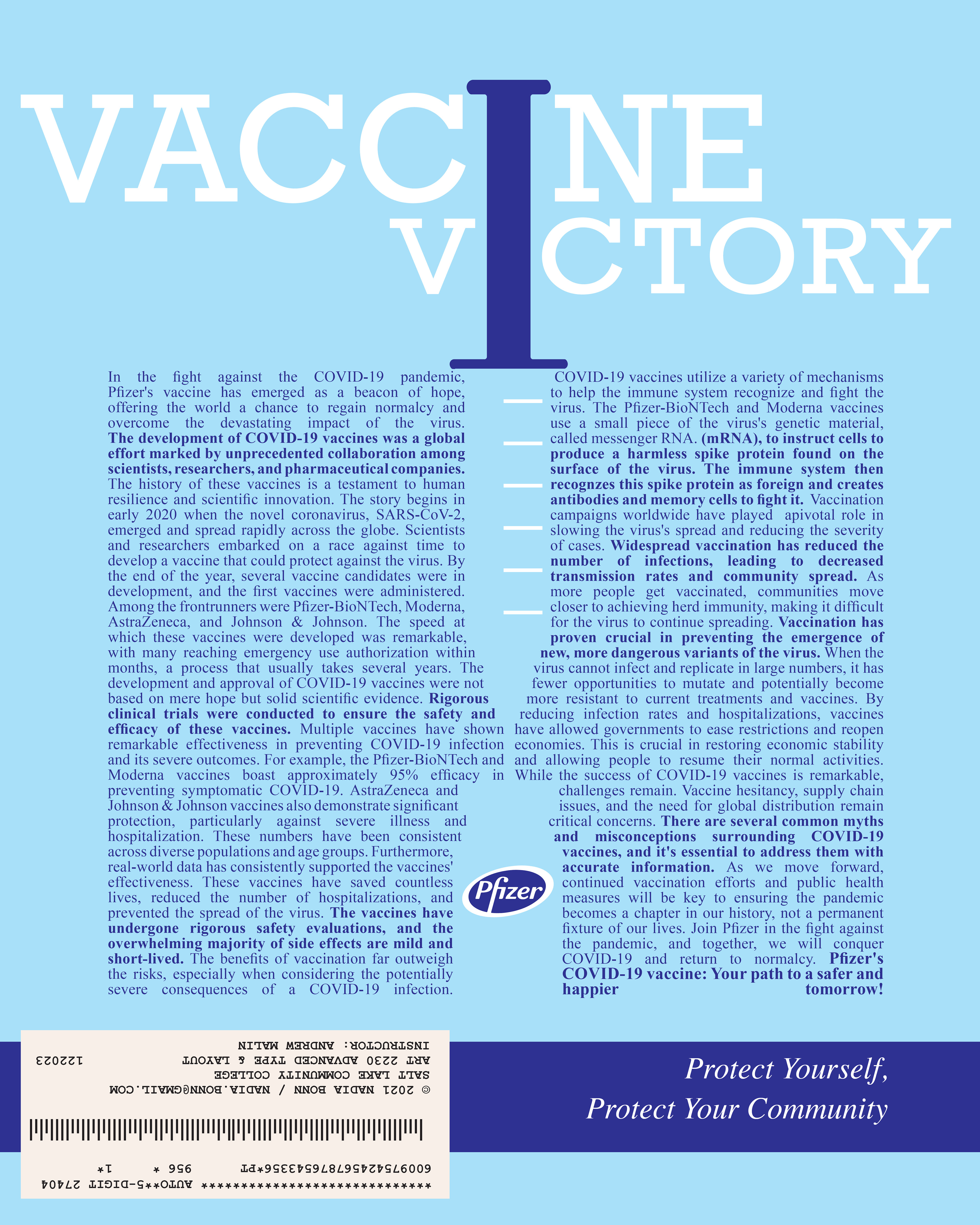
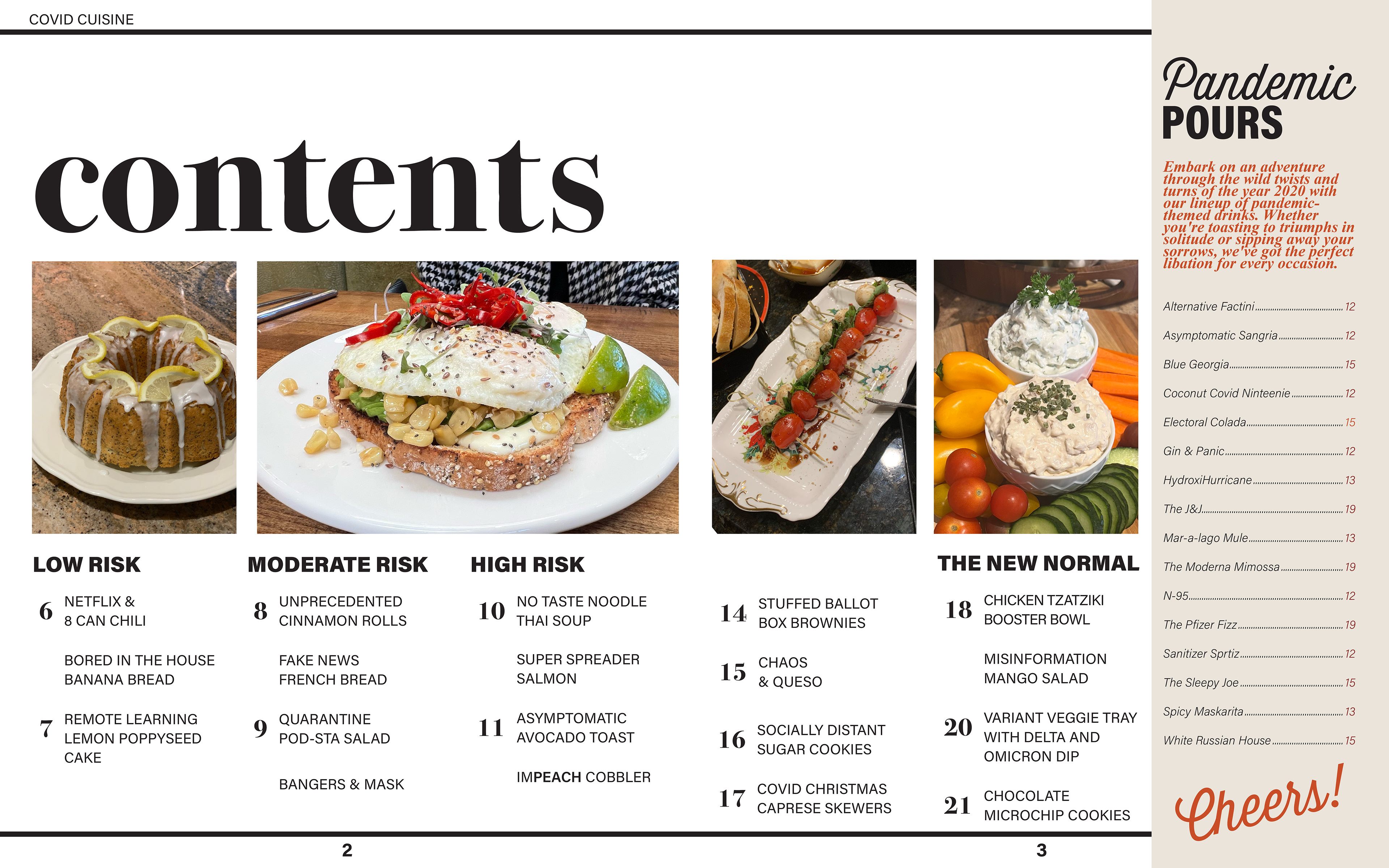
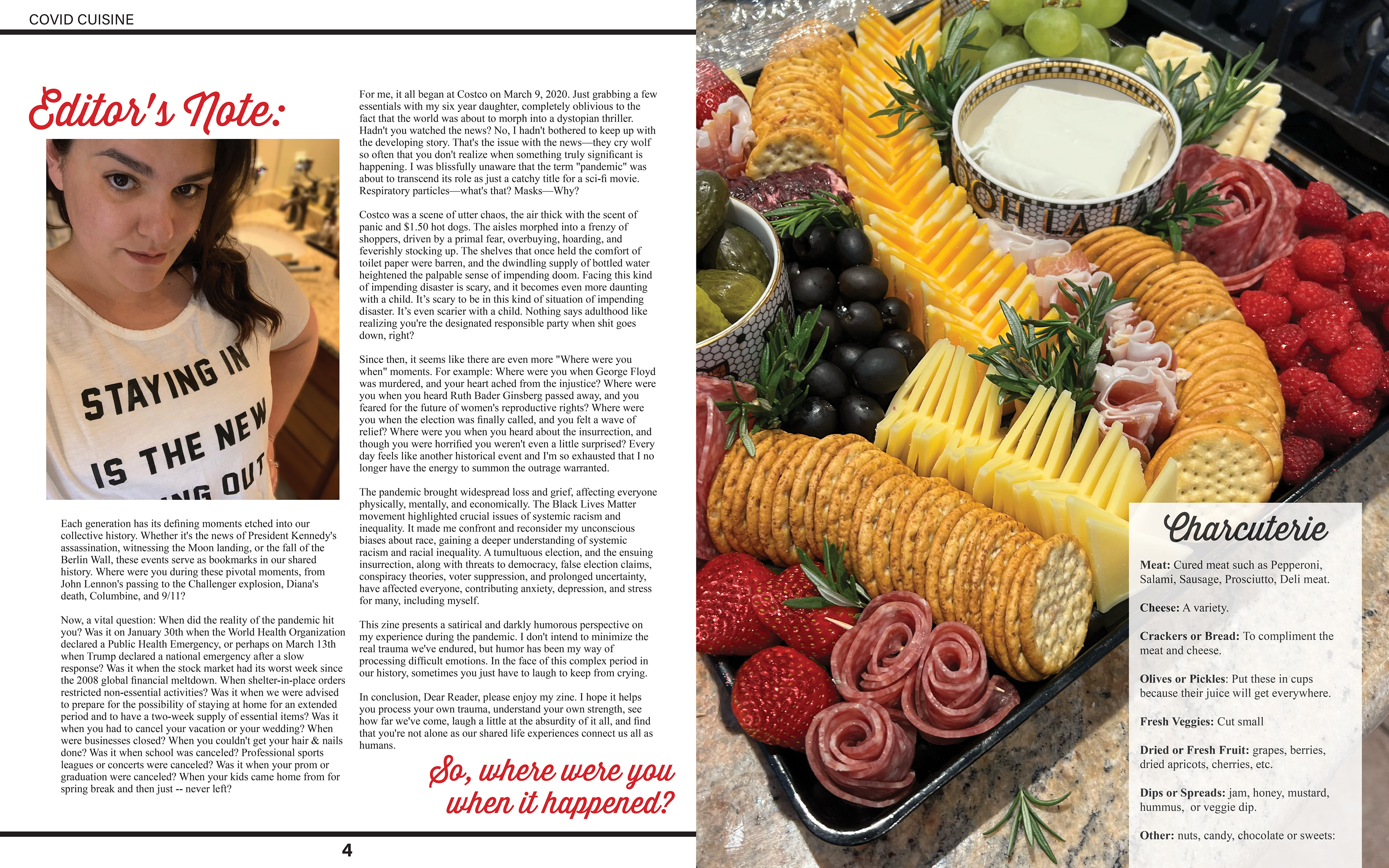
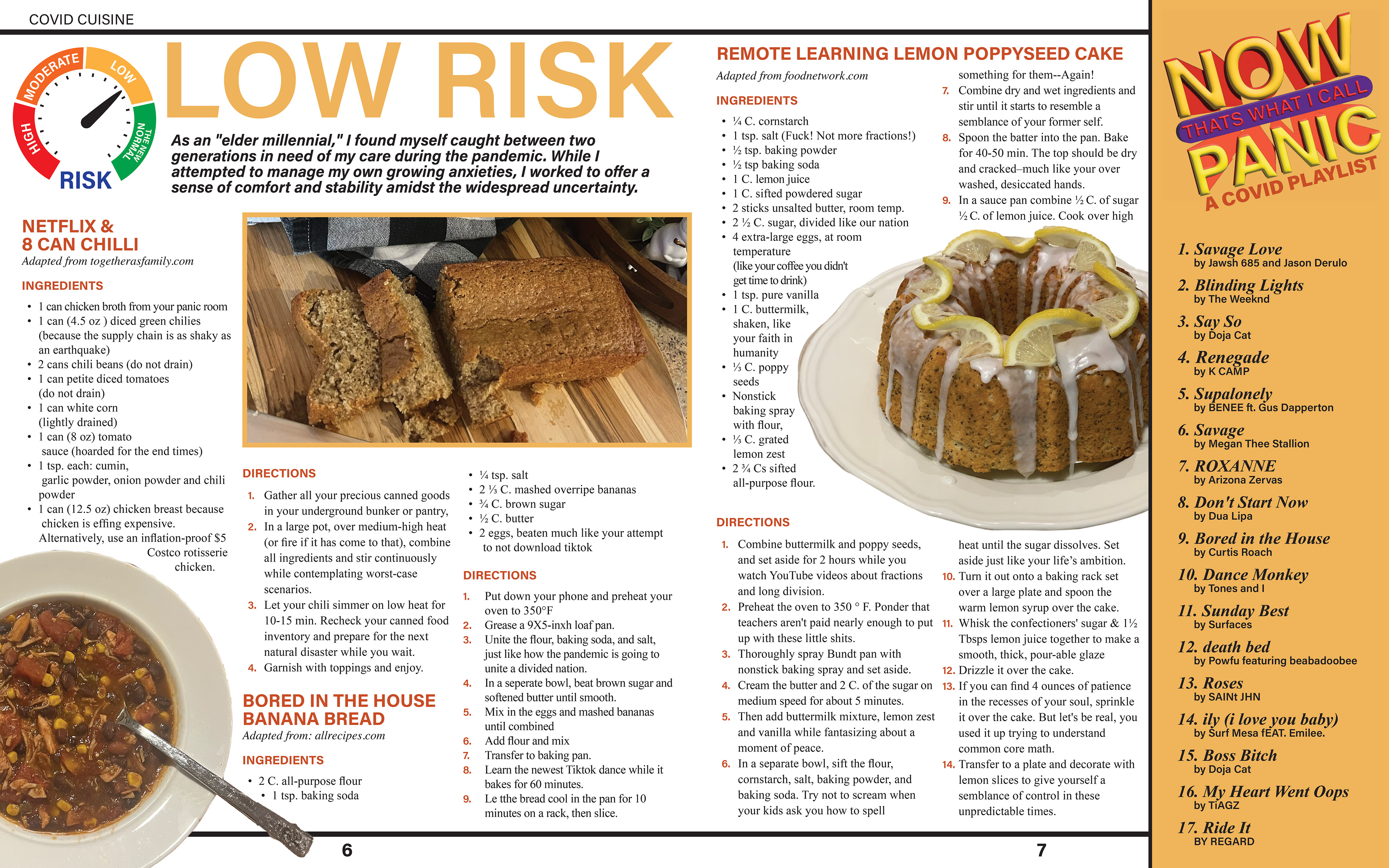
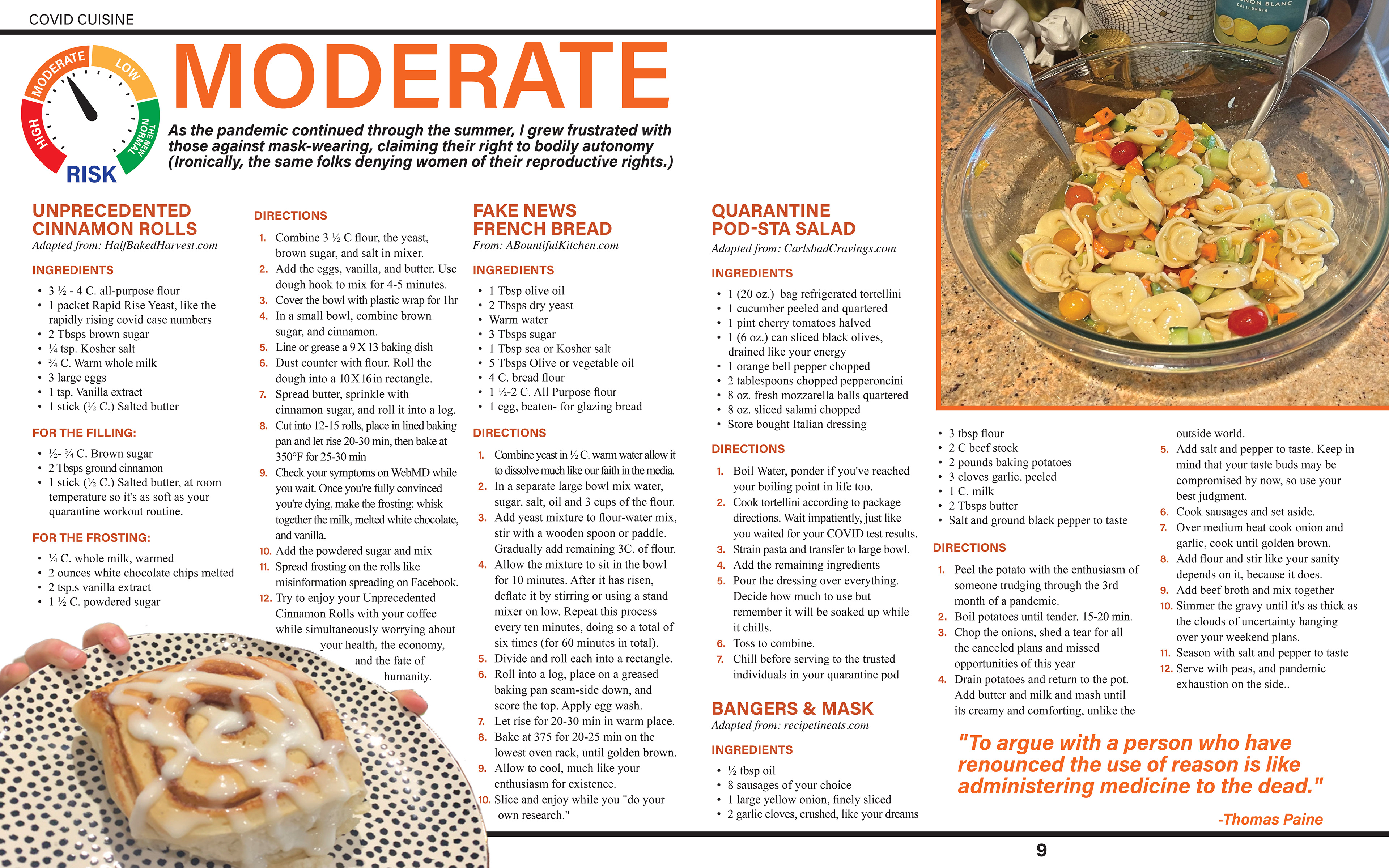

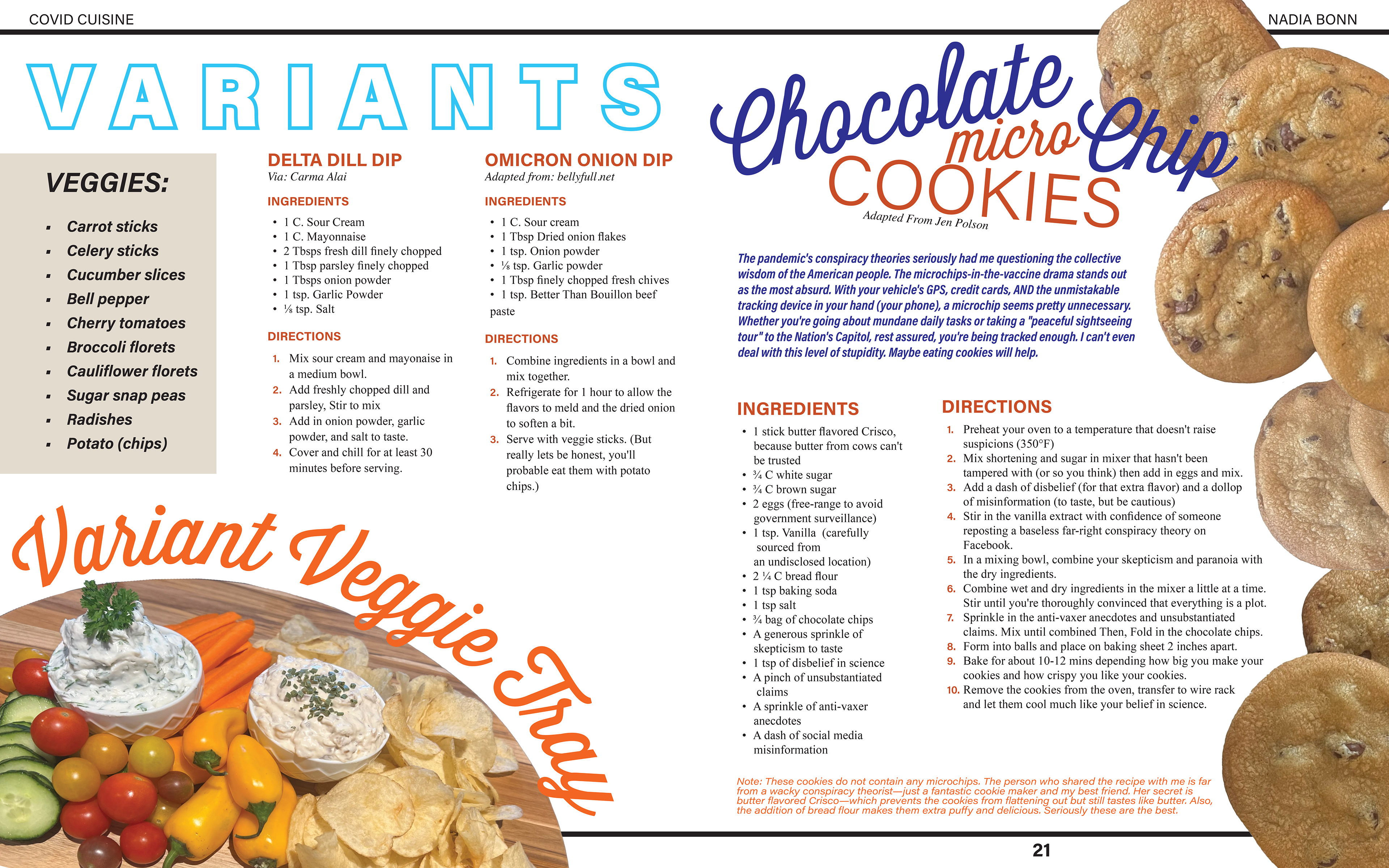
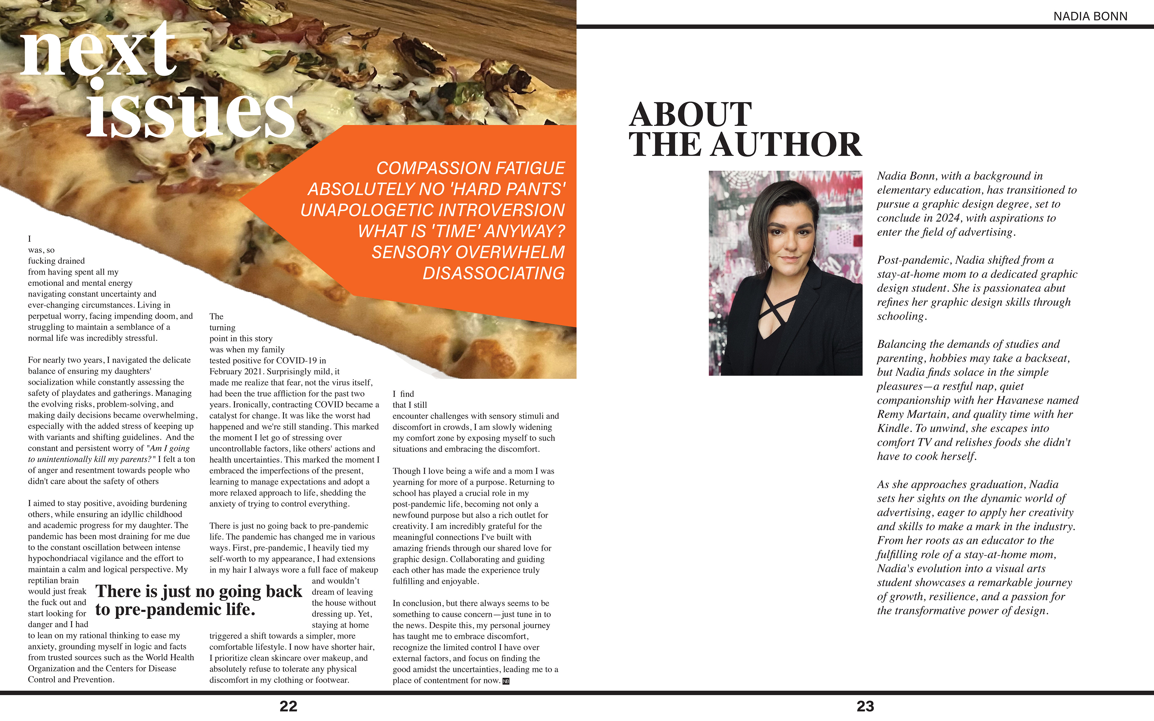
#1 Progress Review
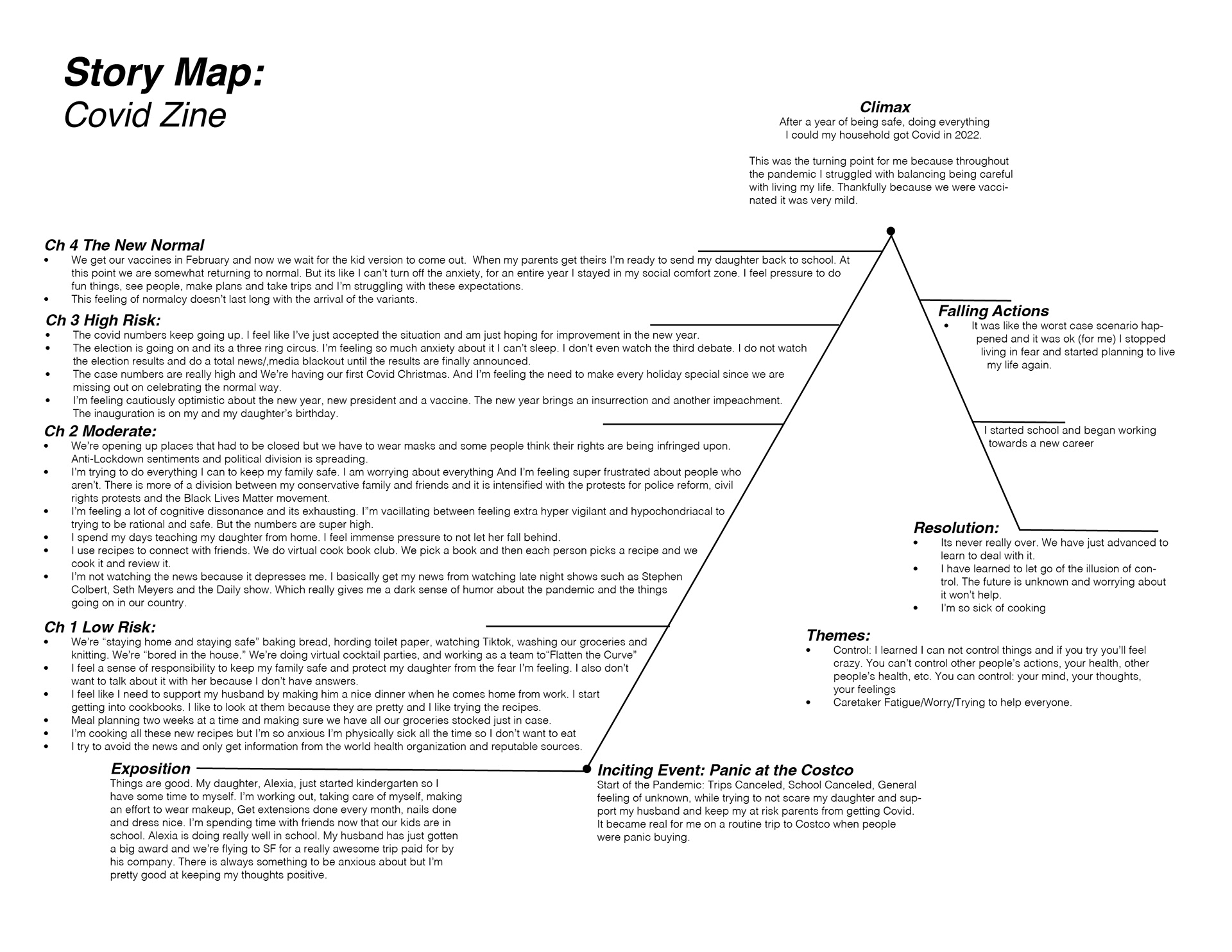
Click to enlarge
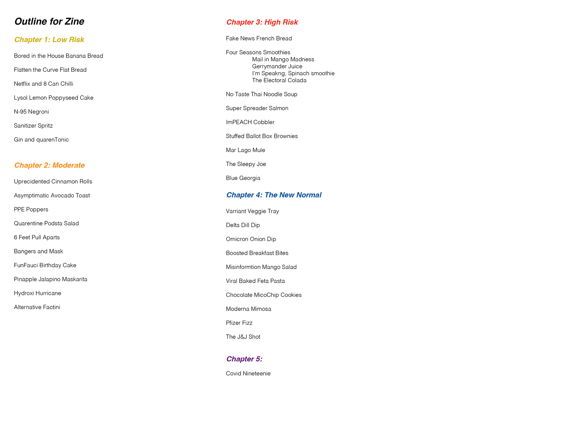
Click to Enlarge
Zine Summary:
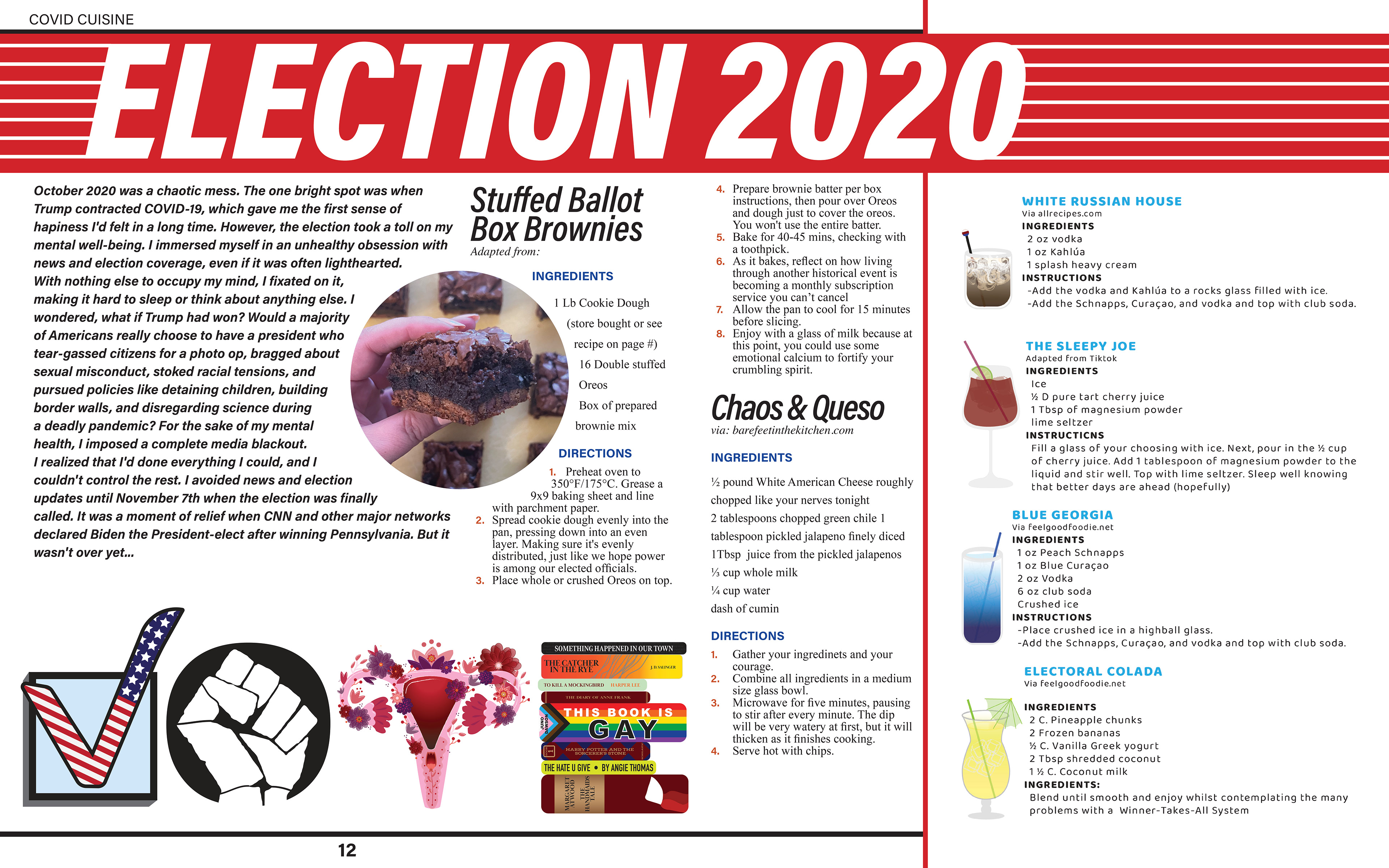
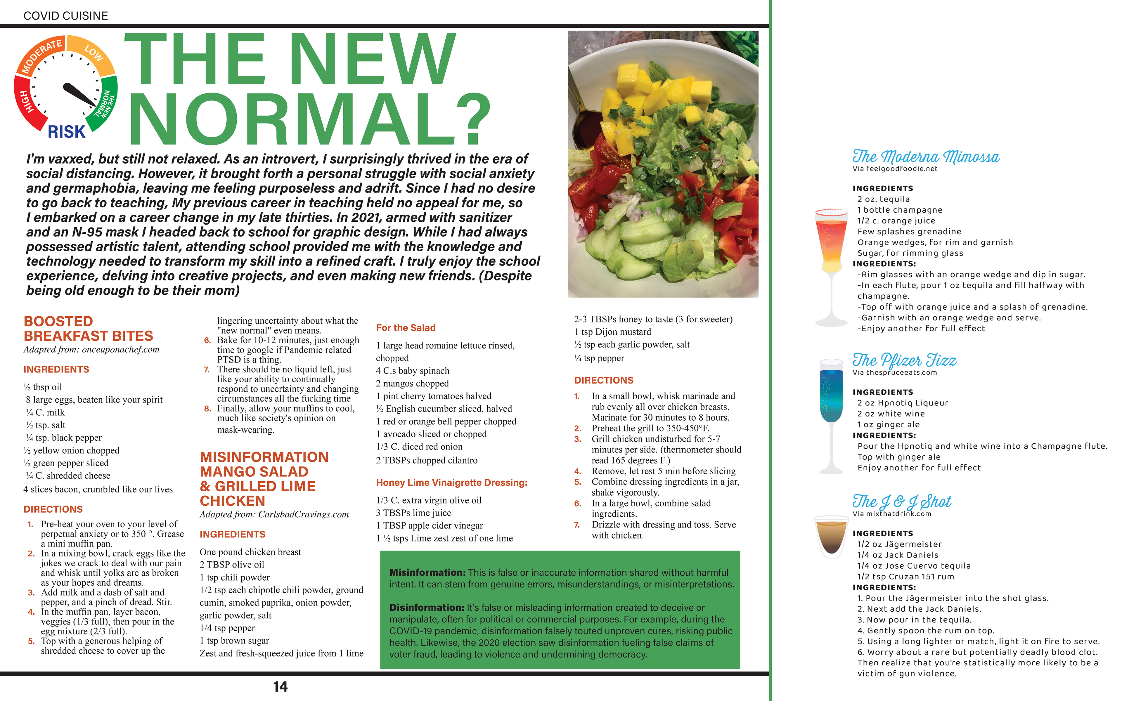
The zine is divided into four chapters tracking the pandemic's progression. Chapter 1 is called “Low Risk," during the early pandemic, I felt a strong responsibility to protect my family. I was concerned for my at-risk parents. The second chapter, "Moderate," covers the period of reopening with mask mandates and growing political divisions. I remained vigilant while some around me didn't, causing frustration. I grappled with cognitive dissonance, which left me emotionally drained. Each day, I swung between trying to live my life and trying to stay safe. Chapter 3, titled High Risk," includes the 2020 election and anxiety over its outcome. I was cautiously optimistic about the new year but faced an insurrection and another impeachment. Chapter 4, "The New Normal," explores the vaccine rollout and my struggle to adapt to a semblance of normalcy. Despite initial relief, new variants prolonged the pandemic and just became something new to deal with. In 2022, after all my efforts, my household contracted COVID, a turning point for me. After recovering, I embraced new beginnings, like pursuing a new career and learning that I can't control everything. I've learned to accept the uncertainty and release caretaker fatigue and worry.
Initial Dummy – Assembled Full-size
I will be using a saddle stitch or staples to connect my 24-page zine
Sketches and Doodles
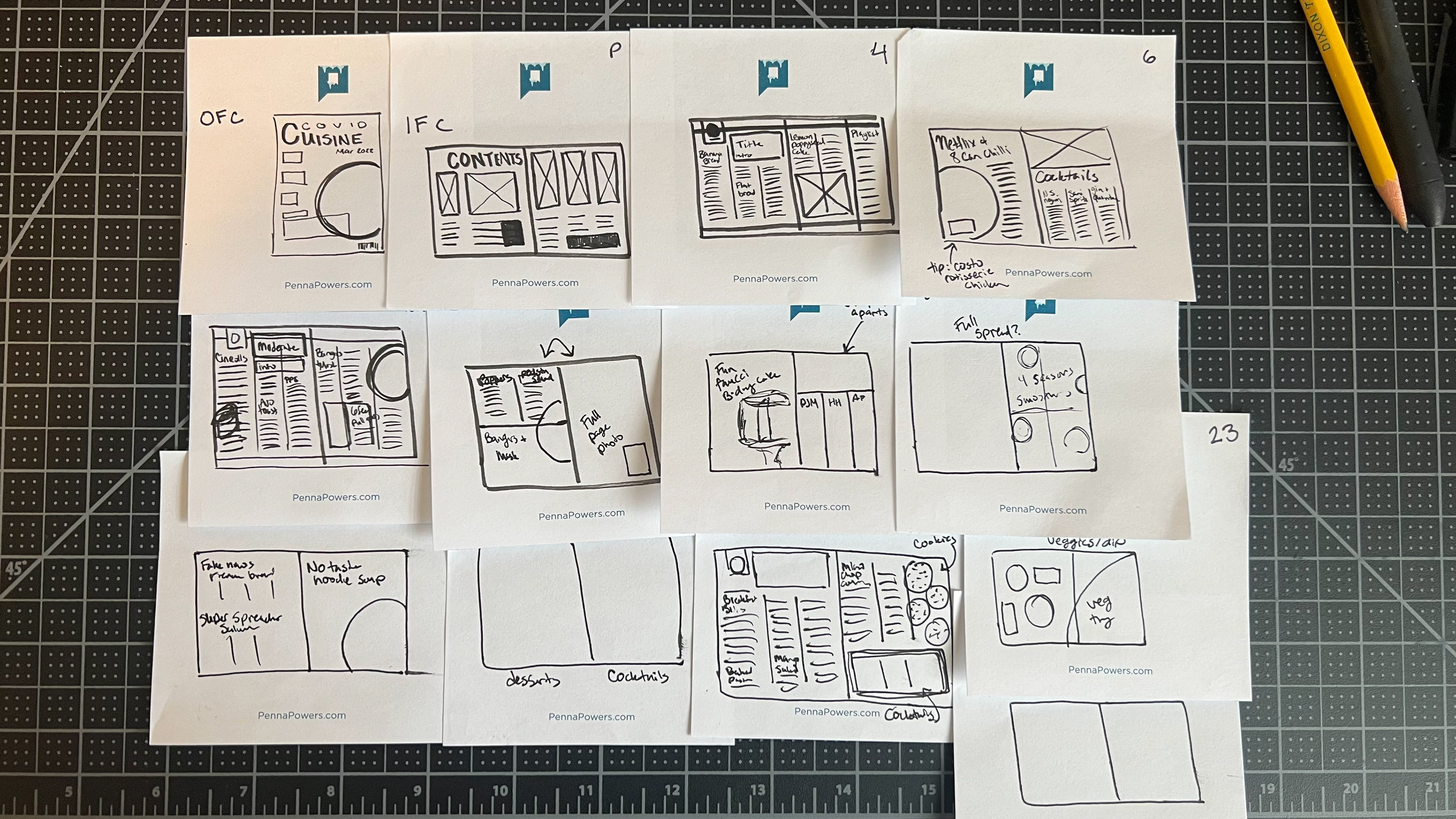
Tentative Page Number Breakdown
1. OFC: Magazine cover with food in a bowl and headlines over
2-3. Spread: TOC, TP
4-5: Title: Low risk and introduction. Recipes: Bored in the House Banana Bread, Flatten the Curve Flat Bread, Lysol Lemon Poppyseed Cake [Photo], Sidebar: Pandemic Playlist
6: Netflix and 8 can Chili [need to photo] Cocktails N95 negroni, Sanitizer Spritz, Gin and Quarentonic [need to photo]
8-9: Title: Moderate and introduction. Recipes: Unprecedented Cinnamon Rolls [Photo] Asymptomatic Avocado Toast [Photo] Mangers and Mask [photo], 6 feet pull apart.
10: Full-page photo
11: PPE Poppers, 'Podsta' salad, Bangers and mask (photo).
12: Funfauci Birthday Cake
13: Cocktails: Pineapple jalapino maskarita, hydroxyhuricane, Alternative Factini
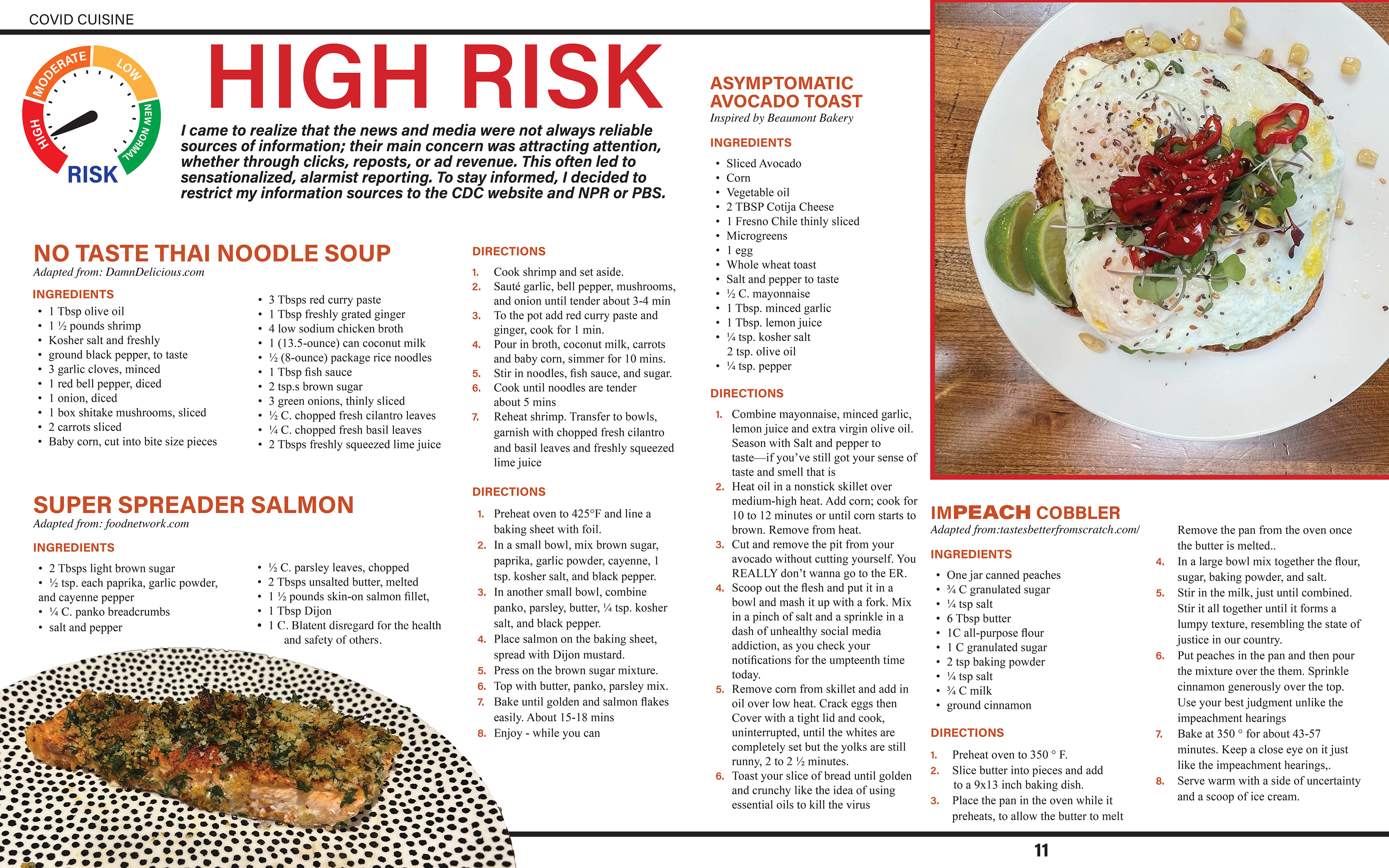
14-15: High Risk: Introduction Fake news french bread, no taste noodle soup [photo], super spreader salmon
16-17 Spread: 4 Seasons Smoothies: Mail in Mango Madness, I'm speaking spinach smoothie, gerrymander juice, The electoral colada: [Need to photograph all]
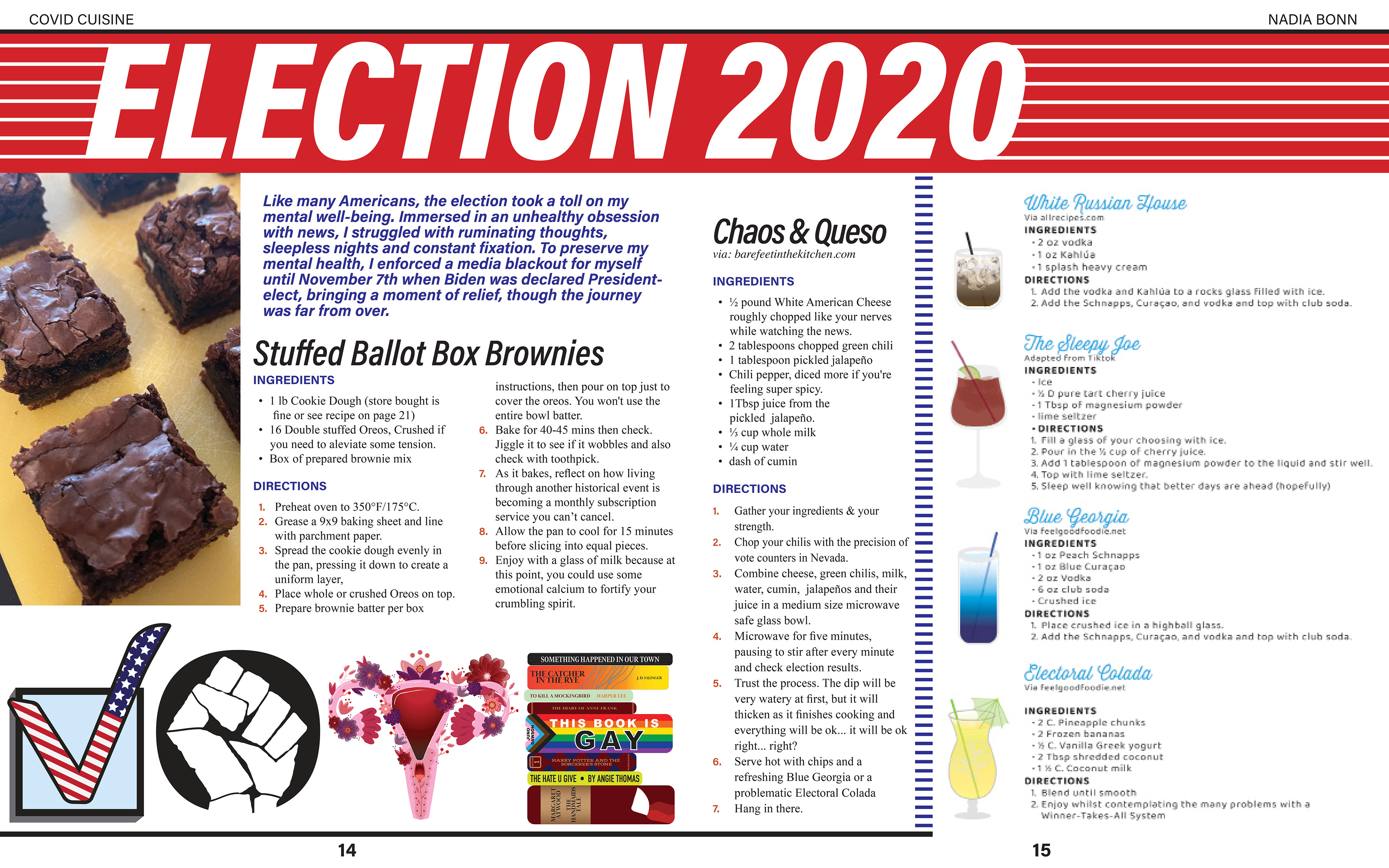
18. Recipes: Impeach Cobbler, Stuffed Ballot box brownies
19. Mar a lago Mule, Sleepy Joe, Blue Georgia
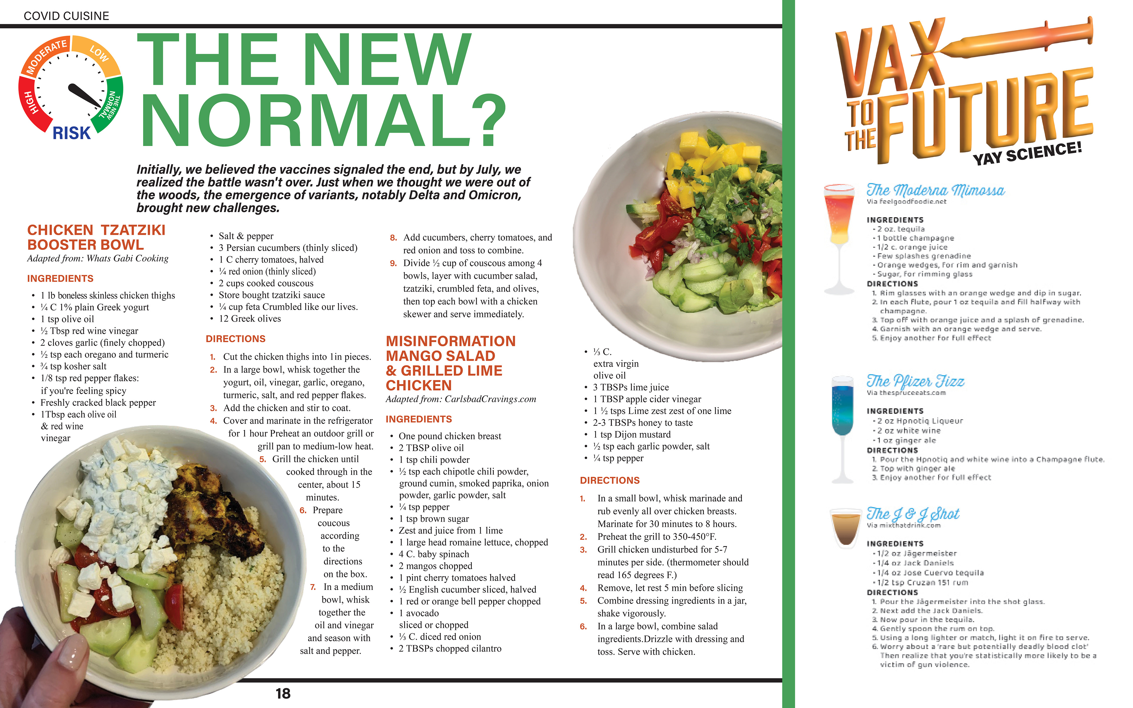
20-21 Title The new normal, introduction. Recipes boosted breakfast bites, Baked feta pasta, mango salad [photo], Chocolate MicroChip cookies
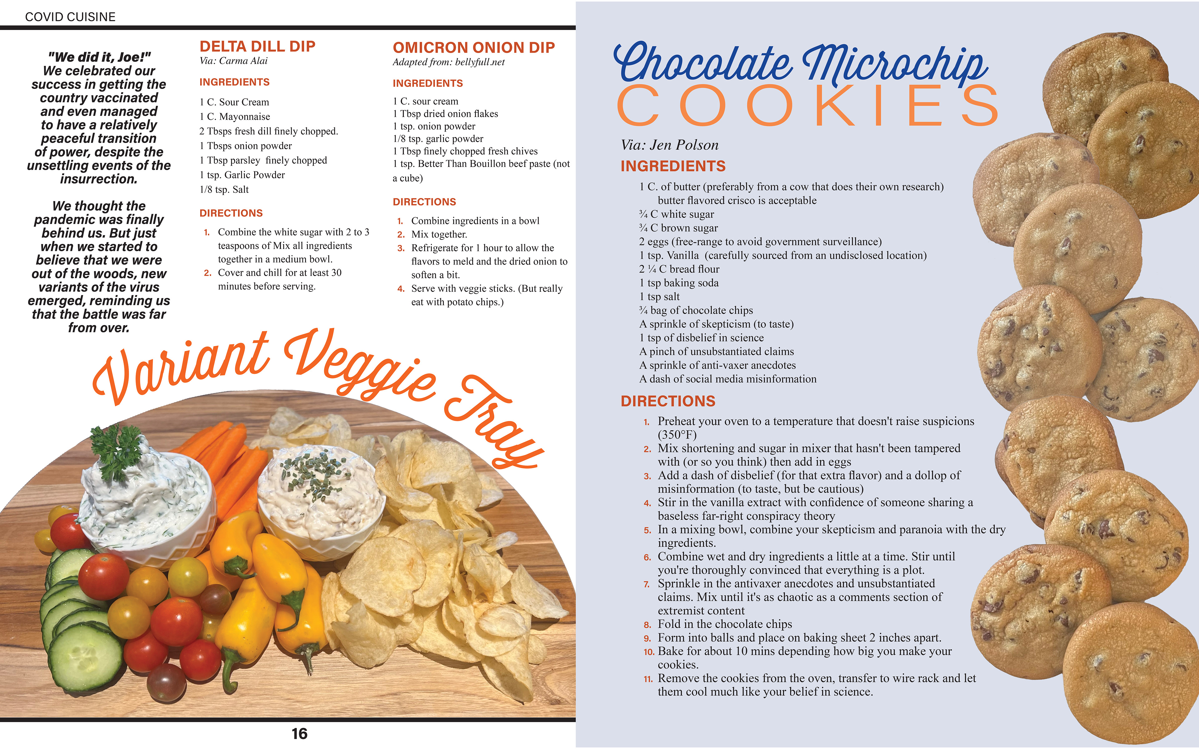
22 Variant Veggie tray with omicron onion dip and delta dill delight. Sidebar: Moderna Mimosa, Pfizer Fizz, J&J Shot
23 About the author
24 Back cover
Research:
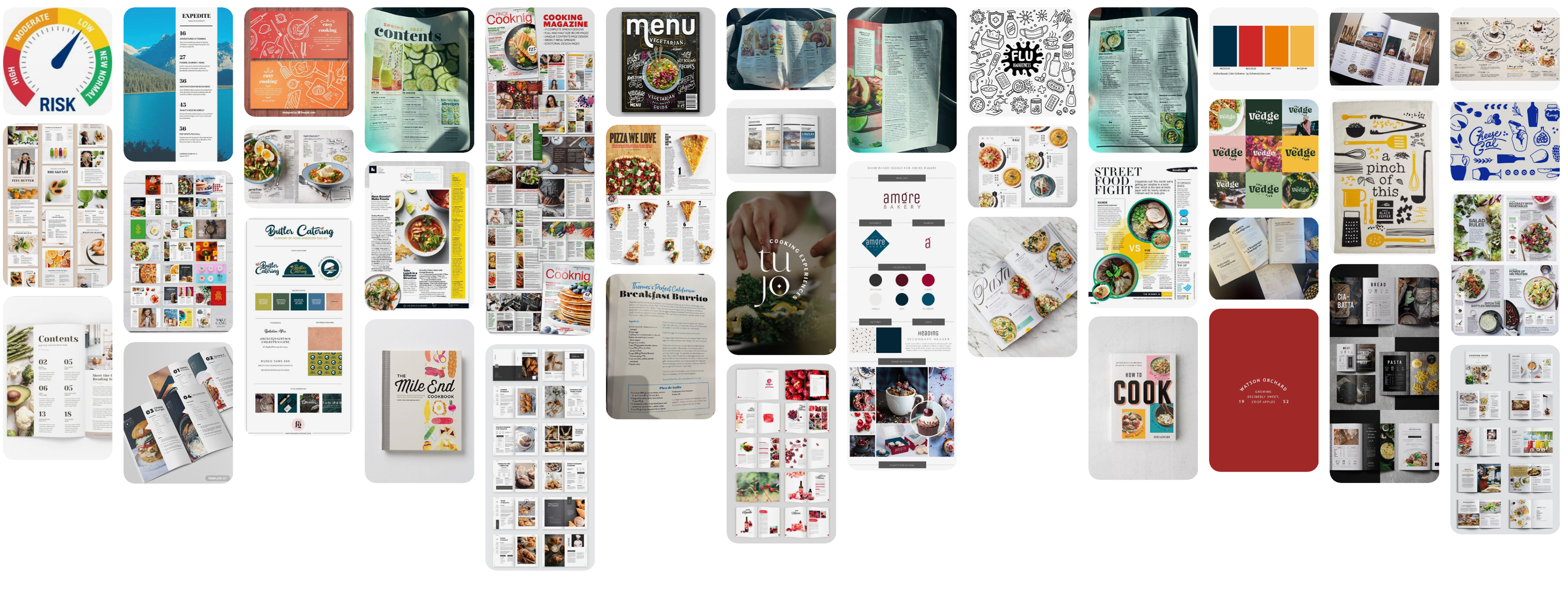
I started by looking through cooking magazines and cookbooks for colors and layouts that I wanted to use. For colors, I'm planning on drawing inspiration from the Covid risk-o-meter which was seen on billboards and on TV. I will be photographing my food photos. For Type design, I'm thinking of using a handwritten chalk art aesthetic. The recipes will be in a sans serif for easy readability and titles will be in something bolder.
Progress Review #2
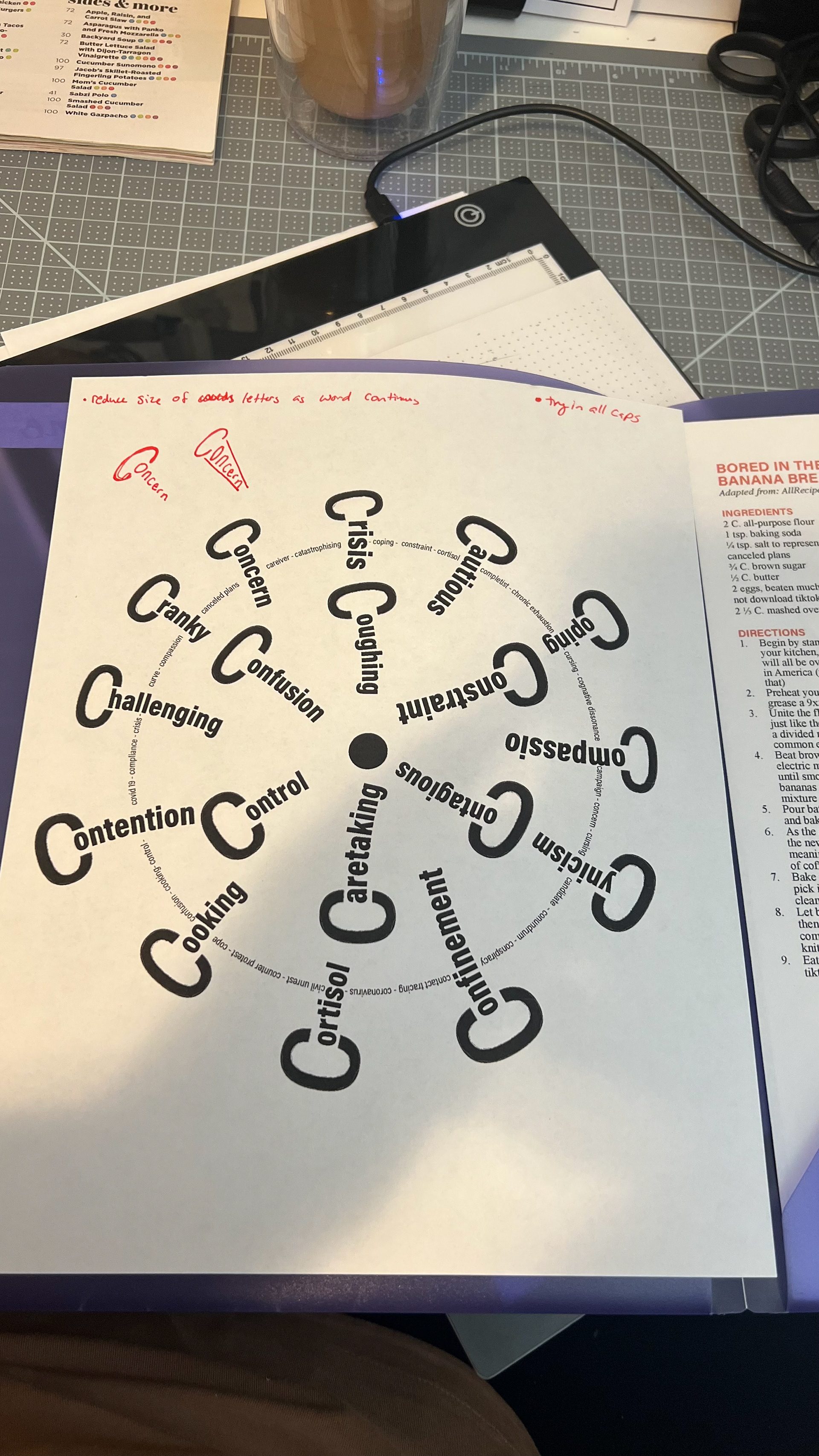
The requirements for this project review are an intermediate reader spreads and an assembled dummy. I was unclear on the size of the dummy. Since my last progress review, I've elected to cut down the length of my zine, combine elements, and discard some of my original ideas. I have cooked and photographed food from my recipes and I have started writing copy. I created the illustrated word and a few ideas for the type figure.
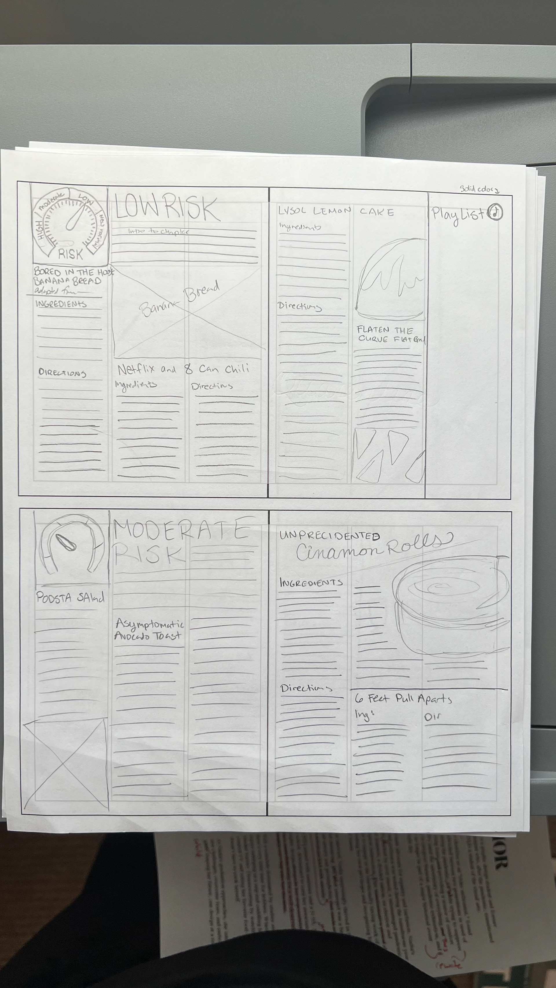
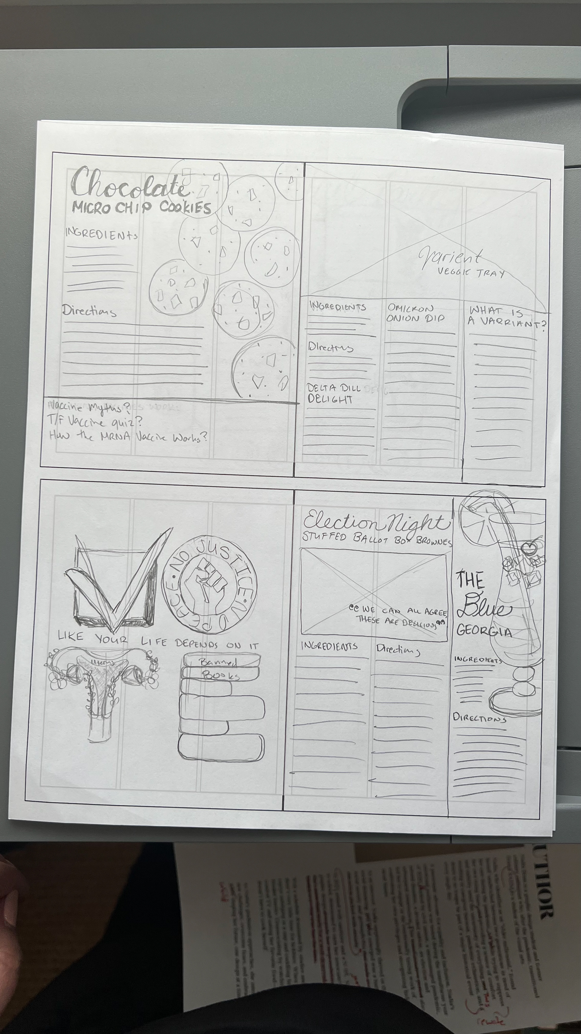
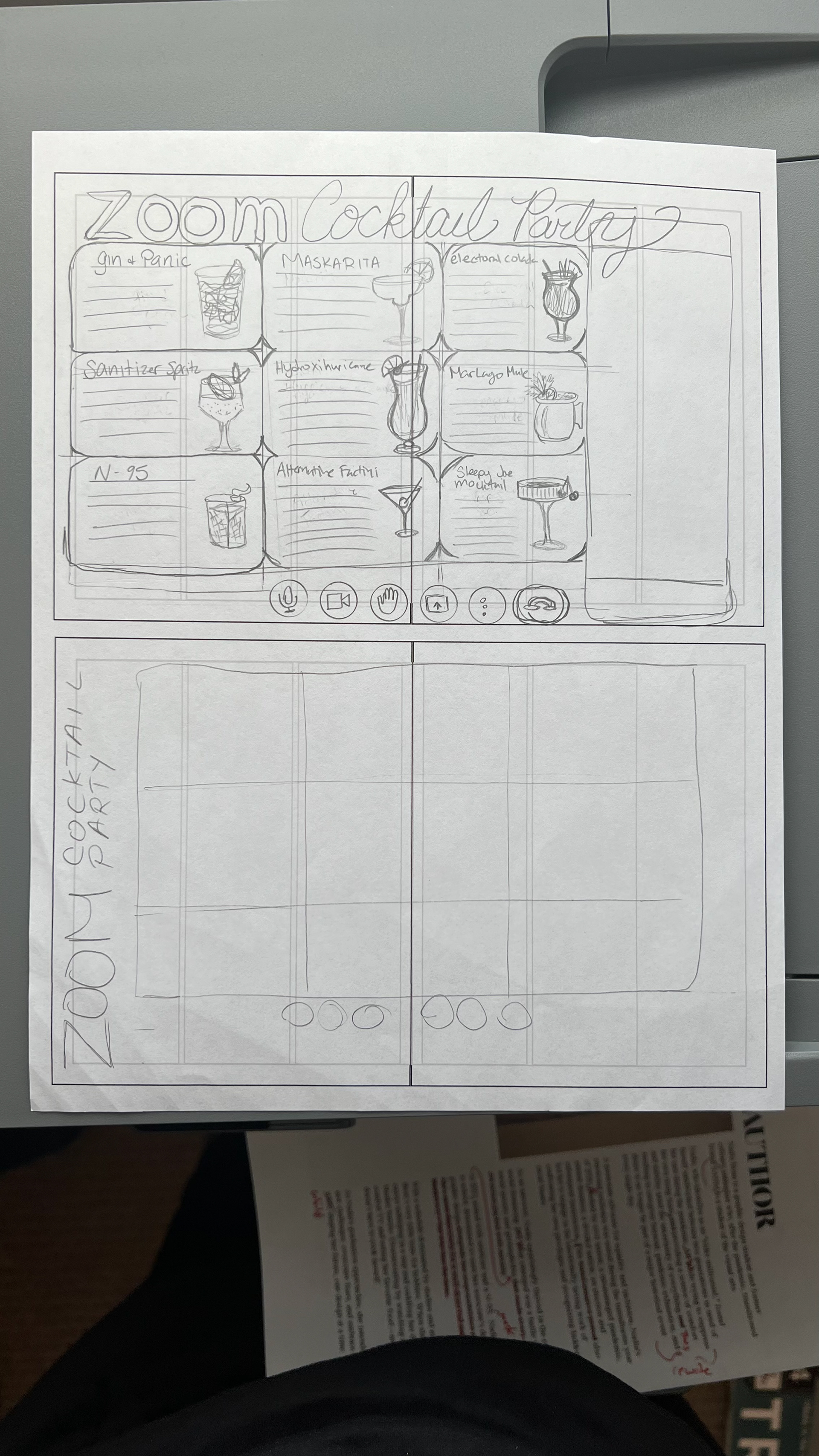
Thumbnail Reader Spreads & Preliminary Designs
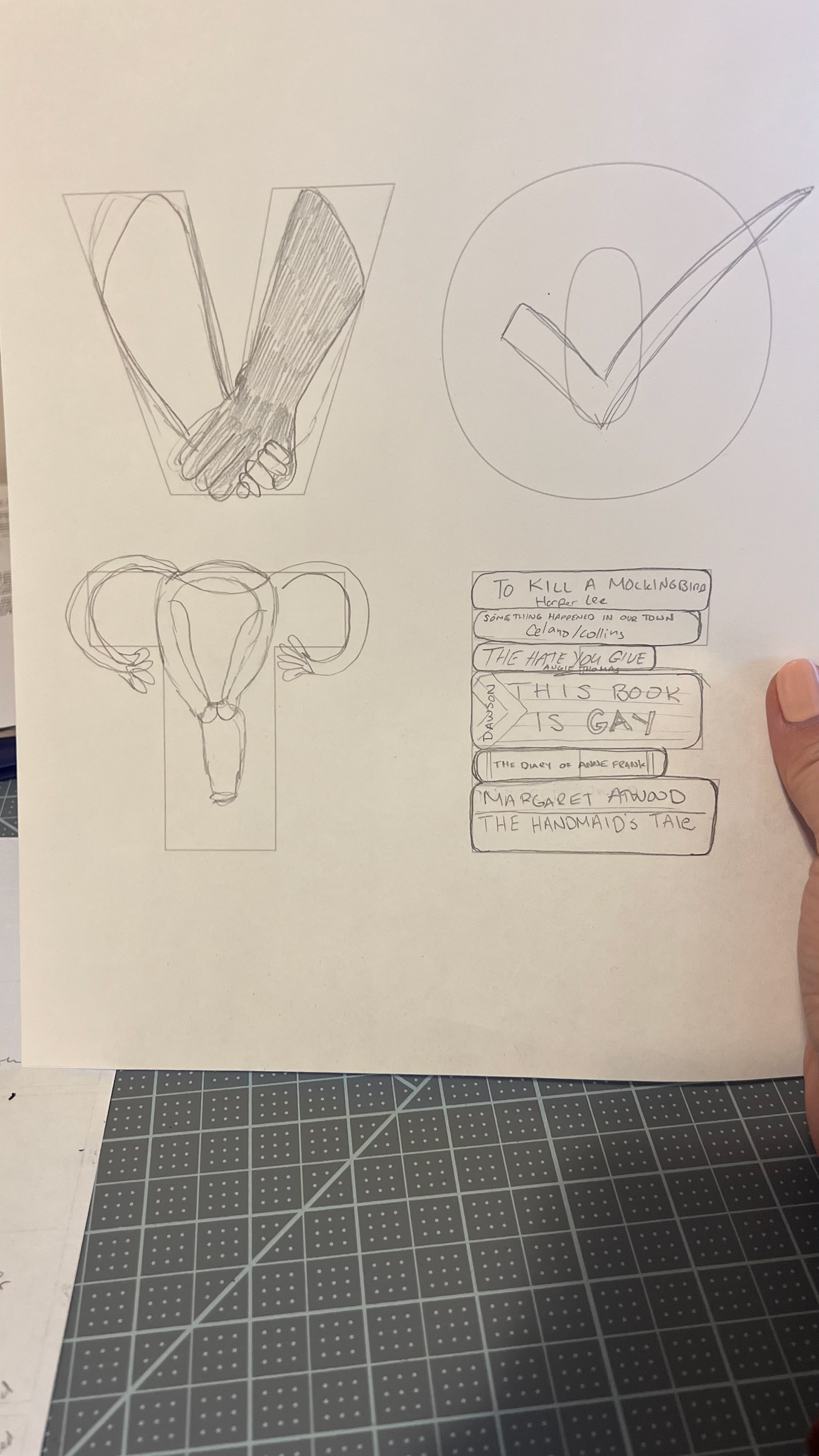
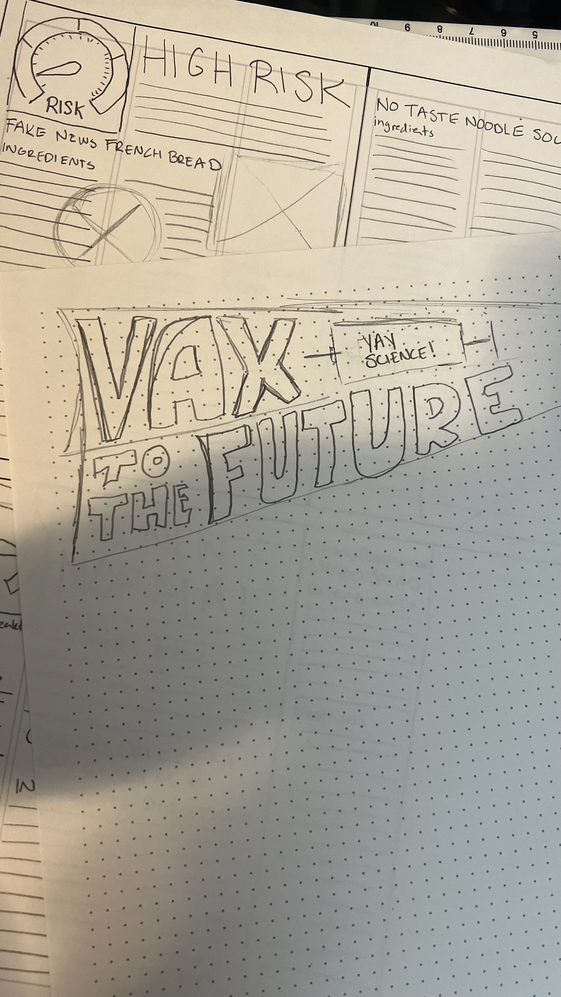
This was a lot of work since I had so many ideas to flesh out. I created a coronavirus out of type and I have the idea to have it be an interactive rotating element. I had the idea to have the center spread be a Zoom cocktail party. Instead of having the various cocktails in their corresponding sections, I'm creating a spread that looks like a multi-window zoom screen. I'm considering having it be an opening flap also but I haven't figured out the logistics yet. I also did several variations on the VOTE letter art.
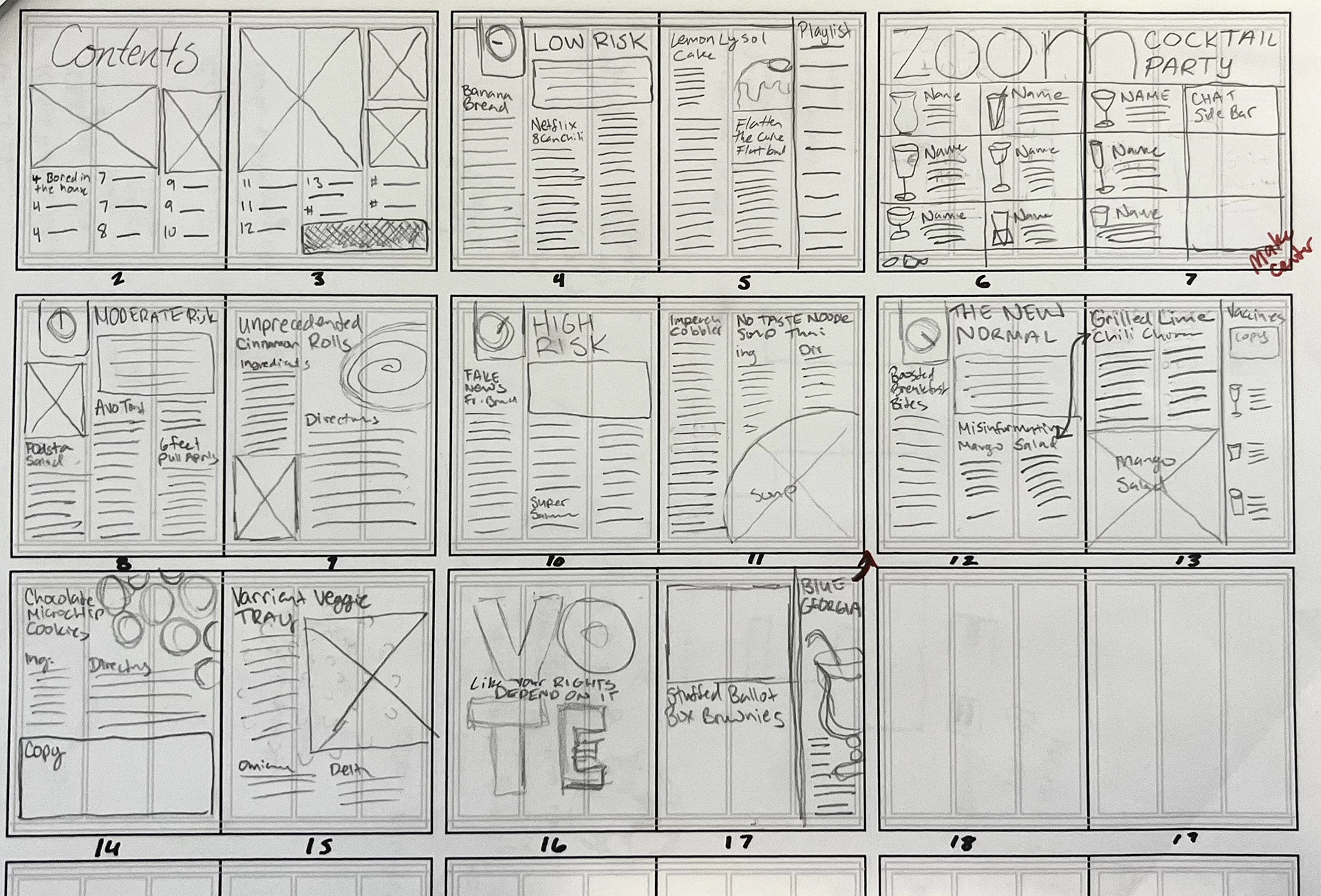
Intermediate Reader Spreads
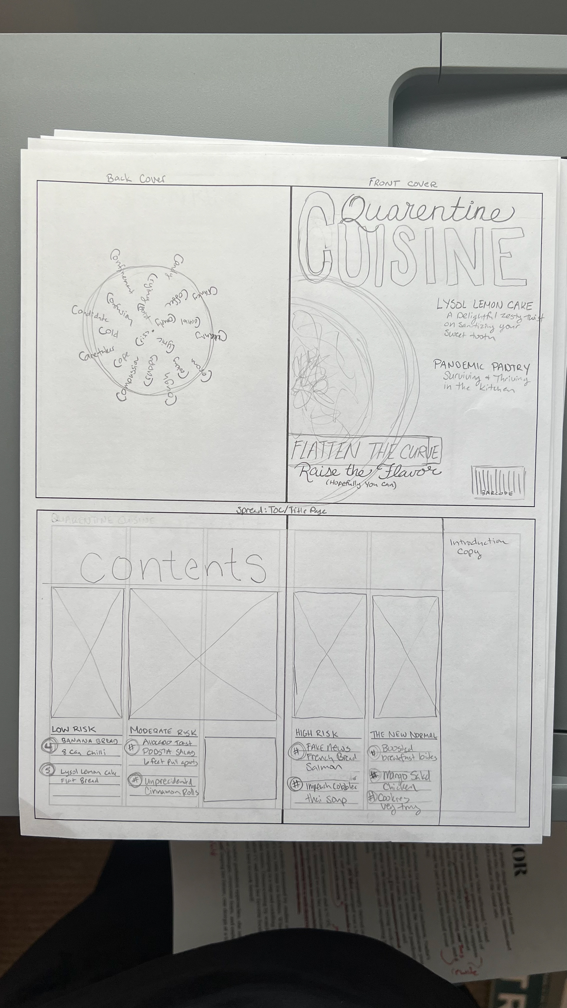
Half Size Intermediate Dummy
(I misread the ASSIGNMENT and made it half-size instead of full size)
Progress Review #3
I have been working hard on my zine. I have photographed food and done several word art illustrations and my little cocktail pictures. I still have a ways to go but I am confident in reaching the deadline ahead of schedule. Below are the things I am still working on:
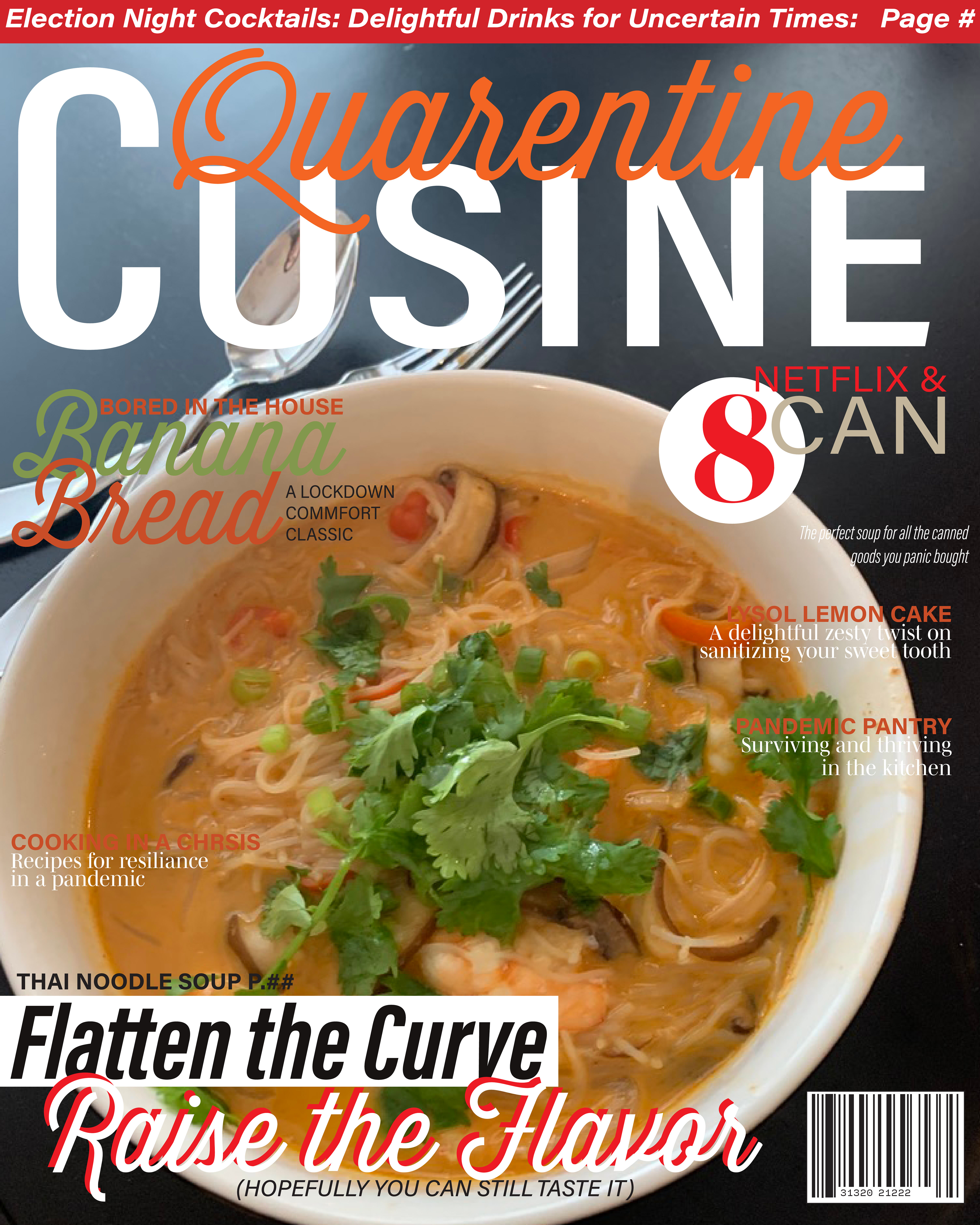
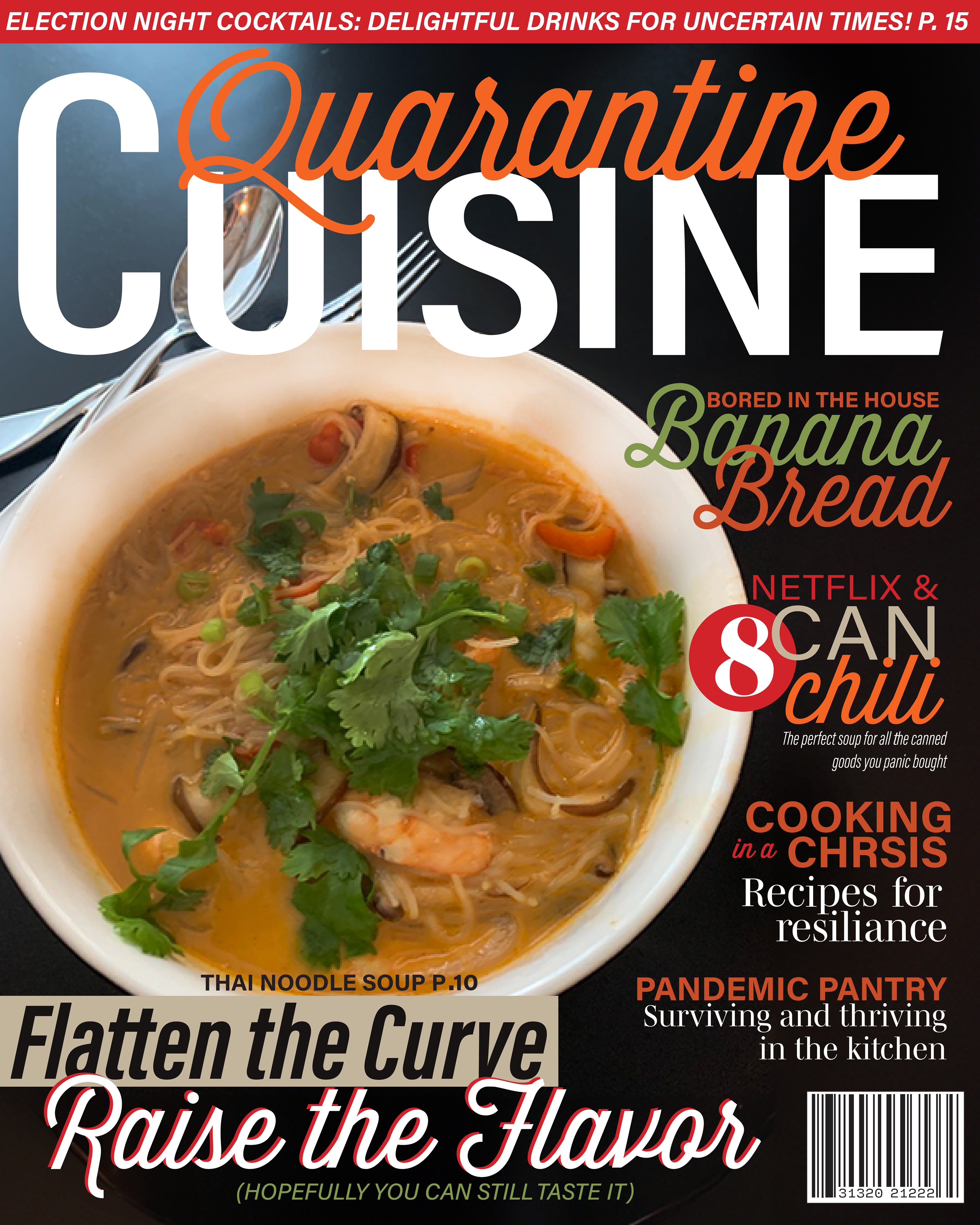
Cover: I'm planning to rework the zine cover so the headlines are more readable.
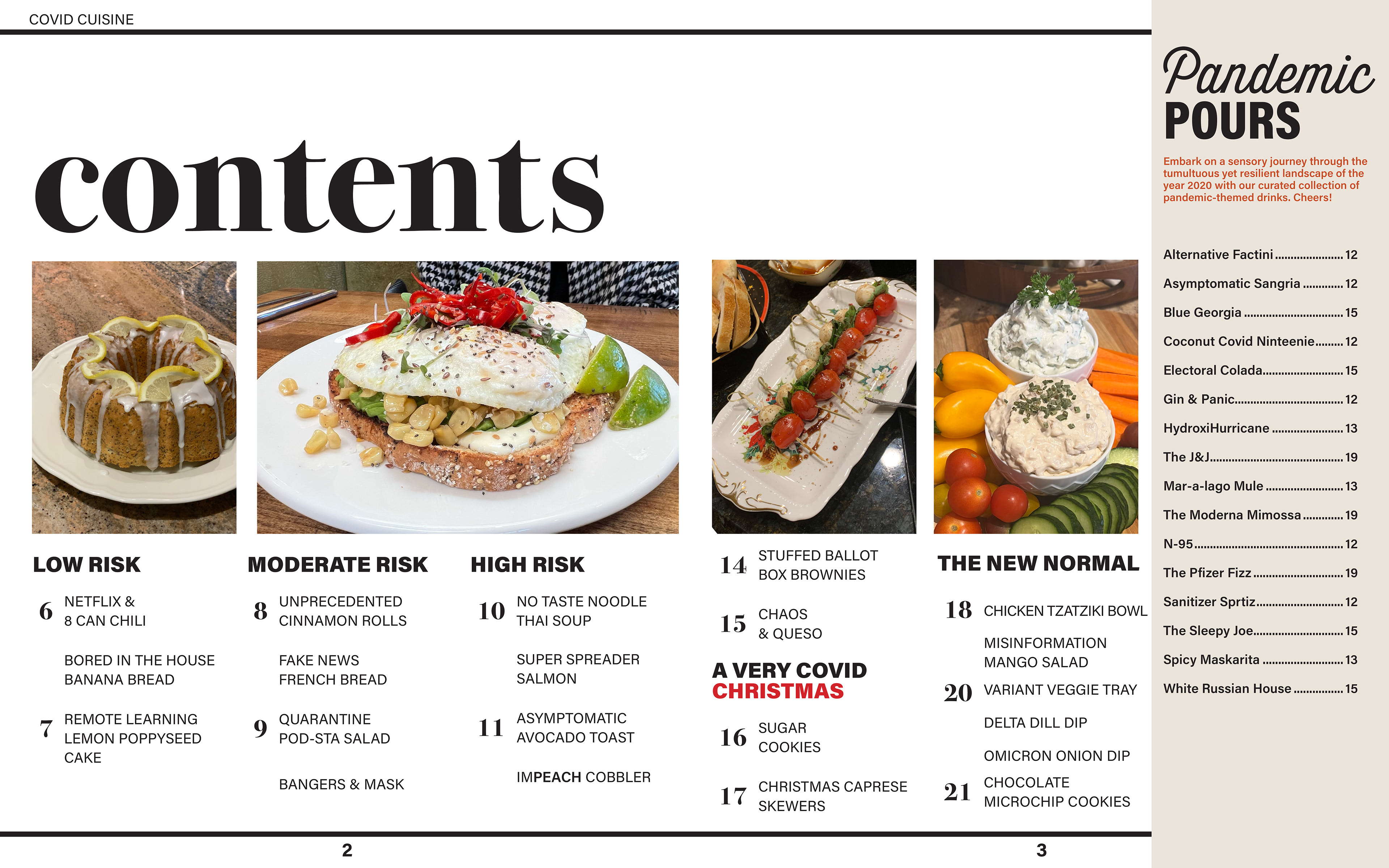
TOC: An essential update here is to refresh the page numbers for easy navigation. I believe I am supposed to have a title page here so I need to figure out how to work that in.
Page 6: I need a pull quote in the circle graphic, or I may use a photo.In that case, I'll need to prepare and photograph jalapeno poppers.
Page 8: This page a photo. I'm deciding between cooking and photographing the feta pasta or replacing it with my avocado toast recipe, which I've got photos for.
Page 9: quote or an image in the circle
Page 12: I need to revise my paragraph. I'll need to source the brownie recipe. It's been a personal favorite for years I'll have to look into that. I need to include the page number for the cookie dough recipe (Page 17).
Page 13: Rework the name for the White Russian. "White House Russian" or "Russian White House"?
Page 15: Make a heading for the vaccine side panel. "Vax to the Future"
Page 18: I'm working on the conclusion for the story
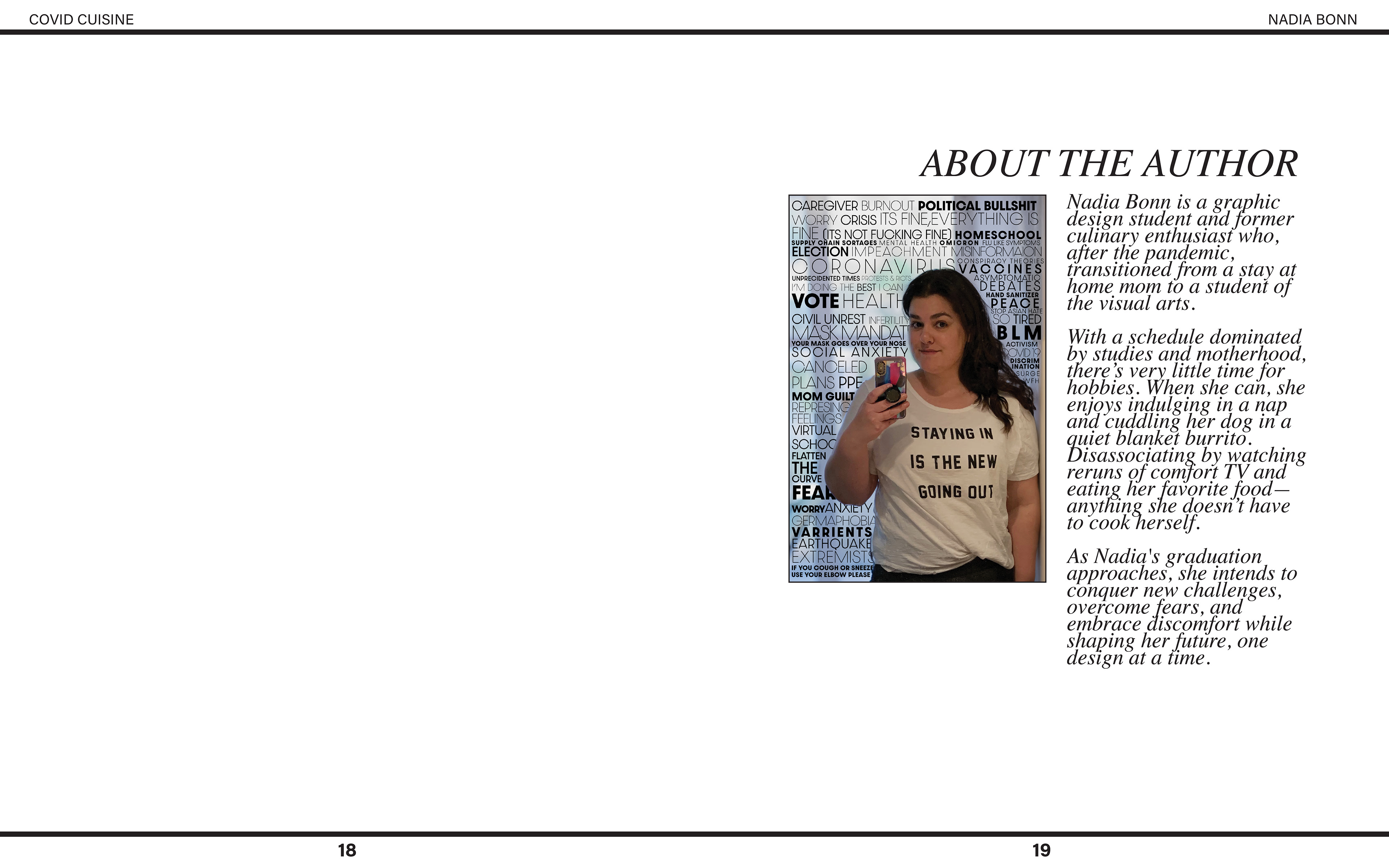
Page 19 - IBC : This page needs a visual overhaul. I'm thinking of using a photo of myself, removing the background, and wrapping the "About the Author" text around one side. I've noticed that the word art is getting a bit cluttered and overwhelming, I might be removing it altogether. Additionally, I'll adjust the leading on the "About Me" copy.
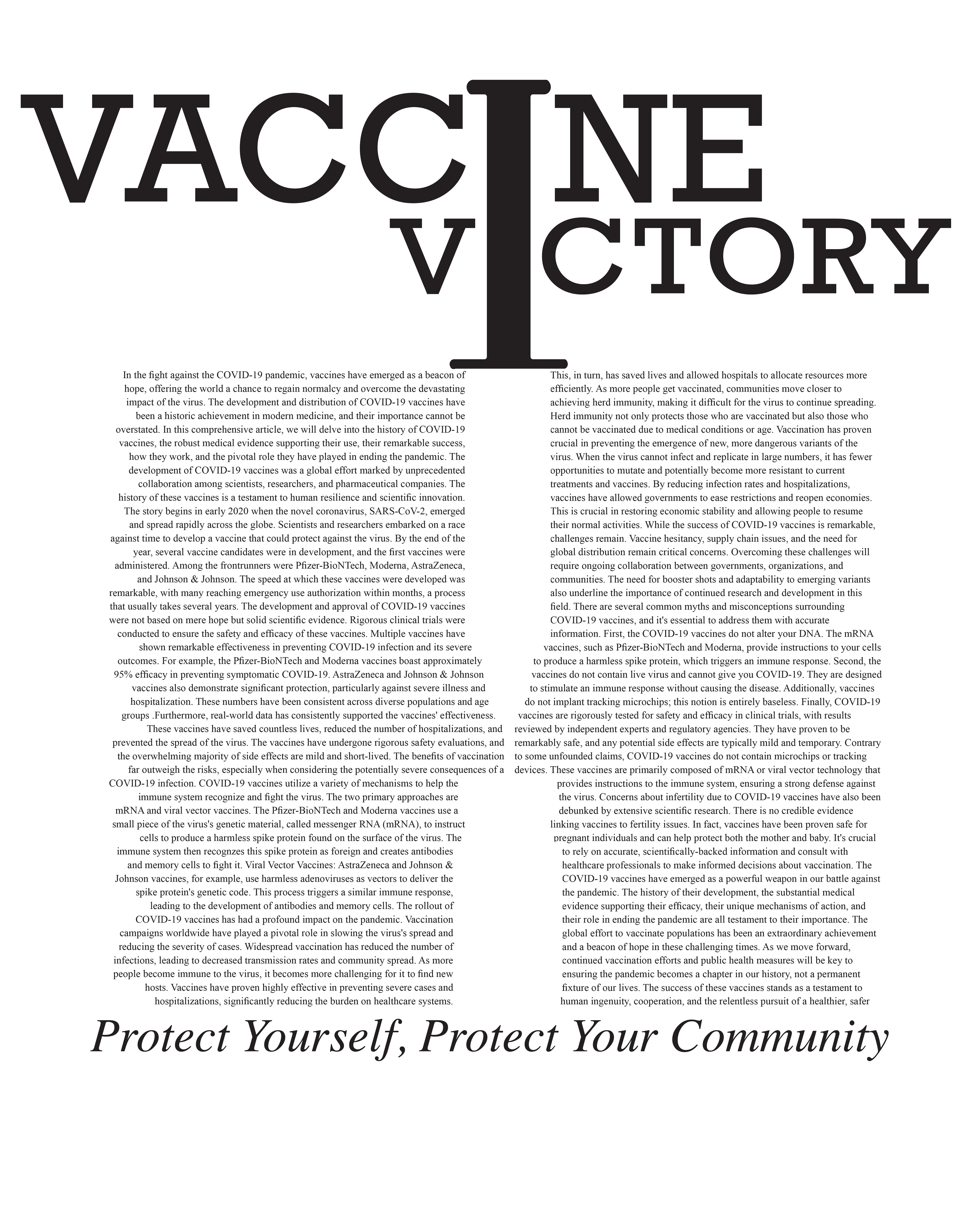
Page 20 - Back Cover: The back cover is reserved for class information. I'll be creating a magazine mailing label, to make it resemble a "Get Vaccinated" ad. I'll also go through the article again for a thorough re-reading and editing since I initially used AI. I have been researching magazine labels which the postal service has guidelines for. If the label is on the front it is right side up but if it is on the back it would go upside down.
Below are my spreads. Click to enlarge.
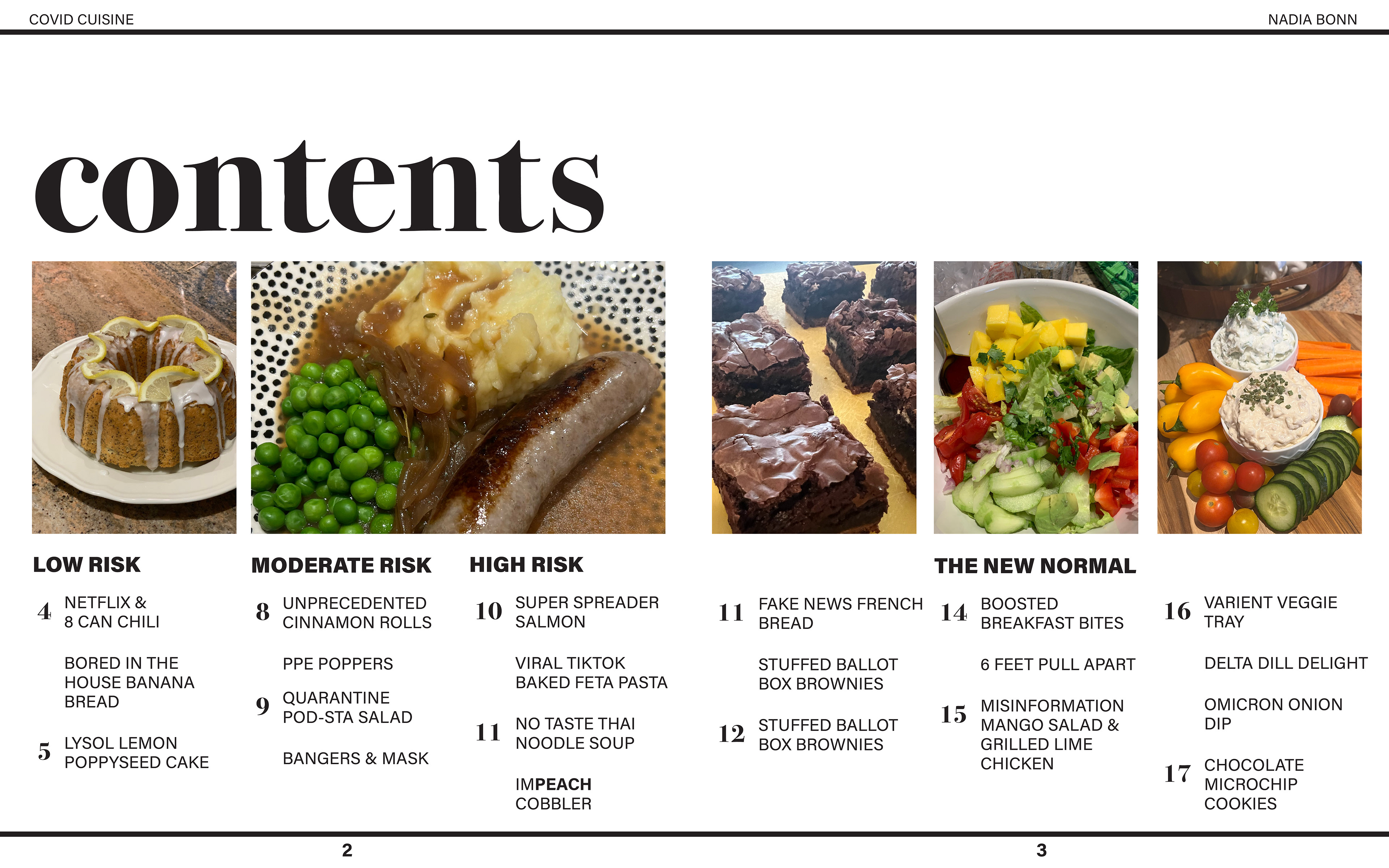
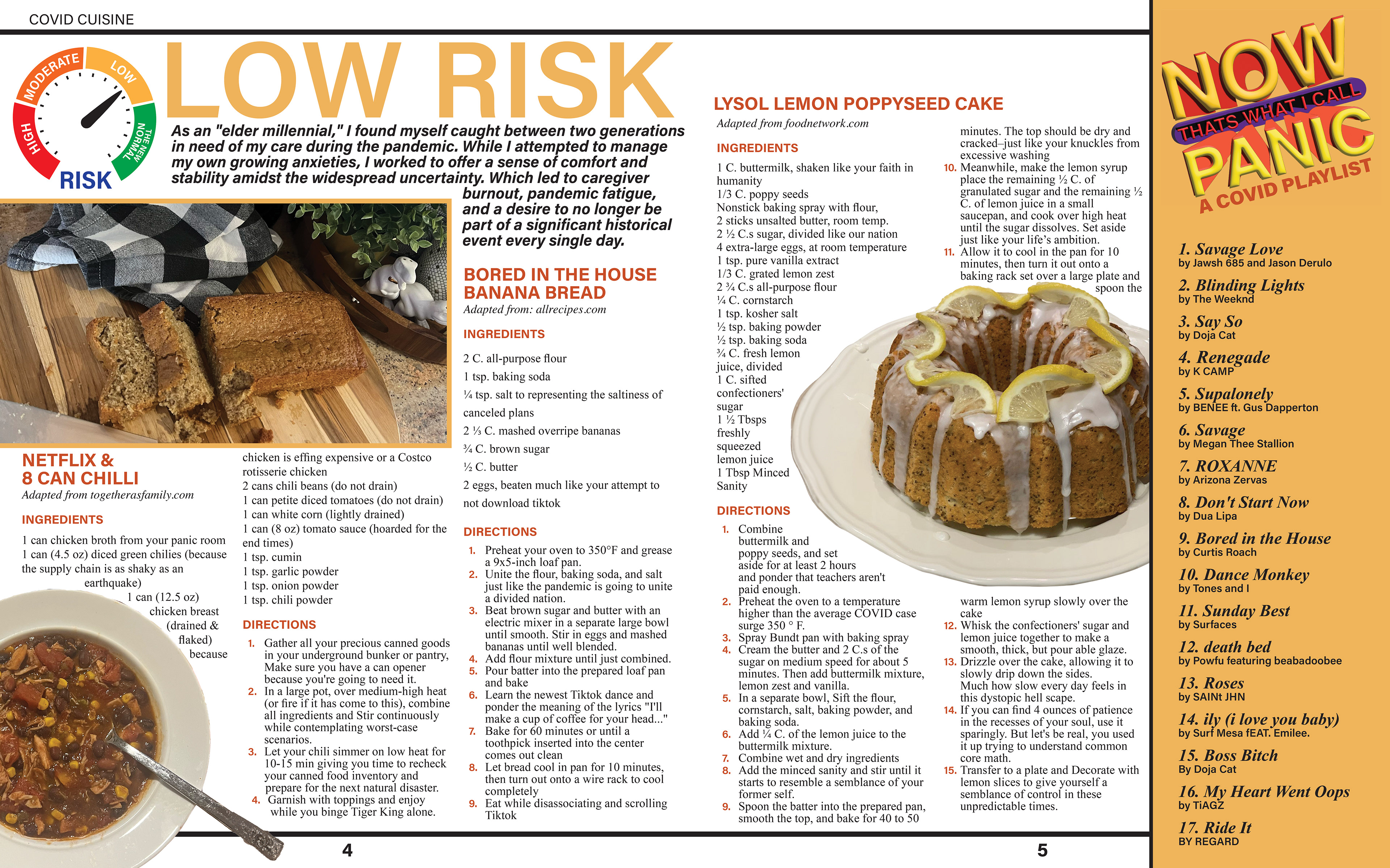
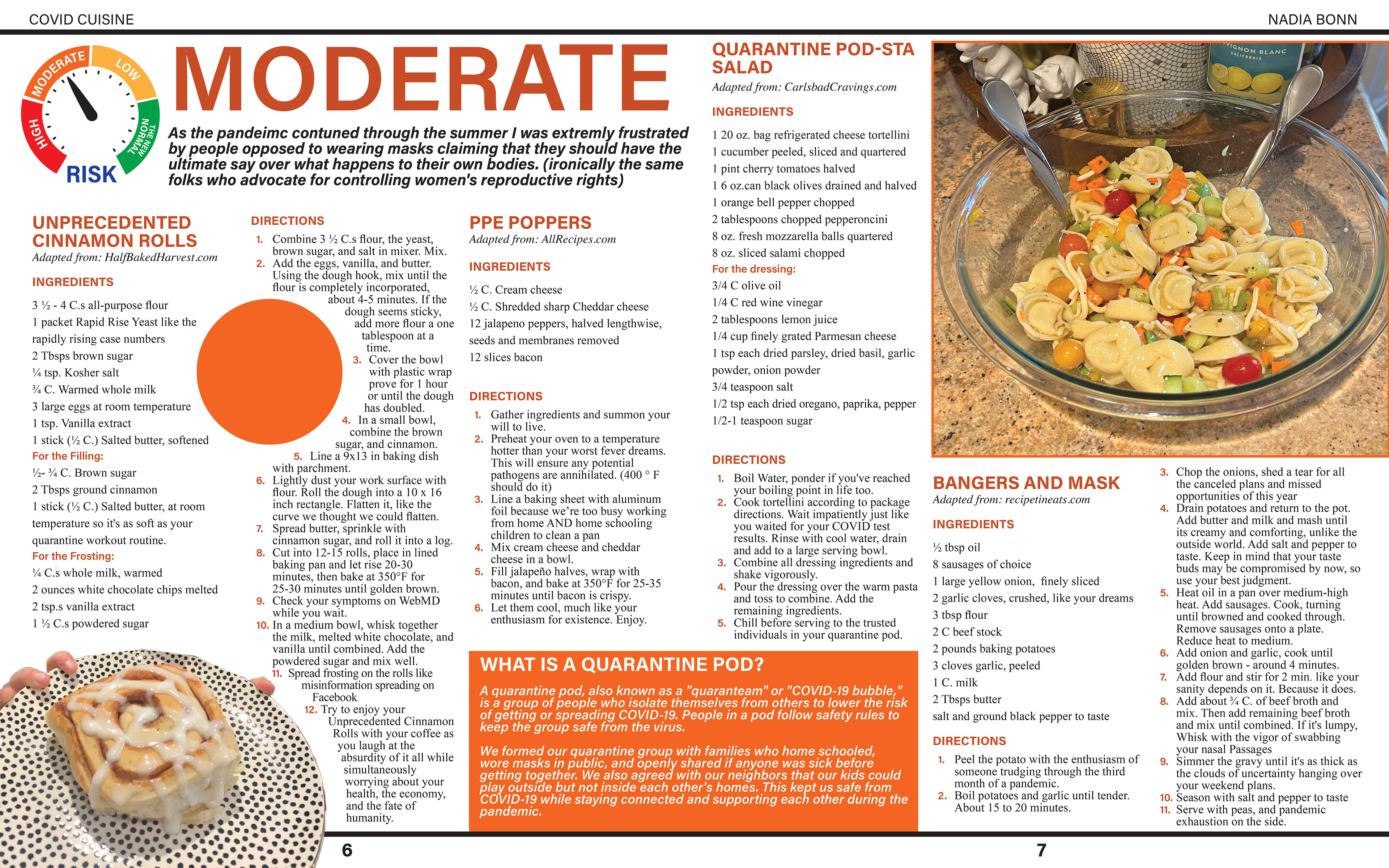
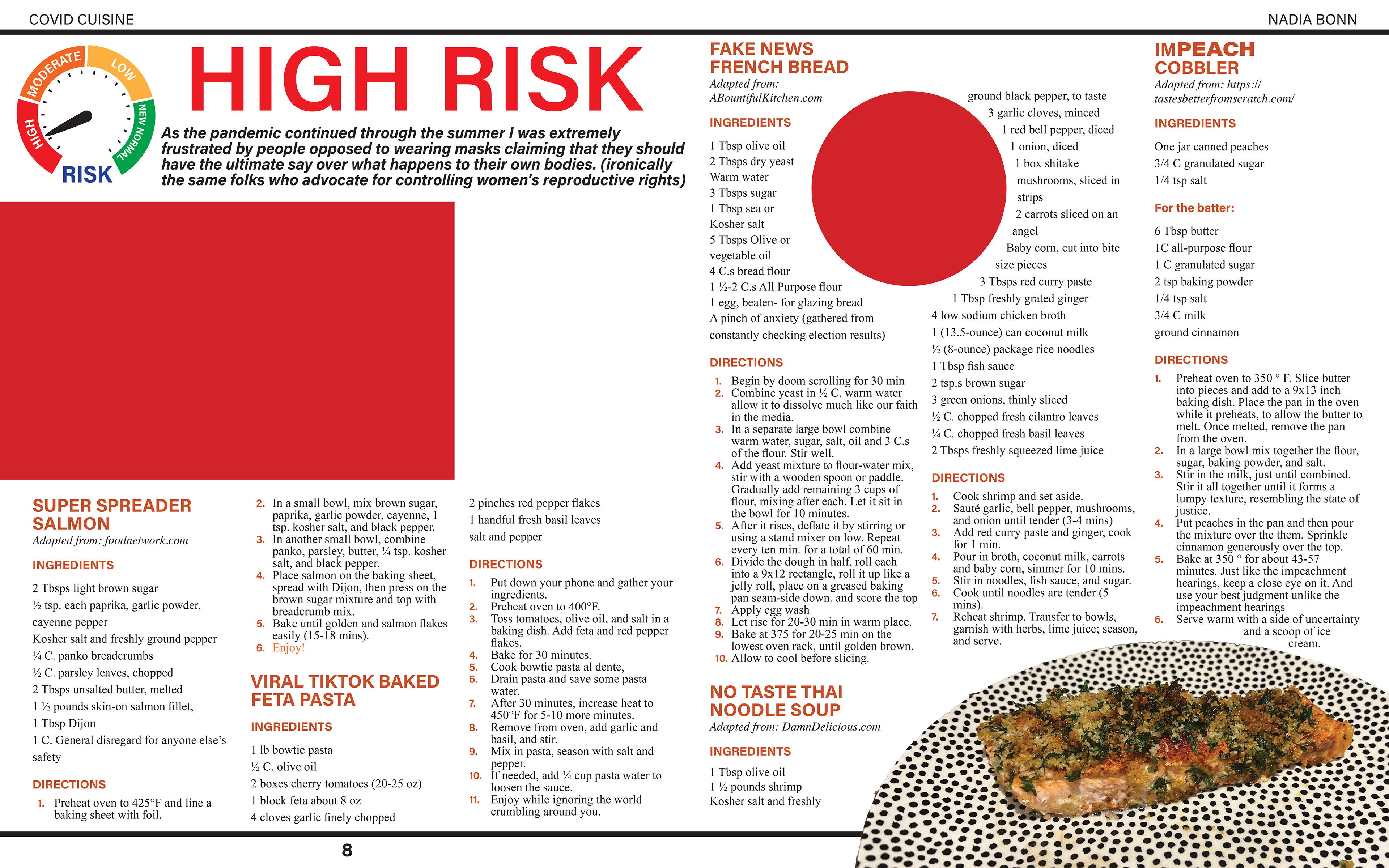
The final and likely the most challenging, yet crucial, task on my to-do list is figuring out how to print my zine. I went to the Printing Services at the Redwood campus and it seems like there was no need since everything can be done at the South City Campus. I'm concerned about their staffing and ability to handle all the print jobs. My solution is to be ready to print a week early and look into alternative print services.
Progress Report 4
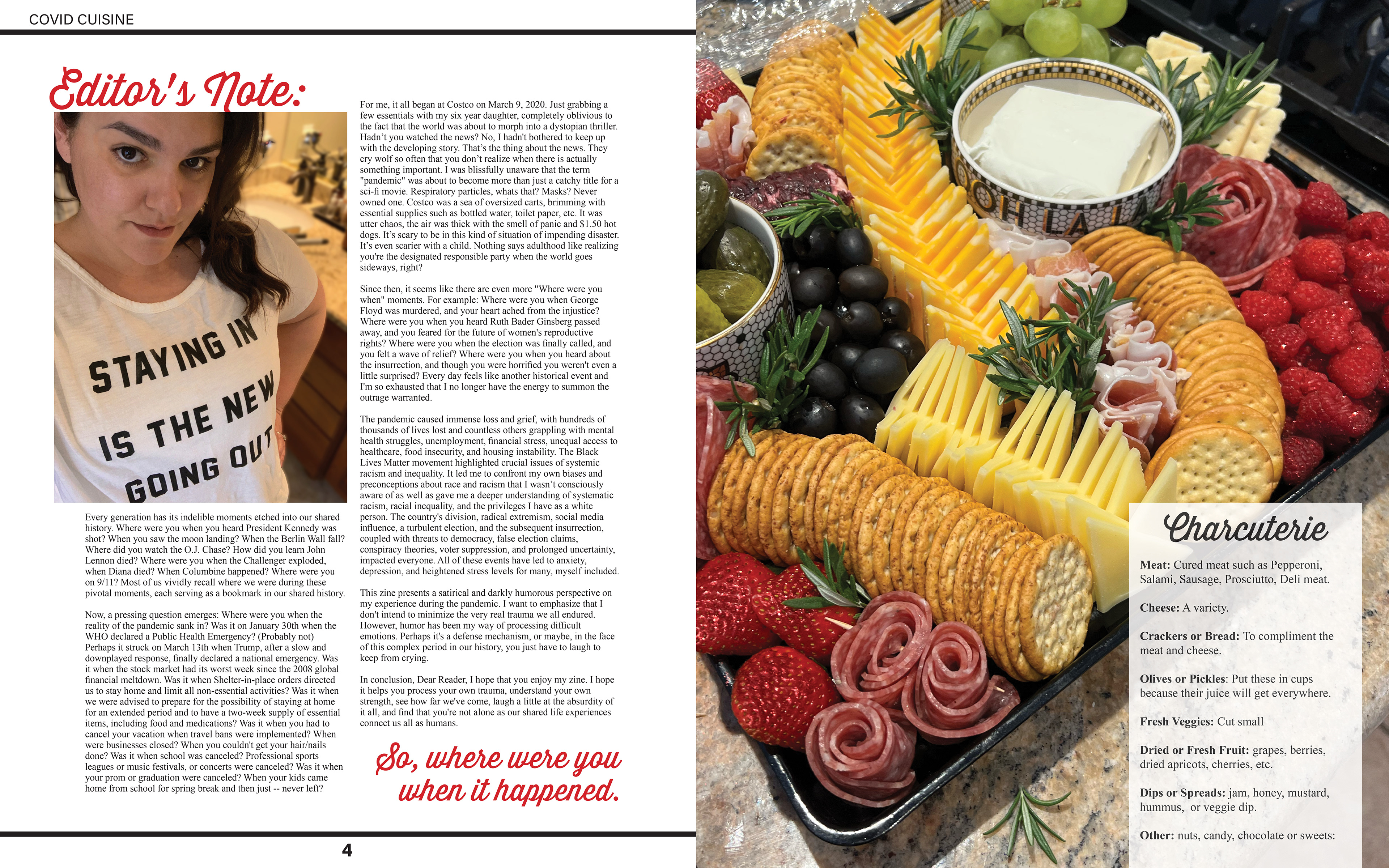
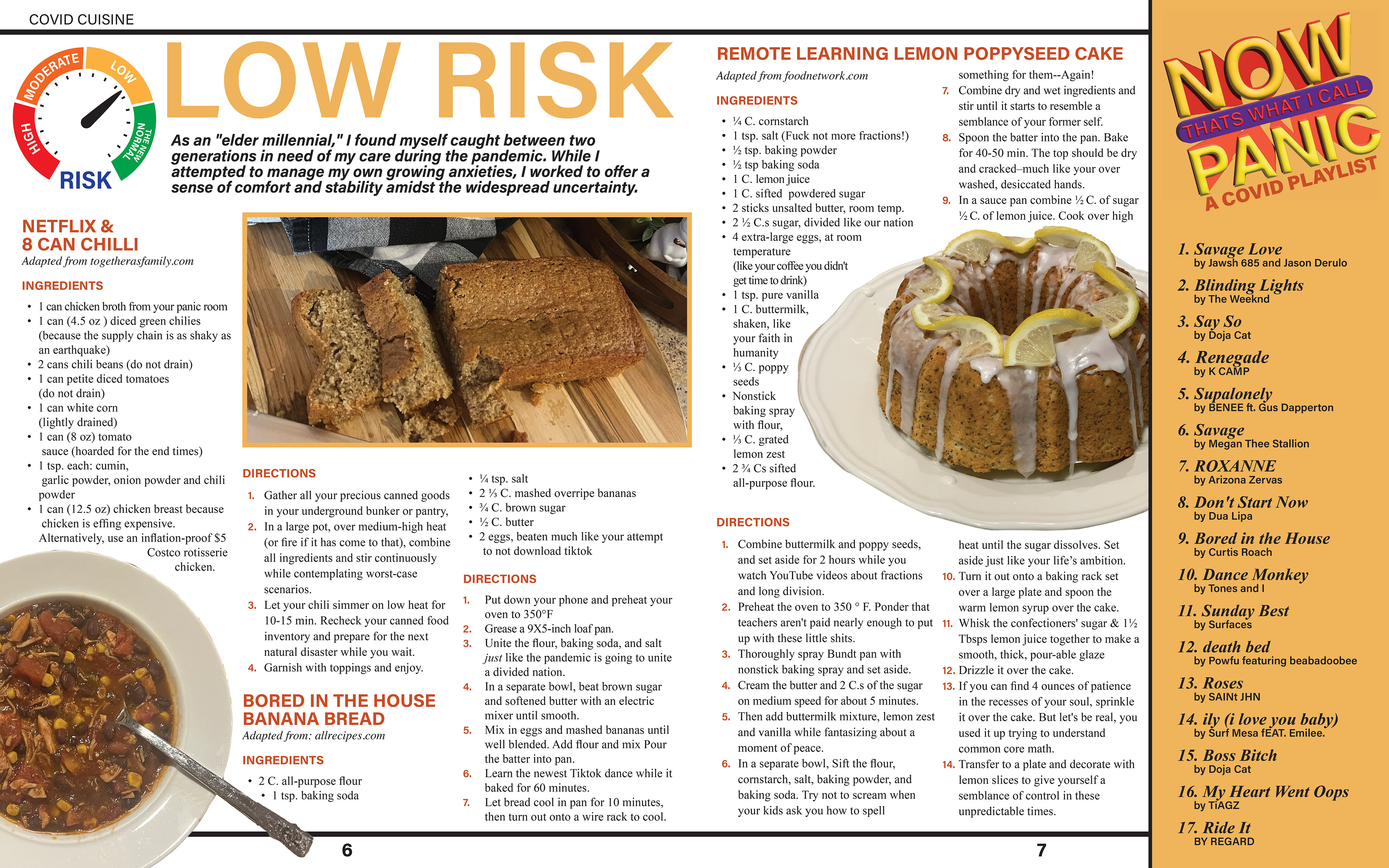
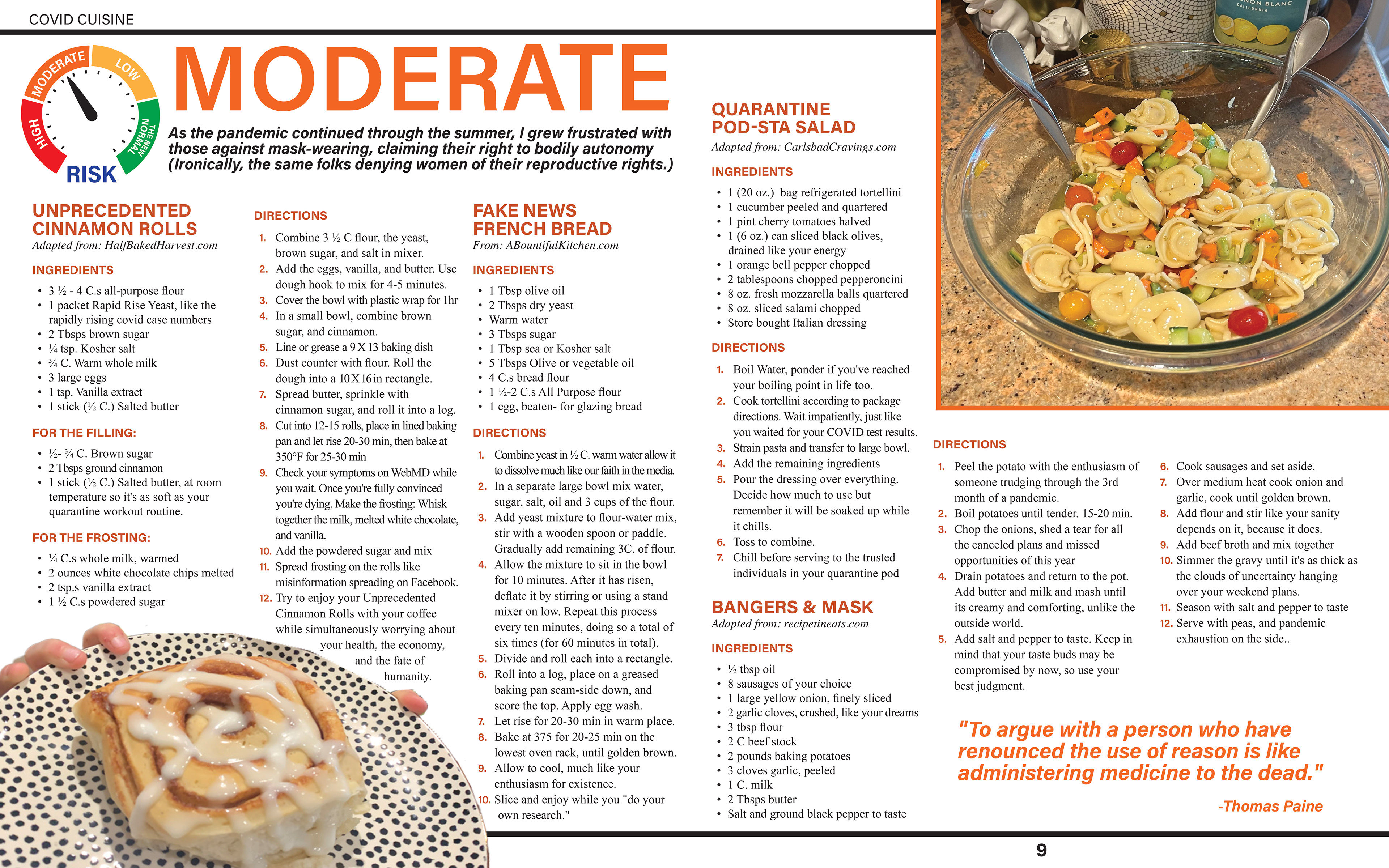
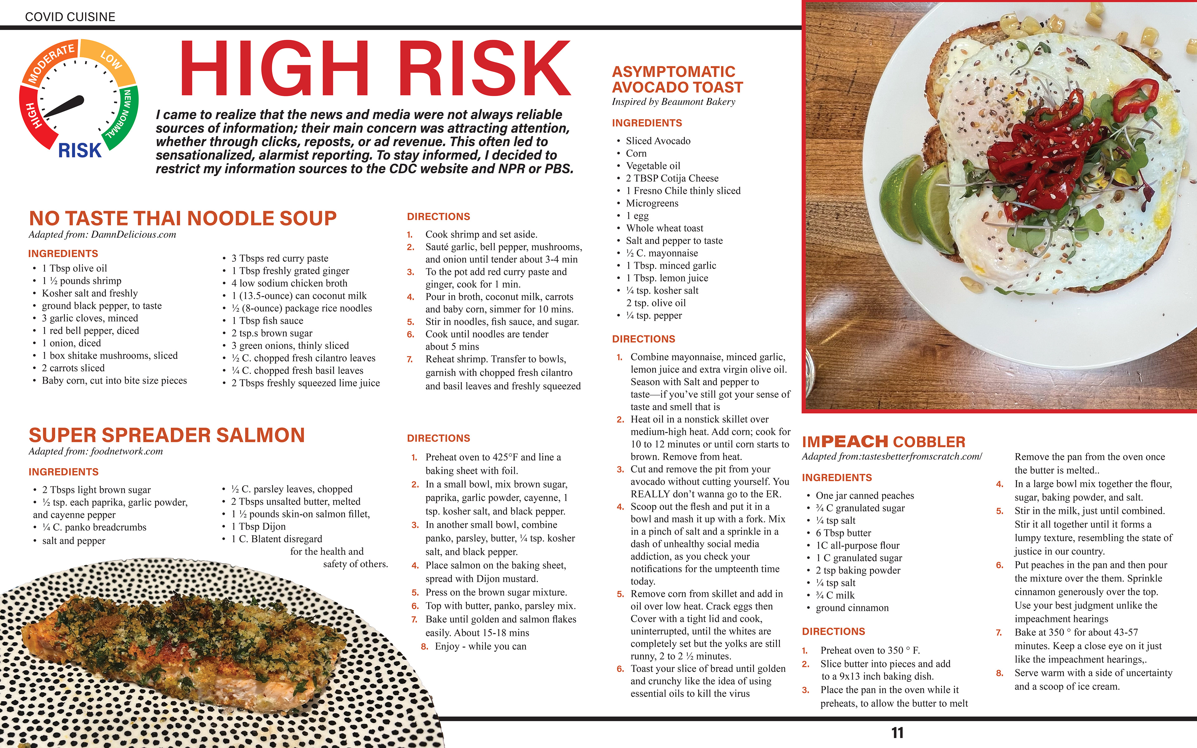
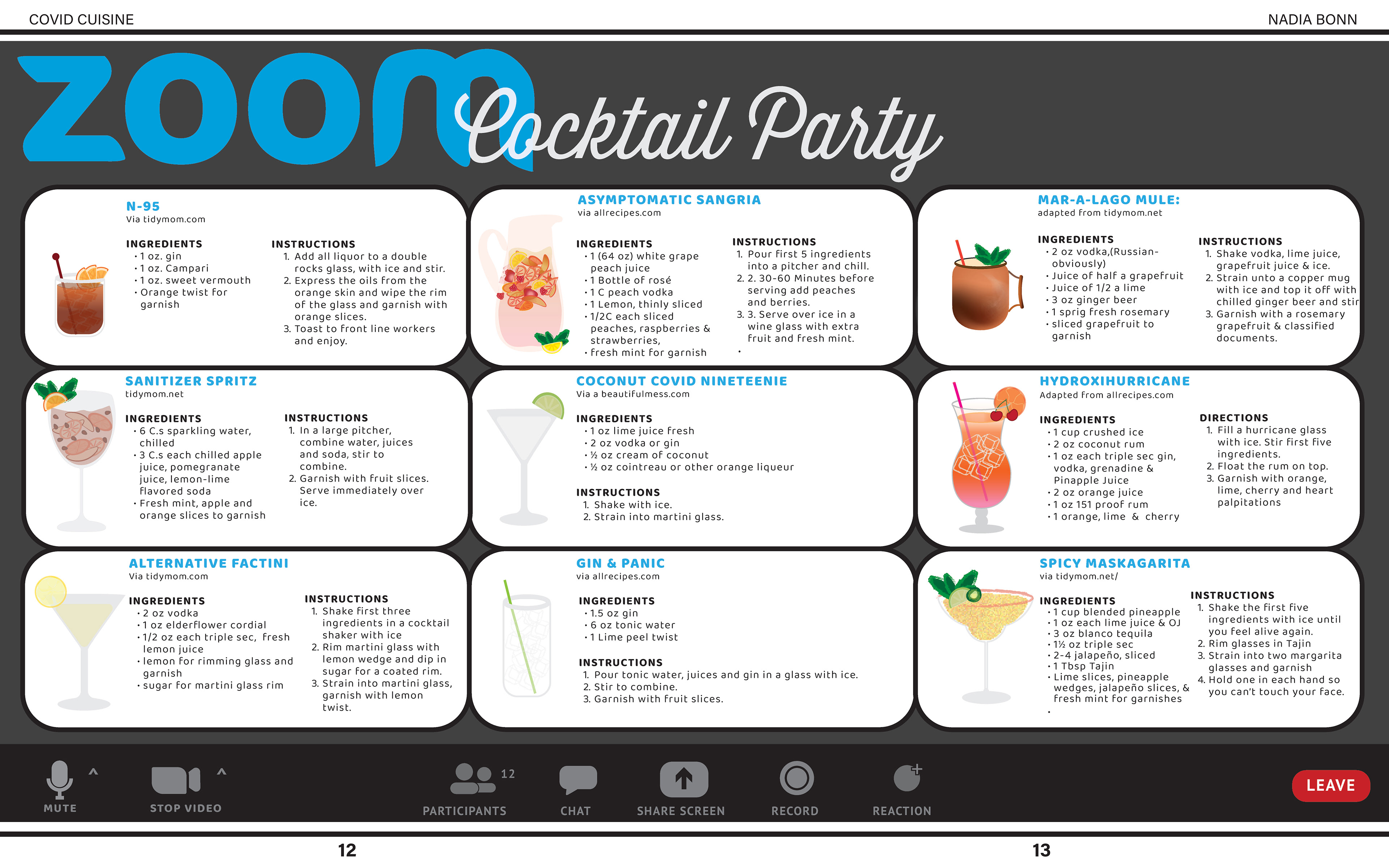
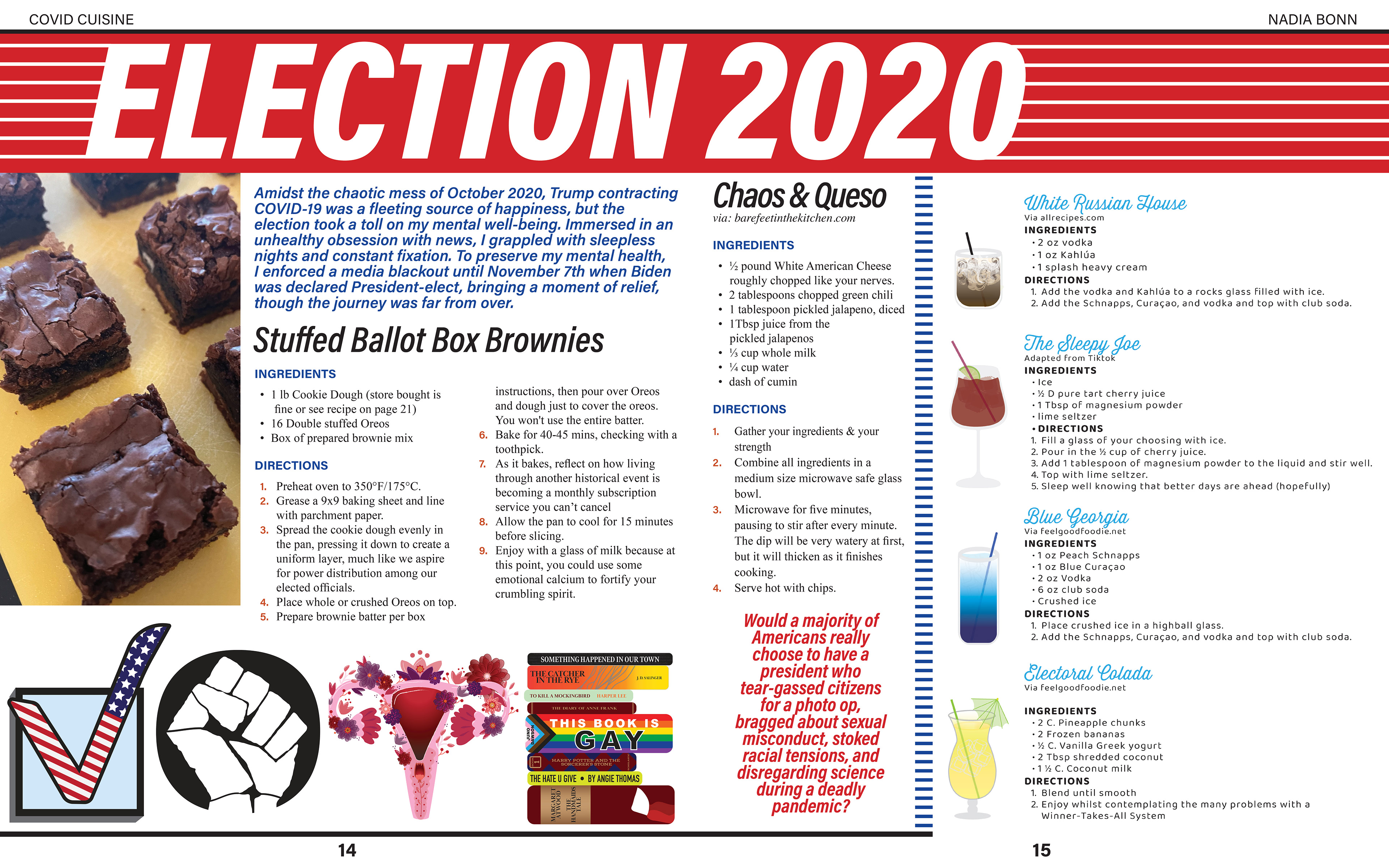
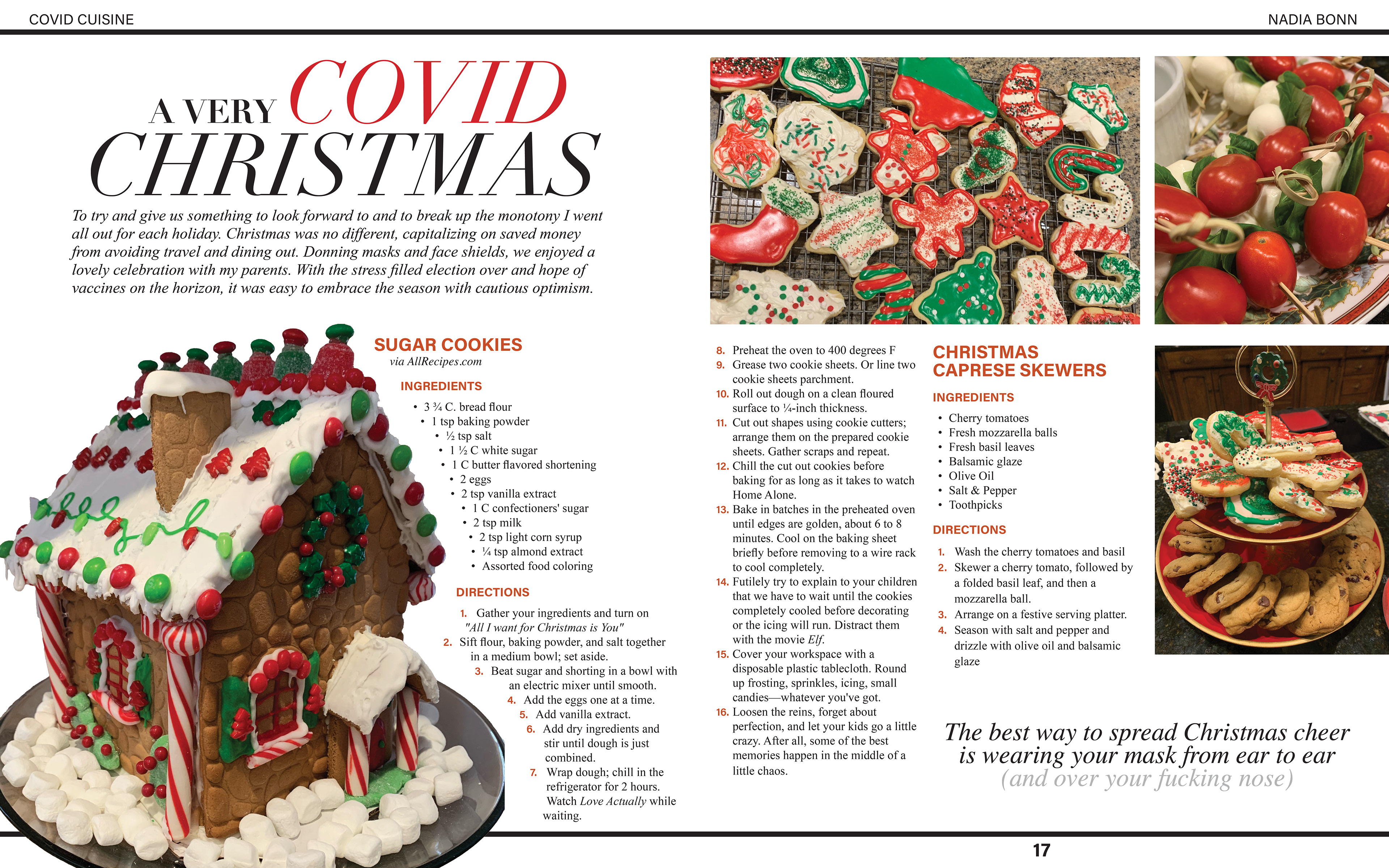
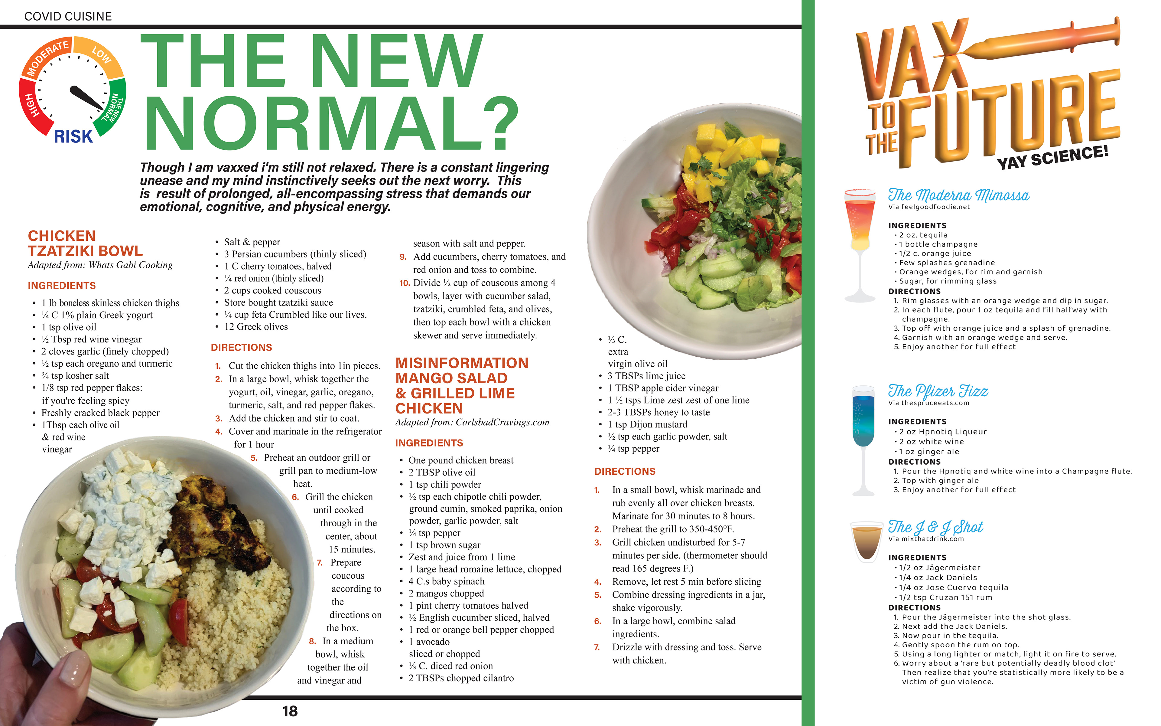
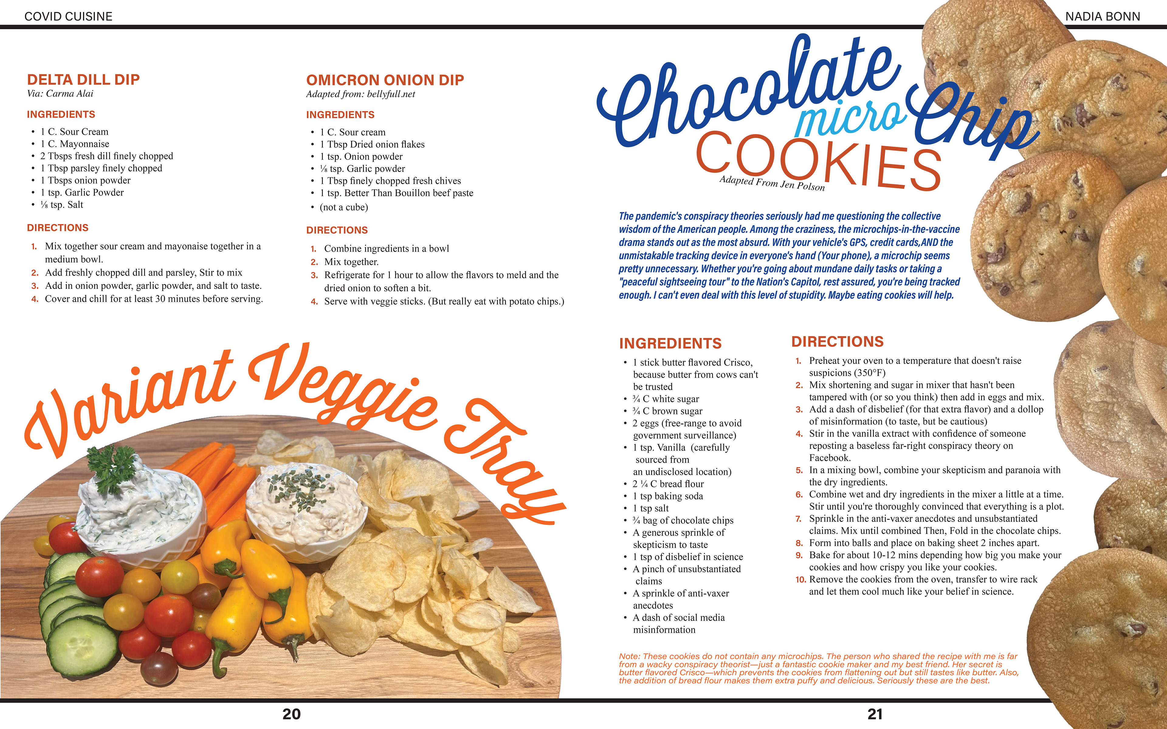
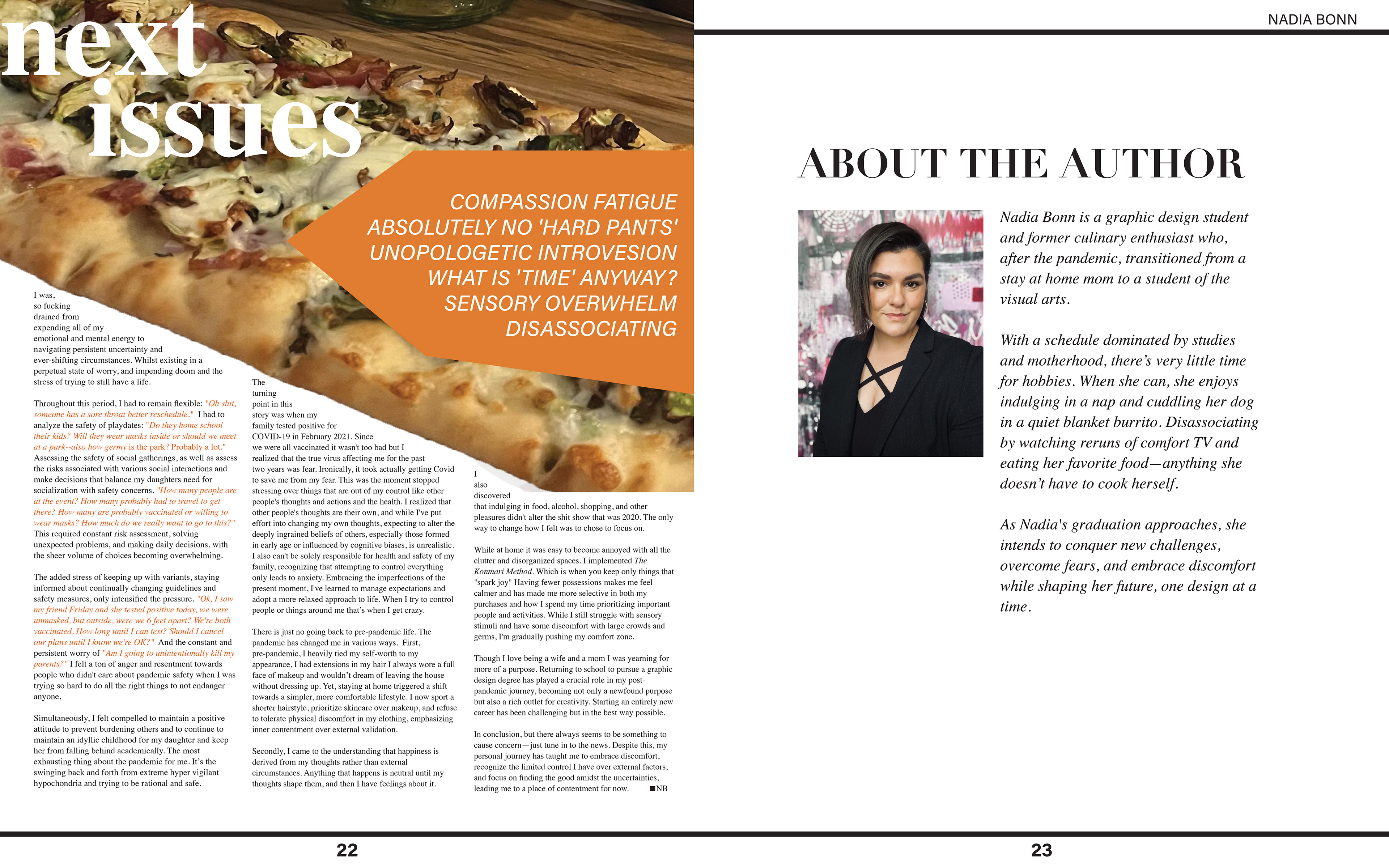
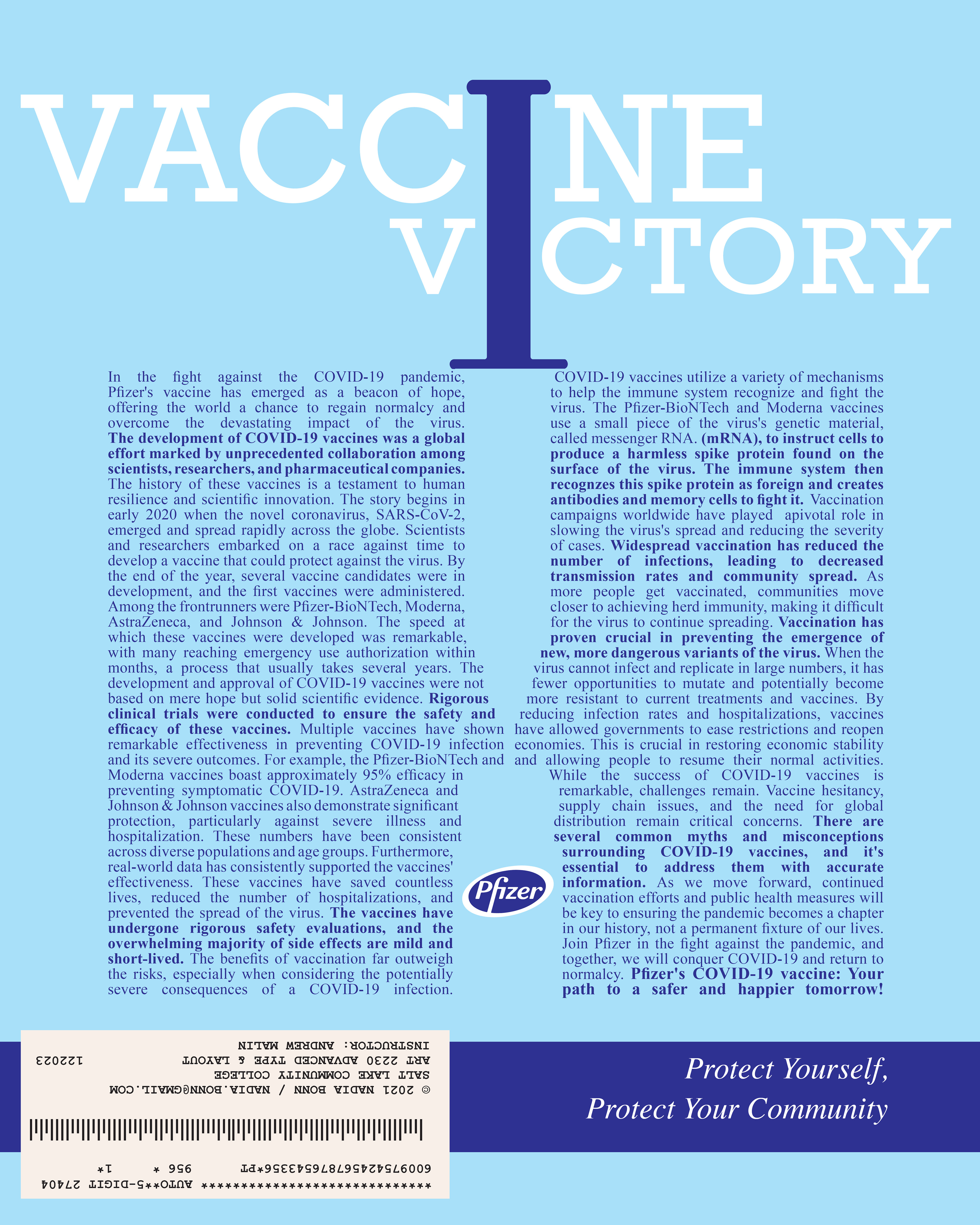
I still need to rework a few things. The next issues page and the editor's note need to look more similar and be formatted better. The needle on the vaccine advertisement on the back needs some work. In the critique, lines were suggested. Page 20 is still giving me strife. I feel there isn't a visual hierarchy and it needs a heading at the top. I'll keep working on it. I removed the colored circles because I didn't think they looked cohesive with the overall look. When I took them out, I had to reformat those pages.
I decided to print at the SLCC south city campus using a shiny magazine paper. I think its called Stearling #80.
