The purpose of this assignment was to create a 5-spot color poster made of ONLY type. The tricky part was that the colors would be given to me and I had to use them all—also no black or white or tints of any kind. The poster aimed to promote Banned Book Week, drawing inspiration from a banned book. The requirements were a conceptual headline, body, text, and byline.
Research
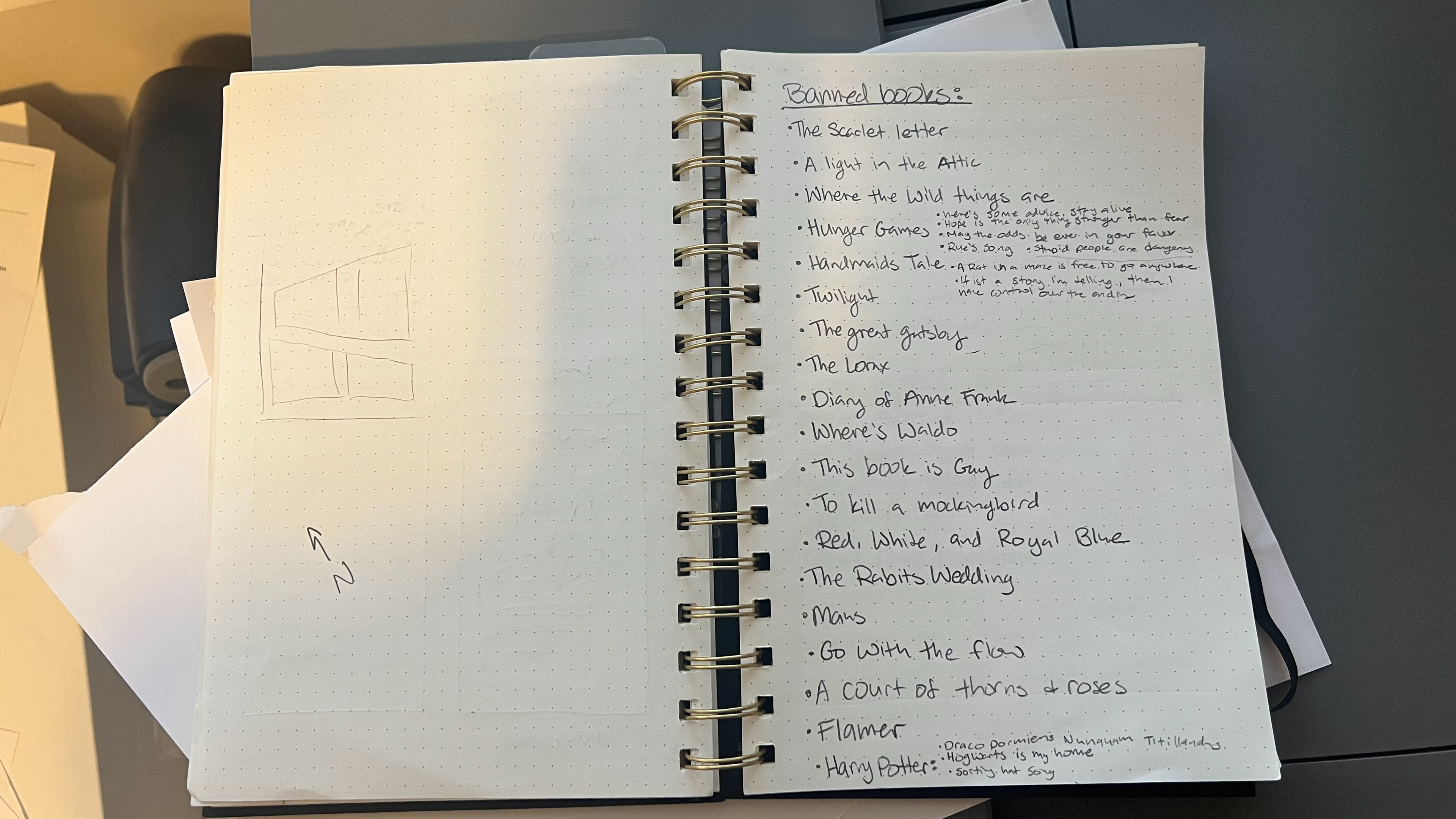
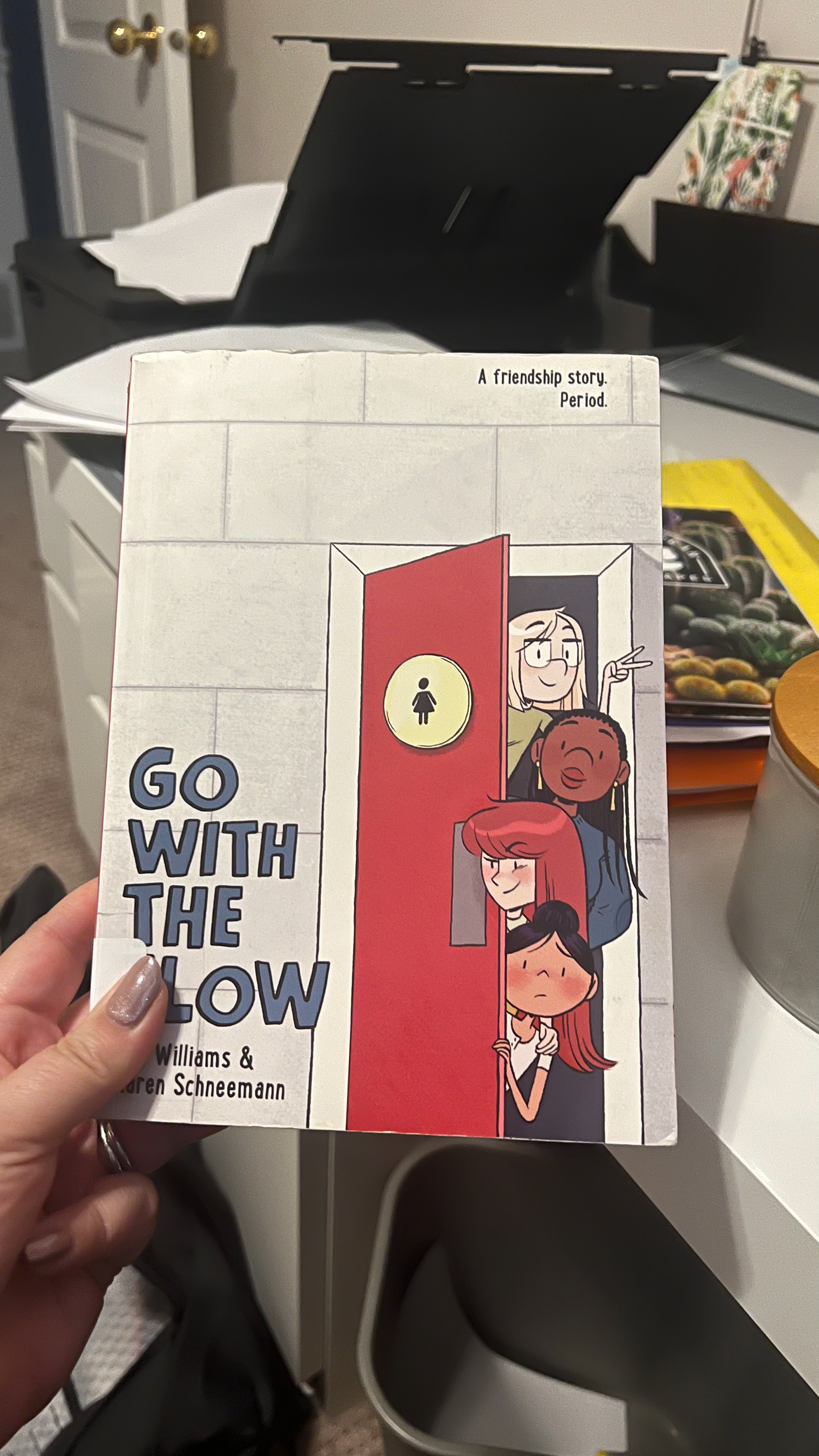
I started this project by researching banned books and making a list of choices. Several I had read before like the Harry Potter books, To Kill a Mocking Bird, The Great Gatsby, and The Diary of Anne Frank. There were some I wanted to read like Red White and Royal Blue, The Rabbits Wedding, and Fllamer but I didn't have the time. So, I read Maus and Go with the Flow because as graphic novels they were a quick read. I loved Go with the Flow and feel passionately about educating kids about their bodies and offering access to menstrual products.
As I researched the accessibility of menstrual hygiene products and the societal shame associated with this normal bodily function, I became increasingly angry. Similar to the girl in the story, the more she learned, the more the injustice bothered her.
Sketches, Doodles & Thumbnails
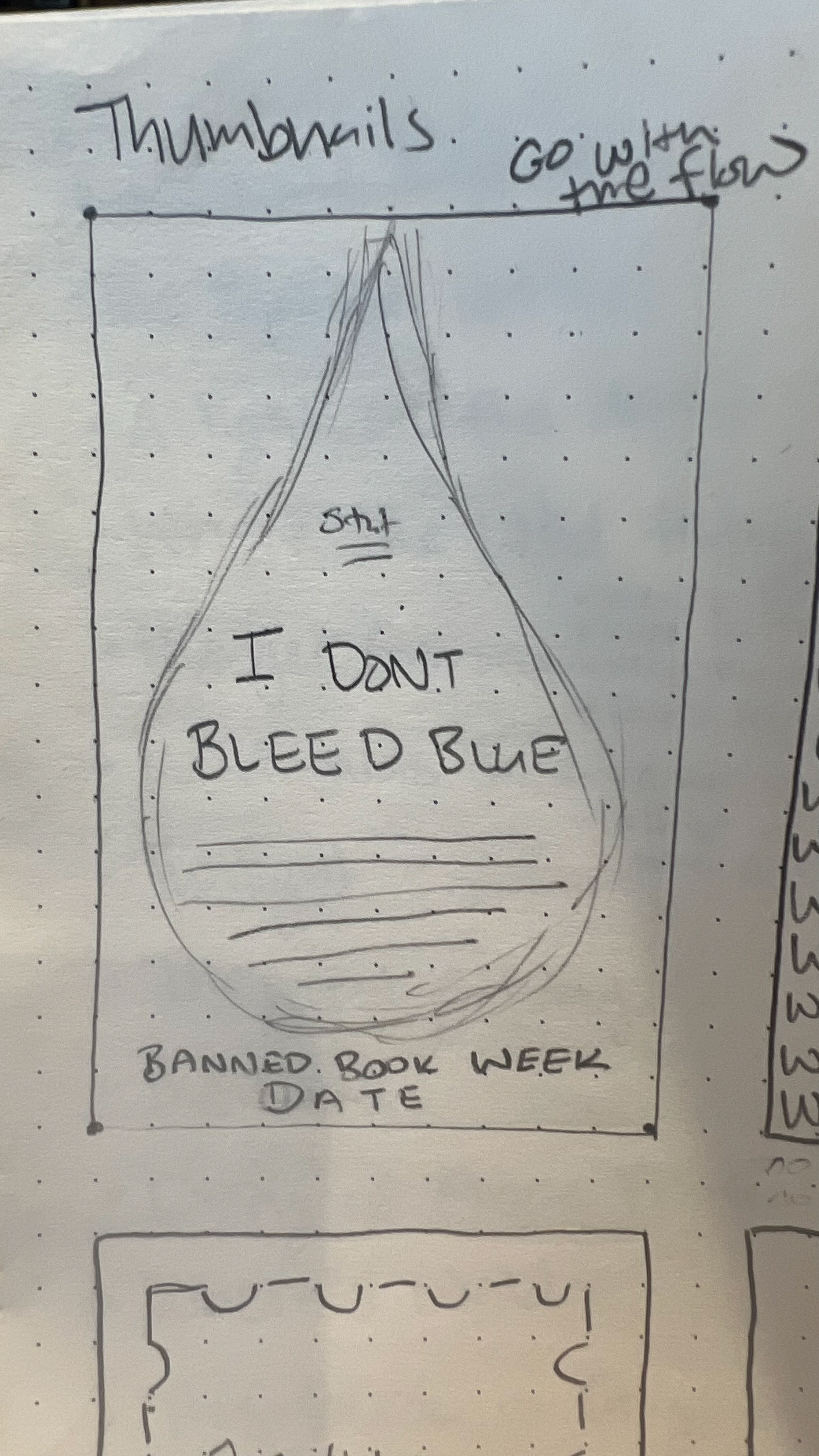
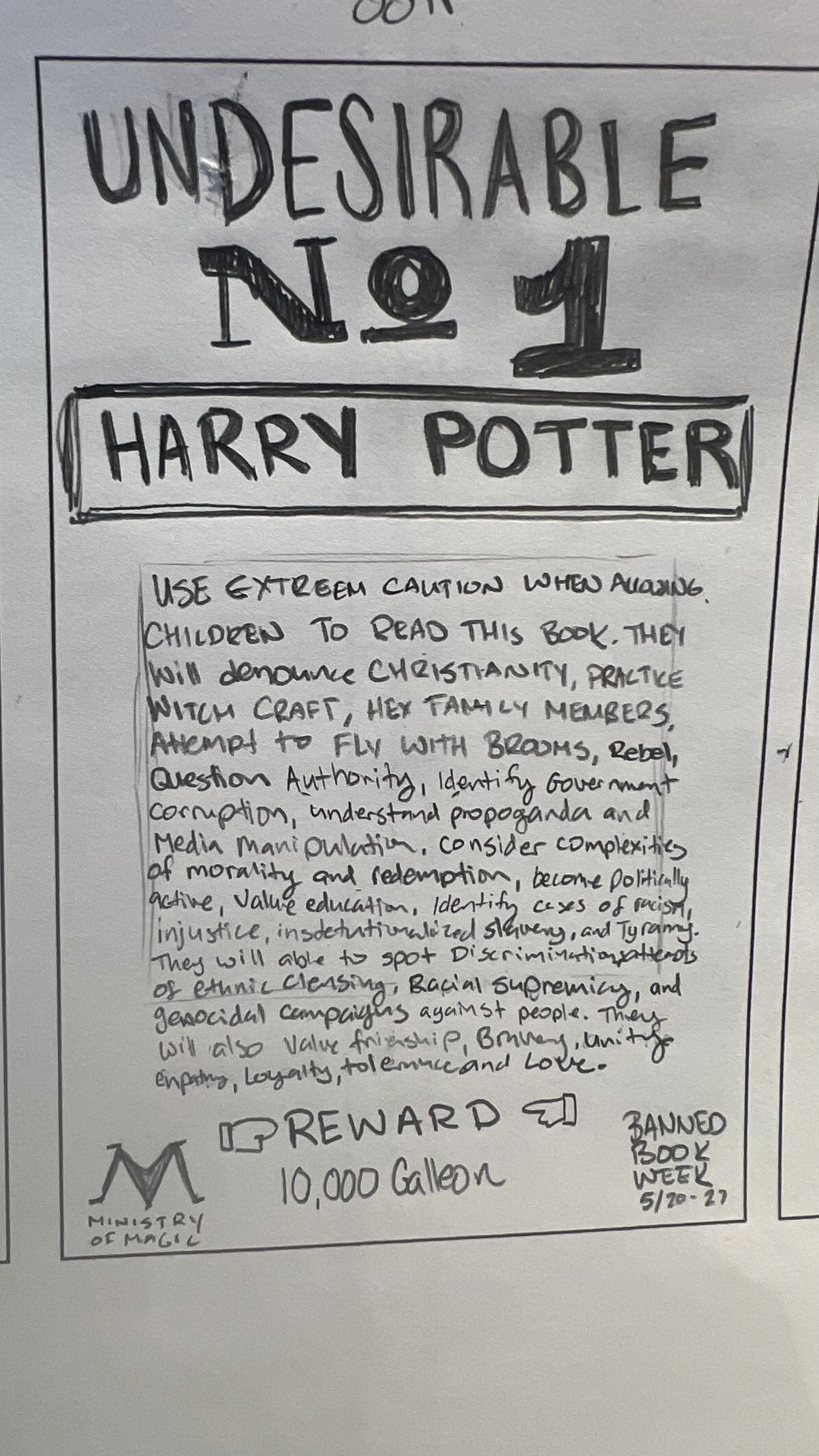
I chose the graphic novel “Go with the Flow”, the 5th Harry Potter, and the Ruby Bridges story for my thumbnails. I also did some sketches for Where's Waldo which has been banned because of a topless sunbather.
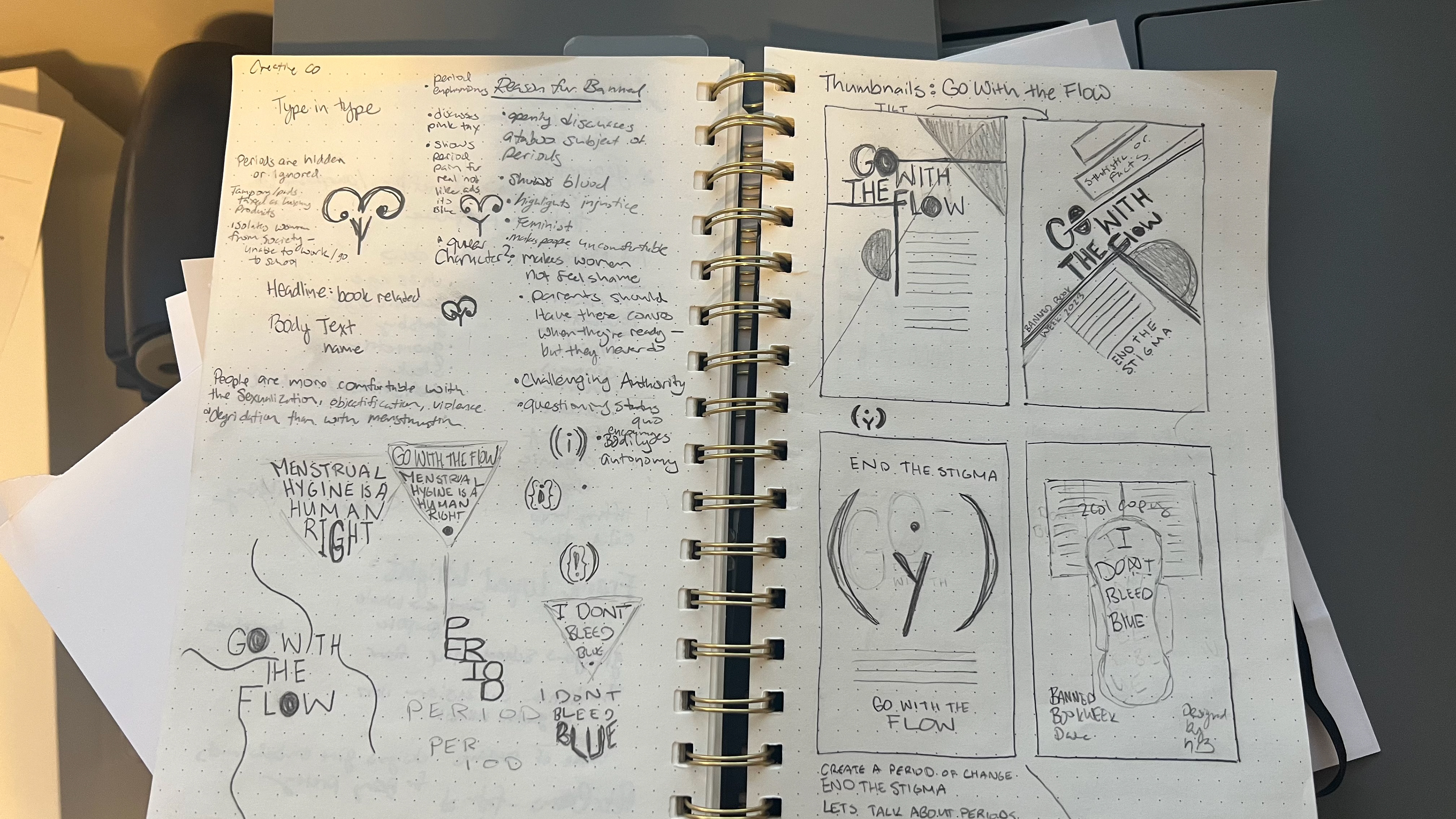
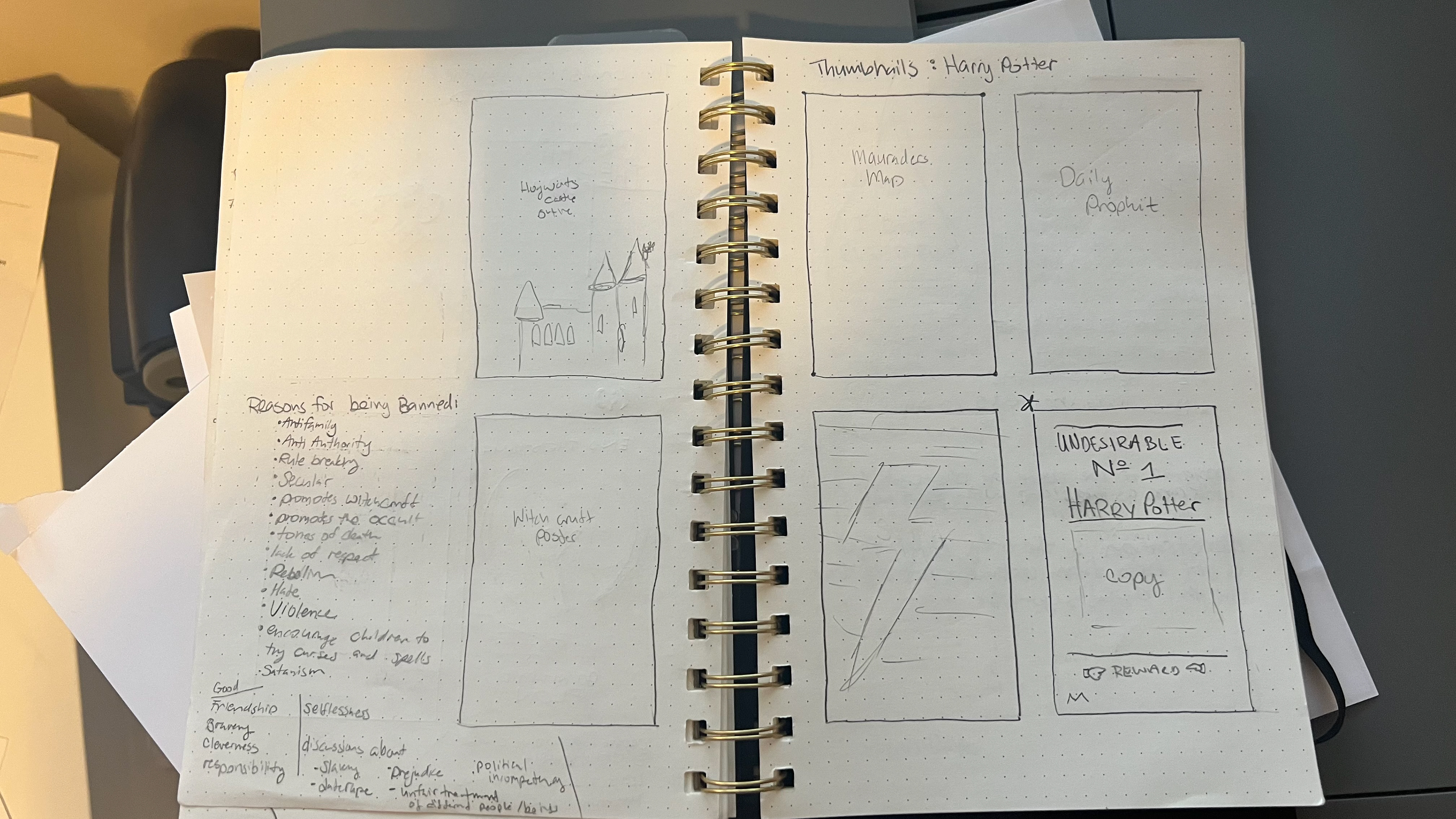
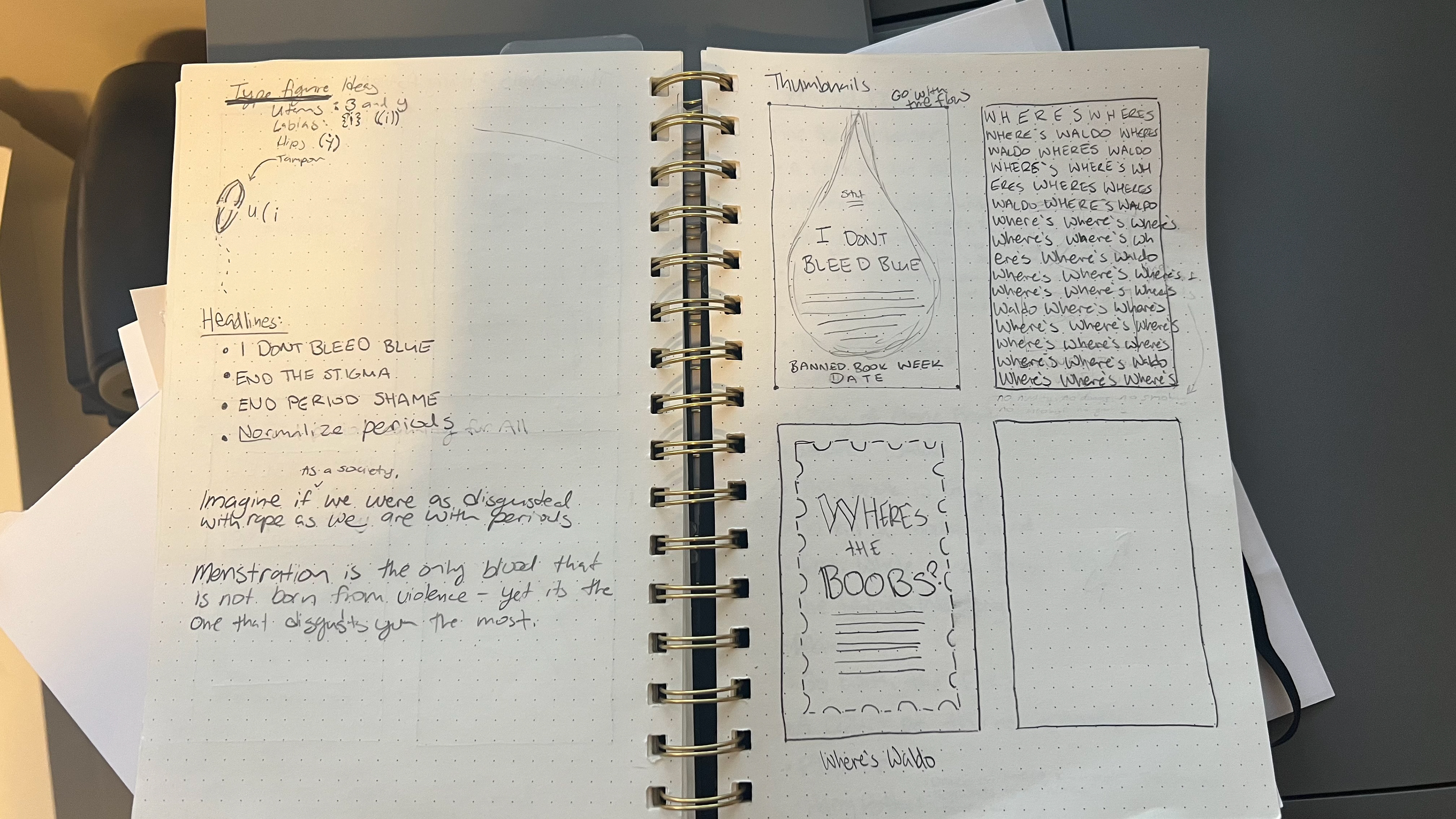
Thumbnails
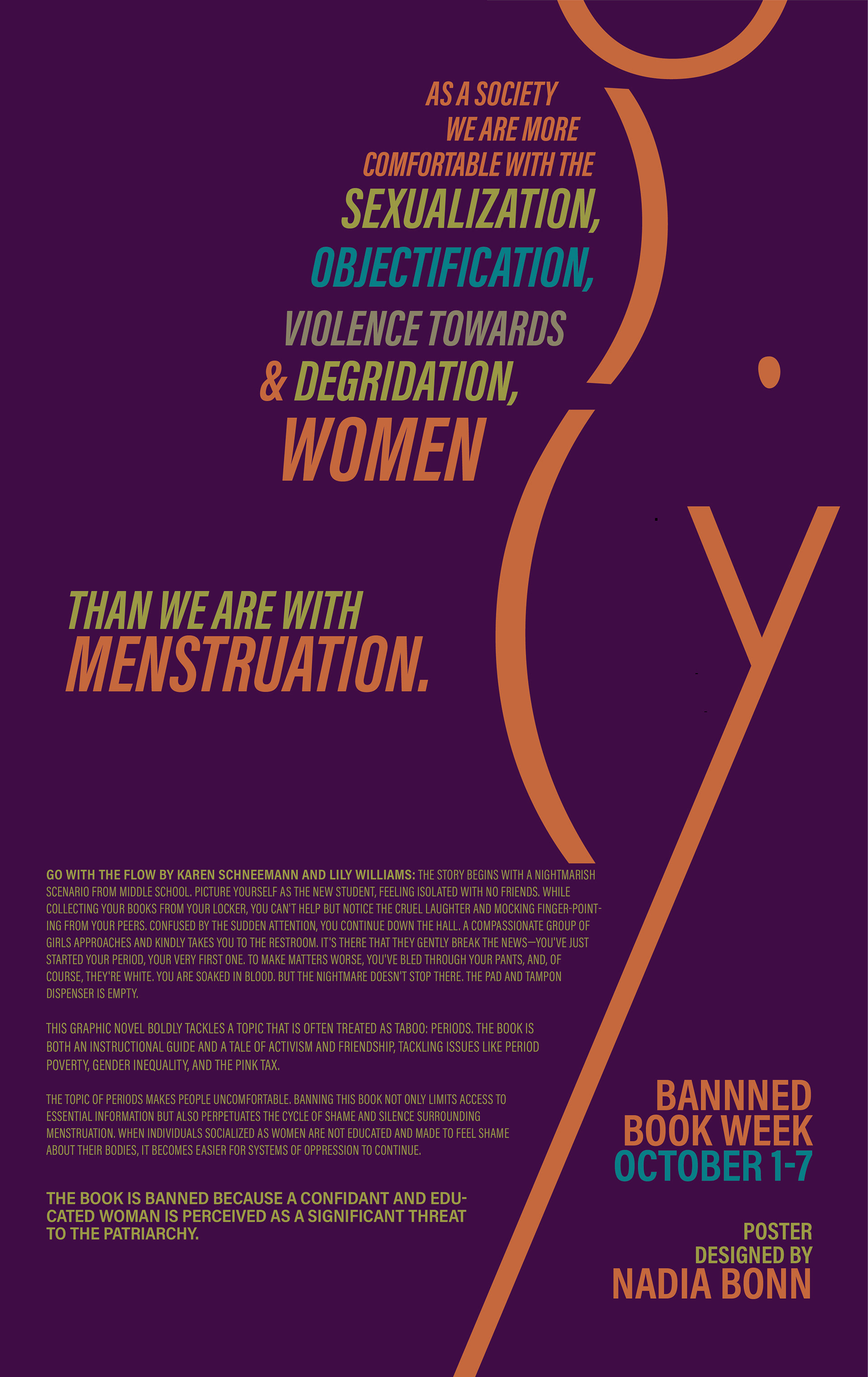
These are my thumbnails. It was challenging to design not knowing the colors I was going to be assigned. There was a debate about using the capital letter Y for the woman's body, but I chose the lowercase y because in my opinion it better represented the various aspects of being a woman. It suggests crossed legs, possibly indicating feelings of shame, societal pressure to be demure, and the impact of sexualization.
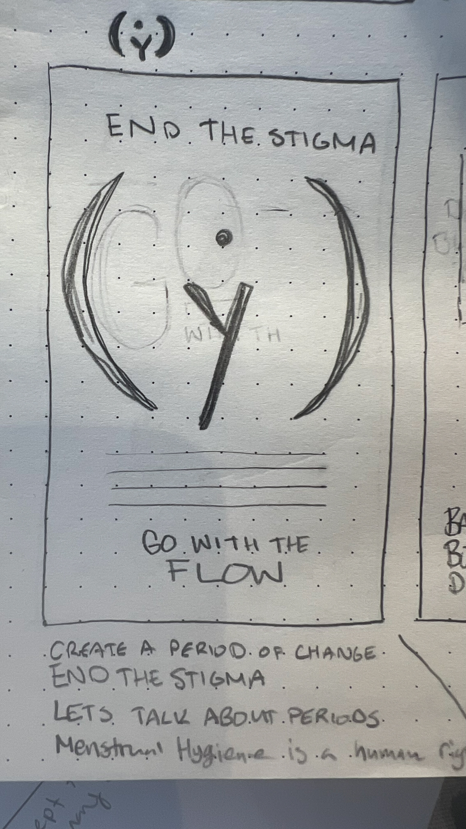
Intermediate
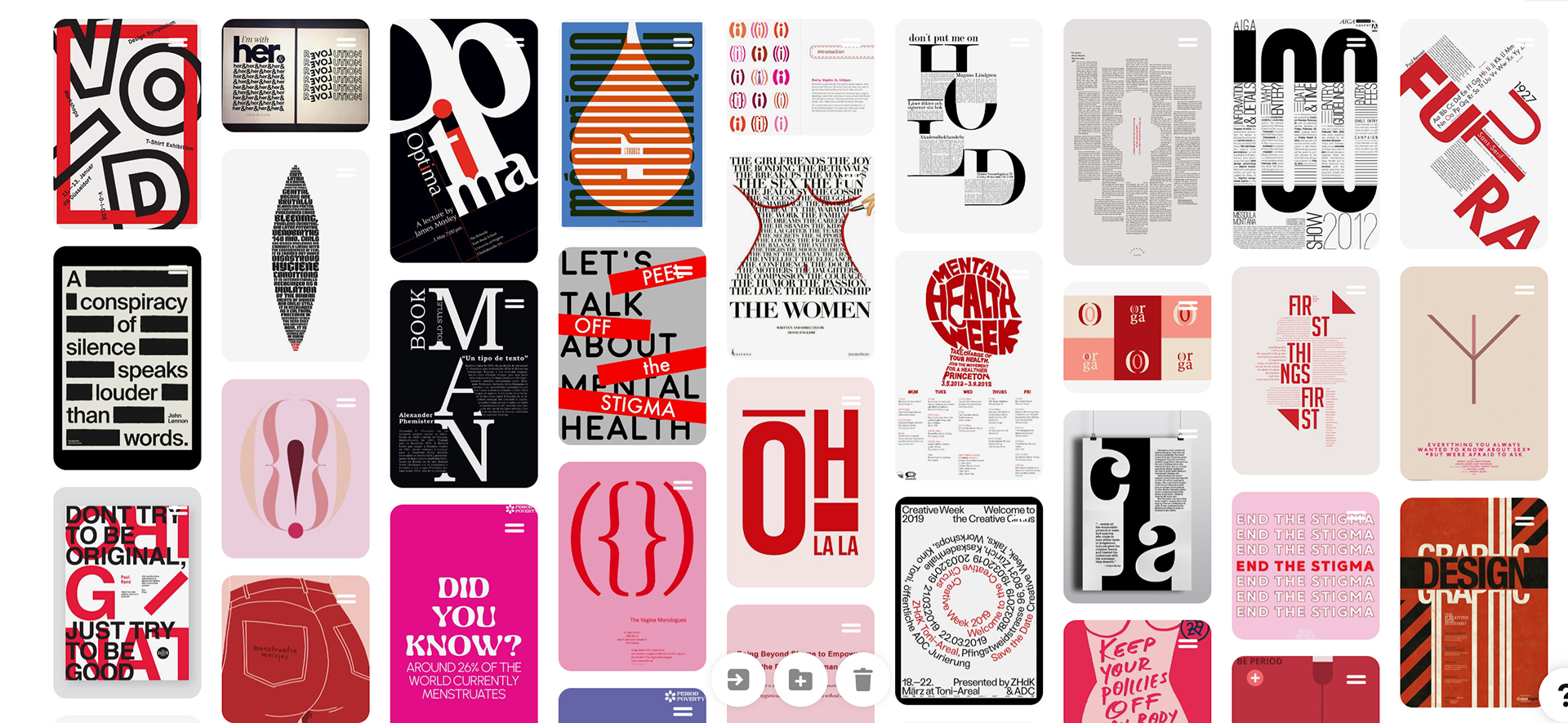
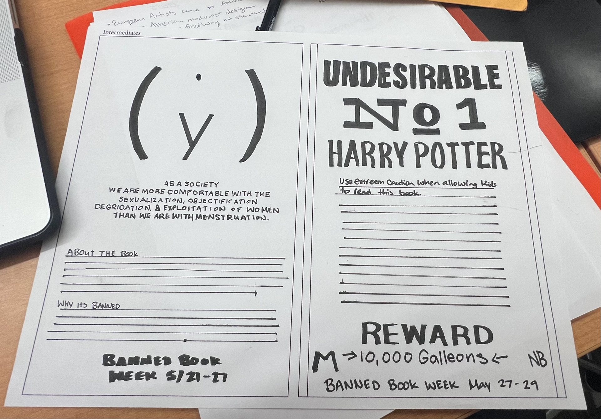
I decided to enhance my Harry Potter wanted poster and the provocative poster featuring the women's body design for my intermediate projects. While I like the first one best, however, I found the center justification to be dull and lacking dynamism. In the critique, many people didn't get that it was a female body. So in my next revision, I aimed to make the poster more captivating, hoping viewers would be drawn in at first glance.
In crafting the headline, I drew inspiration from quotes in my research, like "Imagine if men were disgusted with rape as they are with periods." I intentionally used "as a society" instead of singling out a specific gender. Growing up, I, like many women, was taught not to discuss periods openly, but I'm actively working to break that taboo with my daughter by educating her about her body. Reflecting on this, I recognize the importance of greater inclusivity in my writing, especially in acknowledging all individuals who menstruate. In hindsight, I wish I had conducted more research to find language that embraces everyone affected by menstruation.
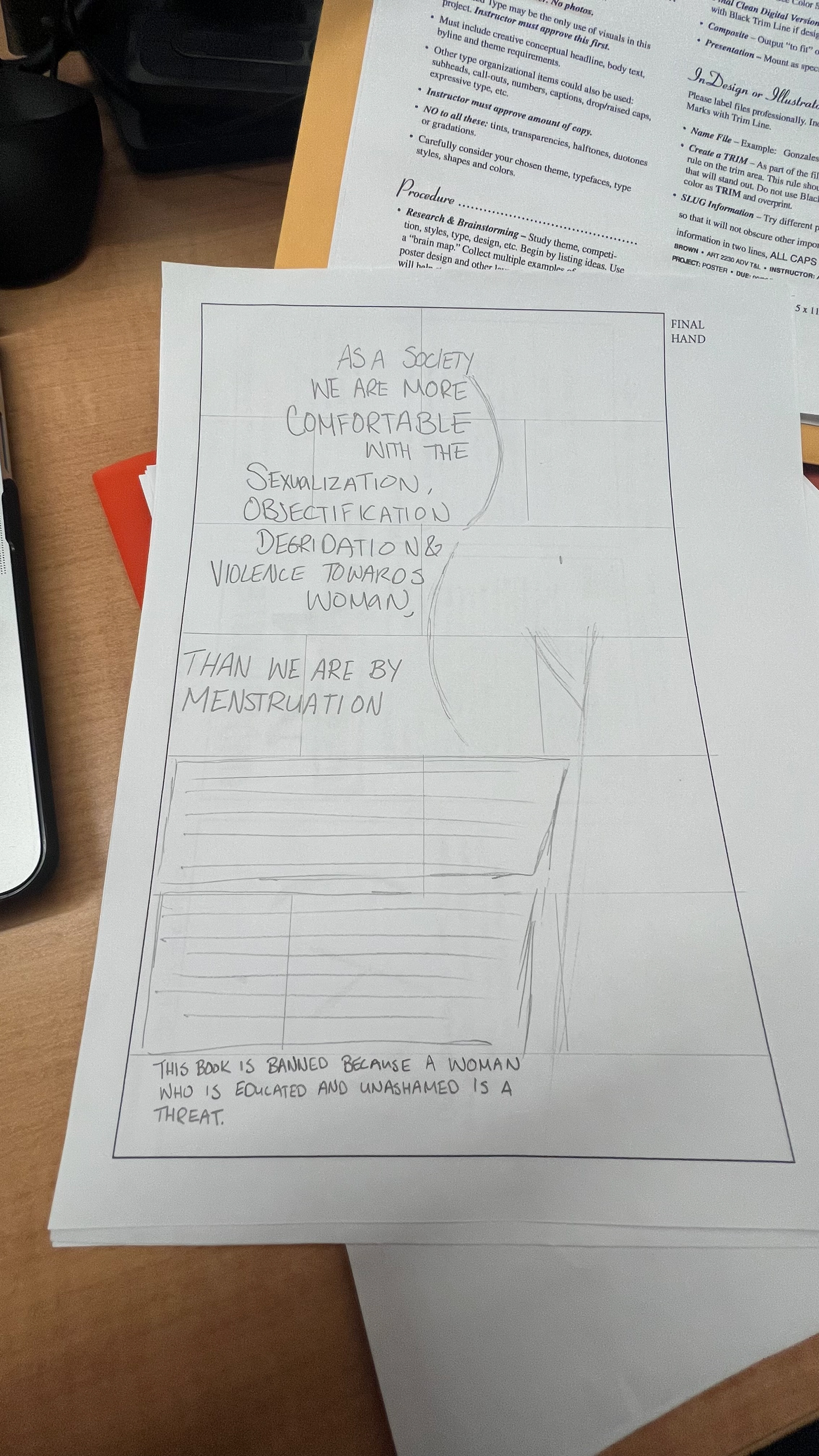
Final Hand Comp
In the final version, I made adjustments to ensure people recognized the body as a woman's. I extended the image to include legs, curves, and the underside of her breast in the digital version. The text now follows her body's contours. I added bathroom tiles as a background since the story is set in a bathroom but it was deemed unnecessary in the critique and several people thought they were guidelines.
Computer Progressions:
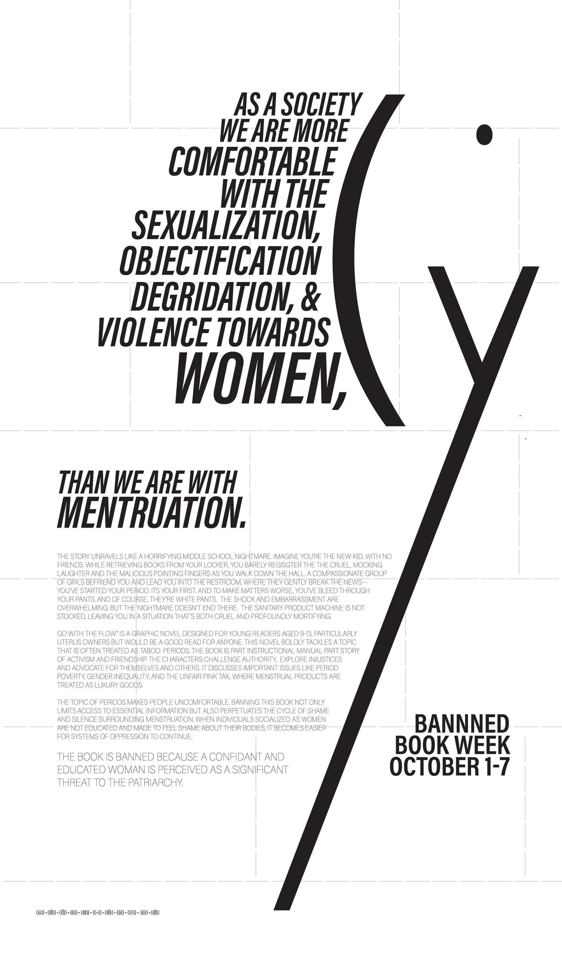
Color Studies:
Upon receiving my assigned colors—orange, teal, light yellowish green, and light olive green—I initially felt disappointed but embraced the challenge. I utilized https://www.myperfectcolor.com/ to find the hex codes. Although I anticipated a challenge, I didn't realize how difficult it would be. As I began coloring the poster, I noticed minimal contrast among the colors, making readability a significant issue. To address this, I used Adobe's accessibility feature to test readability, only to find that none of the assigned colors were easily readable. Therefore I knew that my additional color would have to be the background to ensure better legibility.

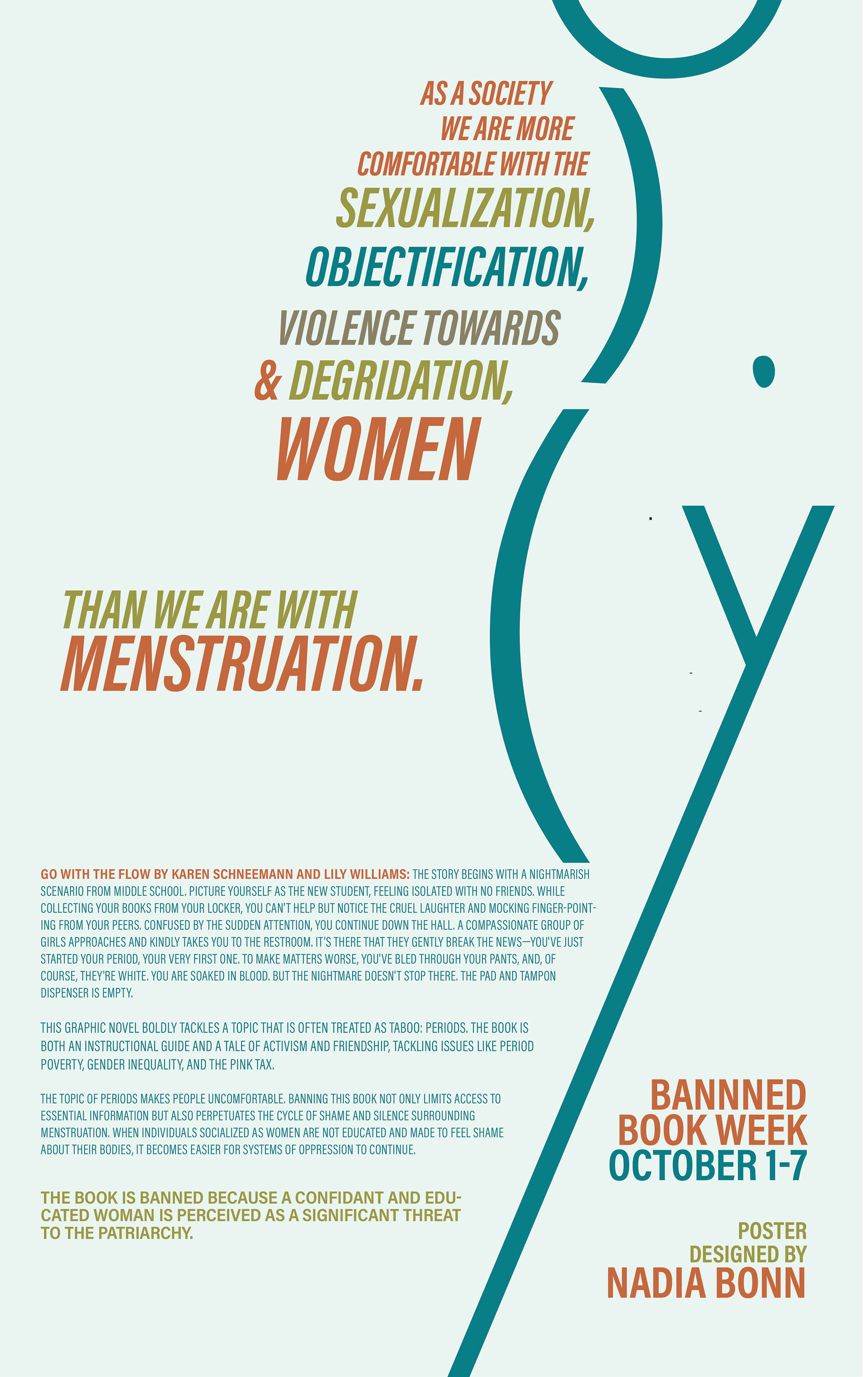
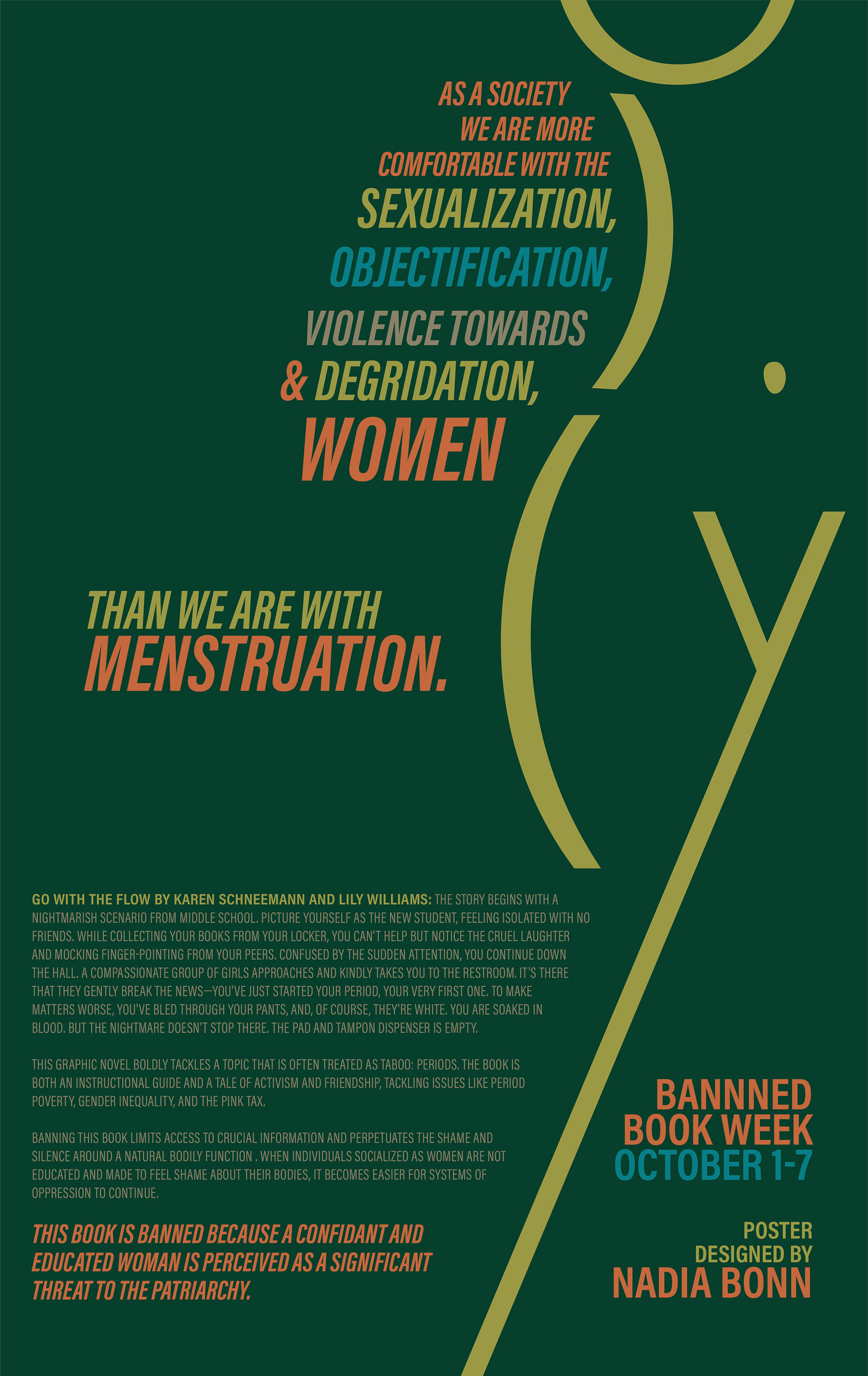

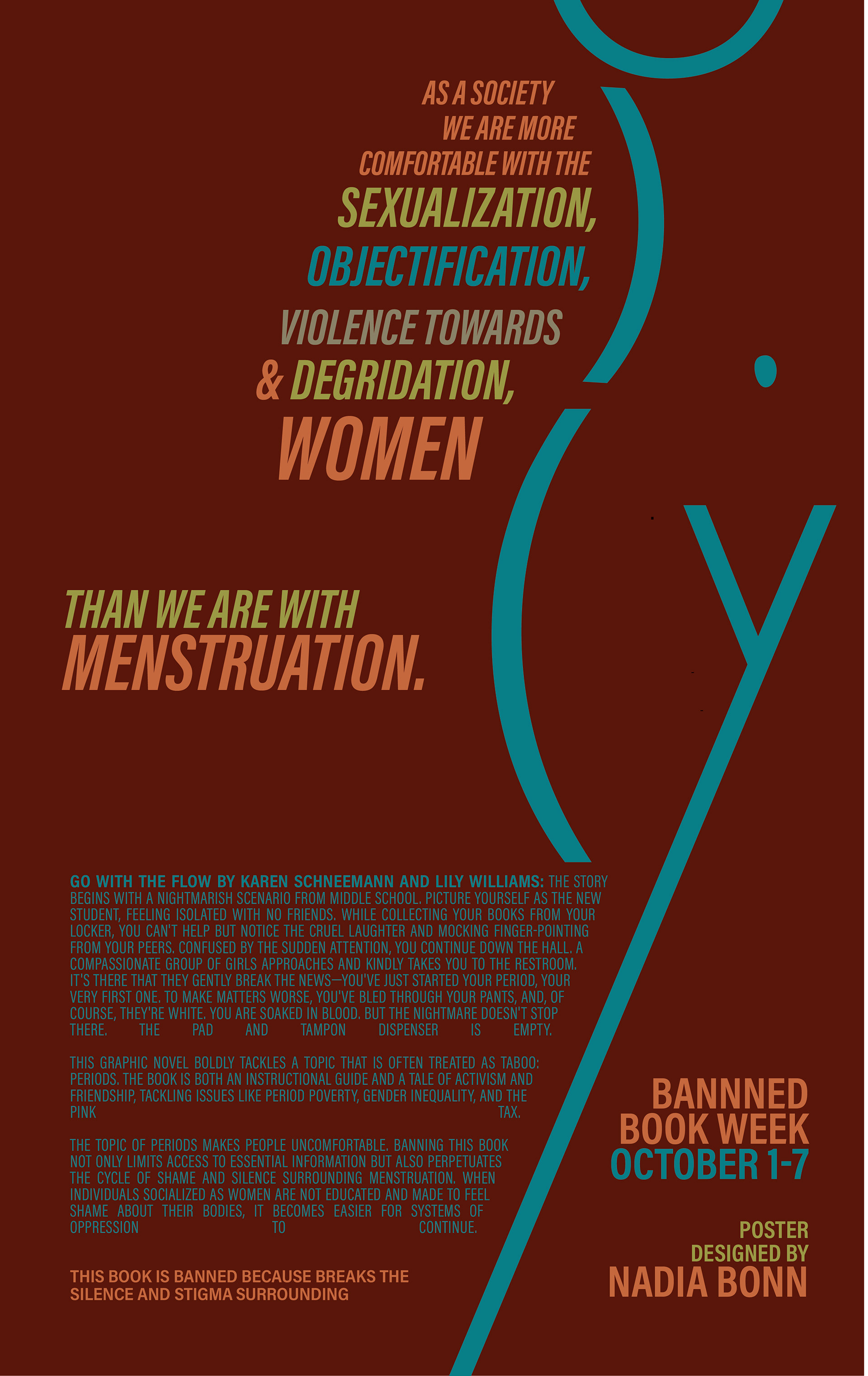
Final Clean Design:
I am so proud of my final design. Despite the colors, I love the composition and I am proud of myself for making it work. I designed a poster about periods without including red and addressed women's issues without using pink. Despite the unconventional color choice, which I've humorously dubbed the "toddler boys section of Old Navy" palette, the message is still effectively communicated. The project was not only challenging due to the given color palette but that only typography could be used.
As I was sitting in the presentation looking at my nicely printed and mounted design I noticed that the orange text at the bottom doesn't align with the body copy. It's disappointing to notice it then. My final at the top of this Page has been modified.
Stay tuned, In future revisions, I plan to recolor it with a palette reminiscent of a St. Valentine's Day Massacre, incorporating shades of pink, red, maroon, black, white, and possibly lavender.

