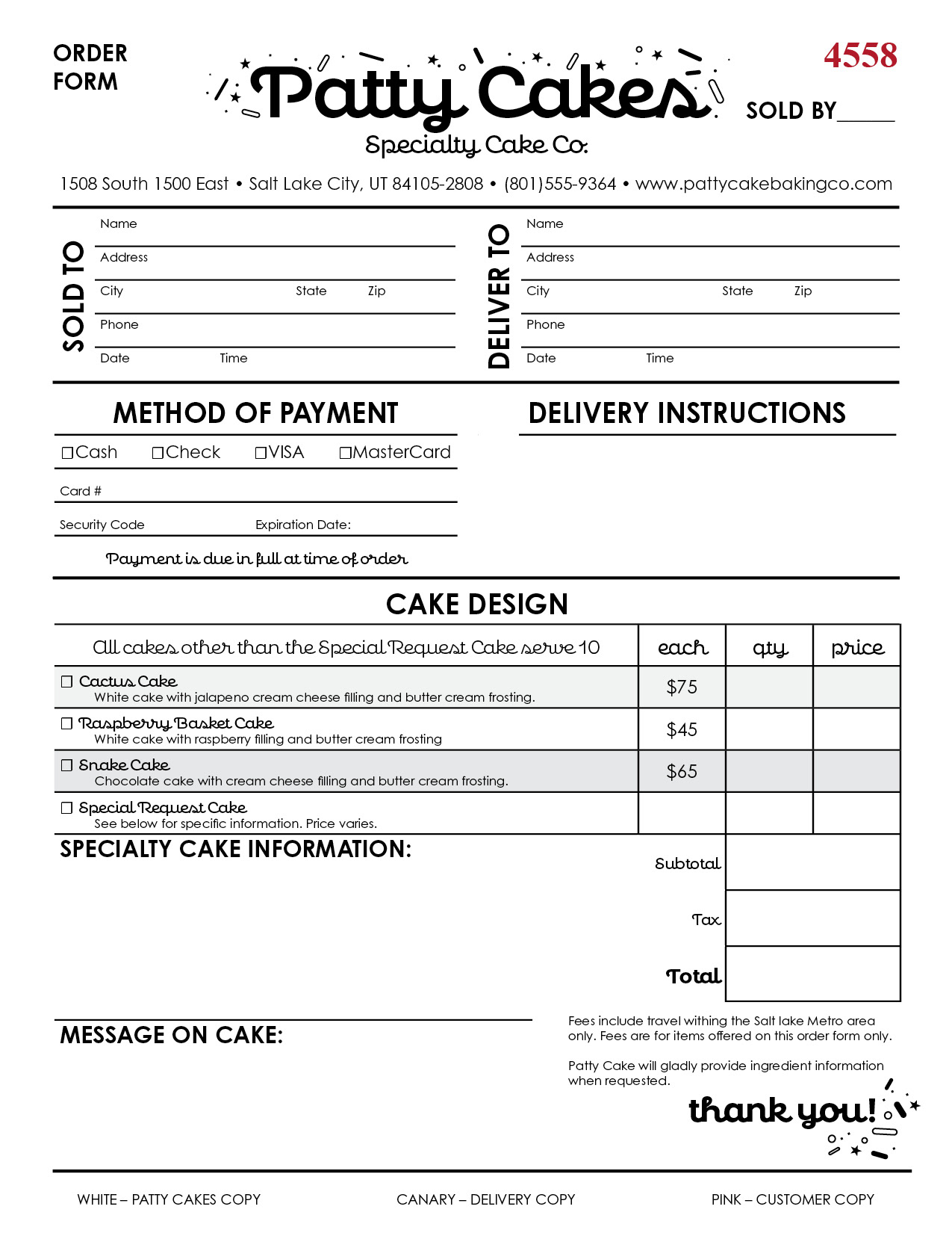
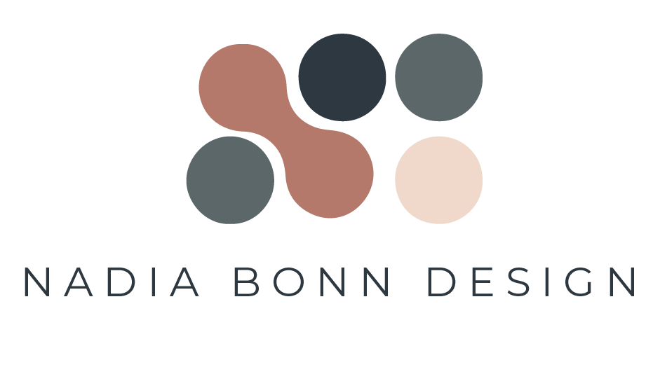
The purpose of this assignment was to create a form that was easy to use and matched the aesthetic of the company, Patty Cakes Specialty Cake Company.
ResearchIO
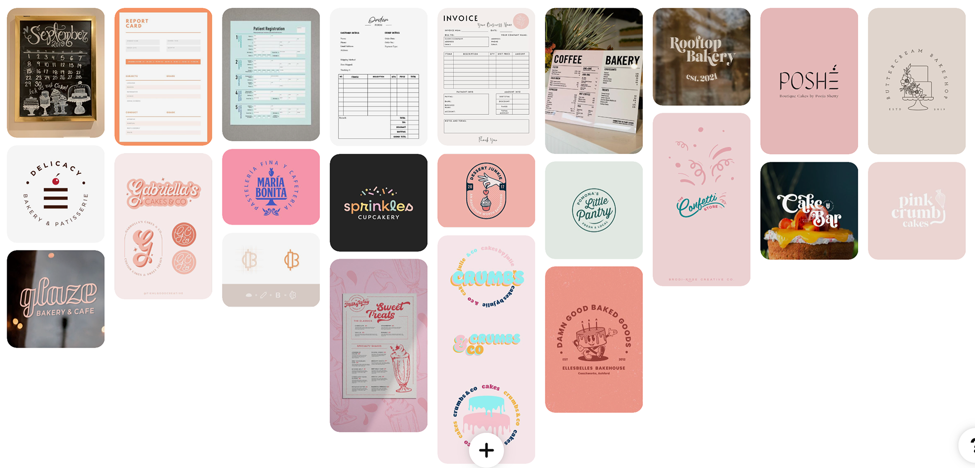
I decided to focus entirely on the form first. I knew that if I started looking at cutesy bakery stuff on Pinterest I'd waste a lot of time. The most important thing is the layout of the form. It has to be very user friendly. For my cake order form, I wanted to make something really functional. As someone who hates filling out forms, nothing is worse than a confusing form you must fill out. I thought to myself, which items made the most sense to be close to each other? Then I started blocking out my form.
Sketches & Doodles
Instead of jumping into aesthetic design, like I usually do, I decided to focus on the structure of all the elements. My goal was to get a layout made before even starting to work on illustrations or font choices.
Thumbnails
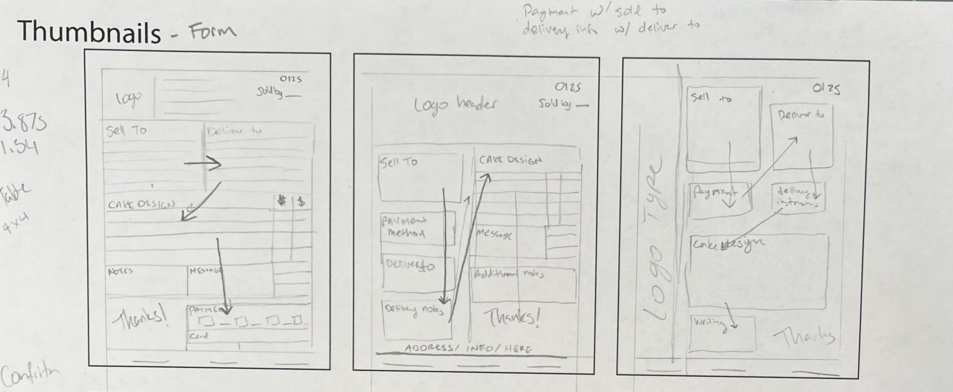
I tried three different variations for the layout. I drew arrows to show the order in which the boxes would be filled to make sure it was in logical order. I also experimented with the logotype being on the side.
Intermediate
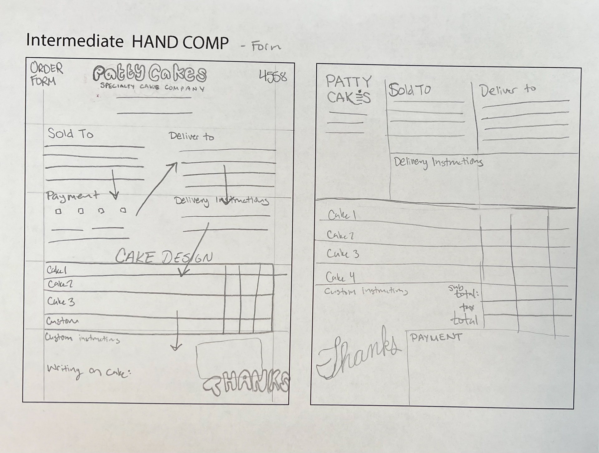
I decided to type on the side would take up more space than necessary. Space is really limited in this particular form because of all the information that needs to be gathered. Since we read left to right I think that the first is the best. The second one is also good because you input all the information about the person buying and the person being delivered to along with the payment info and delivery notes. And then the next column ins the fun stuff (the cake!)
Final Hand Comp
I chose to develop my first design. I put the address at the bottom and the name of the bakery at the top. When it came to the design of the boxes, I wanted them to be as simple as possible. Once everything was laid out I realized I did not need any extra illustrations and that a playful font would convey the brand’s message enough.
Computer Progressions
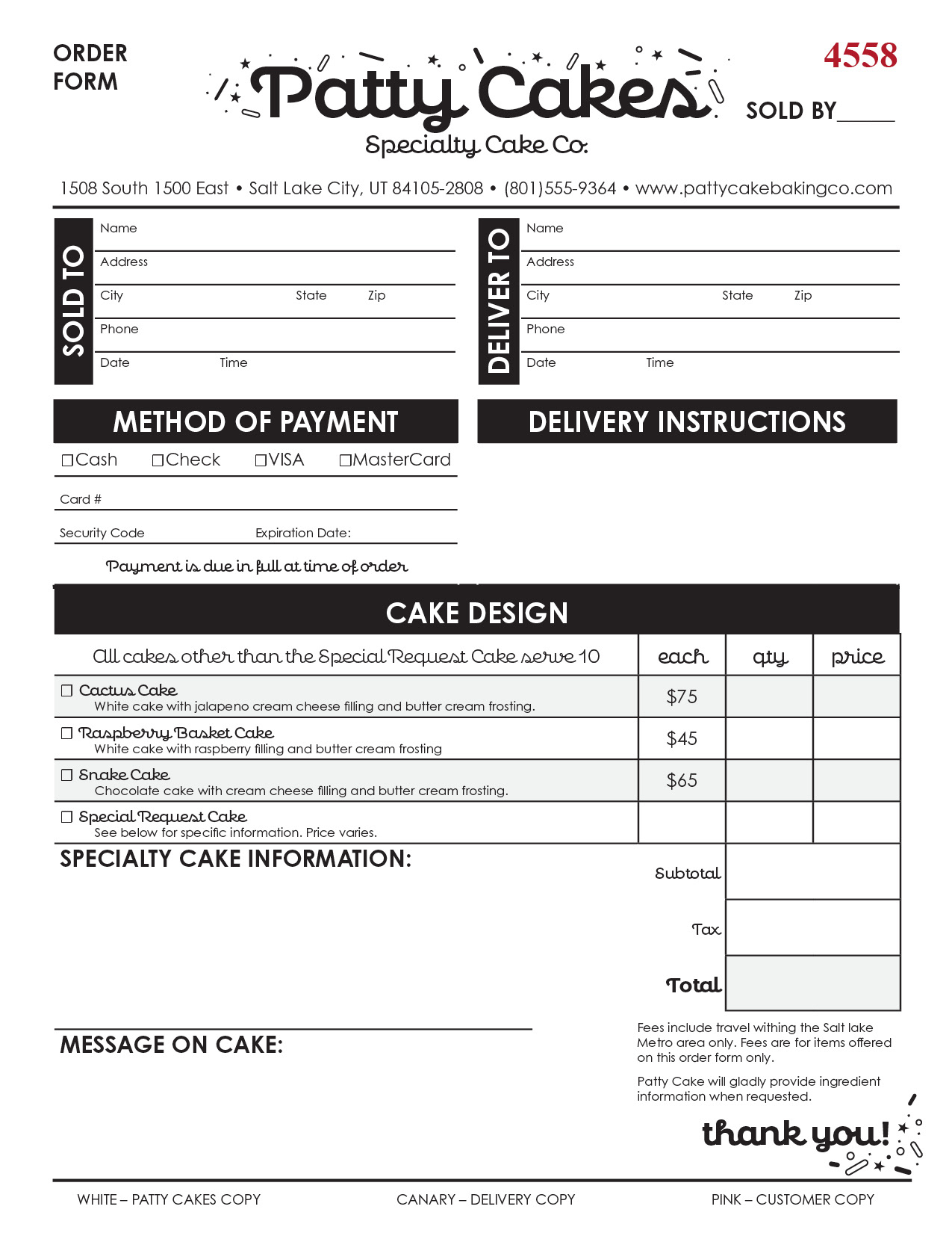
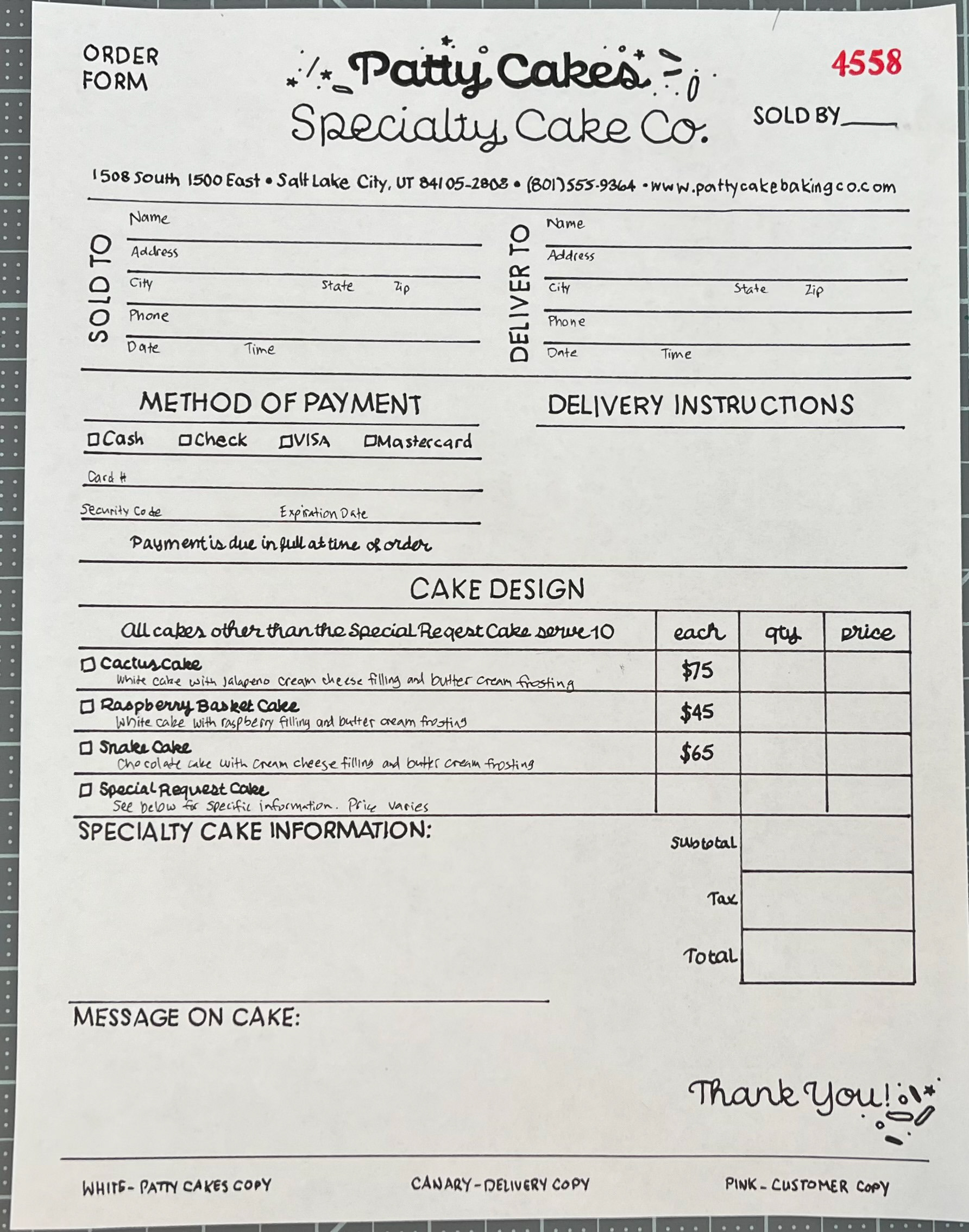
Printing out my design really helped me see how large the space was going to be for someone to write in. After looking at it printed, I also decided to make some titles bold and make a few modifications with the decorations.
Computer Progressions
