The objective of this project was to arrange two or more names or words in a pleasing design using a typeface to convey the essence of the words. The design had to include at least 10 characters and an ampersand. Repeating letters counted as one character if drawn using the same typeface.
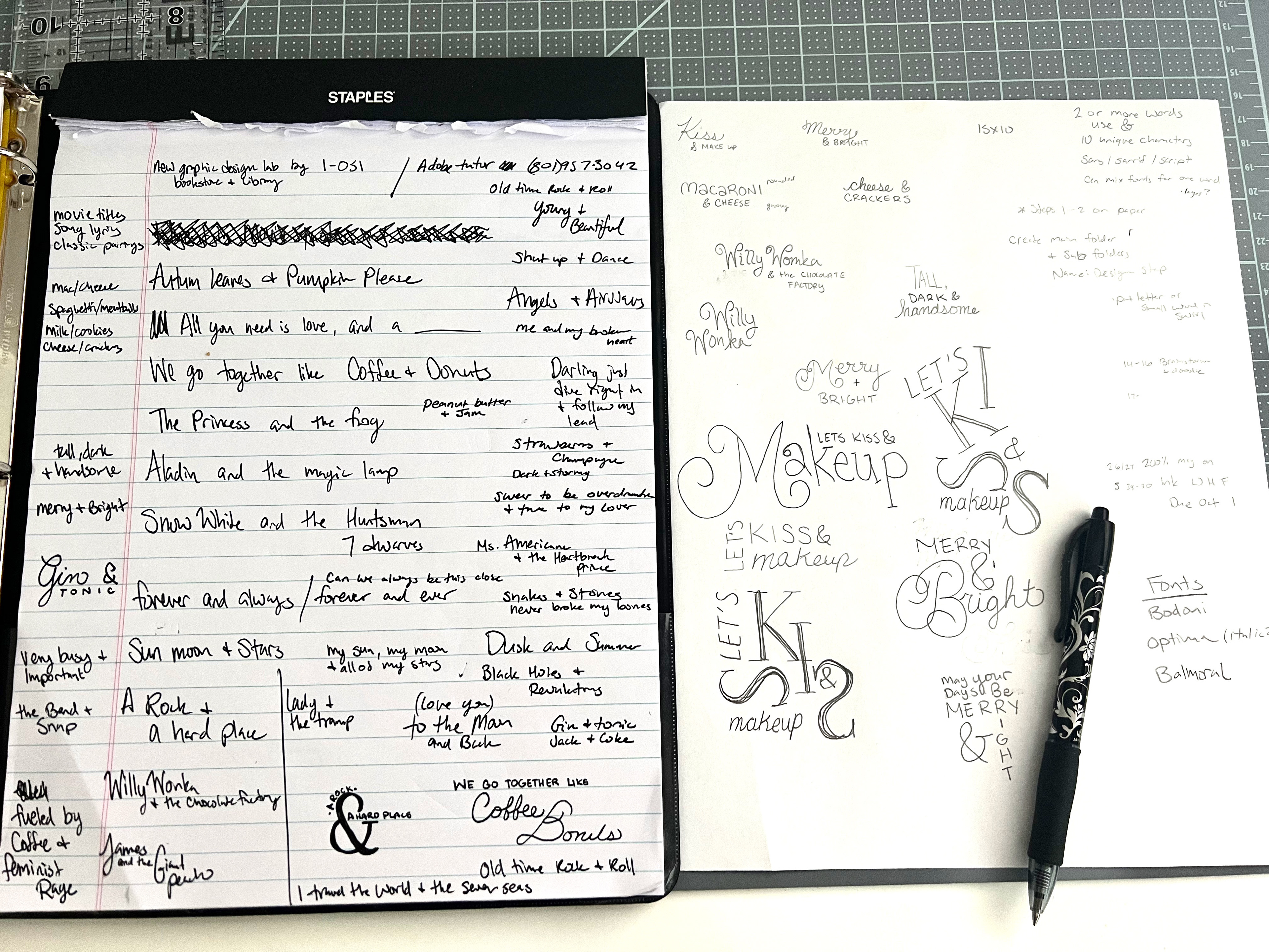
To start, I brainstormed various quotes by compiling a list of song names, movie titles, song lyrics, classic pairings, and quotes that incorporated the word "and". I then counted the character count for each pairing or phrase and narrowed it down to my favorites. After that, I examined different fonts to identify the ones that would work well together, although I wished there were more options for script fonts. I also searched for images on Pinterest for inspiration.
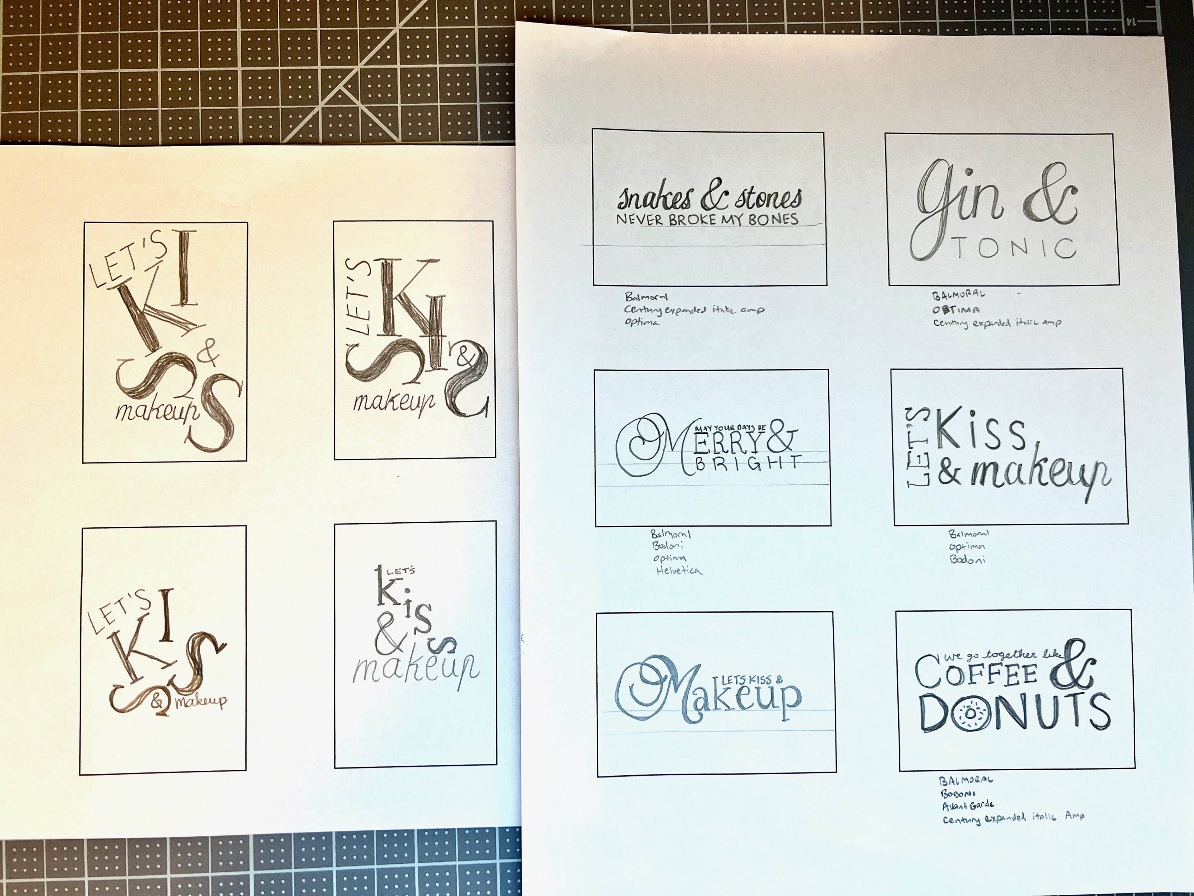
I experimented with different phrases and found that I particularly liked the Century Expanded italic ampersand, which I hope to incorporate into my design. Among my tight thumbnails, I found three that appealed to me, and I will need to make a decision before rendering them into intermediate compositions later this week. I particularly liked the phrase "snakes and stones never broke my bones", which is from Taylor Swift's song "You Need to Calm Down". Another favorite of mine and my husband's is "we go together like coffee and donuts". I also realized that I could turn the "O" of the word "donut" into simple artwork. I experimented with using both uppercase and lowercase for the word "coffee", and ultimately found that uppercase worked better as it avoided dealing with ascenders on the letters "f". My vision is to create an editorial fashion-inspired composition using Bodoni and Optima fonts, and I tried different ideas, including placing the ampersand in the bowl of the letter "S". However, I struggled with the lowercase "p" in the Balmoral typeface, as it looked like it said "makeuh" and I found it challenging to work with overall, especially in uppercase. The large embellished letters also disrupted the balance of my composition.
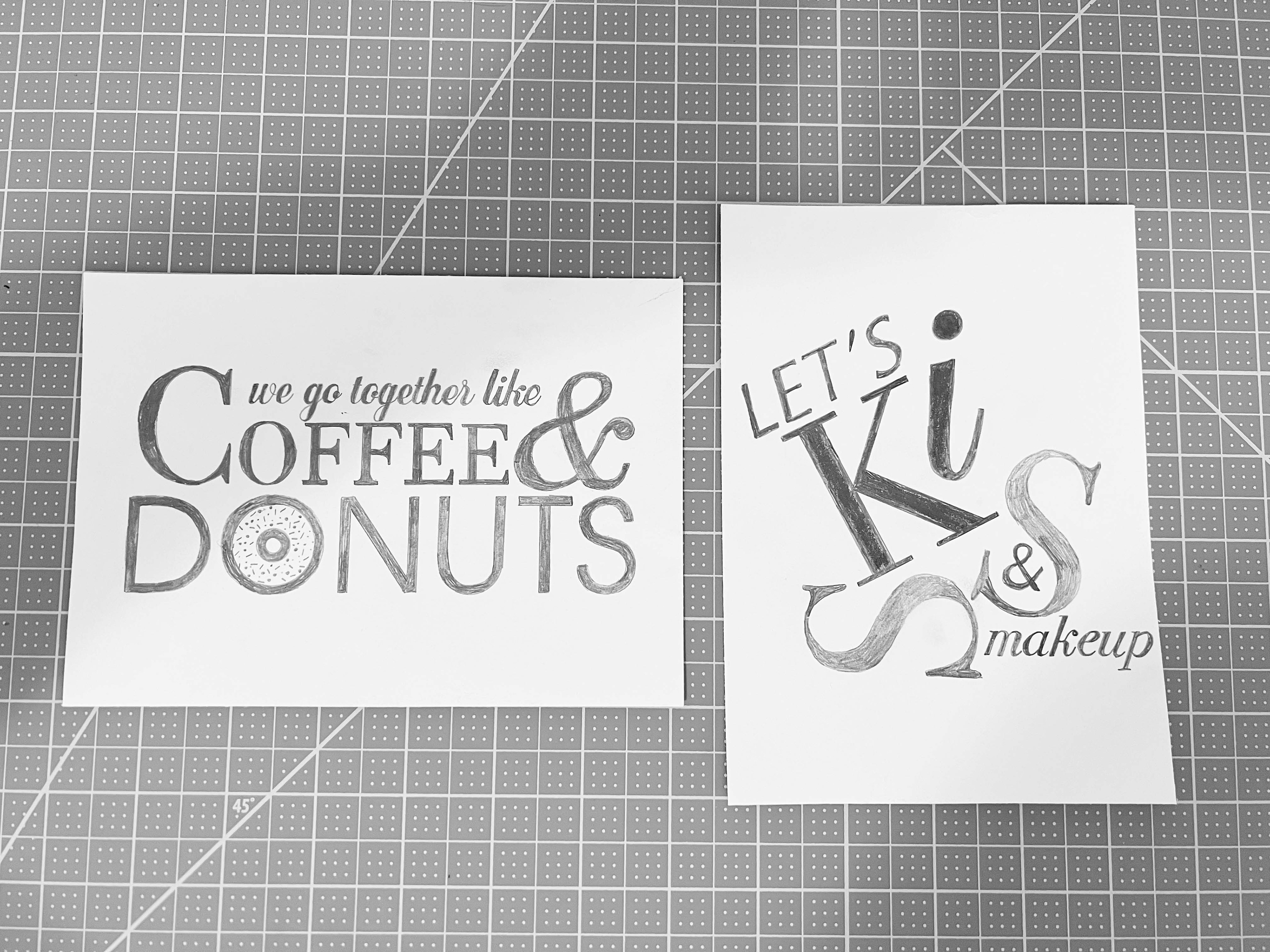
After receiving feedback in class, I made a few modifications to the kiss design. I used Bodoni italic to resolve the issue of the word "makeup" appearing as "makeuh". To fulfill the requirement of using Balmoral, I converted the capital letter "I" in "kiss" to a lowercase script. After rendering two intermediate compositions, I ultimately decided to use the phrase "let's kiss and make up", as I was more excited about that option. I plan to darken and frame the quote "coffee and donuts" and hang it in the kitchen.
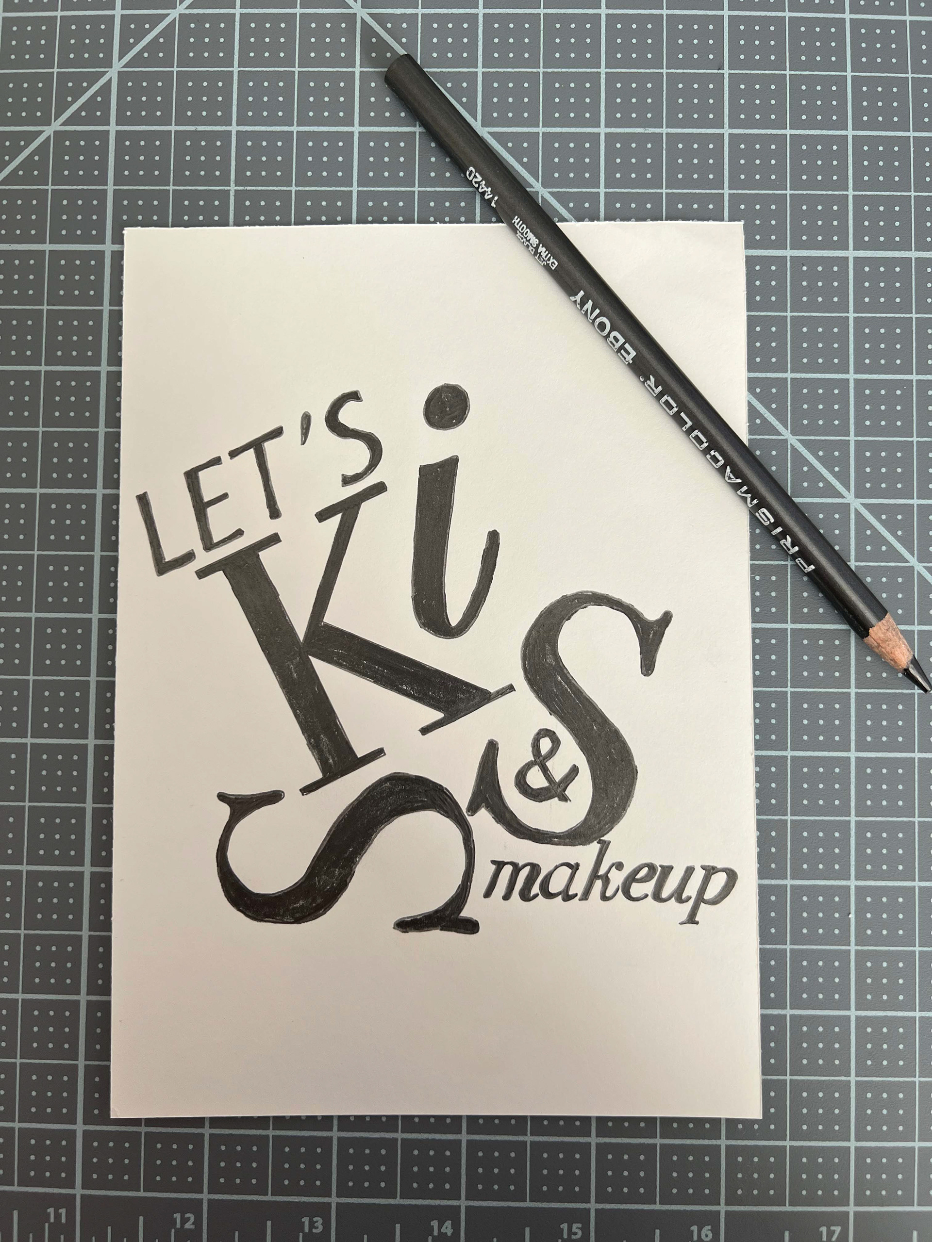
Rendering the final hand composition was challenging, as I needed to apply more force with a softer pencil to darken the letters, which created more dust, and I had to be careful not to make a mess. I covered each completed letter with a sticky note to protect it. In the end, the final composition turned out beautifully, and I was pleasantly surprised with how the ink work turned out, despite my initial nerves.
