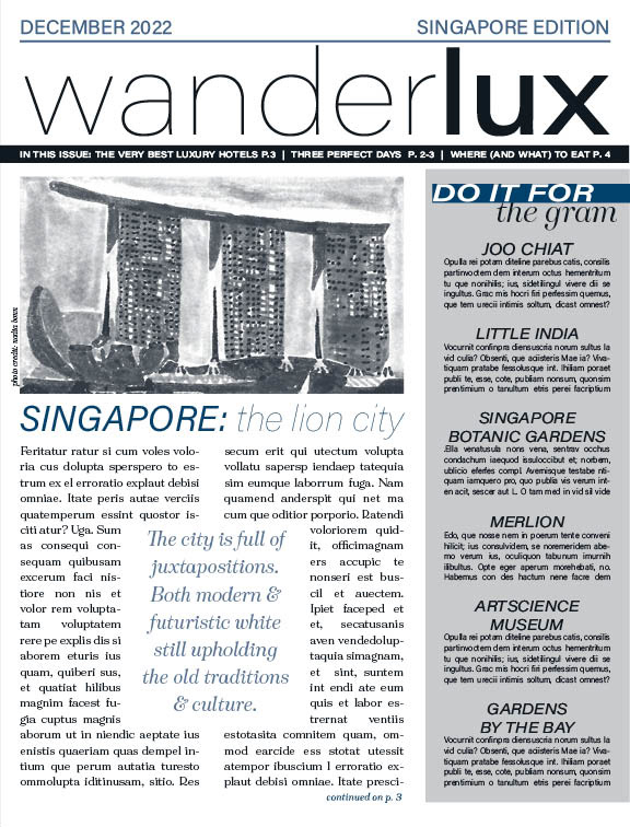
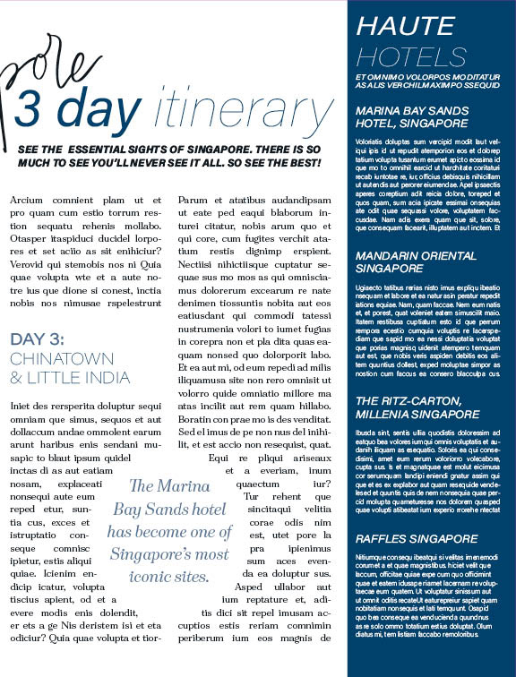
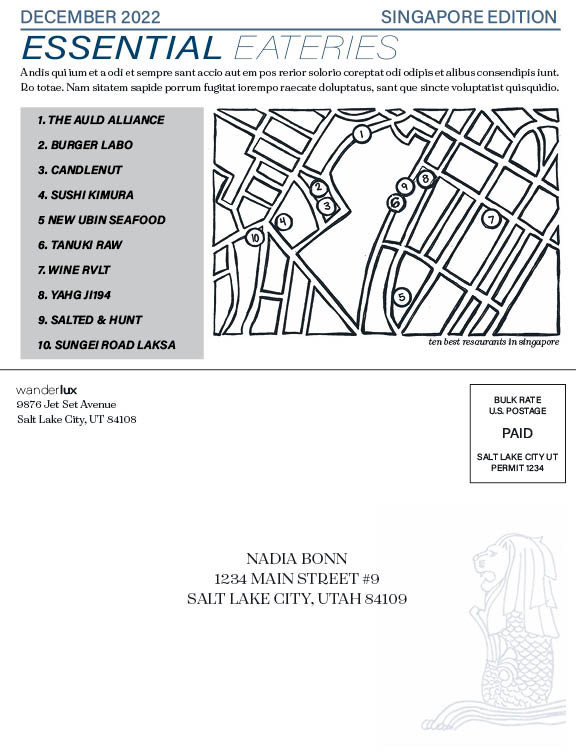
The final project in the class involved the creation of a travel newsletter that effectively utilized design elements to achieve balance within the visual composition. The project required students to undergo a multi-step process of brainstorming and drafting before producing the final design.

Design Process:
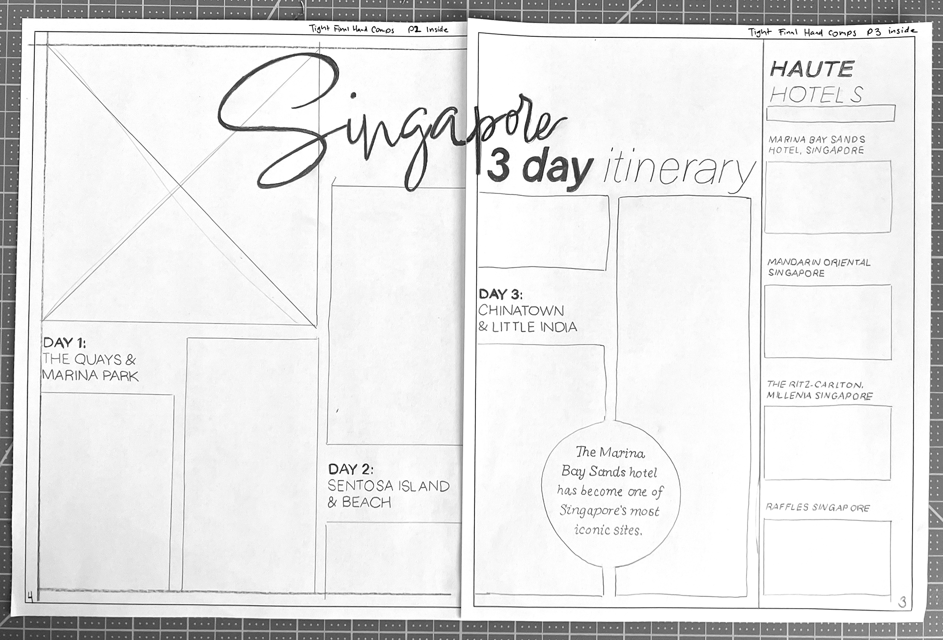
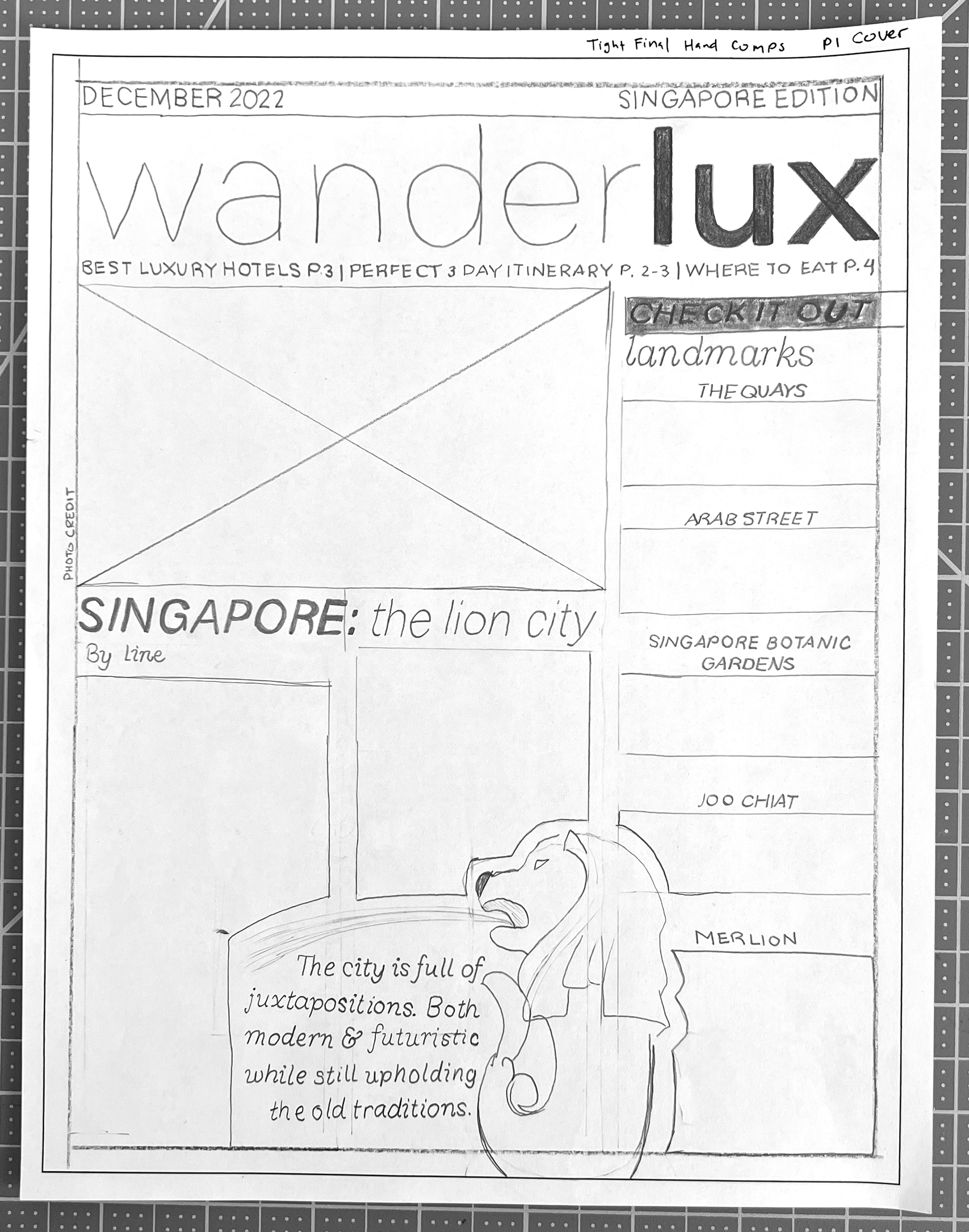
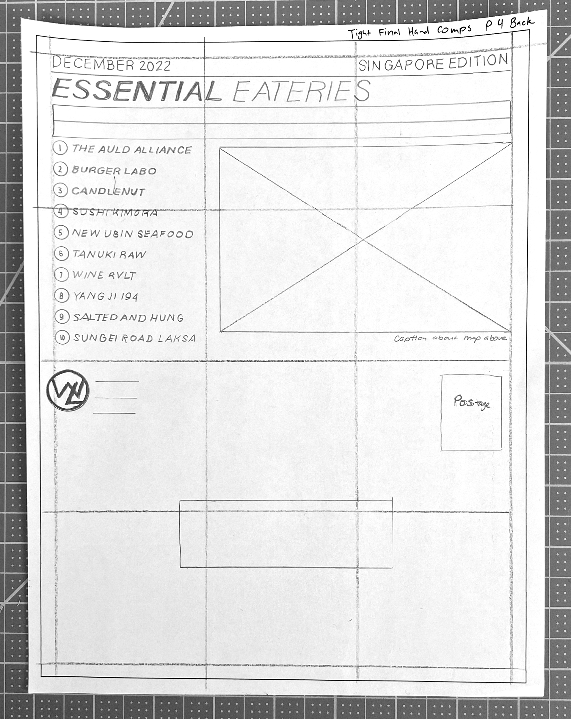
I began the project by conducting research to gather inspiration from magazines and online layouts. Given the multi-step nature of the project as well as several deadlines, I recognized the importance of staying organized and created a detailed checklist to ensure that no element was overlooked.
I decided to do a travel newsletter. I spent a lot of time on typefaces—as I usually do. I found a type called Acumen which had multiple weights and variations which I paired with a readable but not too boring sans-serif and a handwritten script.
I approached this project with a creative mindset, taking time to brainstorm and sketch out potential ideas. I also wanted to establish a cohesive brand identity for the fictional publication, which involved designing a masthead and logo for the return address.
The design process itself involved a series of steps, including the creation of rough sketches, tight thumbnails, intermediate compositions, and final compositions before bringing everything together in Adobe InDesign. Designing a newsletter is like a puzzle where every element must fit perfectly. Doing it by hand made it even more challenging with the constant need to measure margins, grids, and boxes, and the fear of making mistakes. These obstacles made it difficult to maintain a creative flow and turned what should have been an exciting project into a daunting one. Once I started working digitally everything came together much easier. I'm absolutely thrilled with how my travel newsletter turned out! Working on this project gave me the opportunity to learn so much about Singapore and its culture, and it's only made me more eager to visit this amazing destination.
