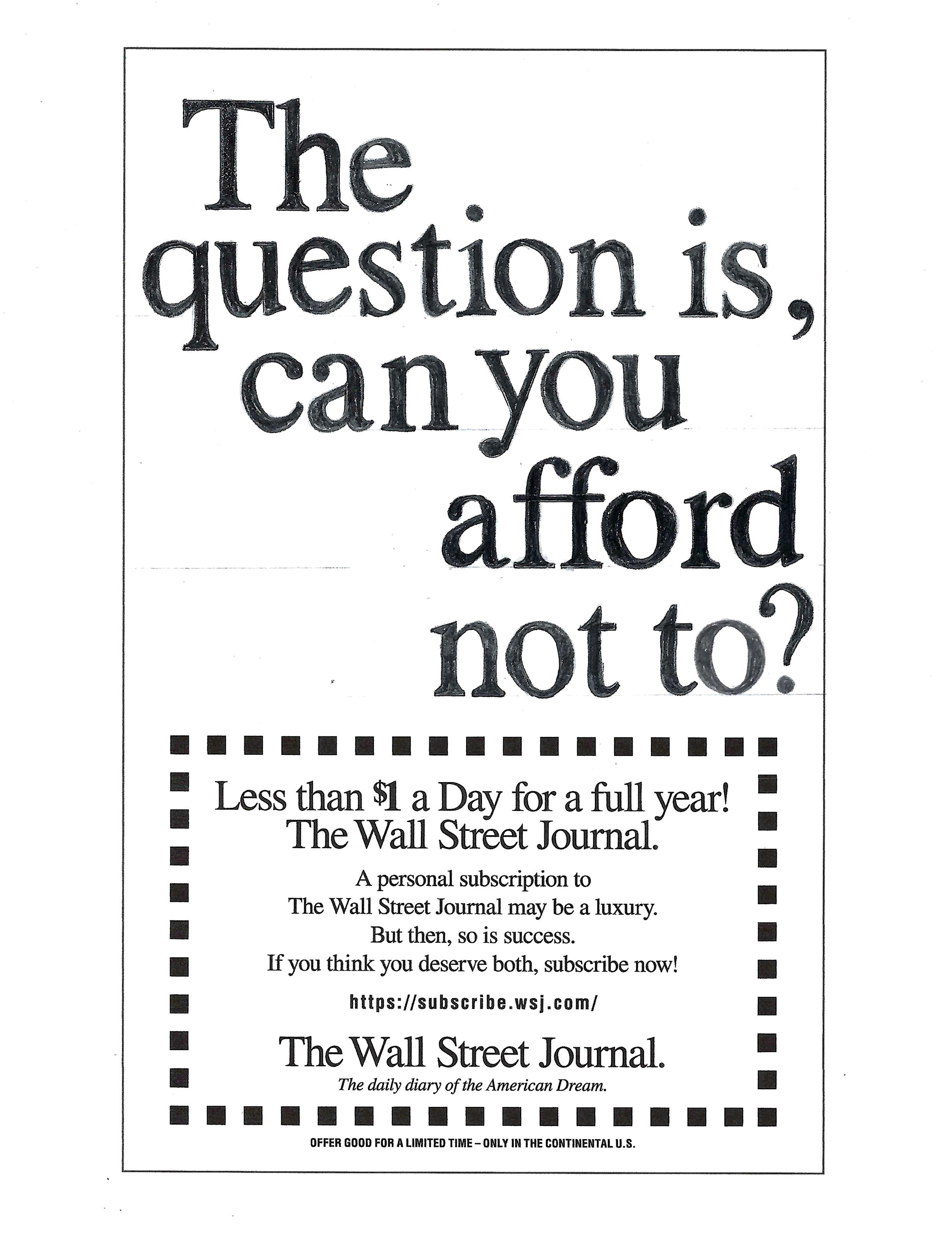
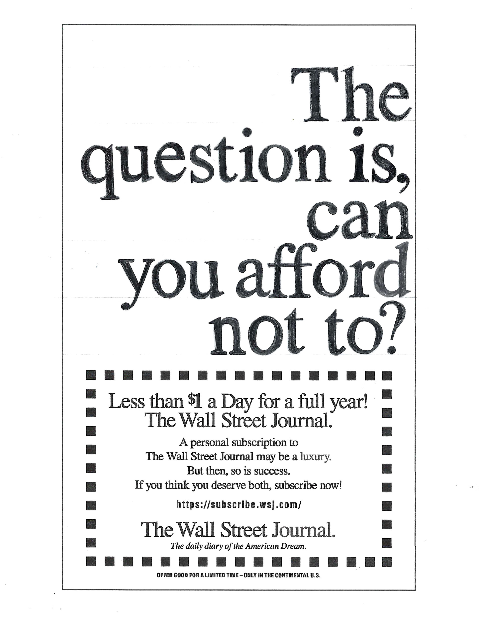
Assignment Objective: The goal of this assignment was to improve my skills in manually adjusting letters, words, and line spacing to support visual communication goals. I was provided with a disordered headline and tasked with arranging the text to achieve optimal alignment. Additionally, I had to identify the font type and size, determine the word order and placement, and apply custom text formatting using both manual and digital techniques.


I experimented with two different layouts for the given headline. The first layout was Flush Right, Ragged Left, but I preferred the Random arrangement described in the books. The Flush Right layout posed a challenge because the word "can" was left orphaned and the descender of the "y" and the ascender of the "d" would collide if placed on the same line. As a result, I had to transfer the layout backward and constantly check the spelling to avoid errors. Through this exercise, I gained a deeper understanding of Times New Roman's nuances by tracing it multiple times.
However, I faced difficulties with this assignment due to the lack of a light table. I attempted to use the computer, iPad, and window as substitutes, but they were all challenging. Therefore, I plan to purchase a light table to make my work easier. The most challenging part of this task was aligning everything and dealing with punctuation marks, ascenders, and descenders that run into each other. The most enjoyable part was coloring in the contours of the typeface. If given the opportunity to do this again, I would try a centered type layout to compliment the centered text on the coupon.
