Objective
Design a 2/0 cylinder container for a baking mix and the company chosen. You may use any TWO SPOT COLORS but not Black or Gray.

Research & BrainStorm
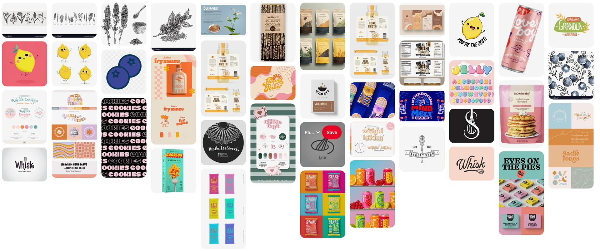
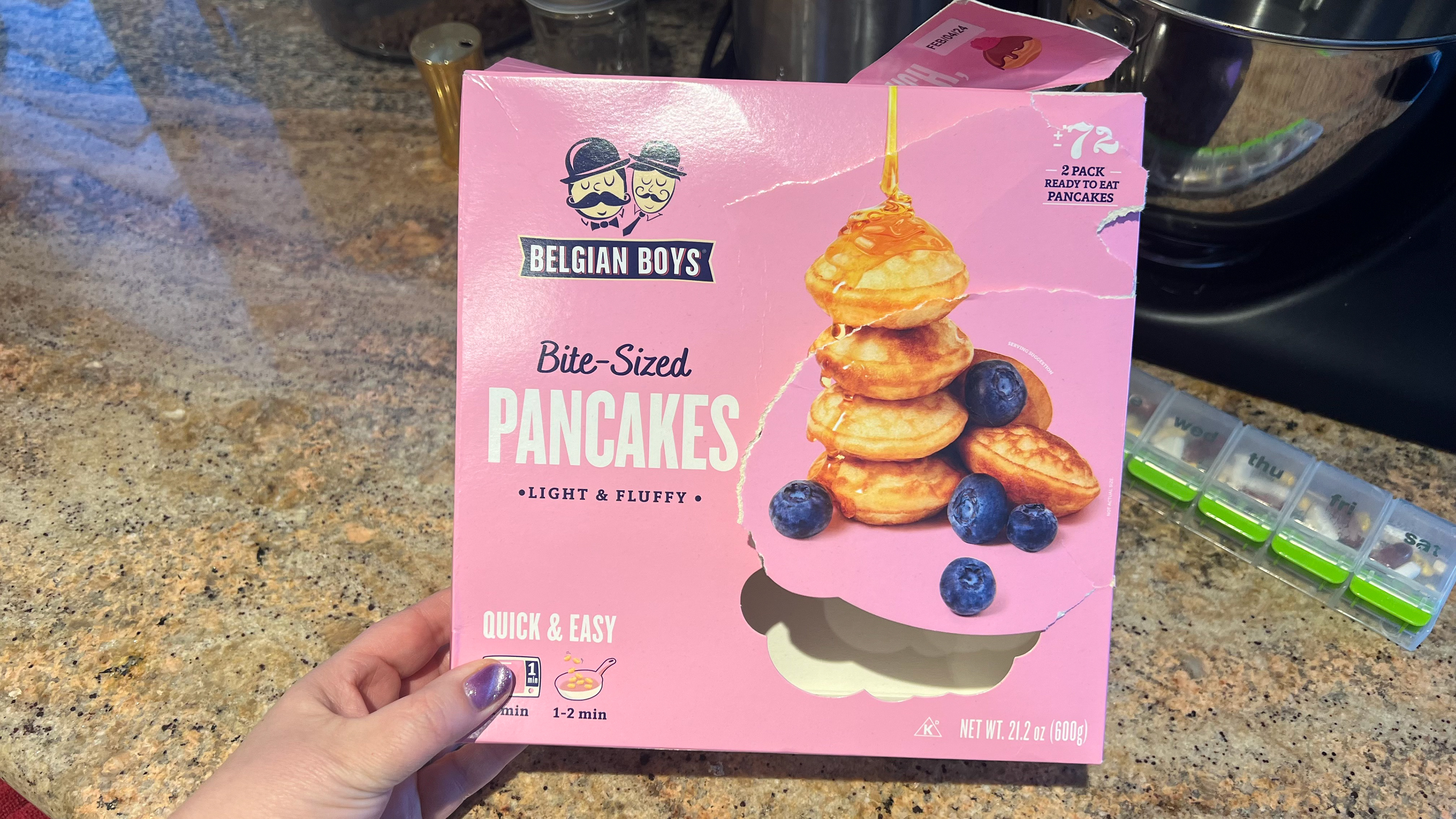
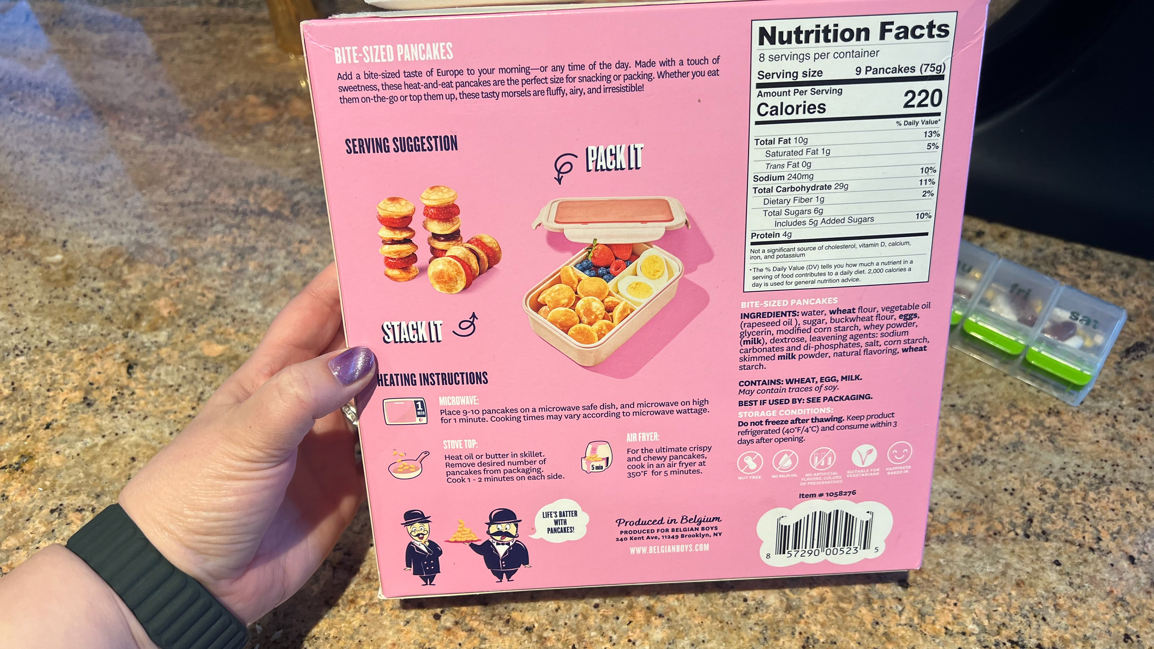
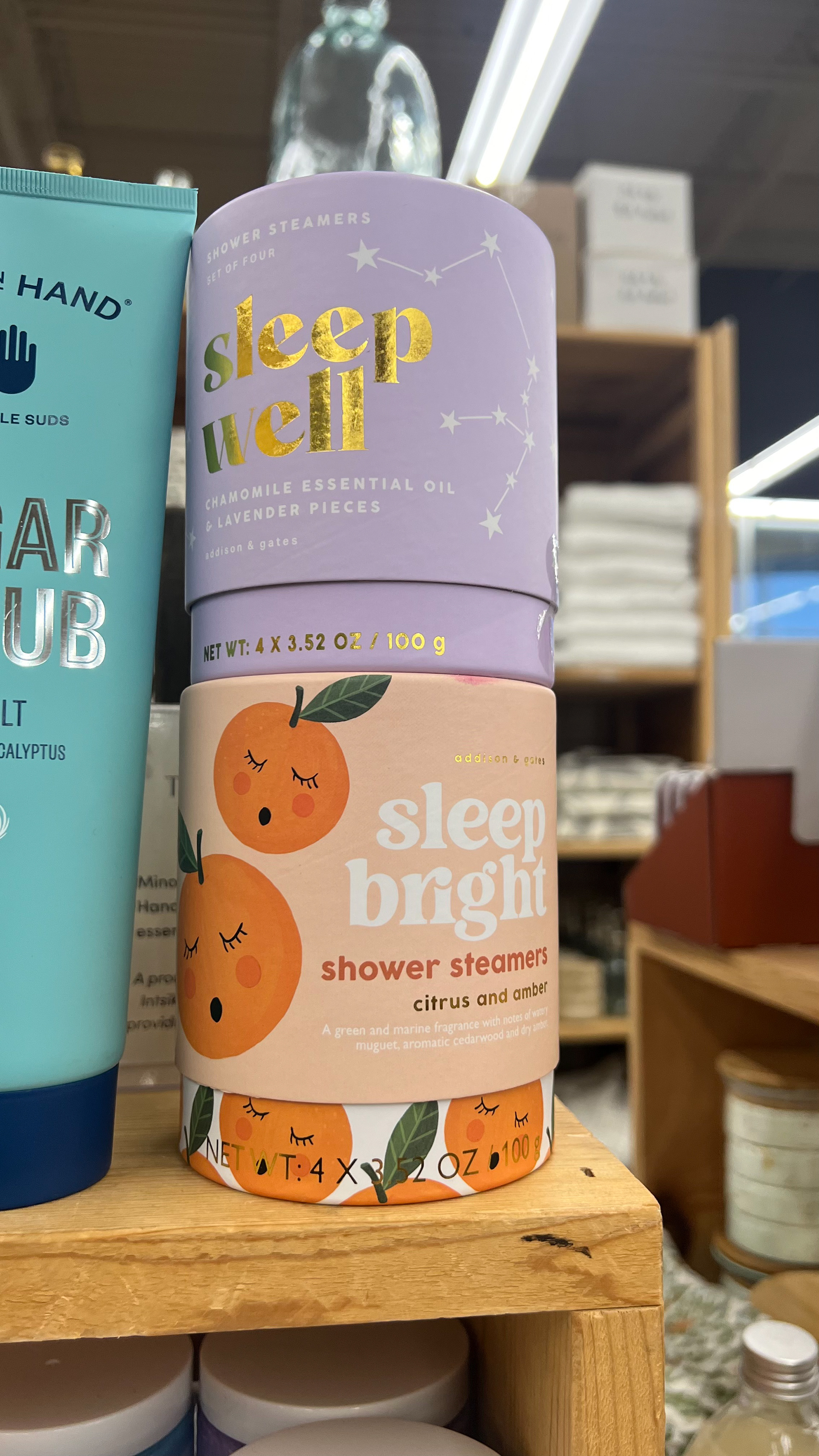
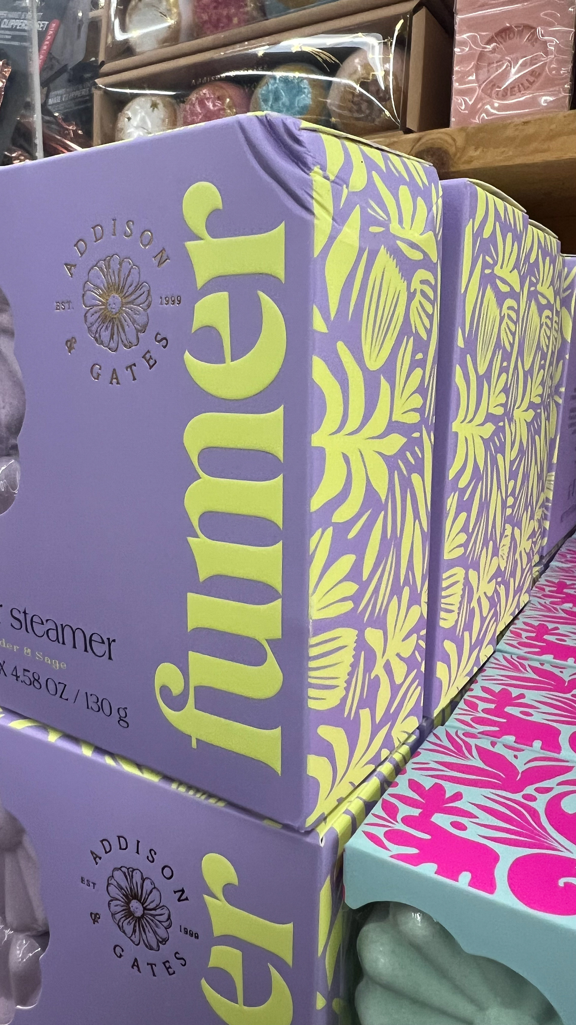
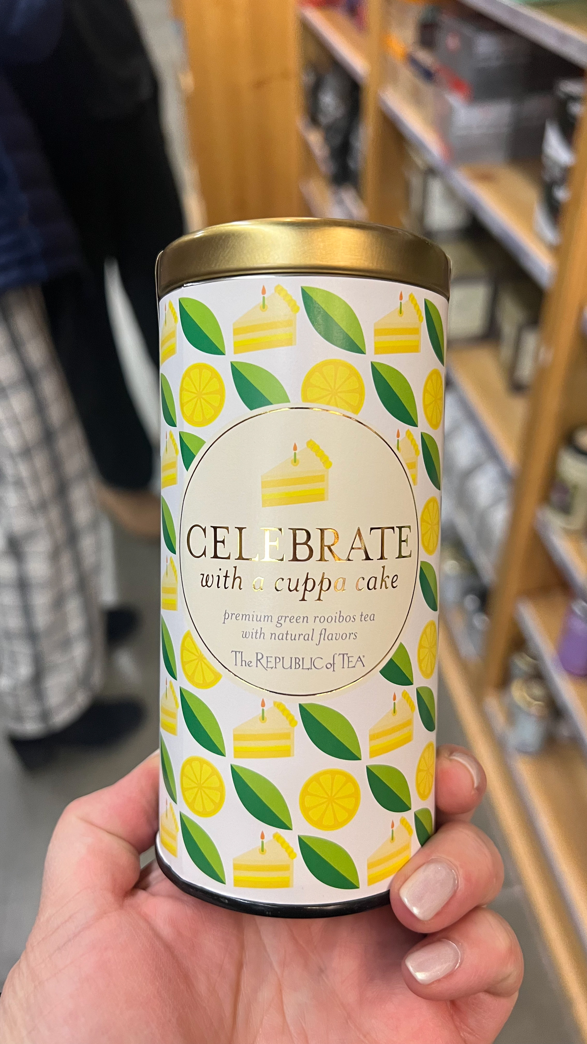
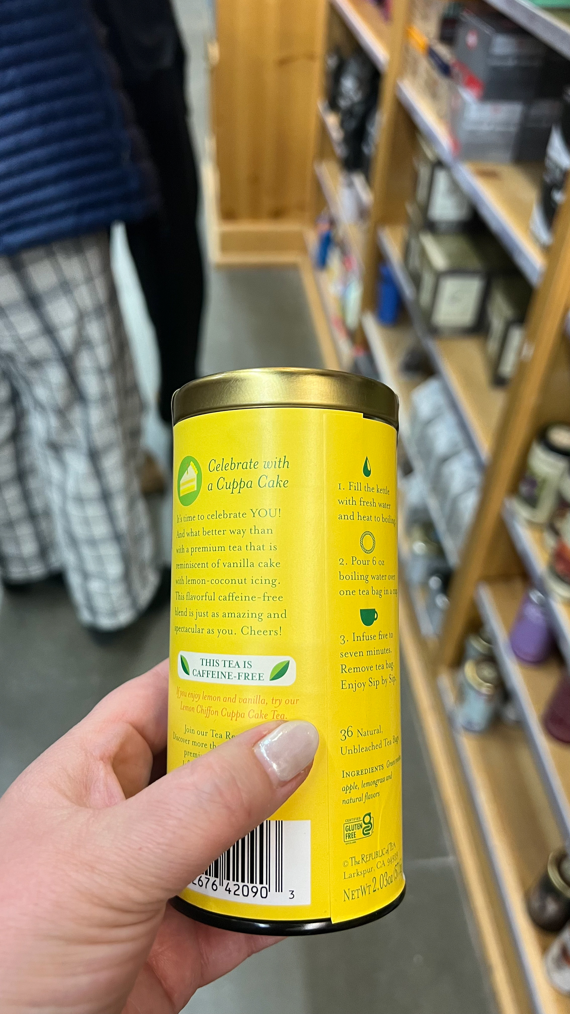
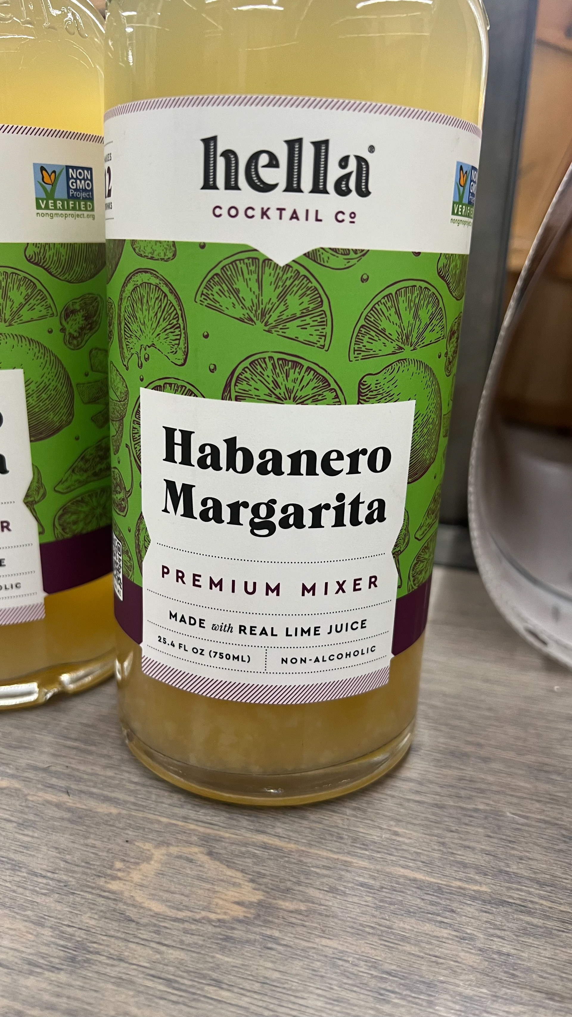
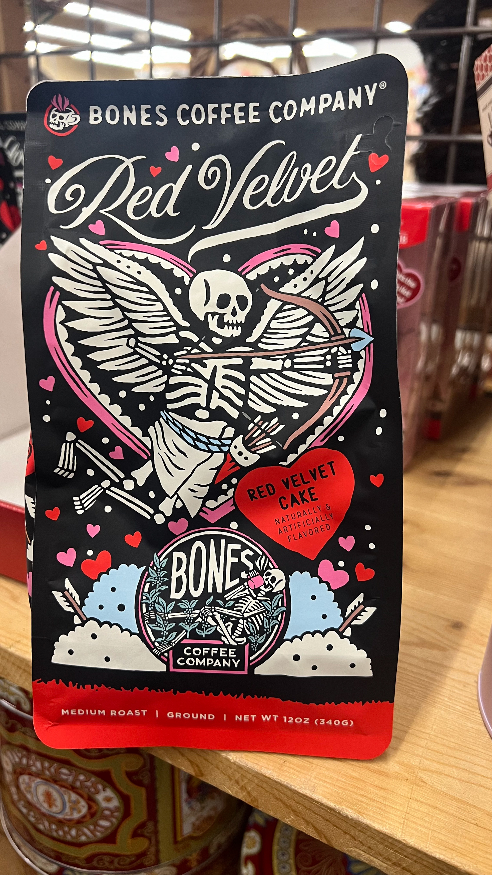
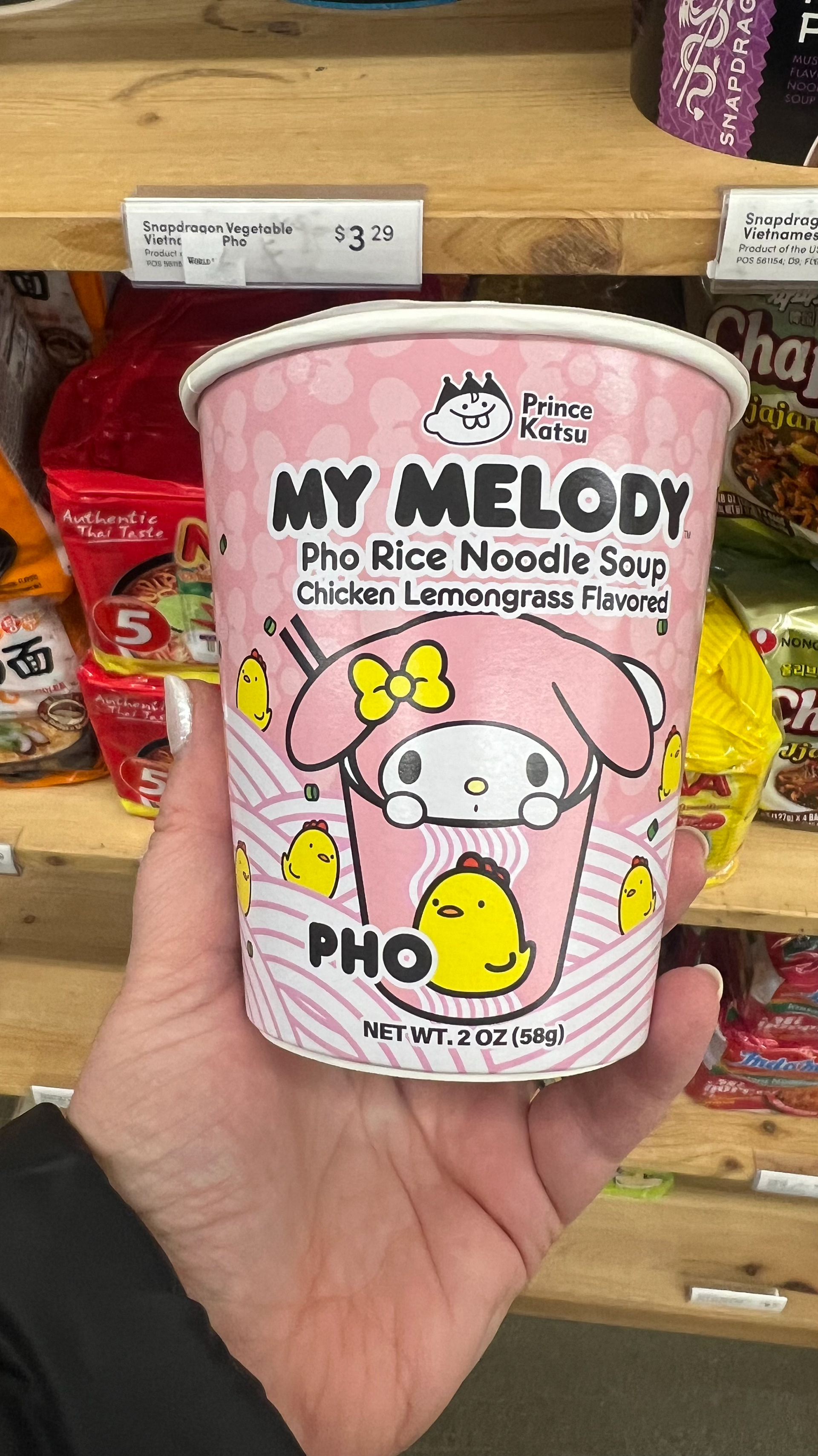
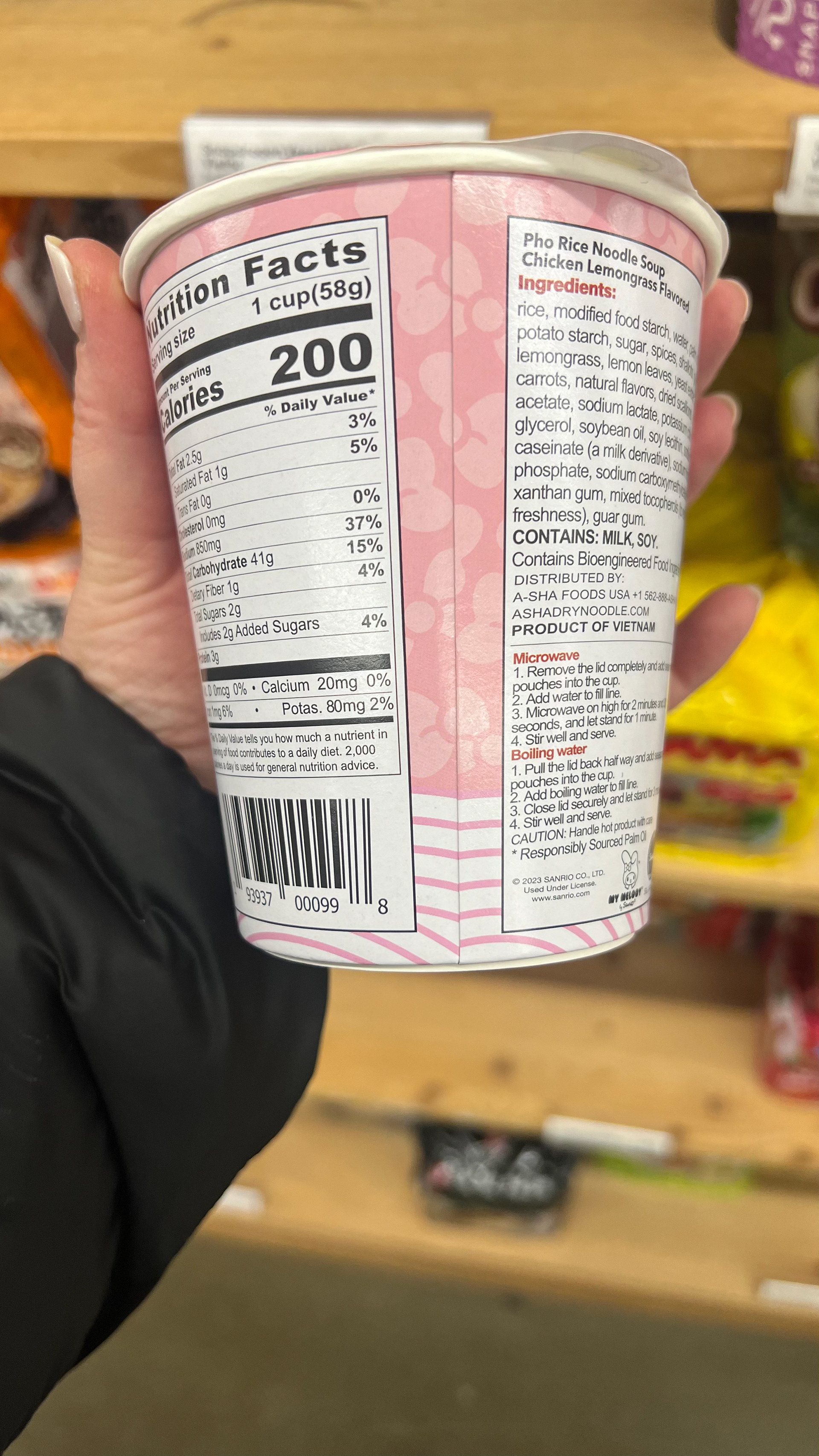
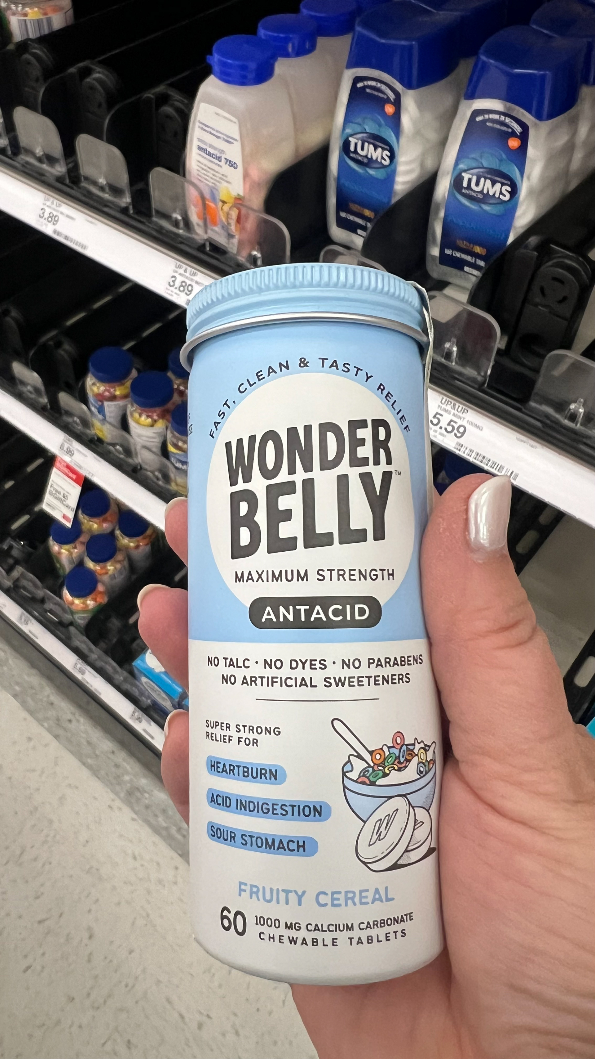
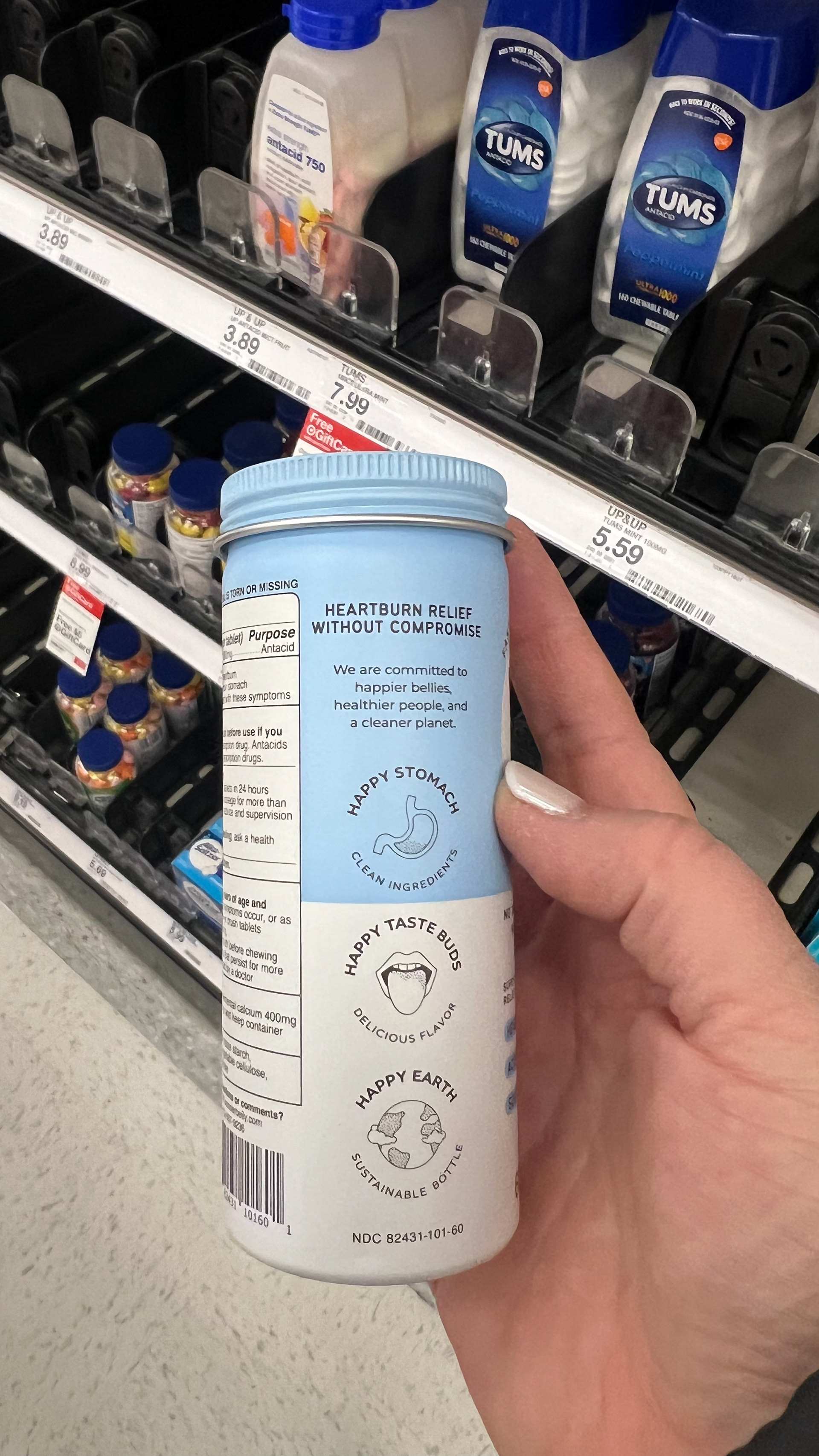
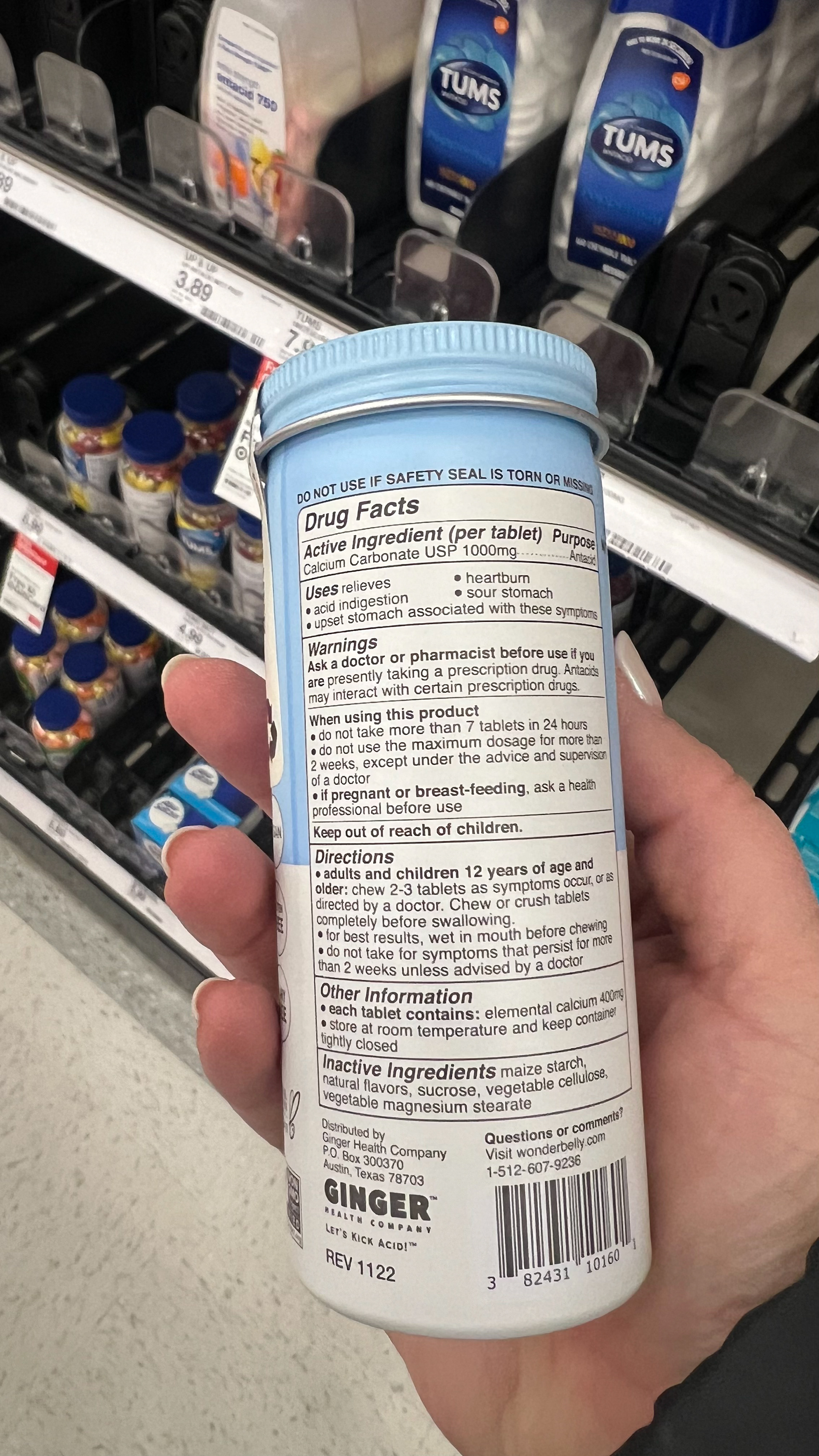
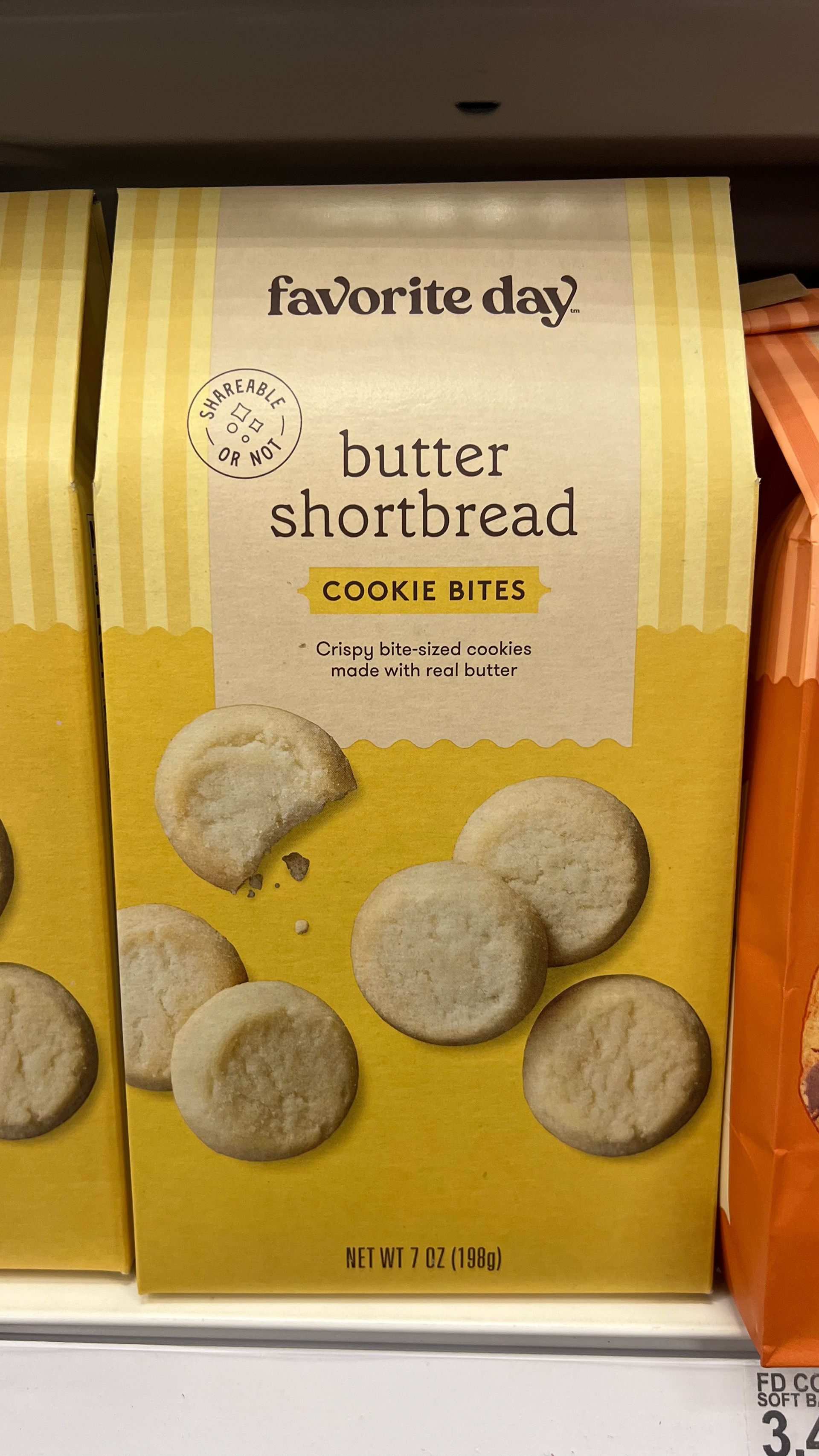
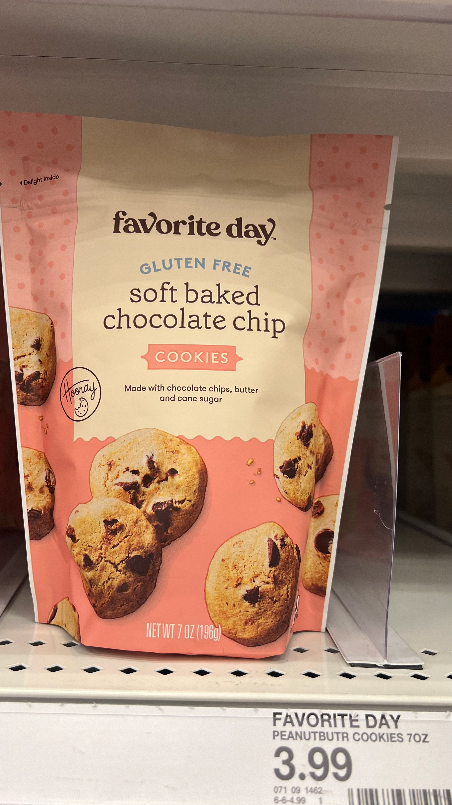
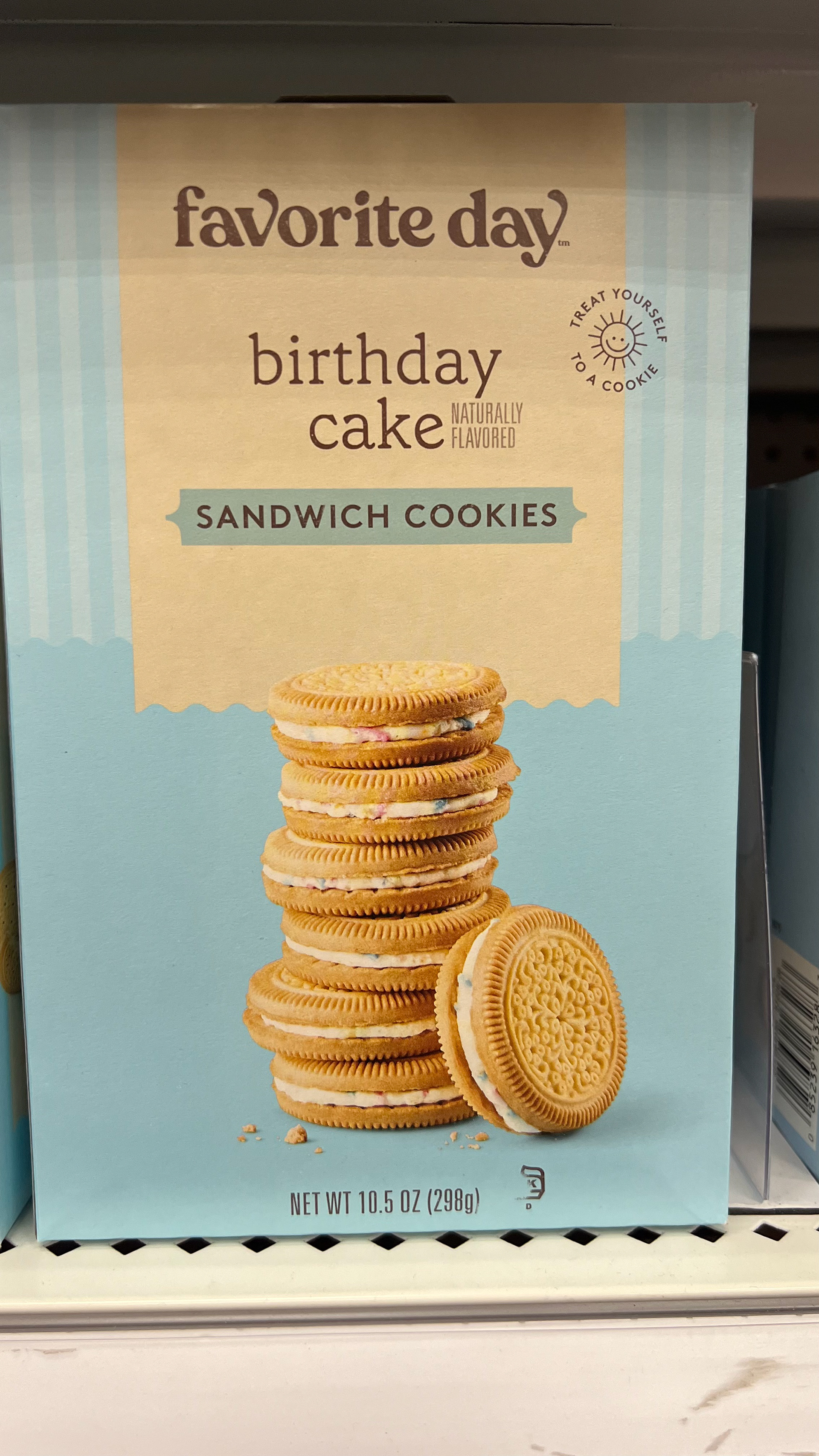
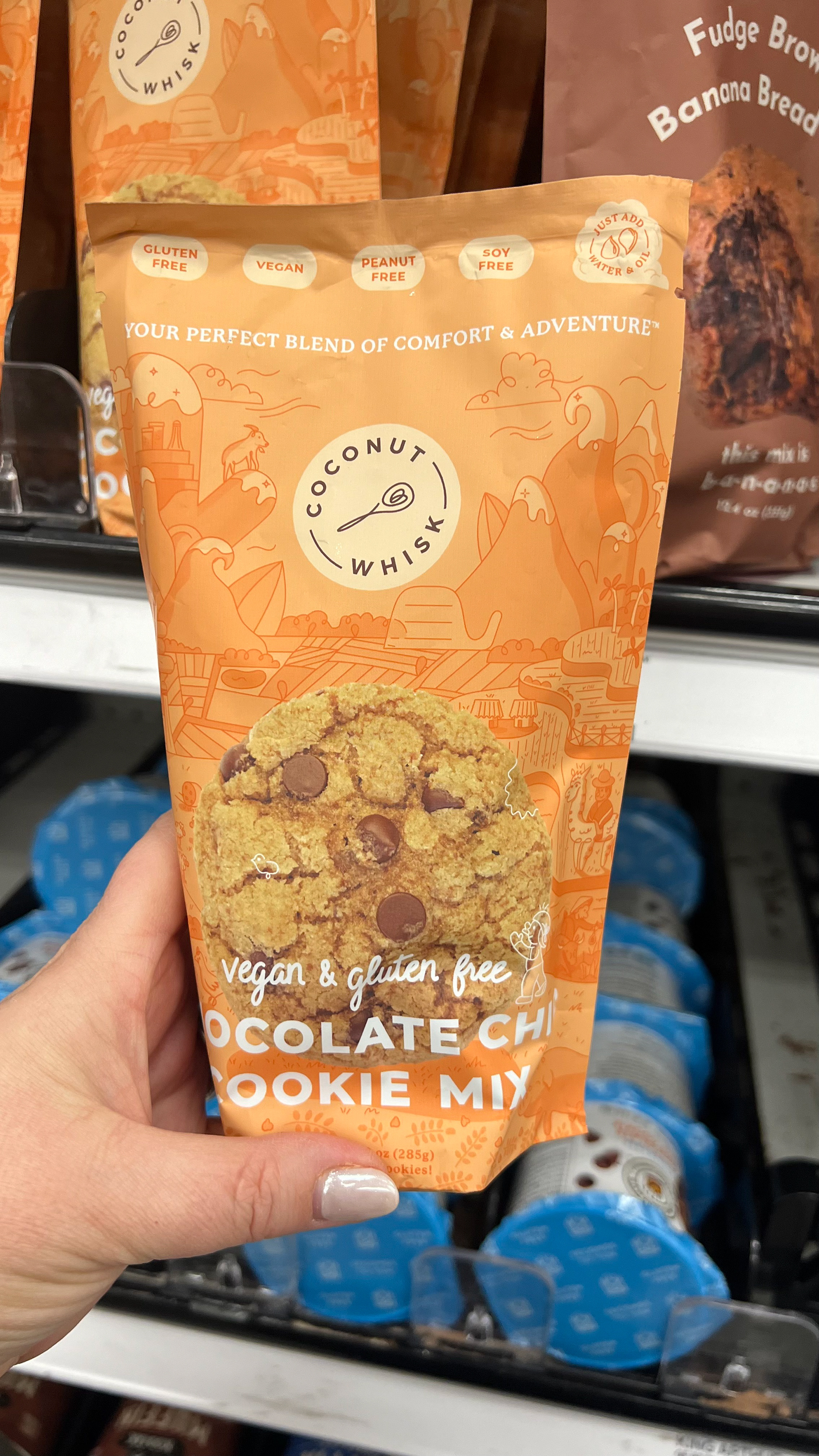
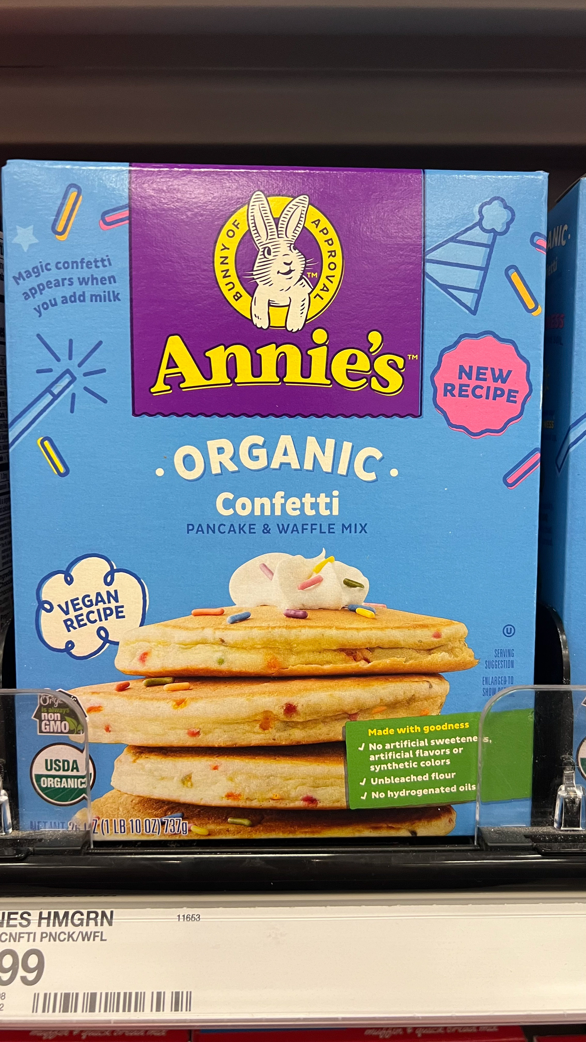
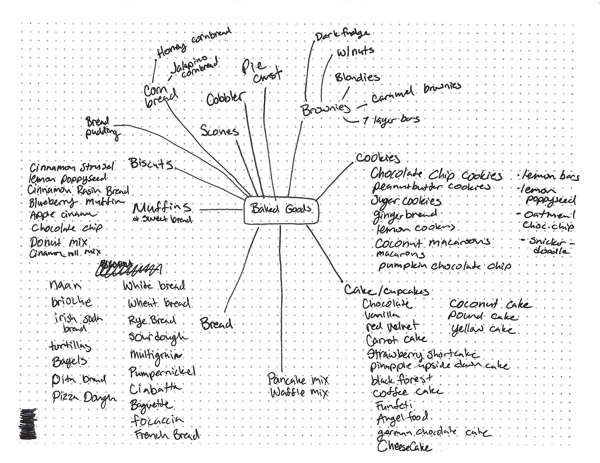
Below is my Pinterest board for design inspiration. I also checked out Target and World Market's packaging for my research. Holding the items in my hand was important to understanding the customer experience better. I noticed that some cylinders had 3 sections, others had 4. This makes it easy to read without tilting it. It's important that the front half is visible and looks good on the shelf. Also, I learned that I shouldn't stretch the title around the cylinder—it needs to be easy to see and read.
Sketches & Doodles
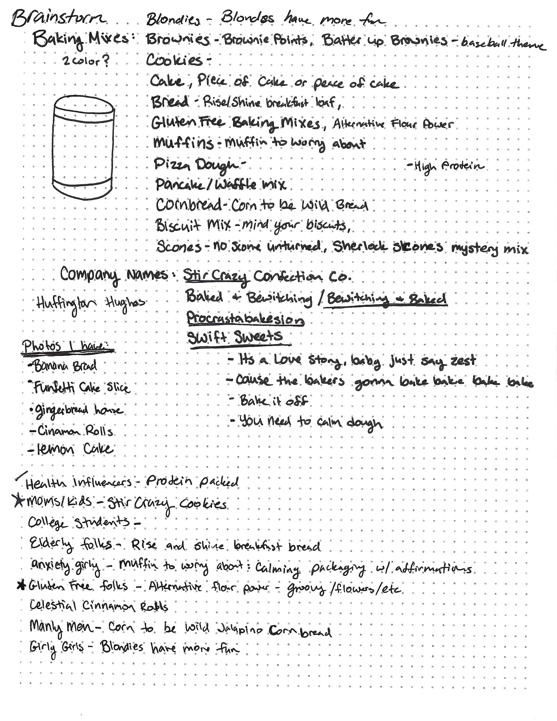
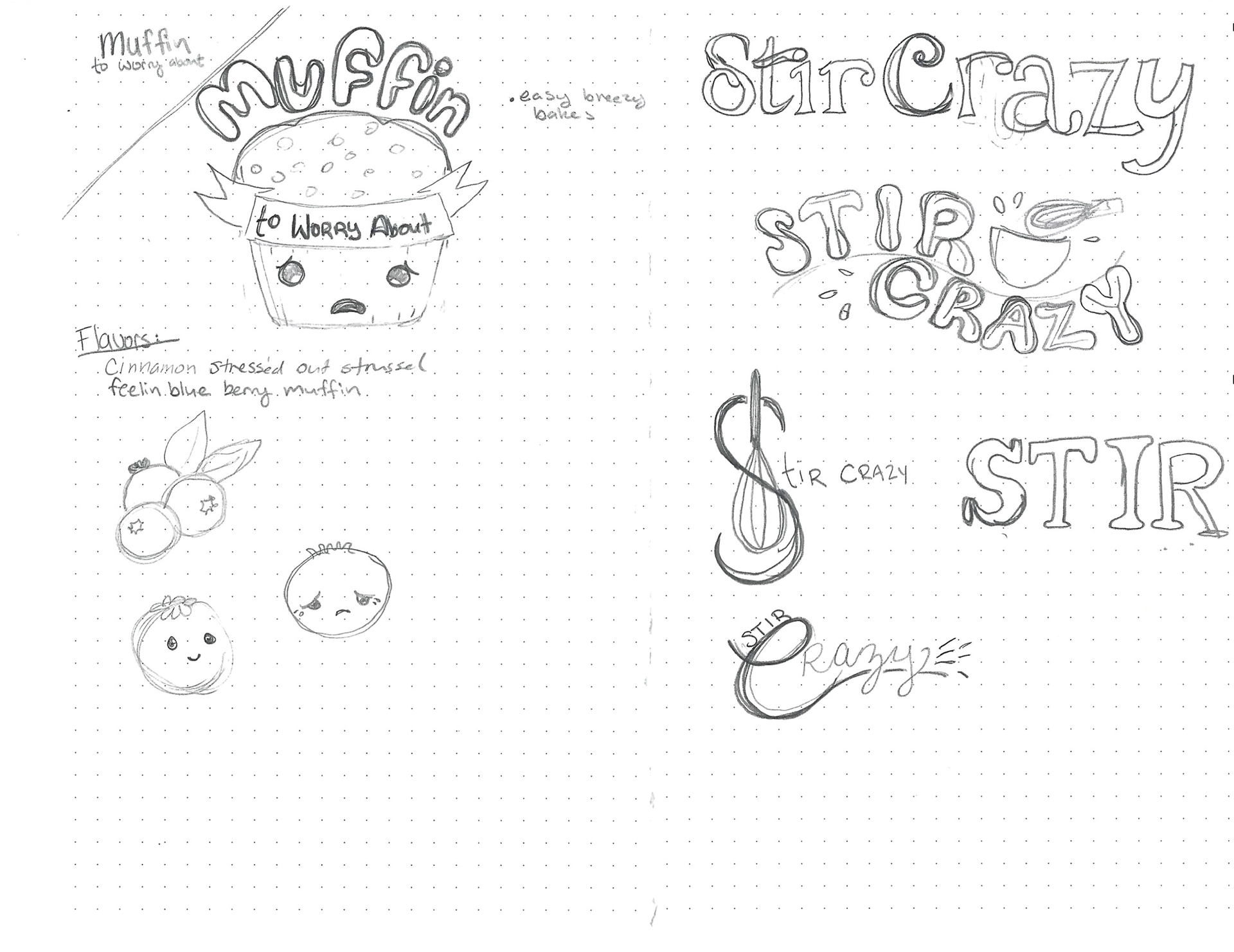
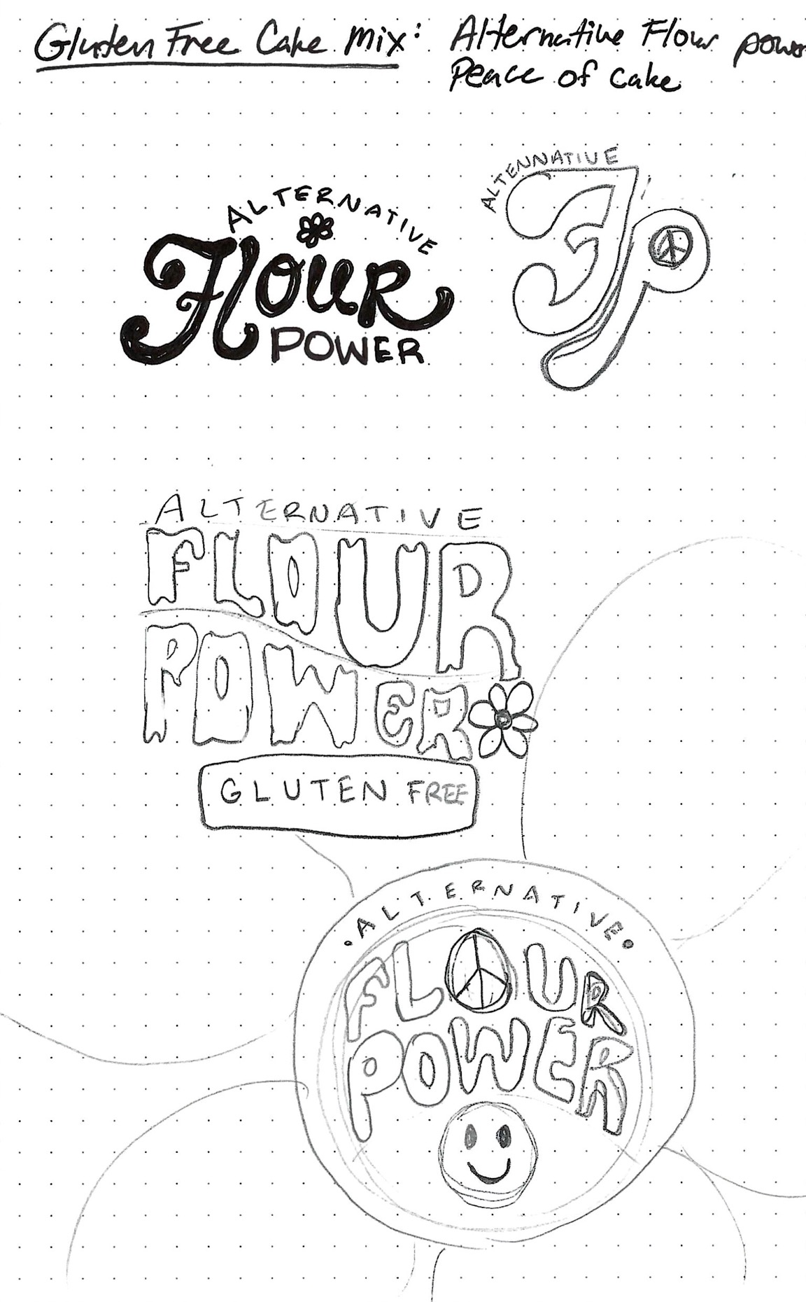
I decided for my first idea I chose to do a muffin mix for the anxious girlies called "Muffin to Worry About" This started out as a joke. This idea originated as a lighthearted gesture when I doodled a concerned muffin for a classmate who was getting overwhelmed with the assignments--even though she's brilliant. The Muffin mix would include funny names like Stressed Out Cinnamon Streusel and Feelin' Blue Berry Muffin. It would be styled in relaxing colors, cute kawaii-inspired characters, and soothing affirmations. My second is a baking mix company geared towards moms and kids. It's something to do when you're home bored or as it would be "Stir-Crazy". Lastly, I wanted to do a Gluten-free mix called "Alternative Flour Power." The theme would be a psychedelic 60's/70's theme and the mix would include really naturalist, earthy-sounding grains like amaranth and chia.
Thumbnails
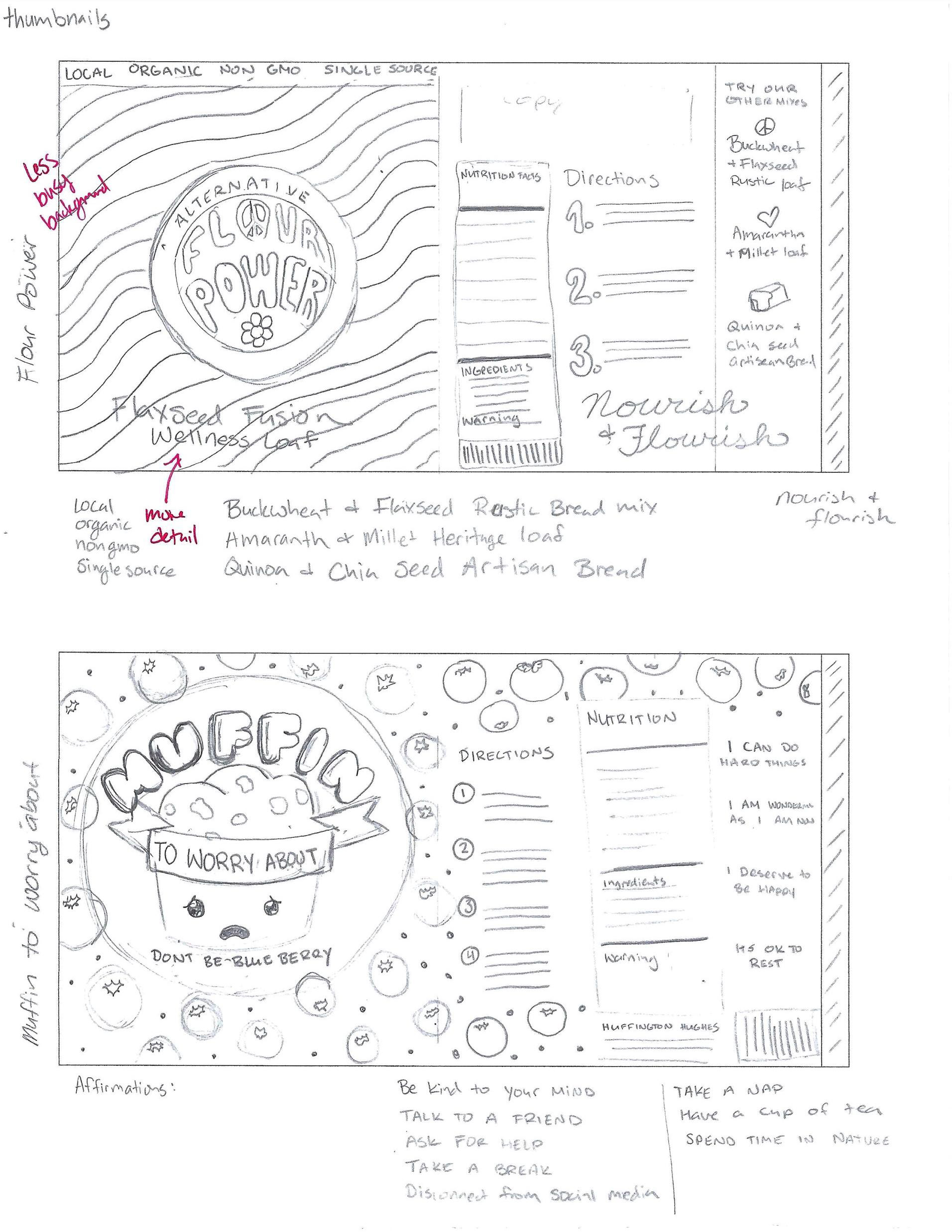
Initially, I designed the packaging for Alternative Flour Power with a groovy style. However, I later changed my approach to something more in line with the traditional aesthetics found at Whole Foods. For the lemon cake mix, I opted for a playful and childlike font, complemented by a cute lemon illustration. The package will prominently display a photo of the lemon cake. In contrast, for Muffin to Worry About, I embraced a full-on cute aesthetic, including a fun blueberry pattern in the design.
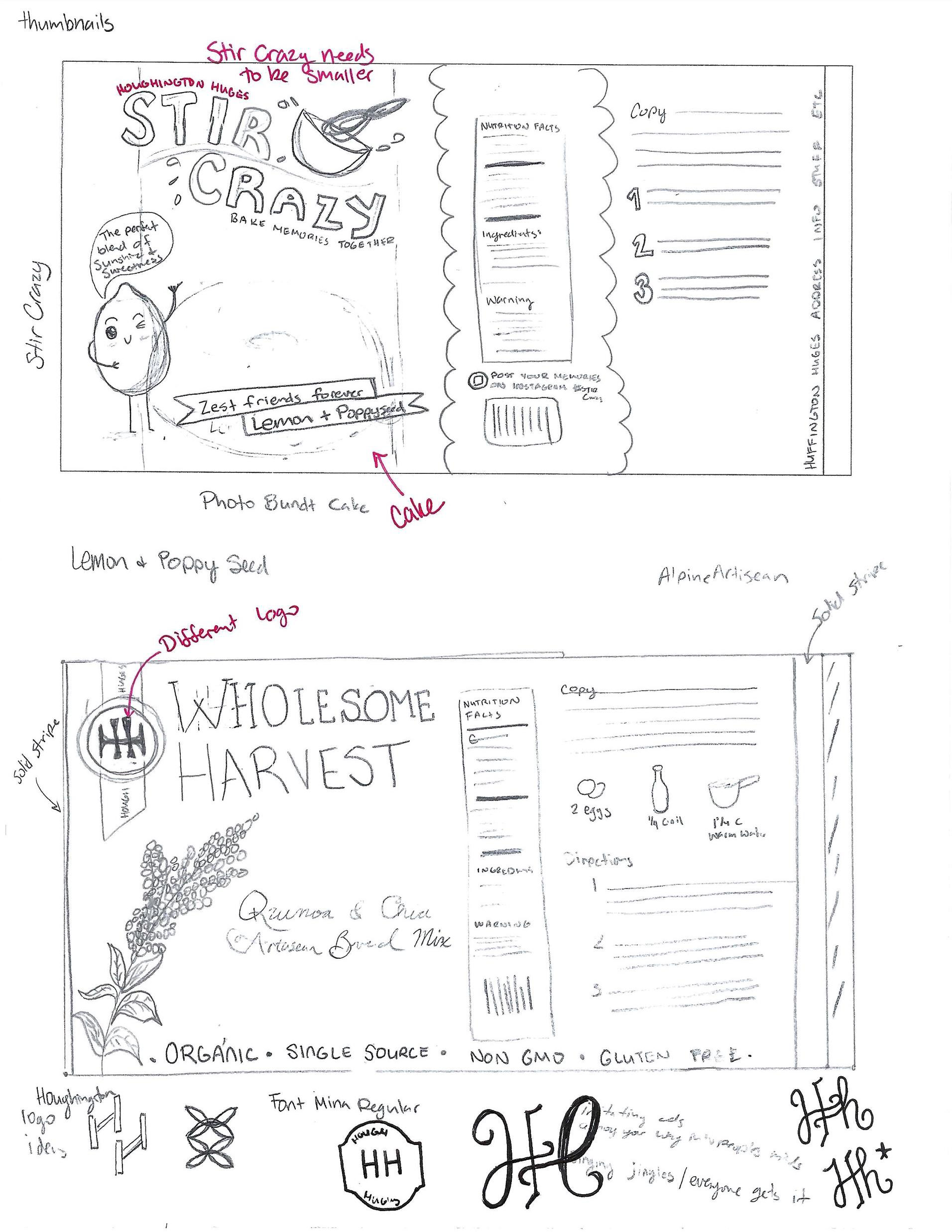
Thumbnail Dummies
When I made my dummies I could tell that a lot of my elements will need to be much smaller. Specifically the stir-crazy logo. It was helpful to build the dummies. I will be better prepared for the intermediates.
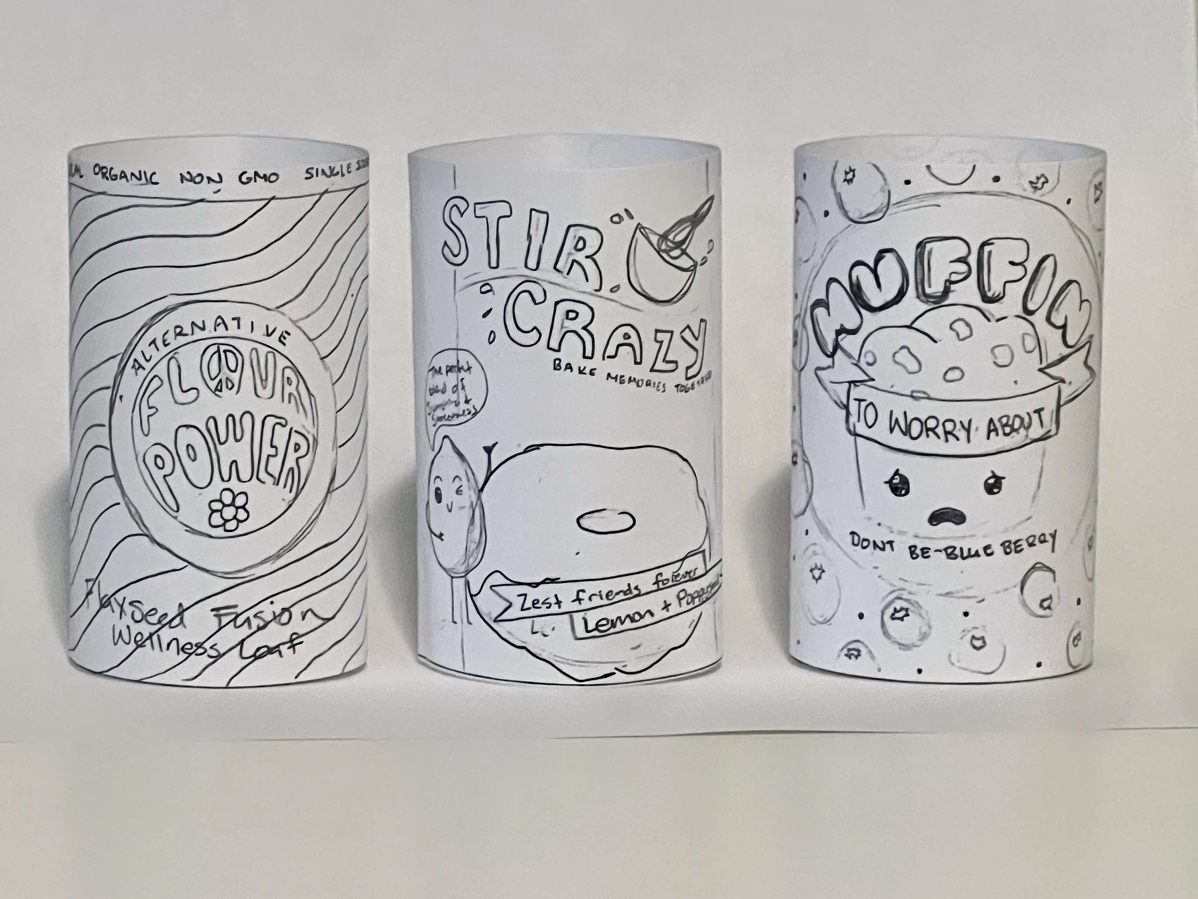
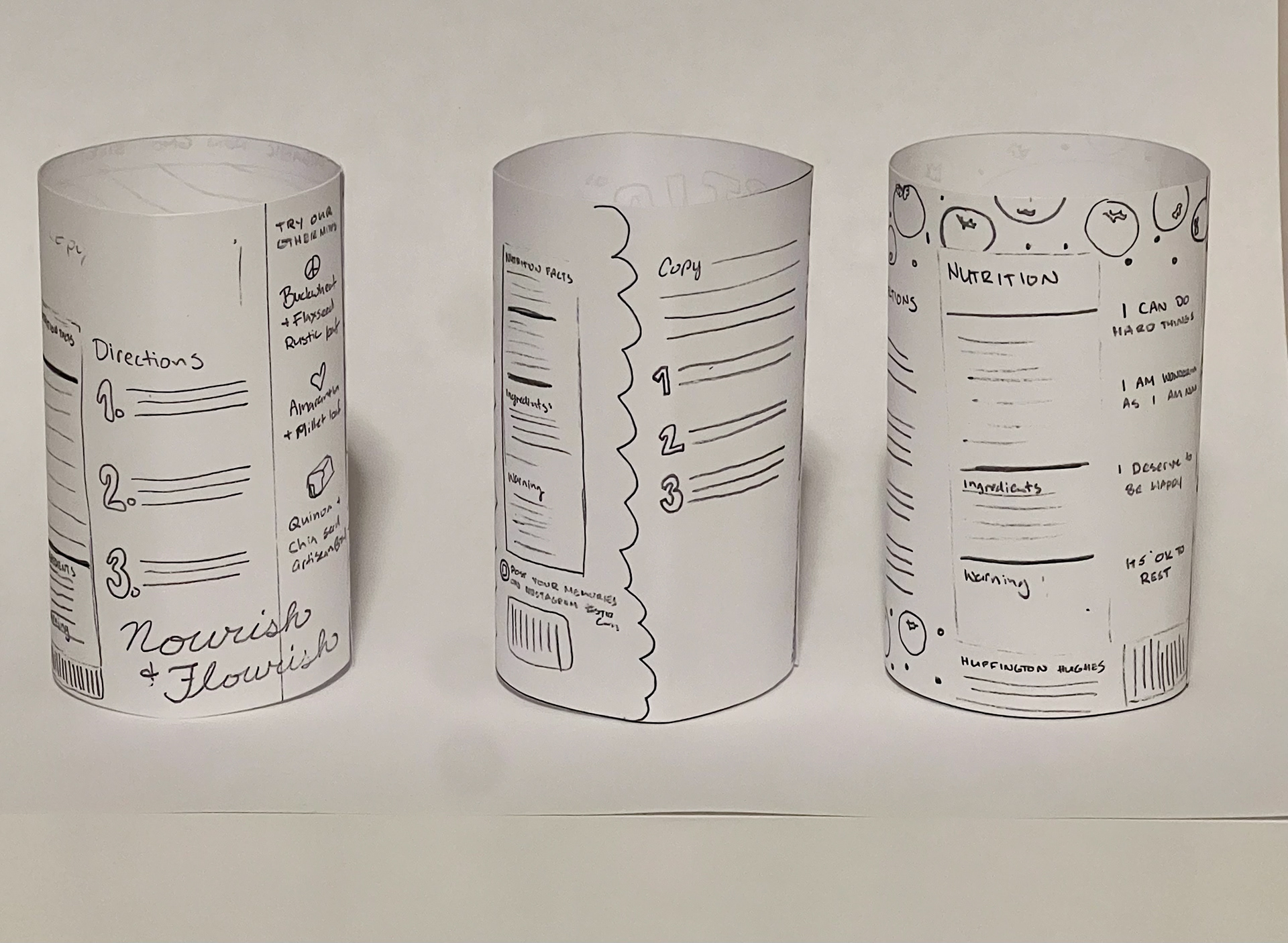
Intermediate Thumbnails
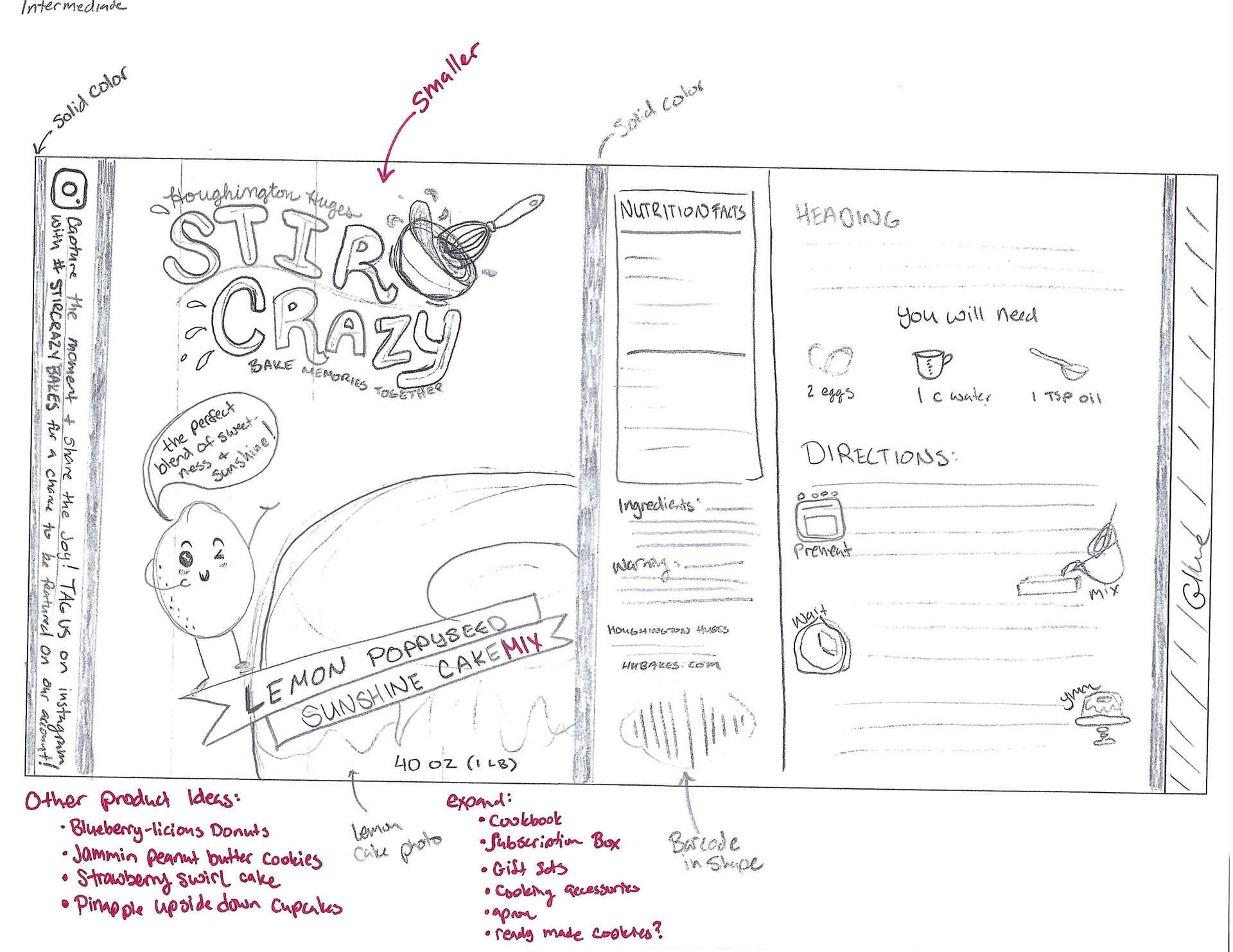
I chose to explore the product design for Wholesome Harvest and Stir Crazy.
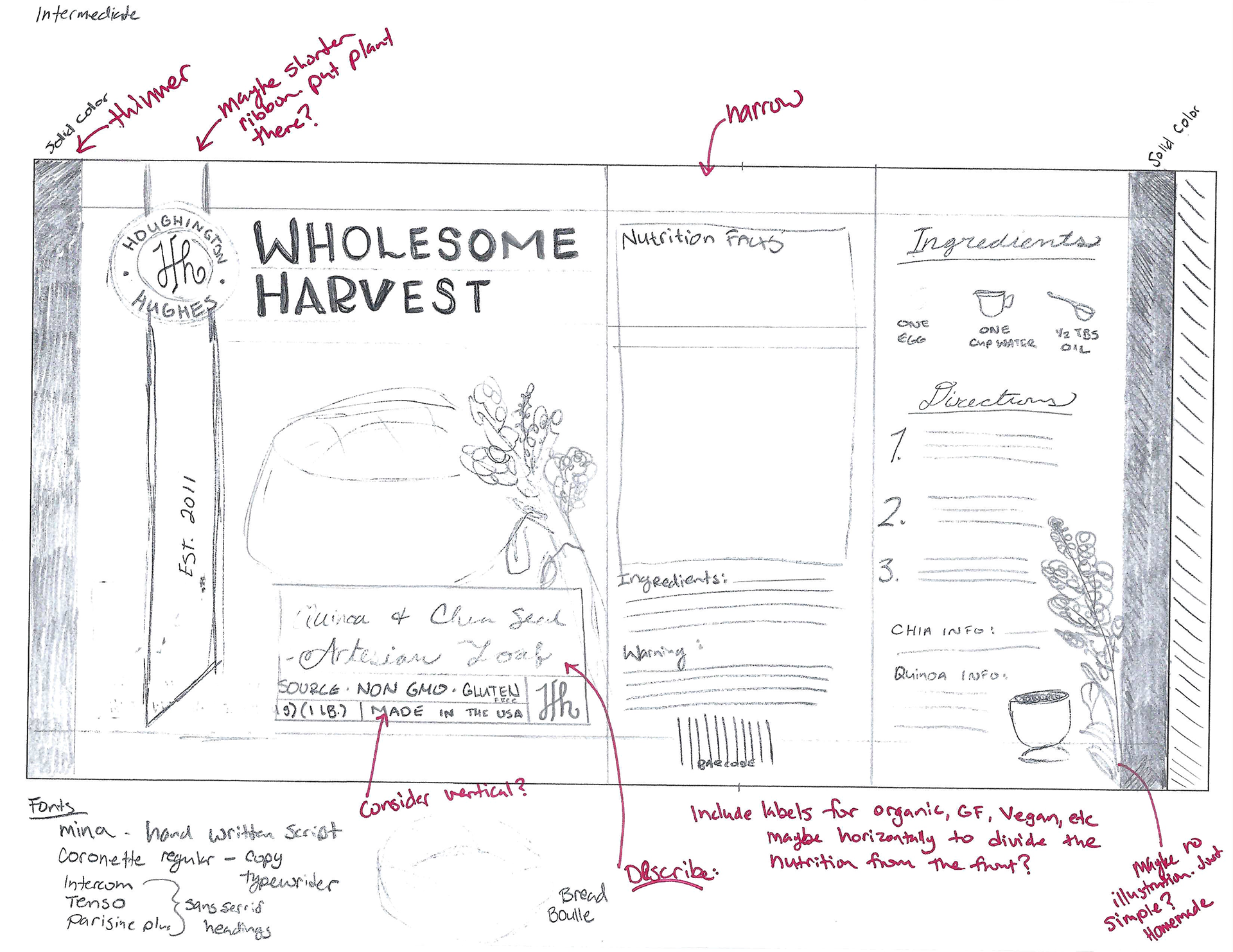
Intermediate Dummies
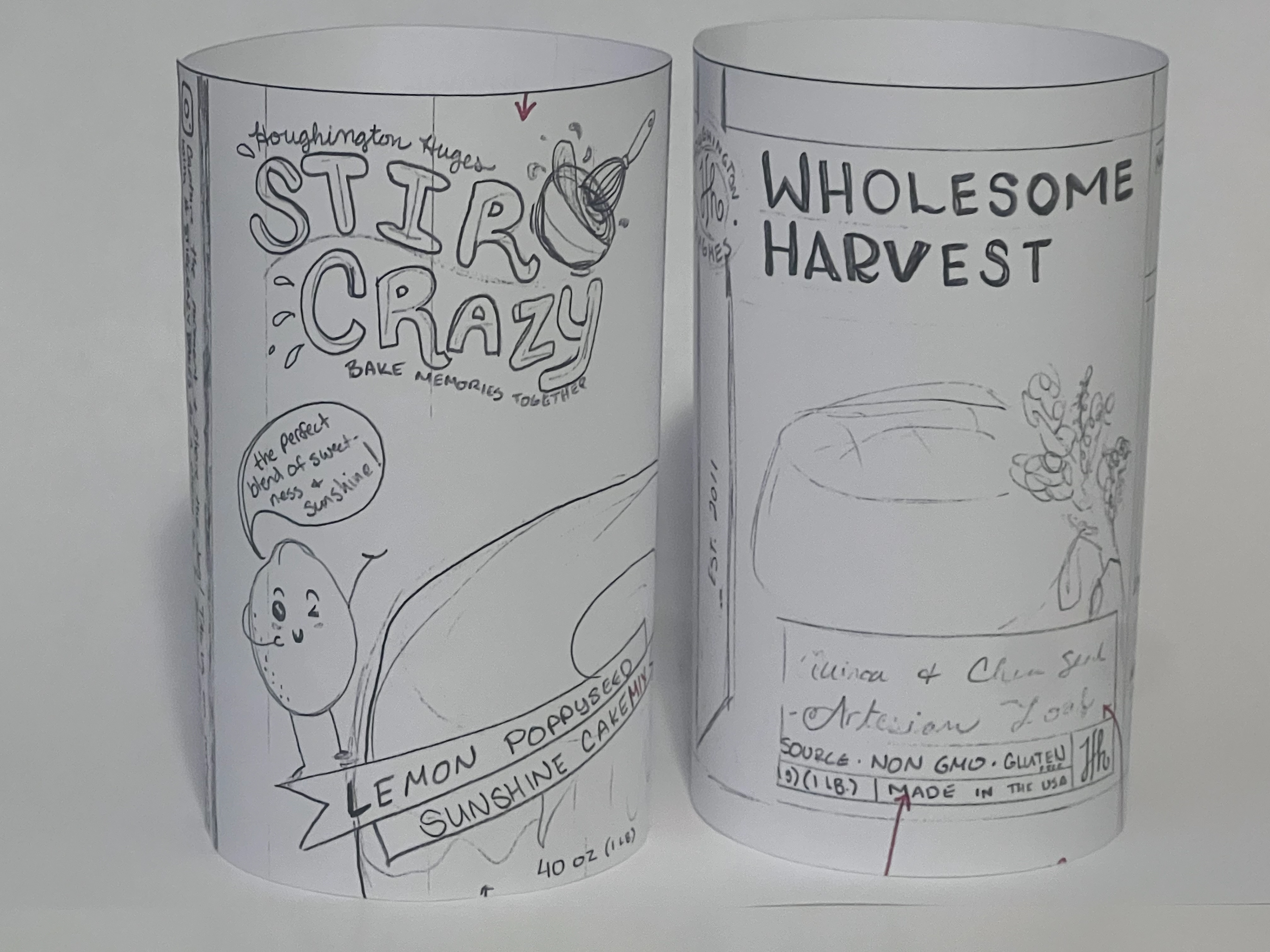
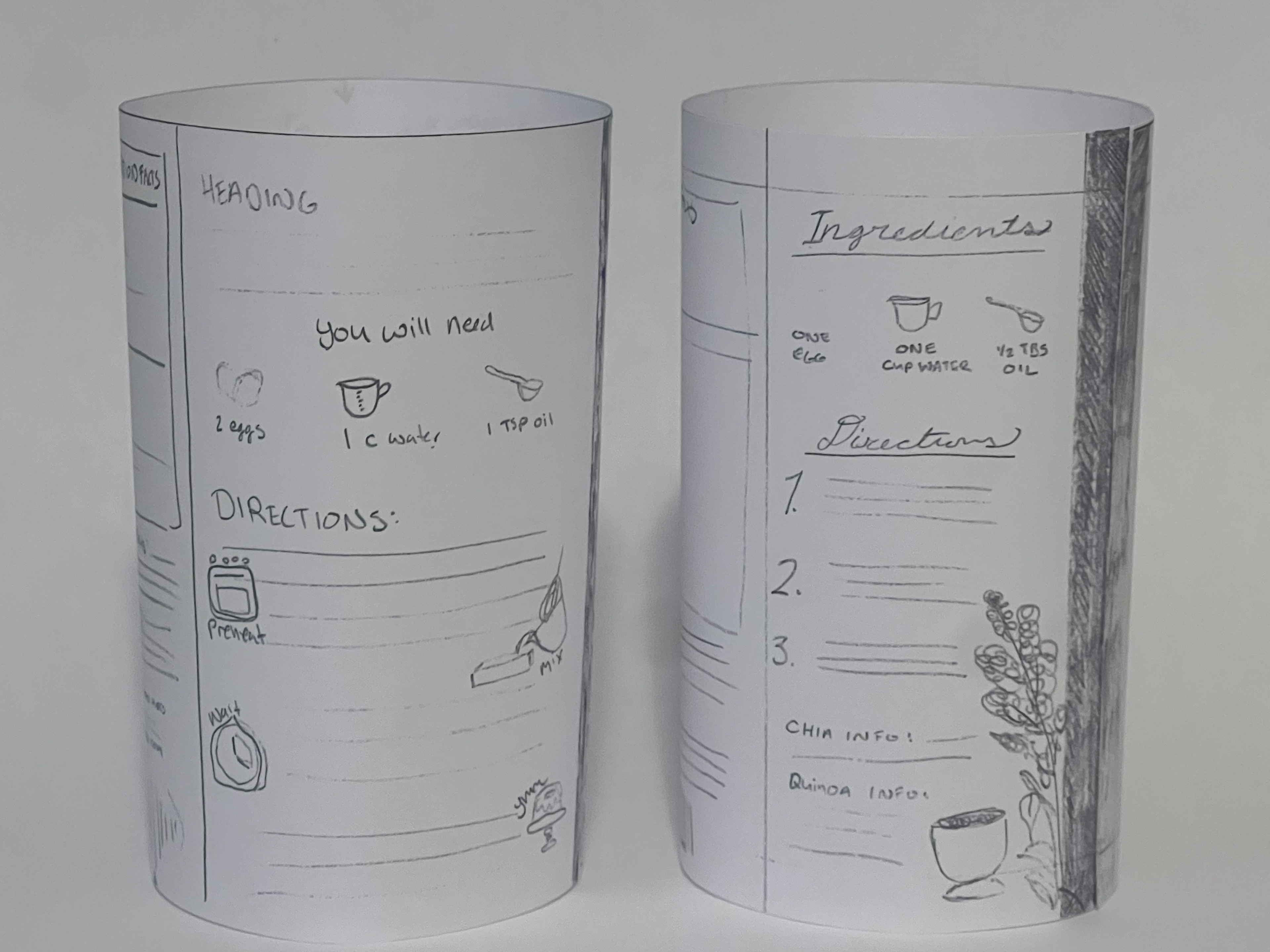
Here are my intermediate dummies. It really helps to see the design assembled. I still need to reduce the size of the graphics on the front
Final Hand Comp
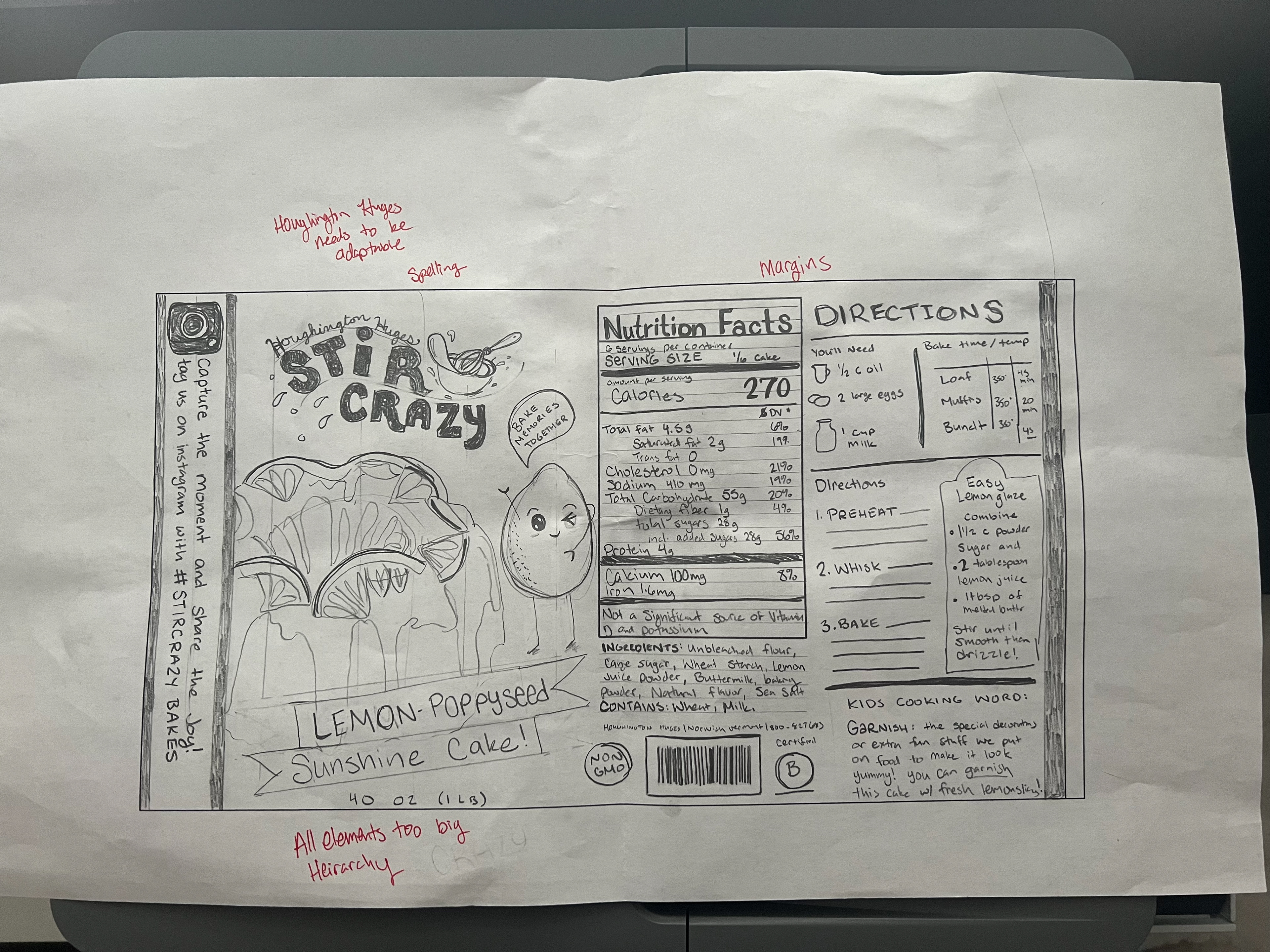
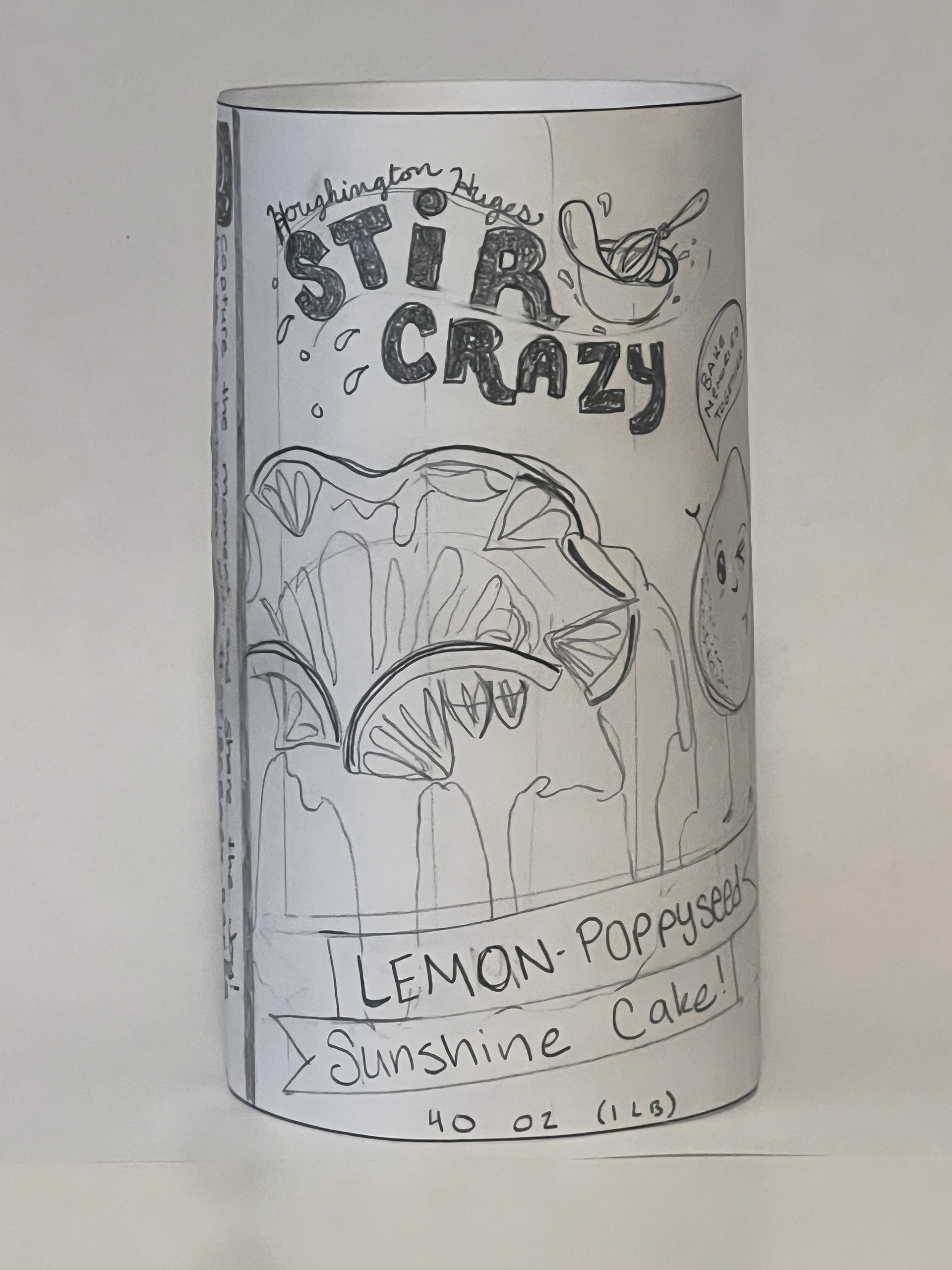
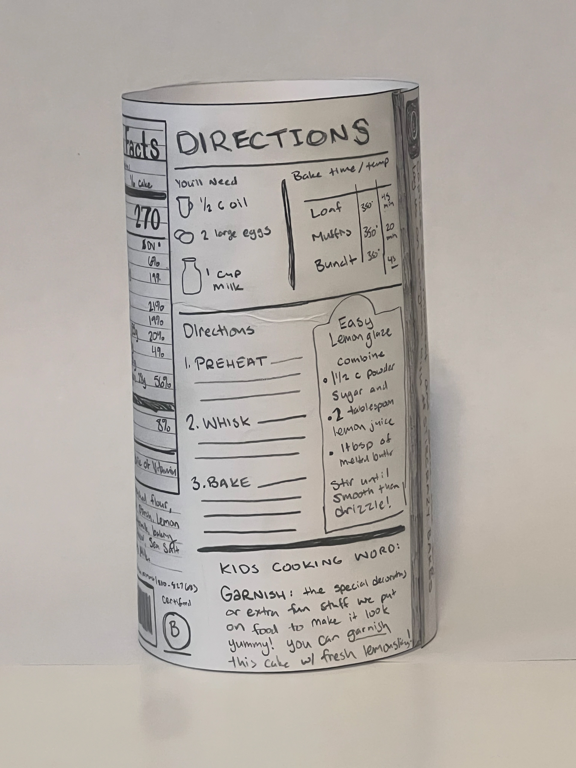
After doing my final hand comp I realized that I need to have wider margins and more space. Everything is very crowded and I need to make things smaller in my computer progressions.

Computer Progressions:
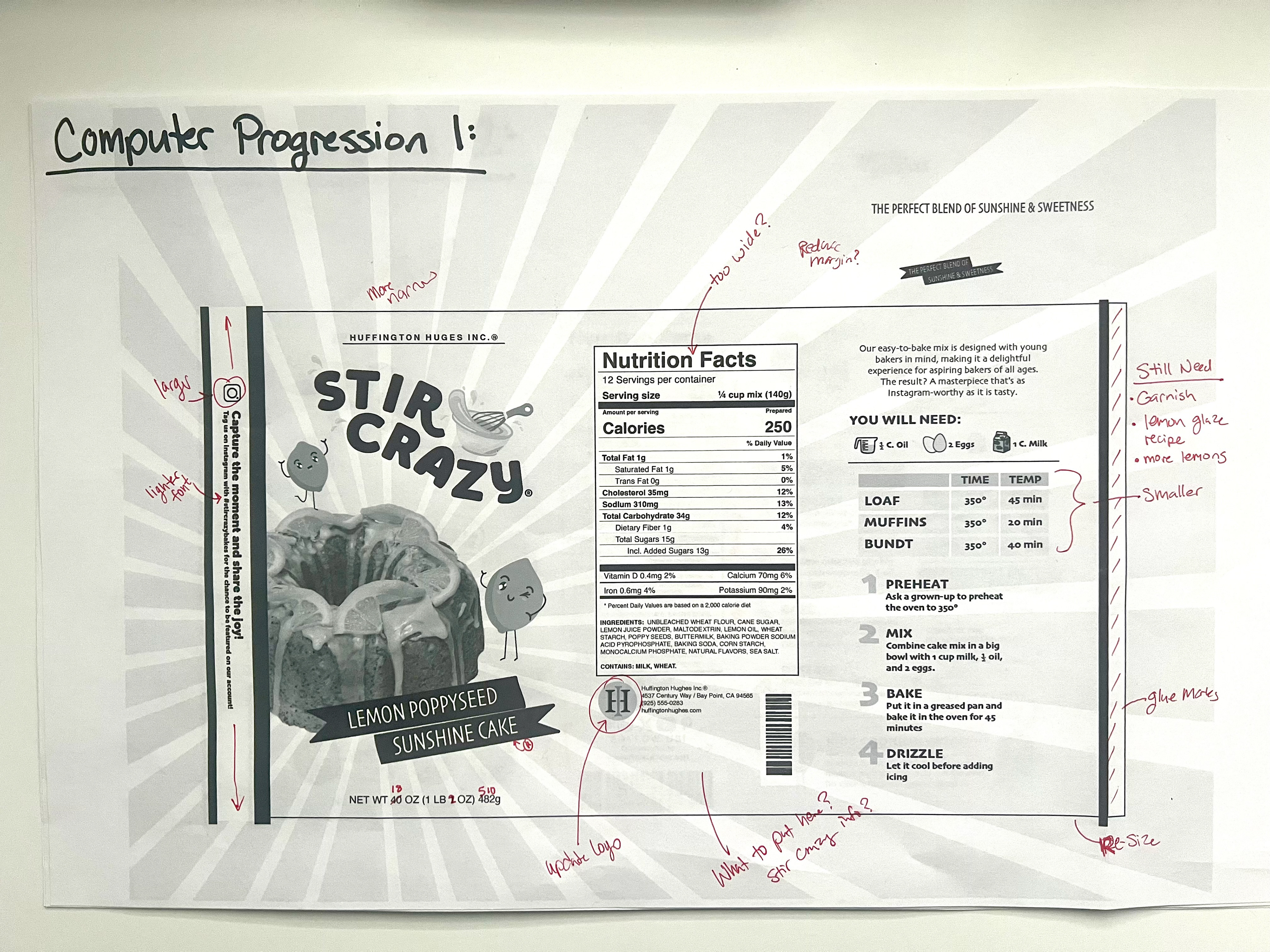
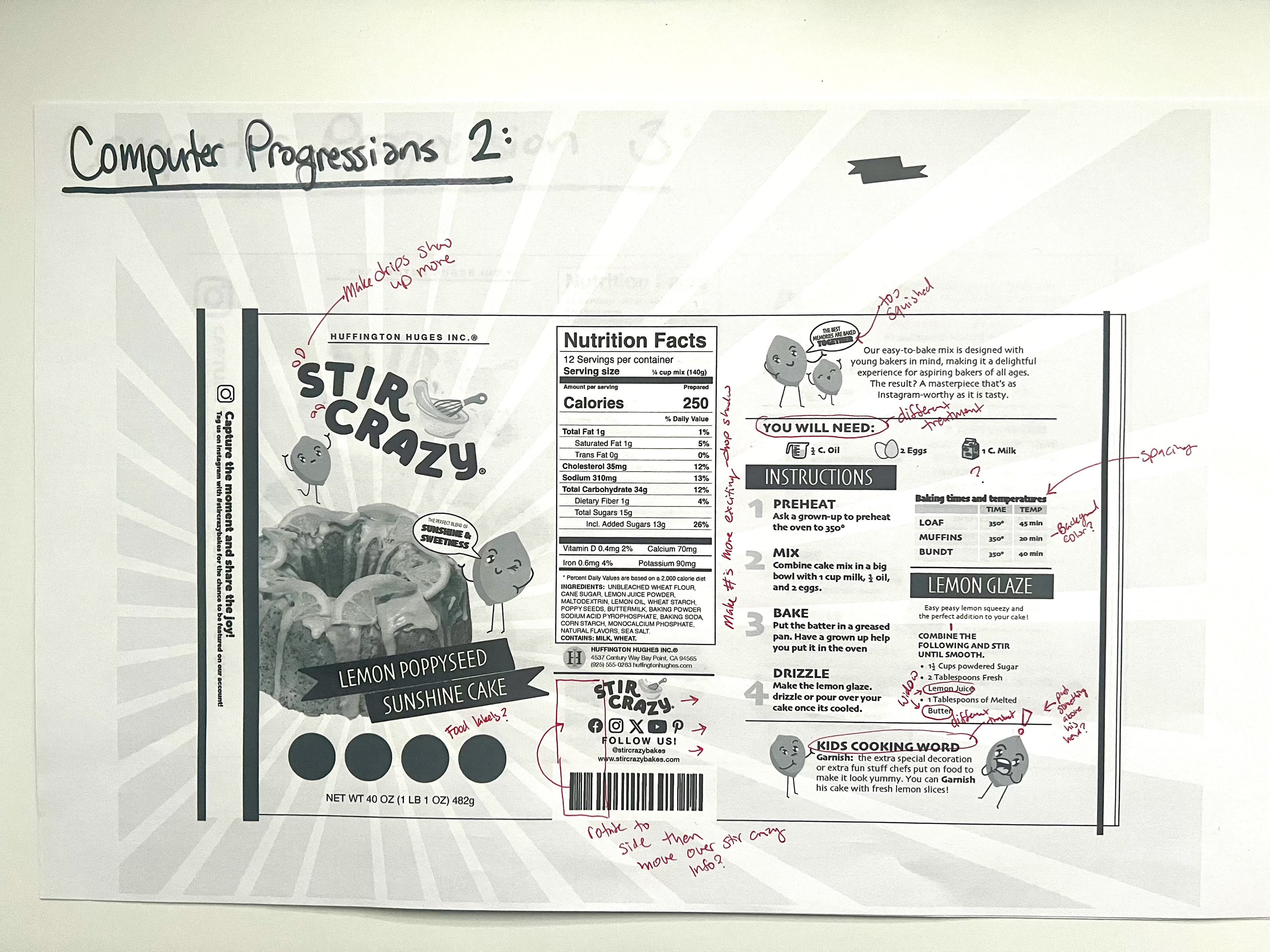
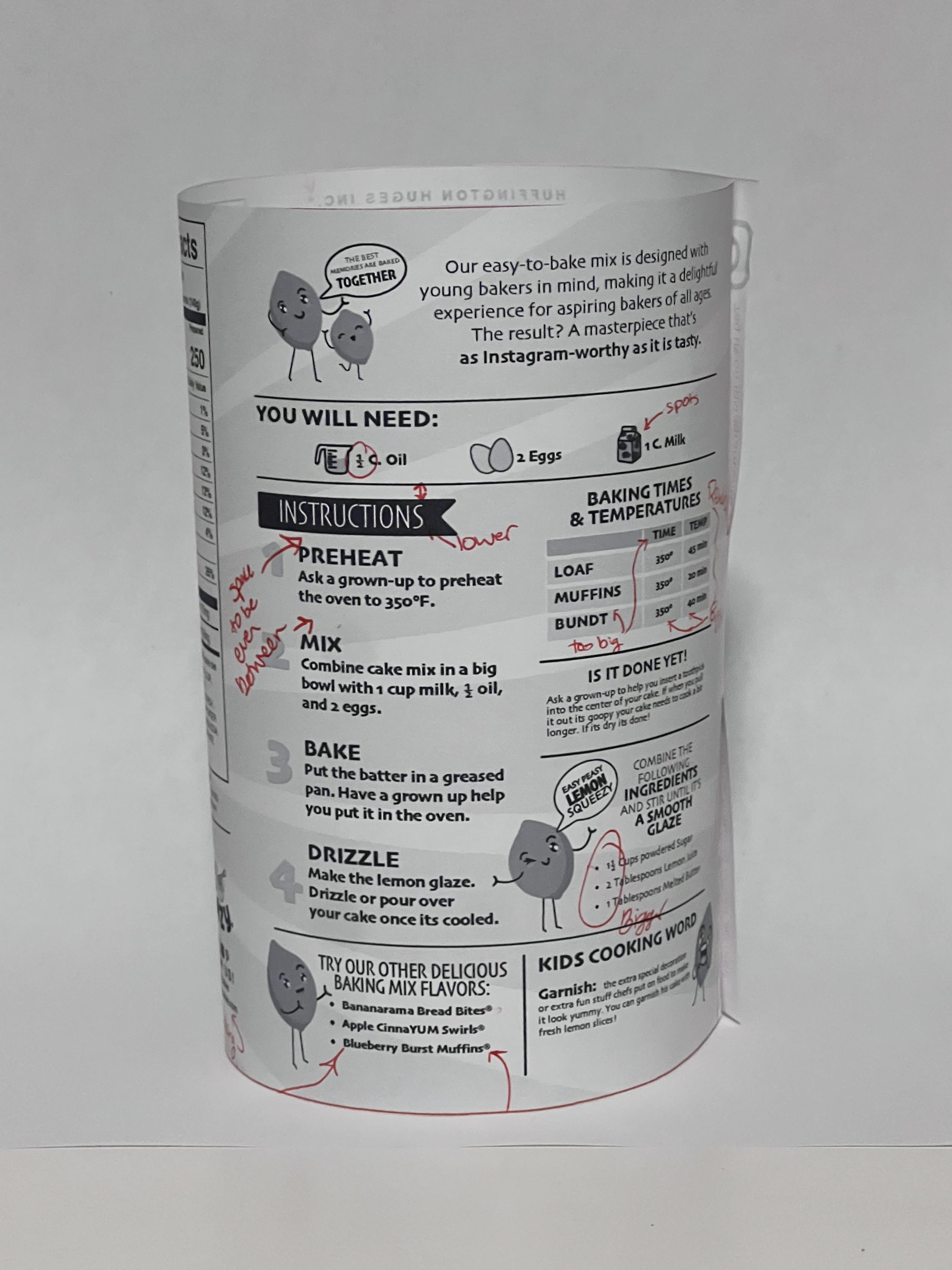
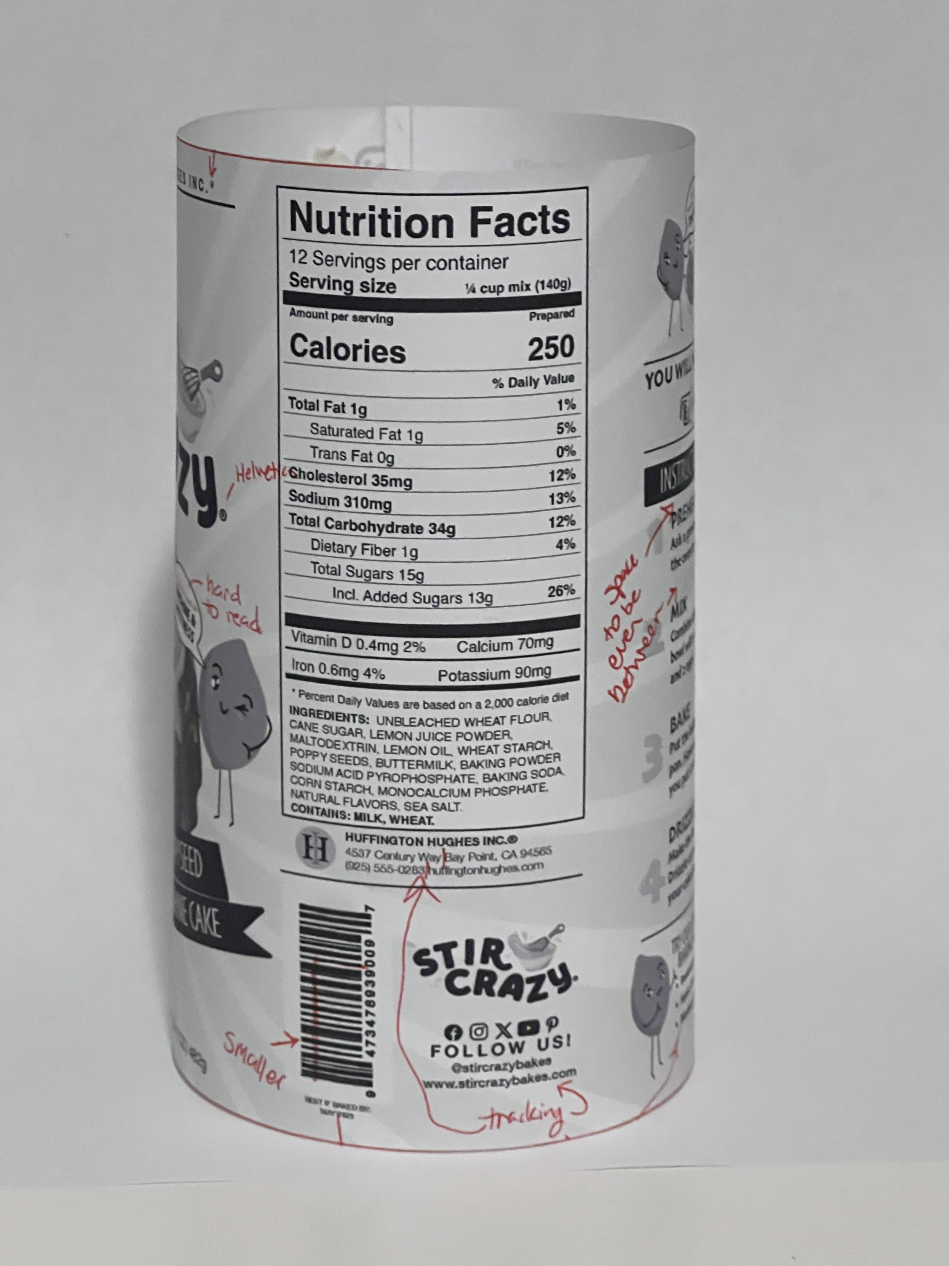
These are my computer progressions
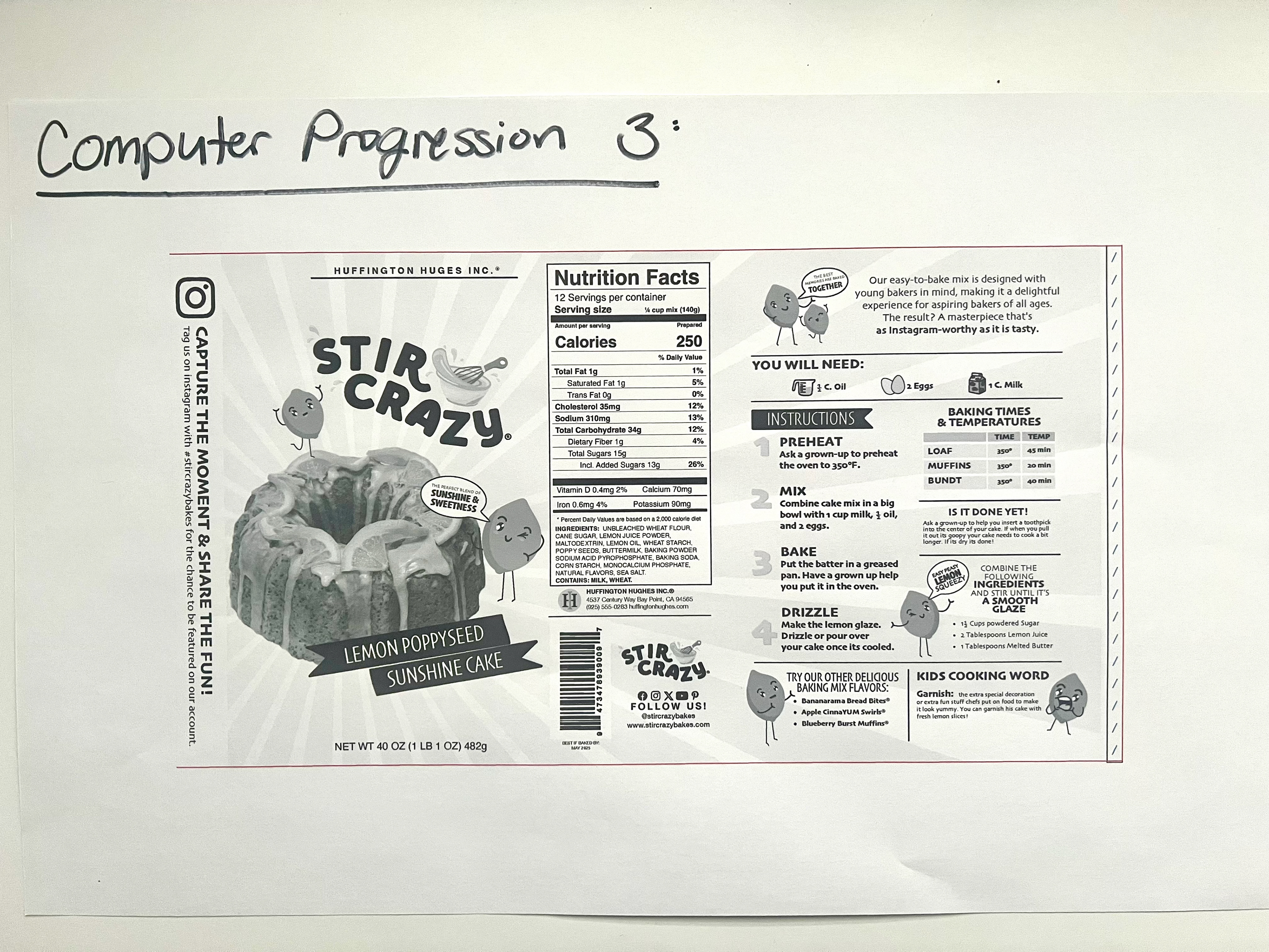
Computer Progression Dummies
click to enlarge
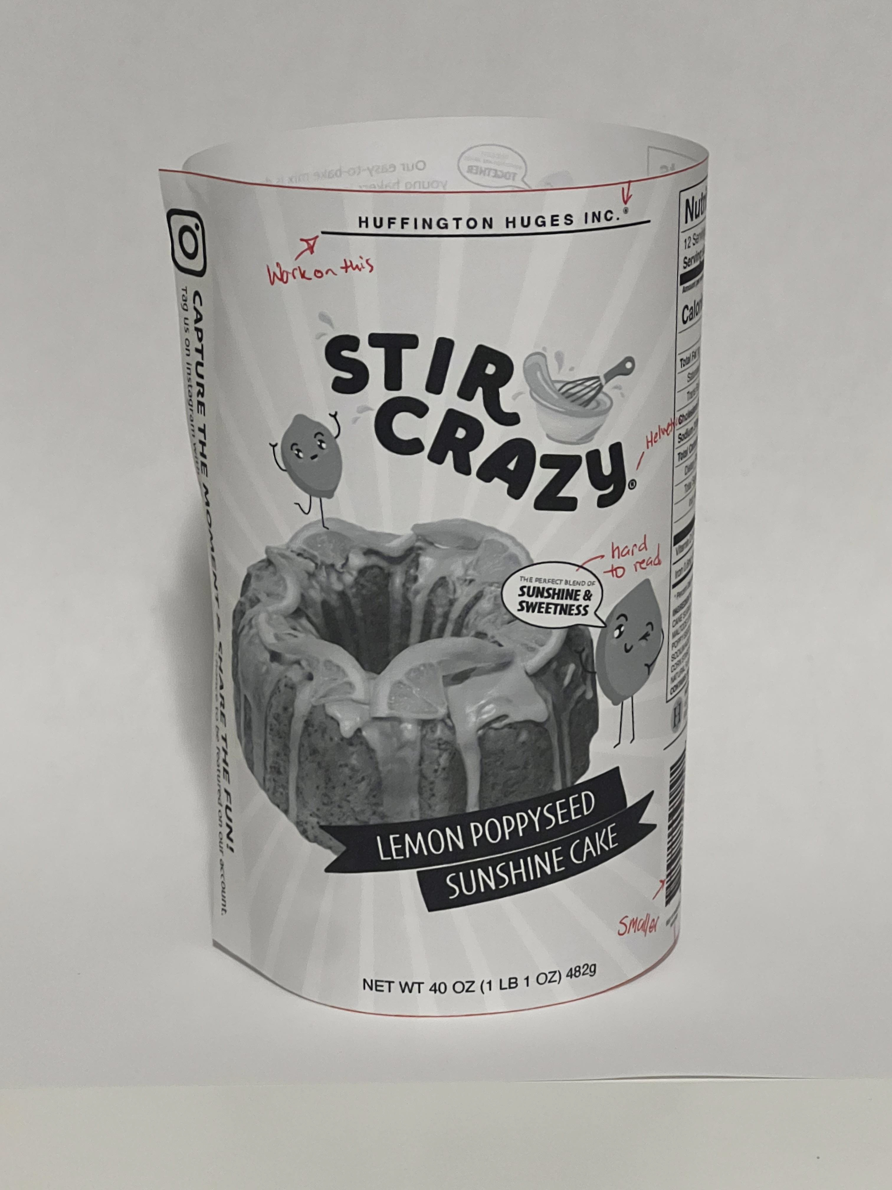
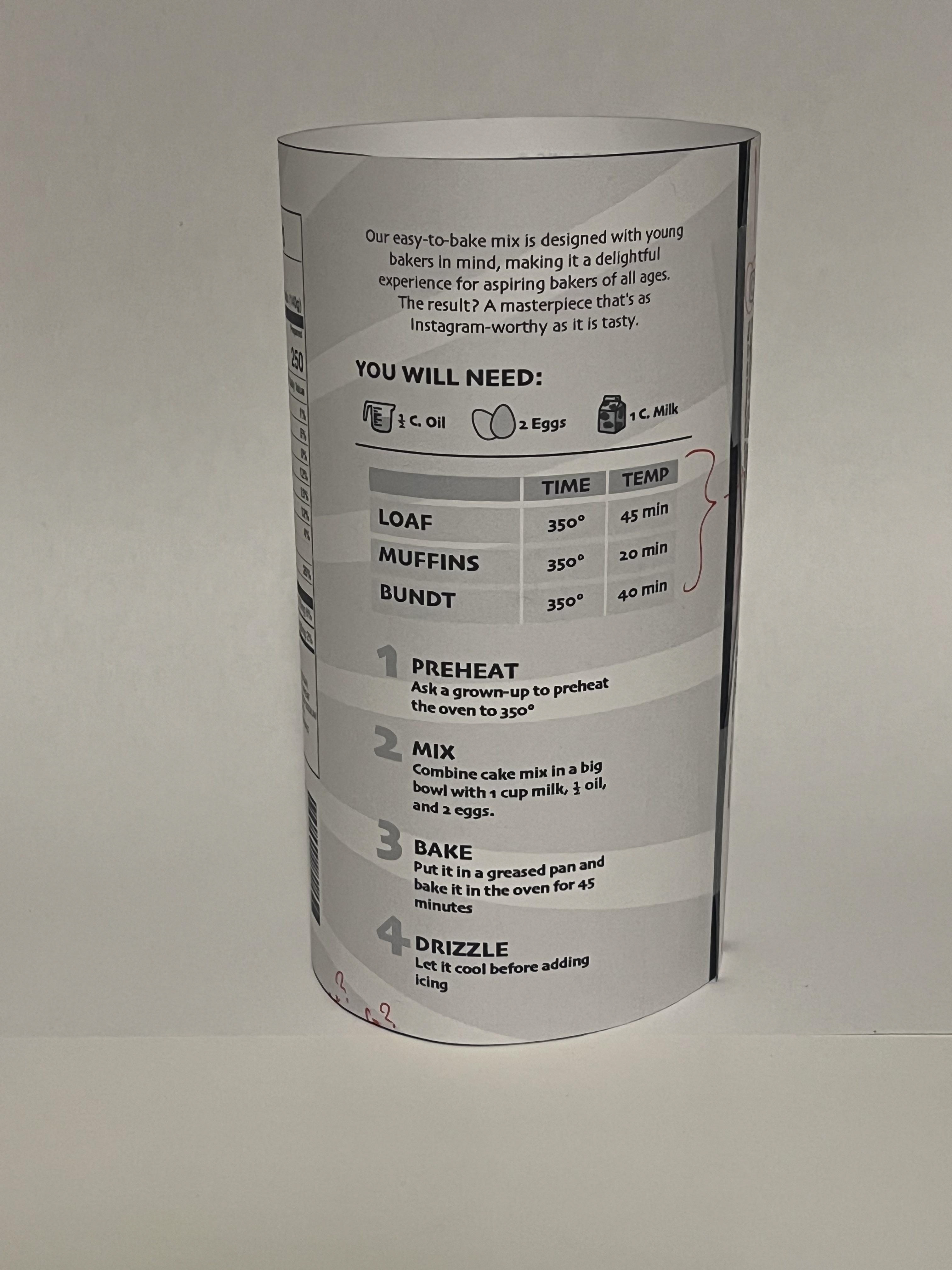
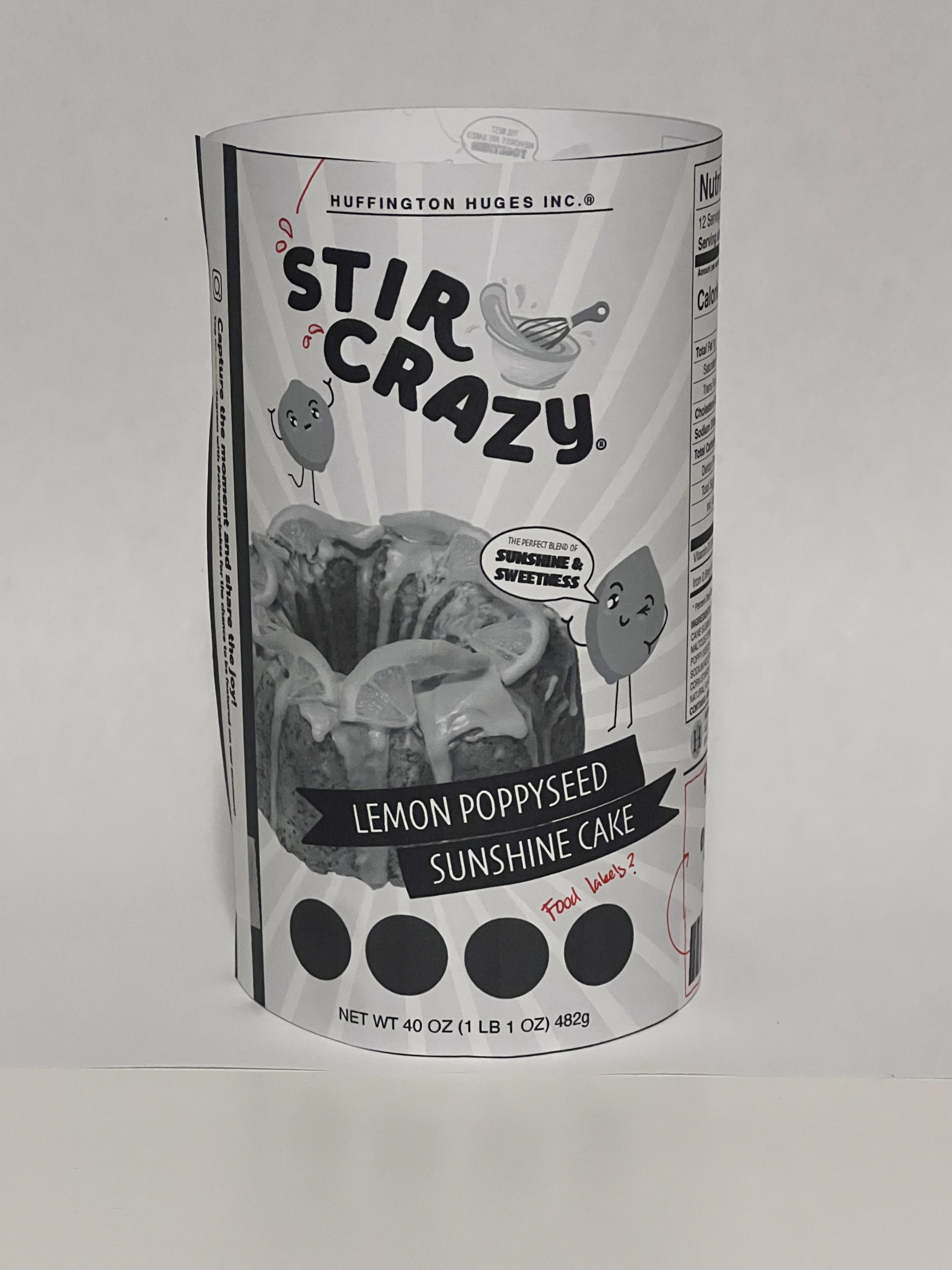
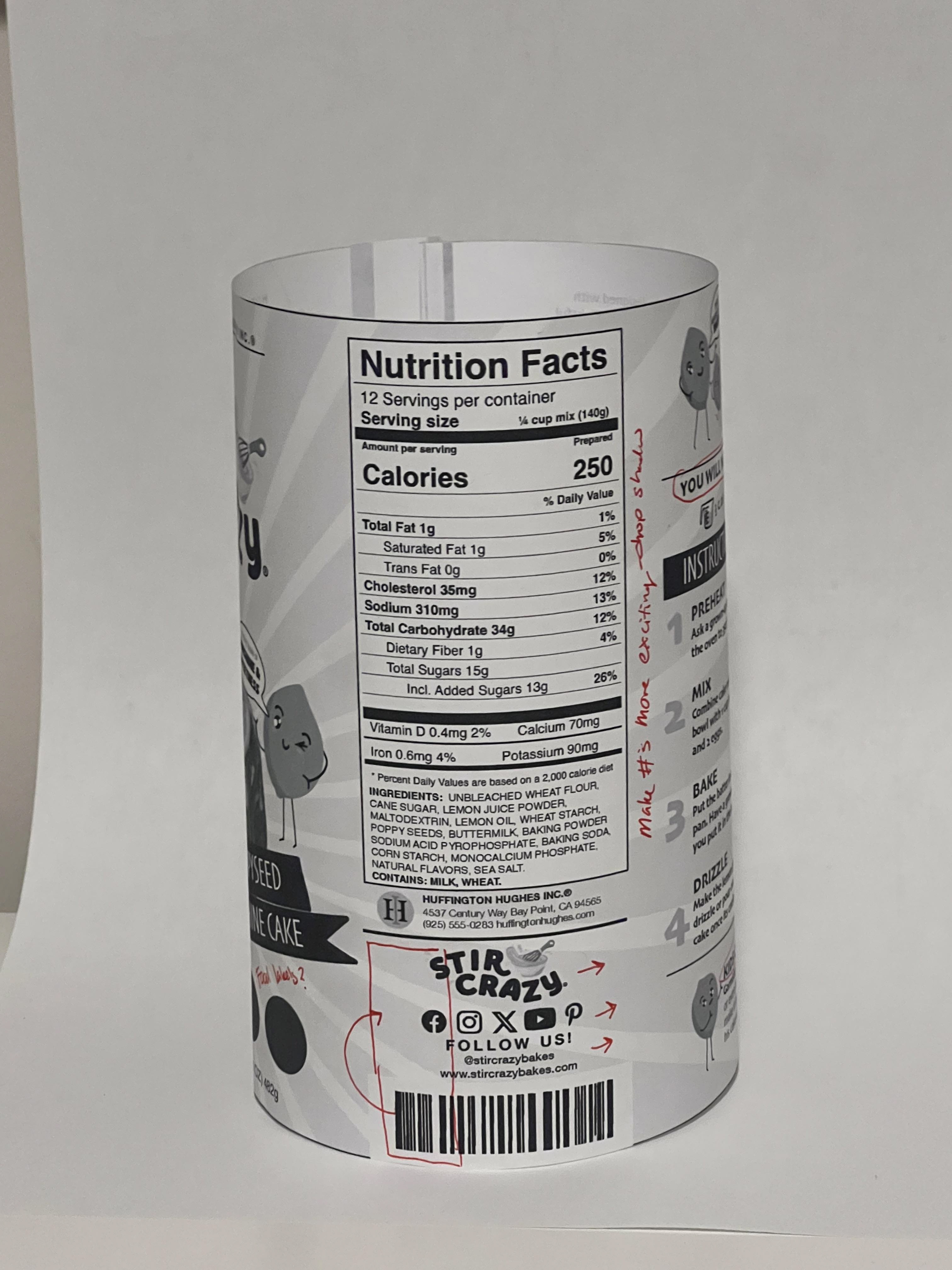
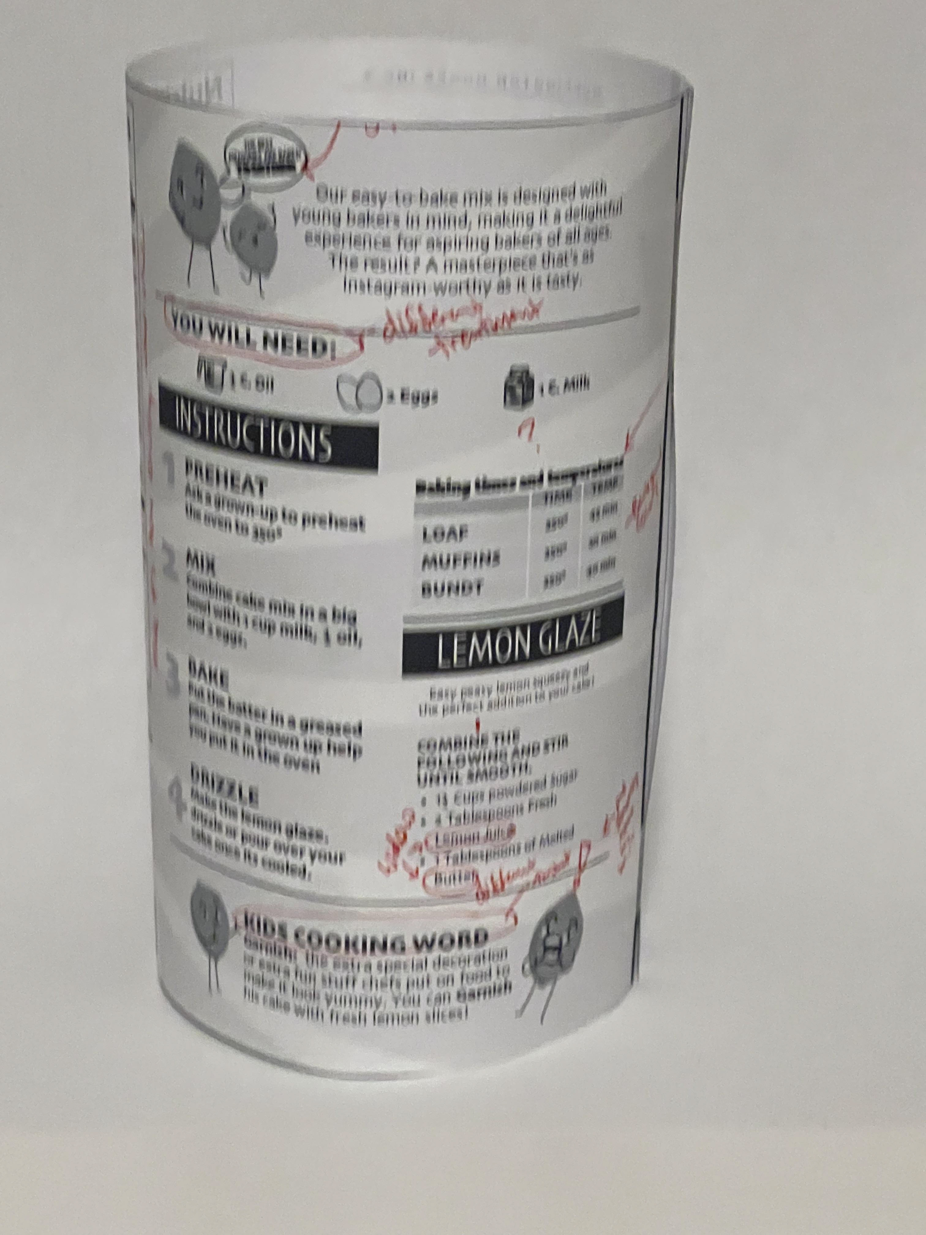
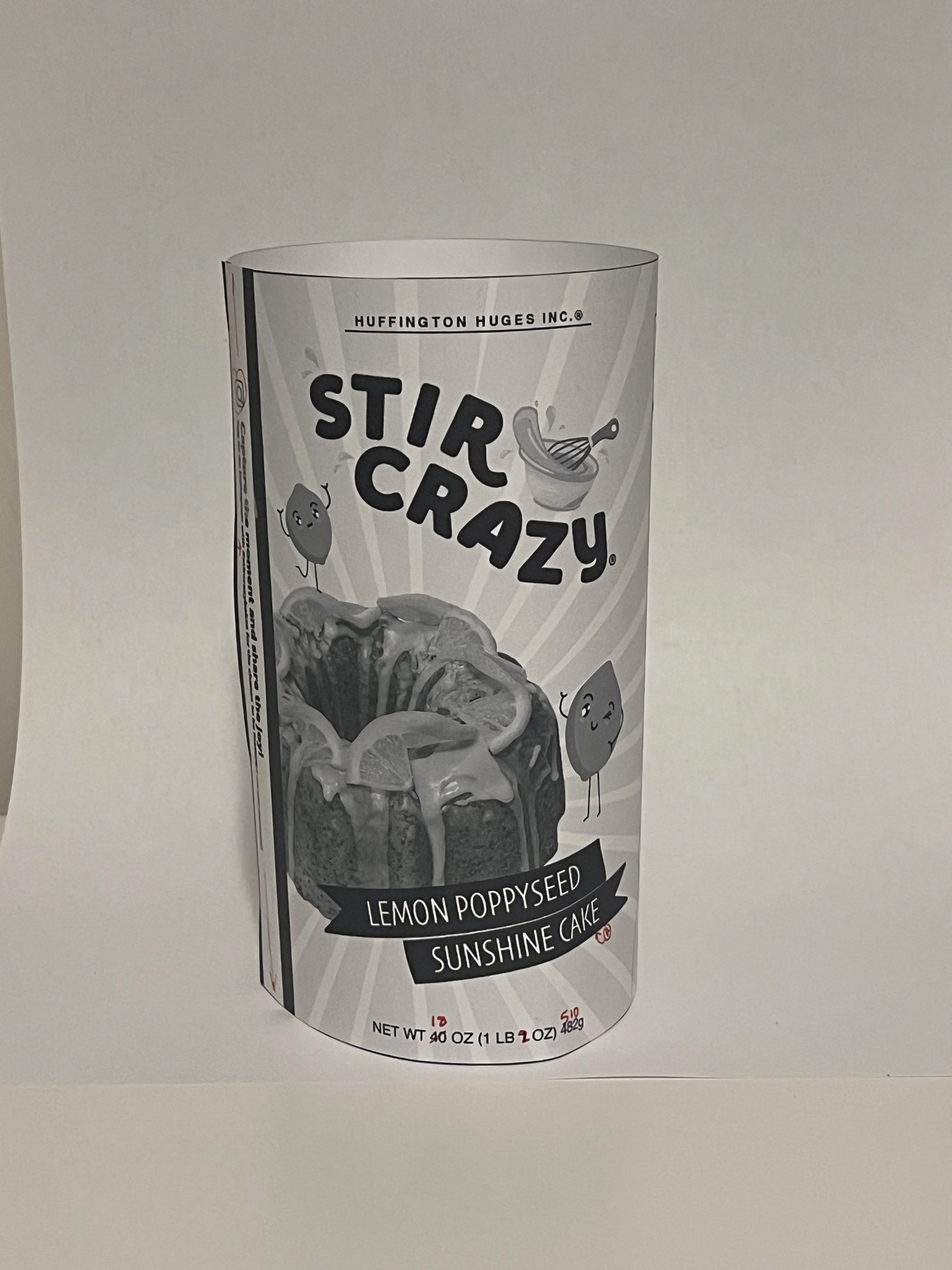
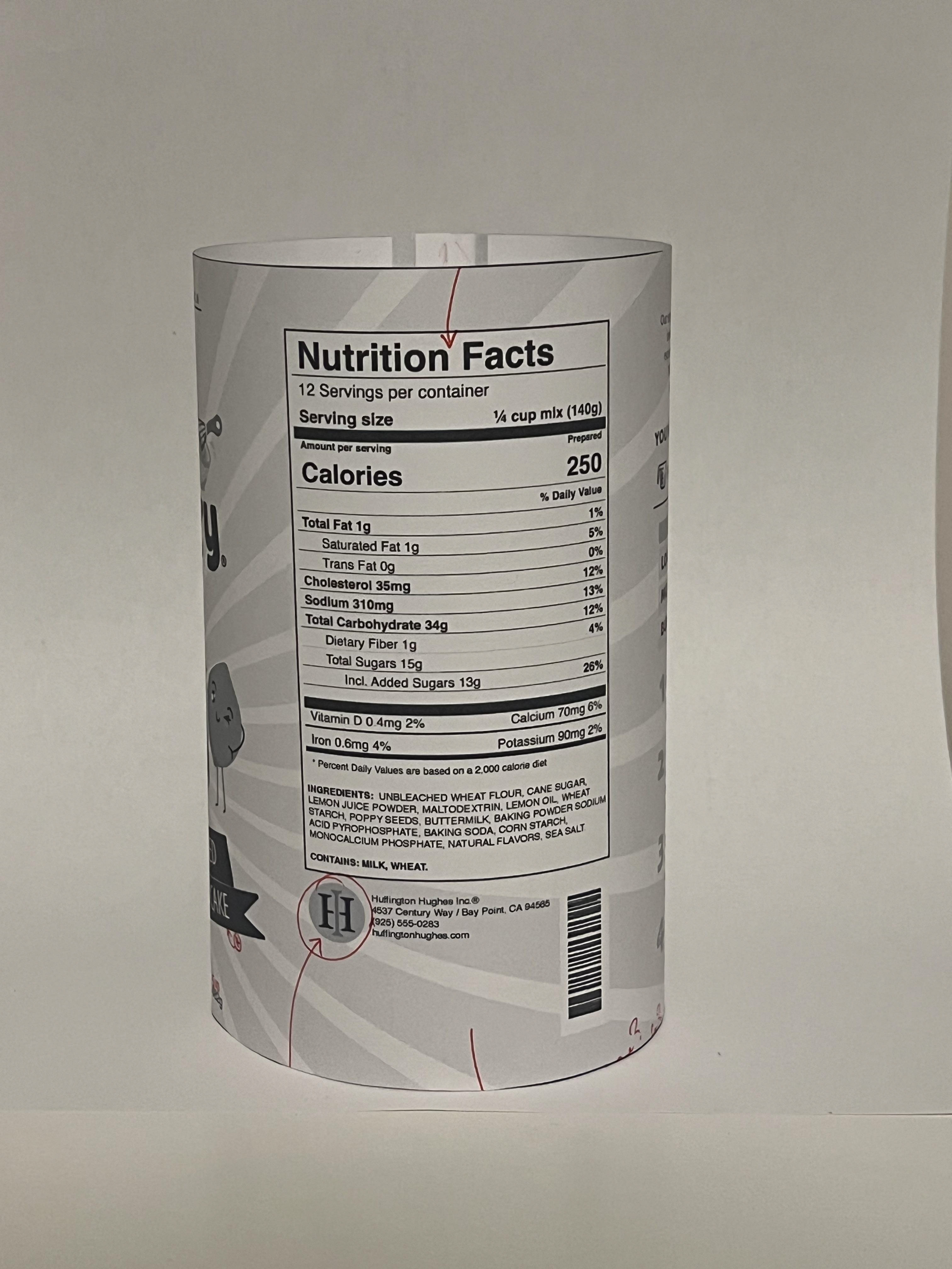
Color Studies:
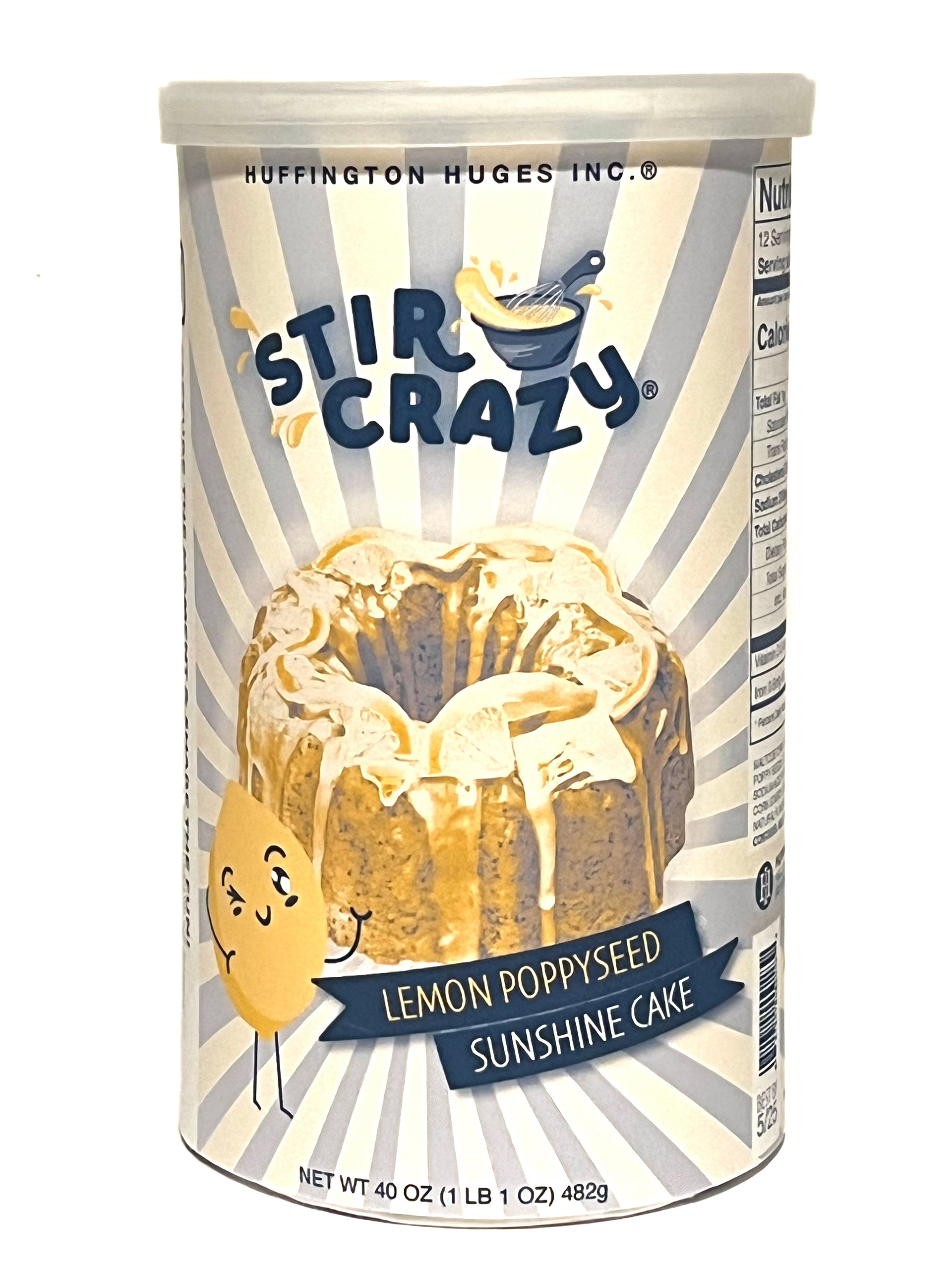
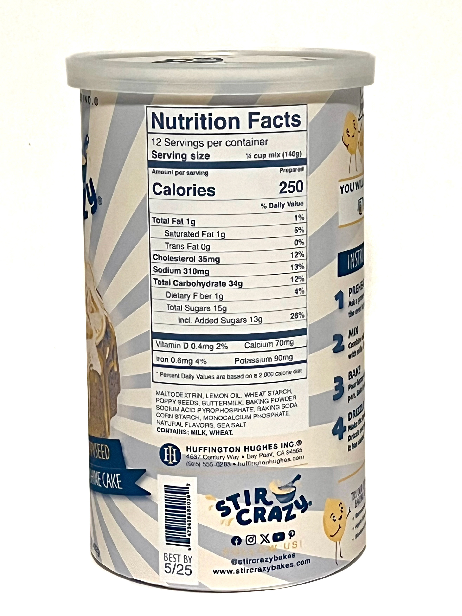
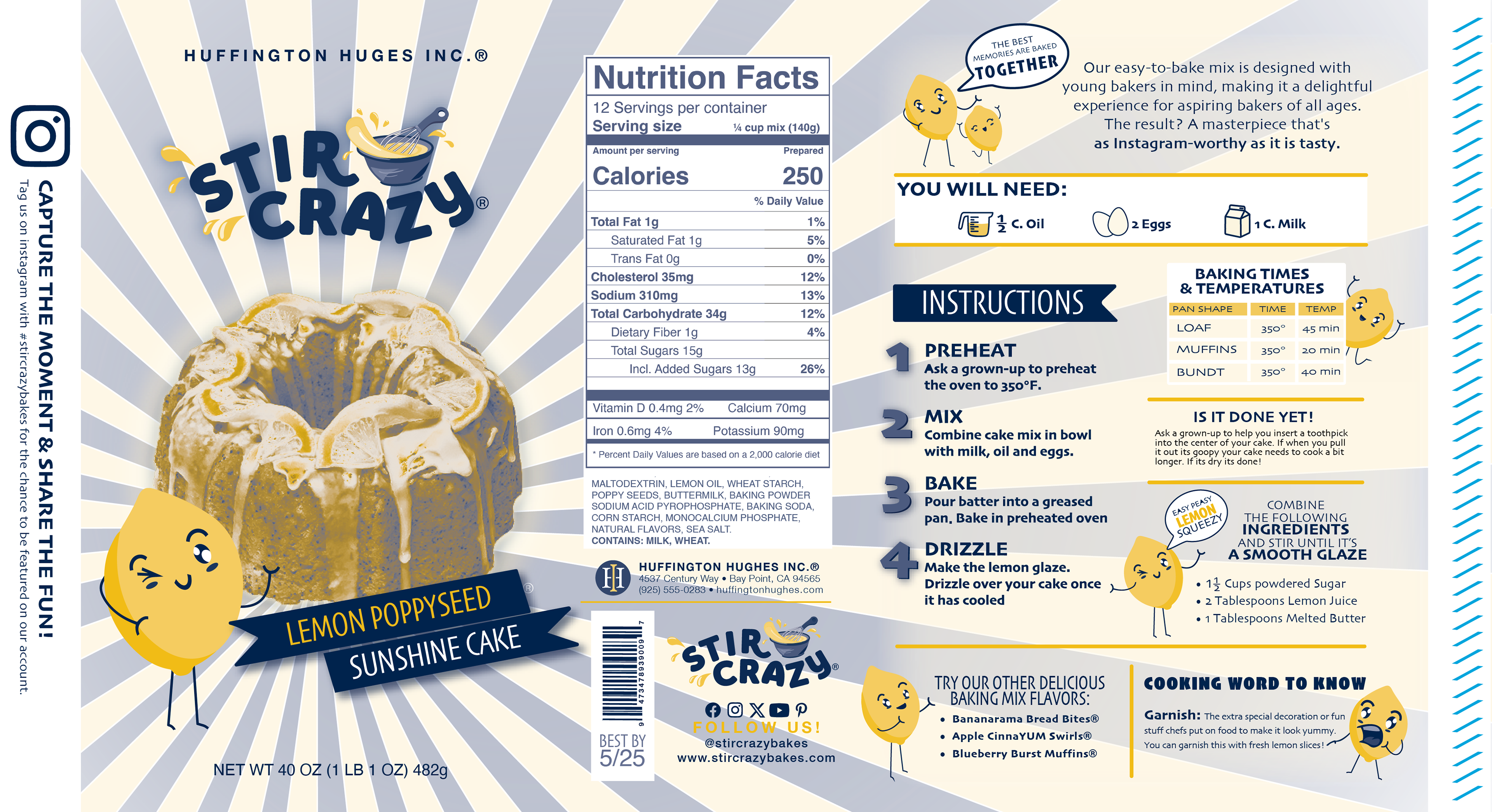
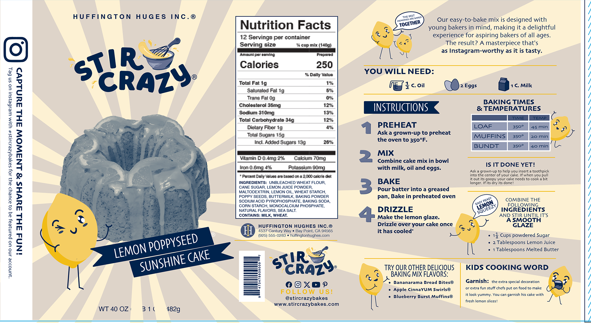
I knew that I wanted to use yellow for the lemons. They really couldn't be any other color. So I had to find a color to go with it. I chose to try its complementary color, purple, hoping to get a neutral brown duotone. It was also essential to not have the cake look green--because that's not appetizing. I experimented with several variations of purple and blue and also some pink just for fun. I wanted a lavender color with yellow. I created the packaging with lavender and yellow but then tried it with navy and it was even better!




Final Clean Design:
Explanation

