Brainstorming & Research
The first step was understanding the parameters of the assignment and learning the rules that needed to be followed. I looked at some type art on Pinterest and found a few different ideas. Though they don't all follow the rules of the assignment I think they were helpful.
I adore seahorses, and my research led me to discover a wealth of information about them, perhaps more than the assignment required. These little underwater friends are the height of cuteness, with their tiny frames and a touch of helplessness. I'm obsessed. They are super slow, moving at a leisurely pace of 5 feet per hour, and can become fatally exhausted when waters get rough during storms. They swim upright, relying solely on their dorsal fin for propulsion. And use their flexible tails to hold on to vegetation, whether it's to avoid strong currents or seek shelter from predators. They have chromatophores, unique skin cells that enable color change, their sole defense mechanism. Instead of fighting, they rely on a "blend in and hide" strategy for protection. No drama, no confrontation. Which as a fellow conflict-avoider, I totally respect. Their tough exterior makes them hard to digest, so they have few natural predators. However, their populations are declining due to ecosystem damage.
They eat constantly and their little snouts suck up tiny crustaceans and plankton in the water. They also mate for life. (awww) To impress the female, male seahorses will show off by wrestling each other. The winner gets the girl, of course. It's like a seahorse version of "The Bachelorette," but the relationships last. When they mate, they circle each other, twist their tails around each other, and do a little courtship dance that can go on for hours. For the grand finale, the female transfers the eggs into the male's brood pouch where they are fertilized. He rocks the dad bod look while nurturing the eggs for around twenty days. When the big moment arrives, he shoots out hundreds of fully formed baby seahorses with a burst of abdominal contractions.
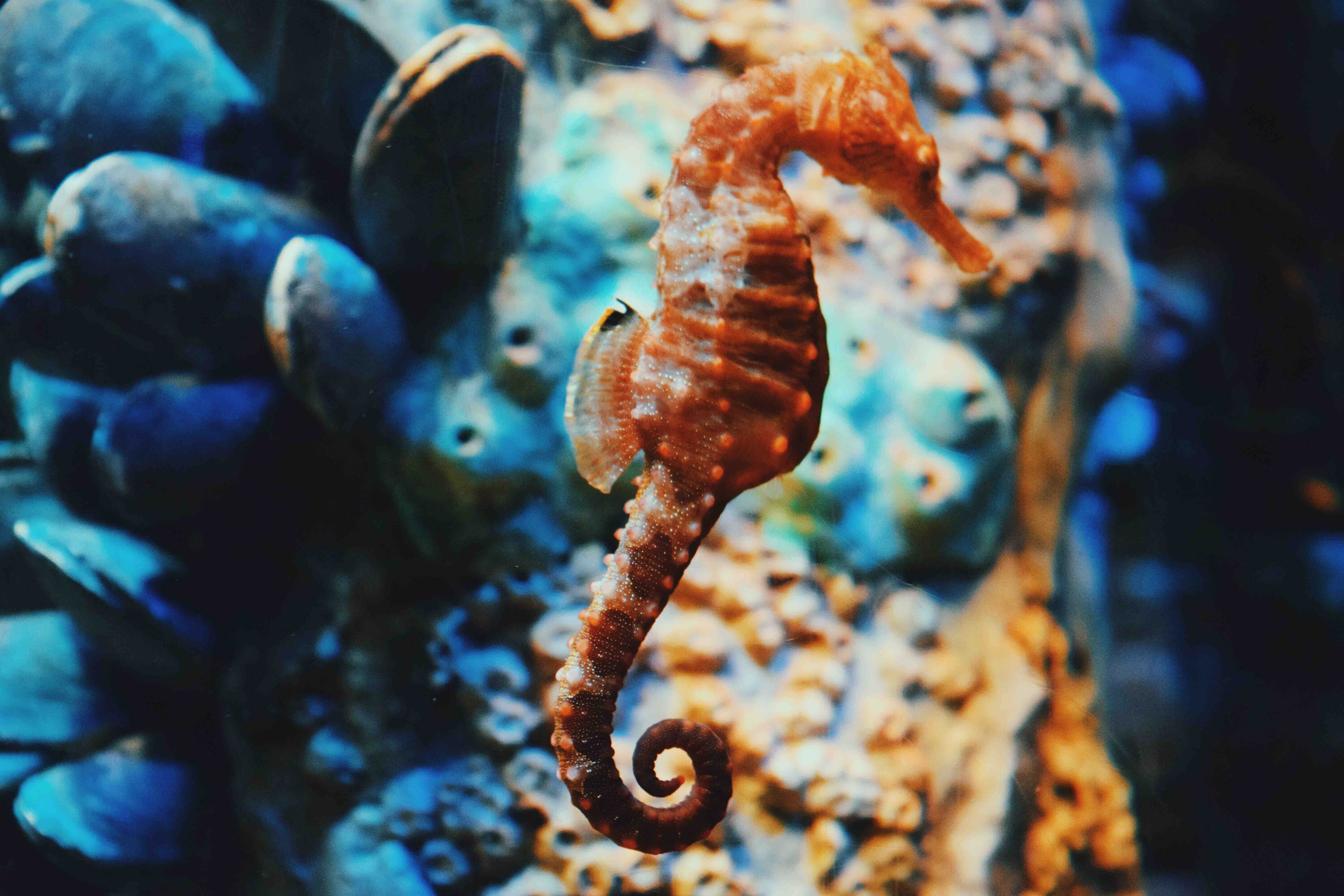
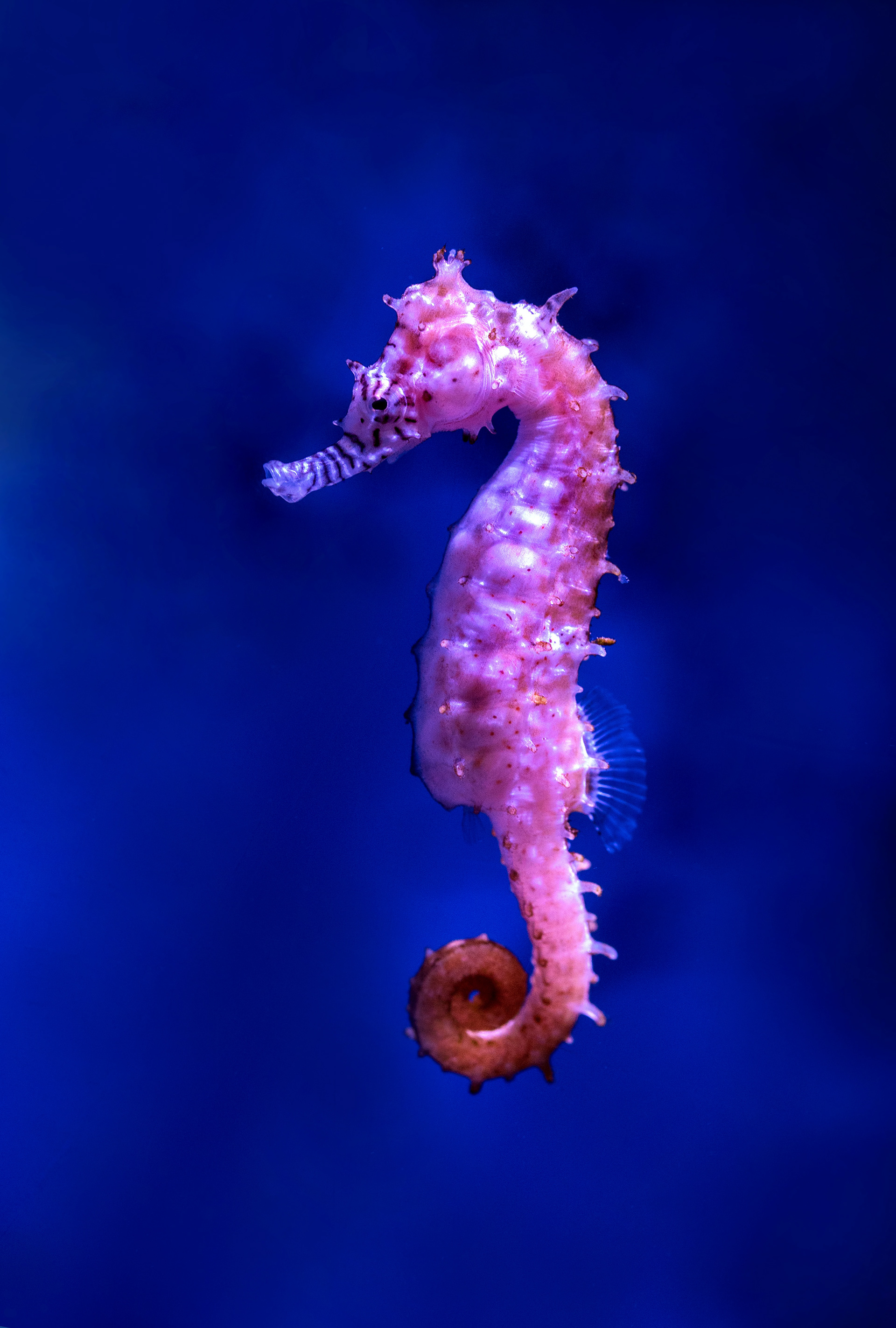

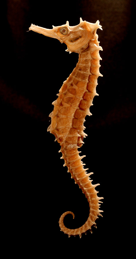

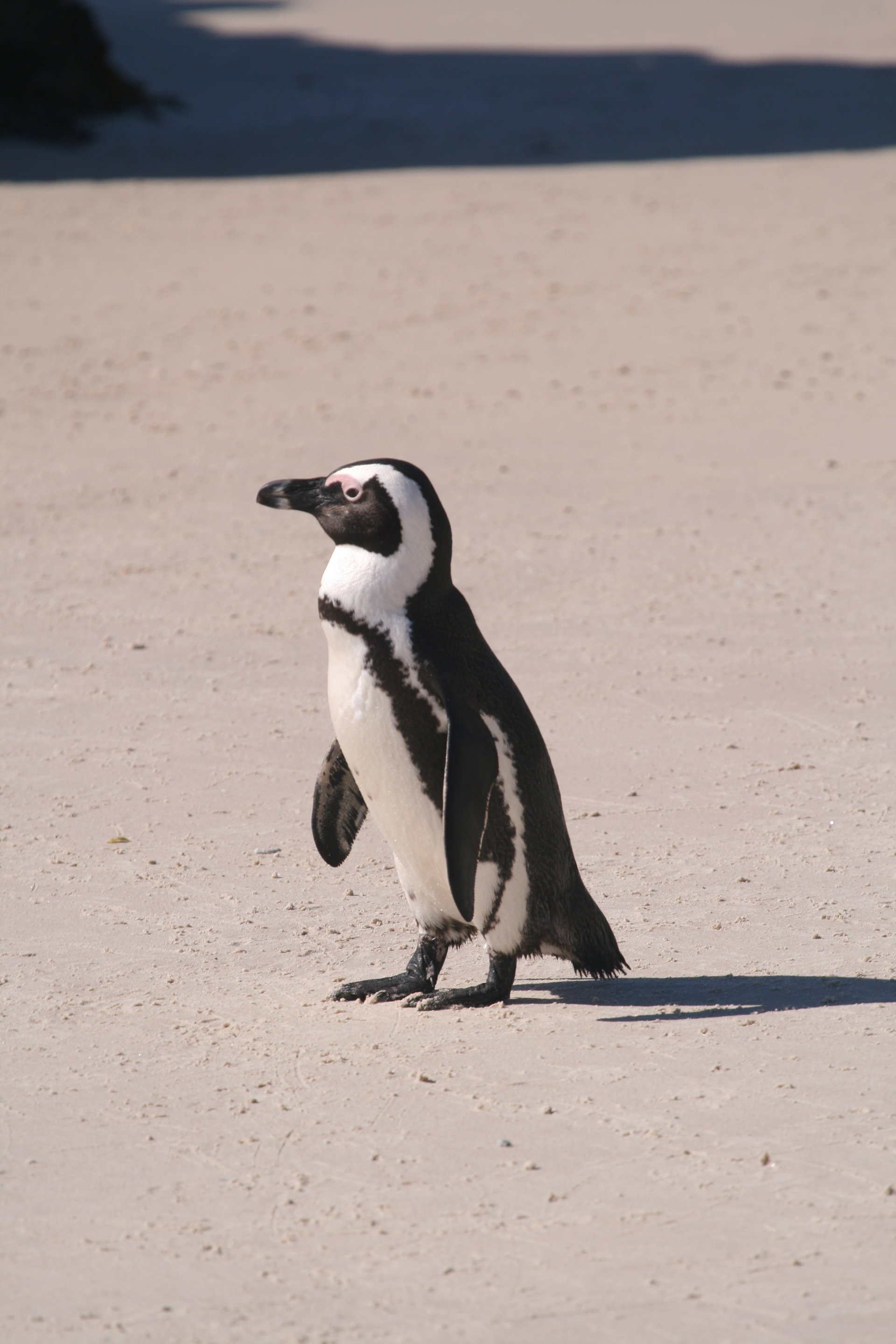
Seahorses are all about peace, love, and food. And if possible, I'm even more in love with them after doing my research for this project. Though the penguin would've been easier because of the defined lines and high contrast of the black and white, I decided to do a Pregnant Daddy Seahorse. I found photos of two seahorses and photoshopped them together to give me the exact shape I wanted and then converted it to grayscale.
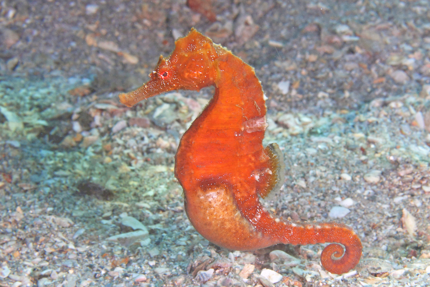
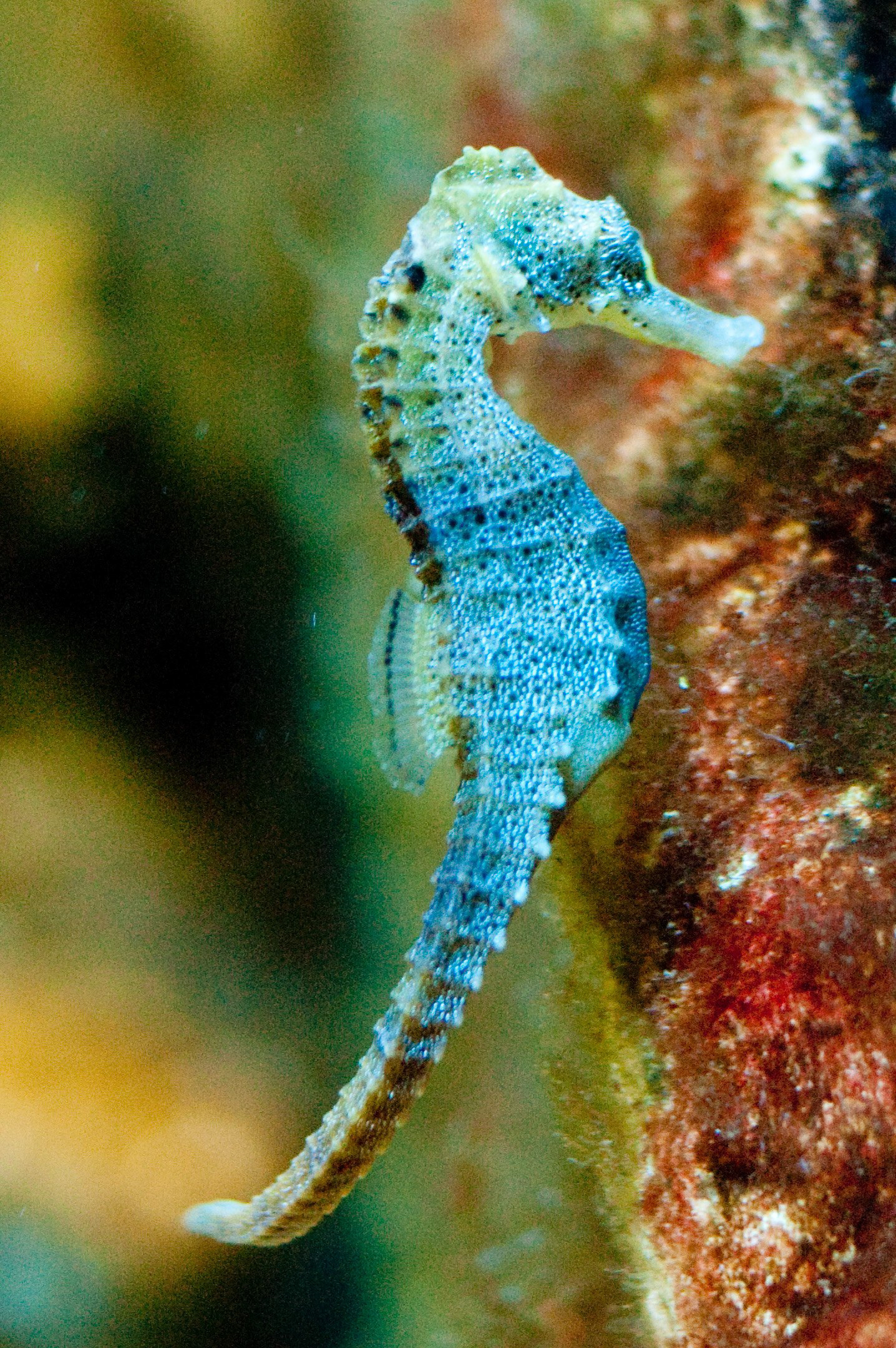

BLOCKED TYPE FIGURES
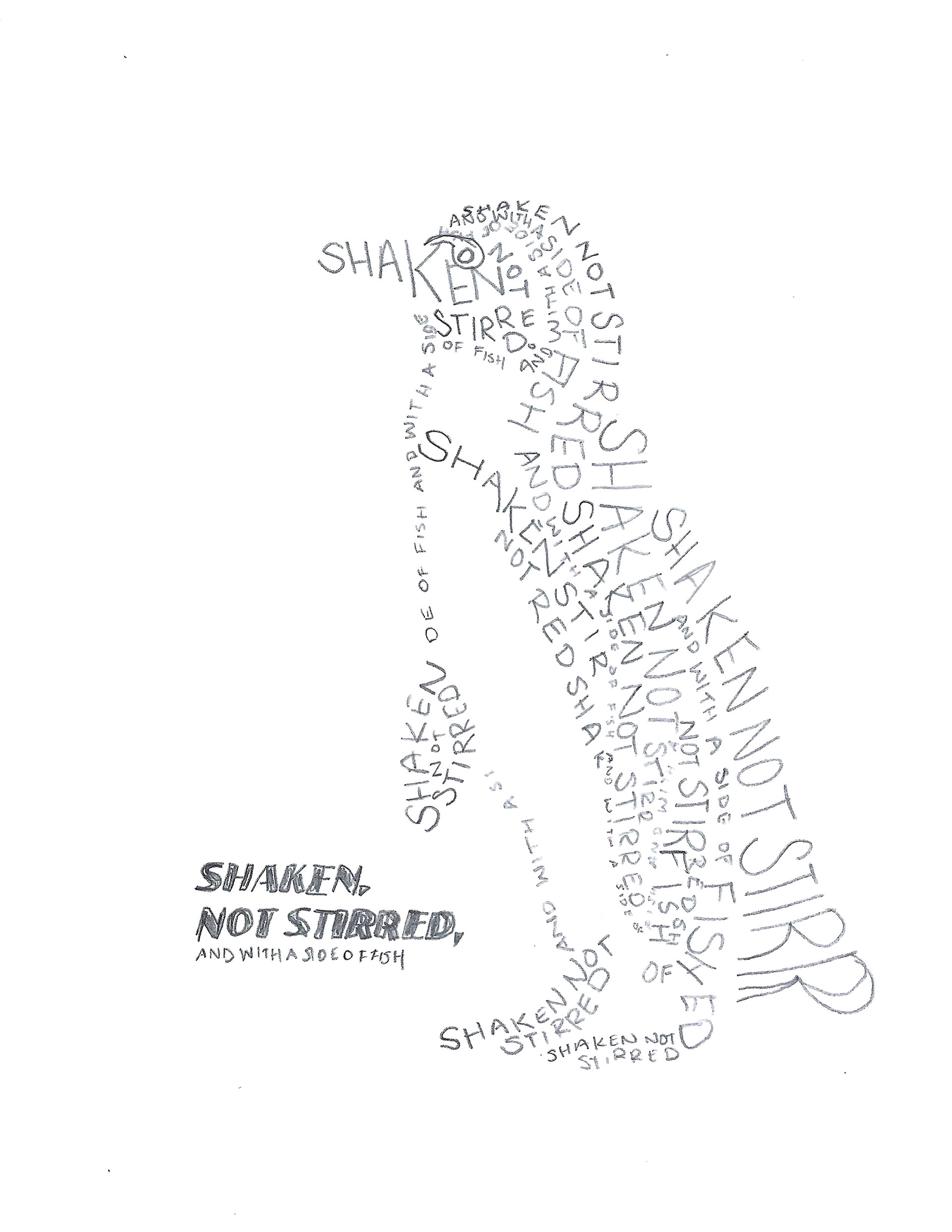
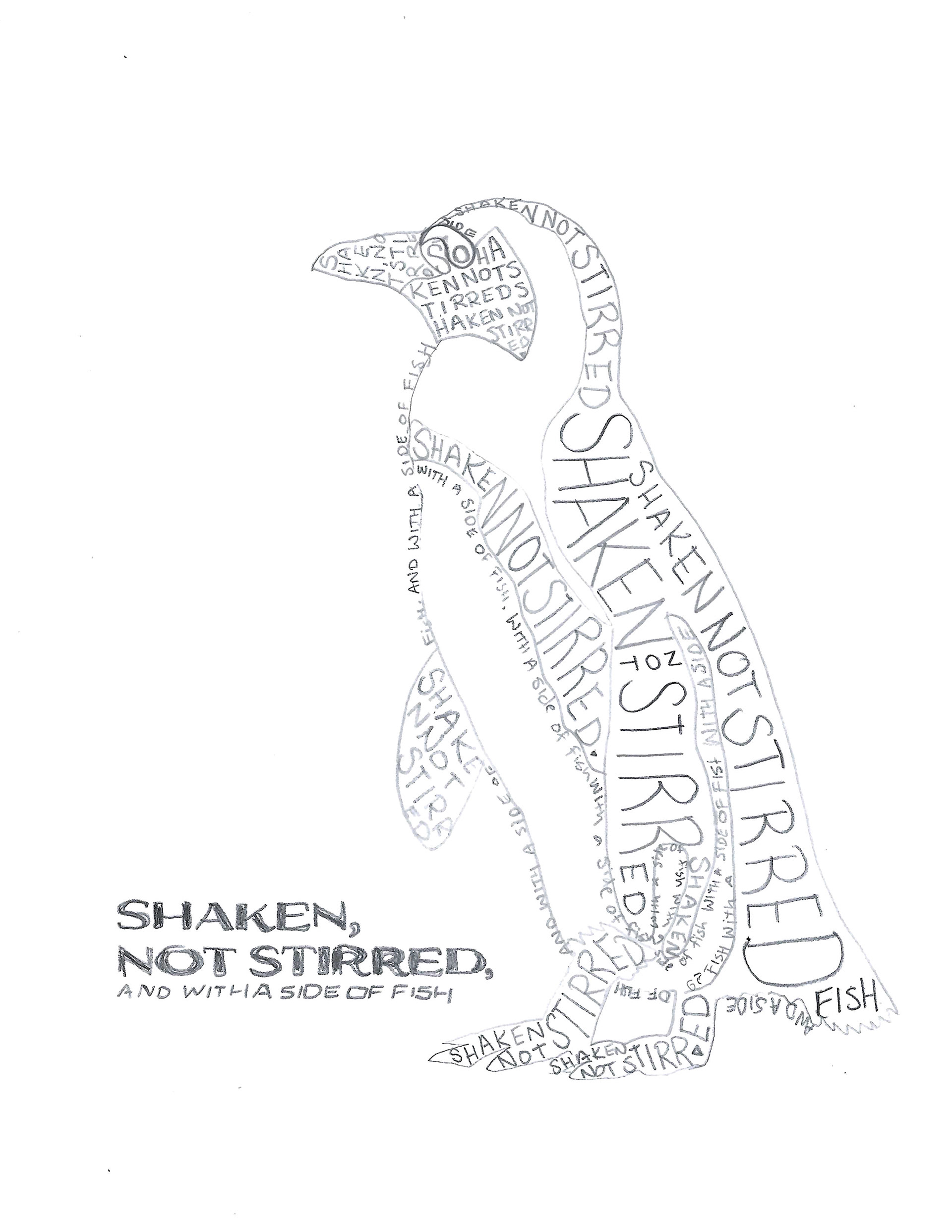
Next, I traced and blocked out areas for the typography. I traced them using a light table and then applied Different type treatments to the two animals. Creating the penguin was straightforward due to the clear black-and-white contrast. I like the use of negative space on the second one. The seahorse posed more challenges due to its bumpy texture and less defined areas. I used curved horizontal lines to convey a sense of roundness and turn the form. I used the script around the edges but made the B S, and H larger to make the bumps of his back.
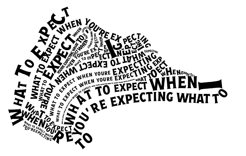
I played around with different typeface combinations, drawing inspiration from the font used in the unsettling classic, "What to Expect When You're Expecting." My efforts to replicate its condensed serif style didn't match the desired look, as shown in the first figure. So I pivoted to something different and decided on Espiritu Regular and Espiritu Script from Adobe fonts. I also had the idea to use the quote "It's not a dad bod, it's a father figure." on the seahorse. I considered using the quote "It's not a dad bod, it's a father figure" for the seahorse. For the penguin, I opted for a tuxedo theme and chose the James Bond movie line "Shaken, not stirred," but added a side of fish because he's a penguin.
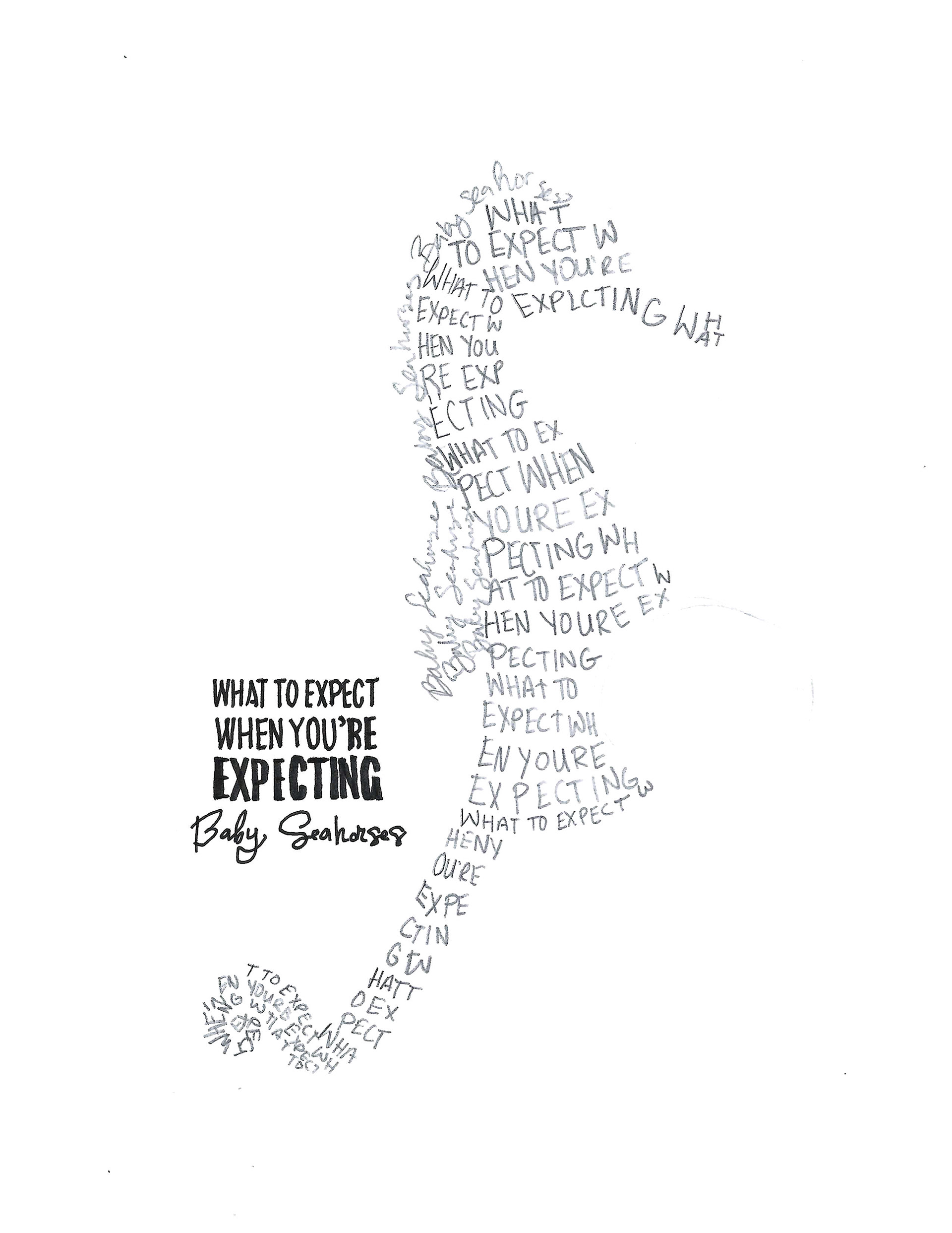

INITIAL COMPUTER AREA STUDIES
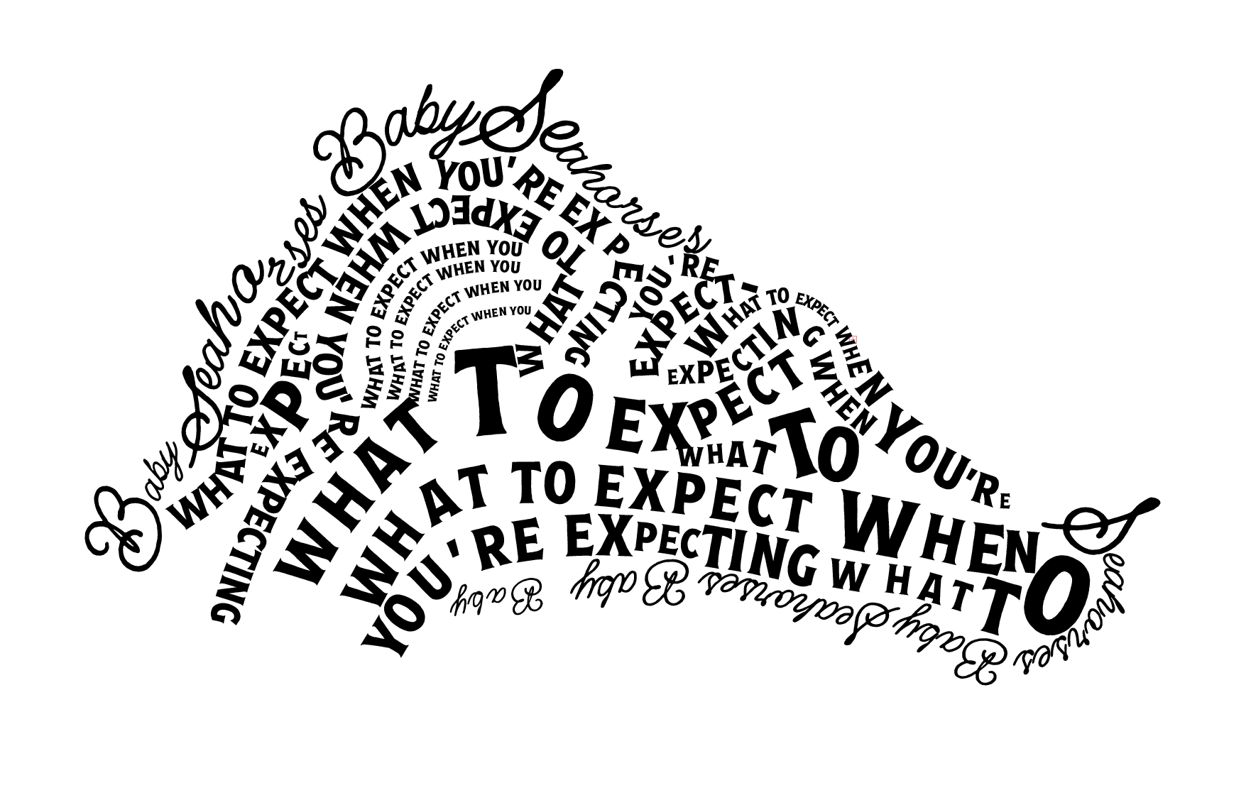
For my area studies, I focused on the head of the seahorse and the swirly portion of the tail. These were two important areas that needed the most attention since they are focal points in the composition. I realize now that it would have been beneficial to print out these sections rather than working exclusively on the computer.


B&W COMPUTER PROGRESSION
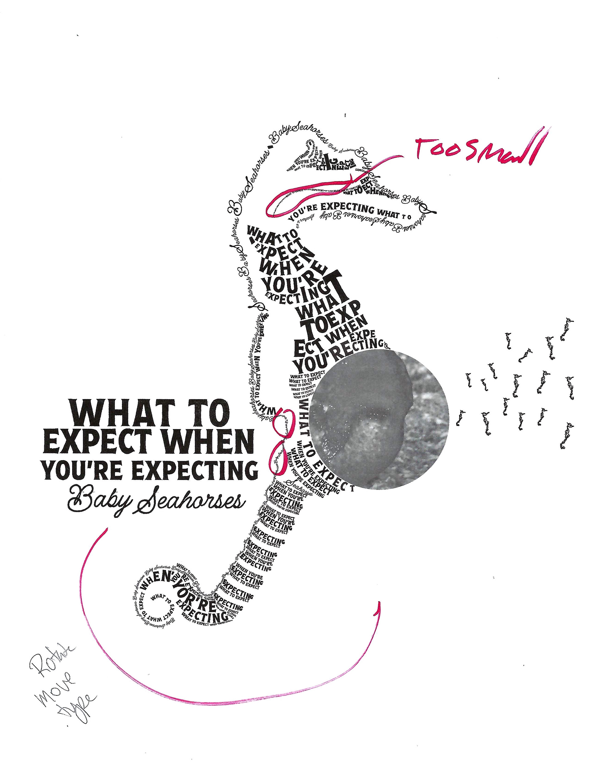
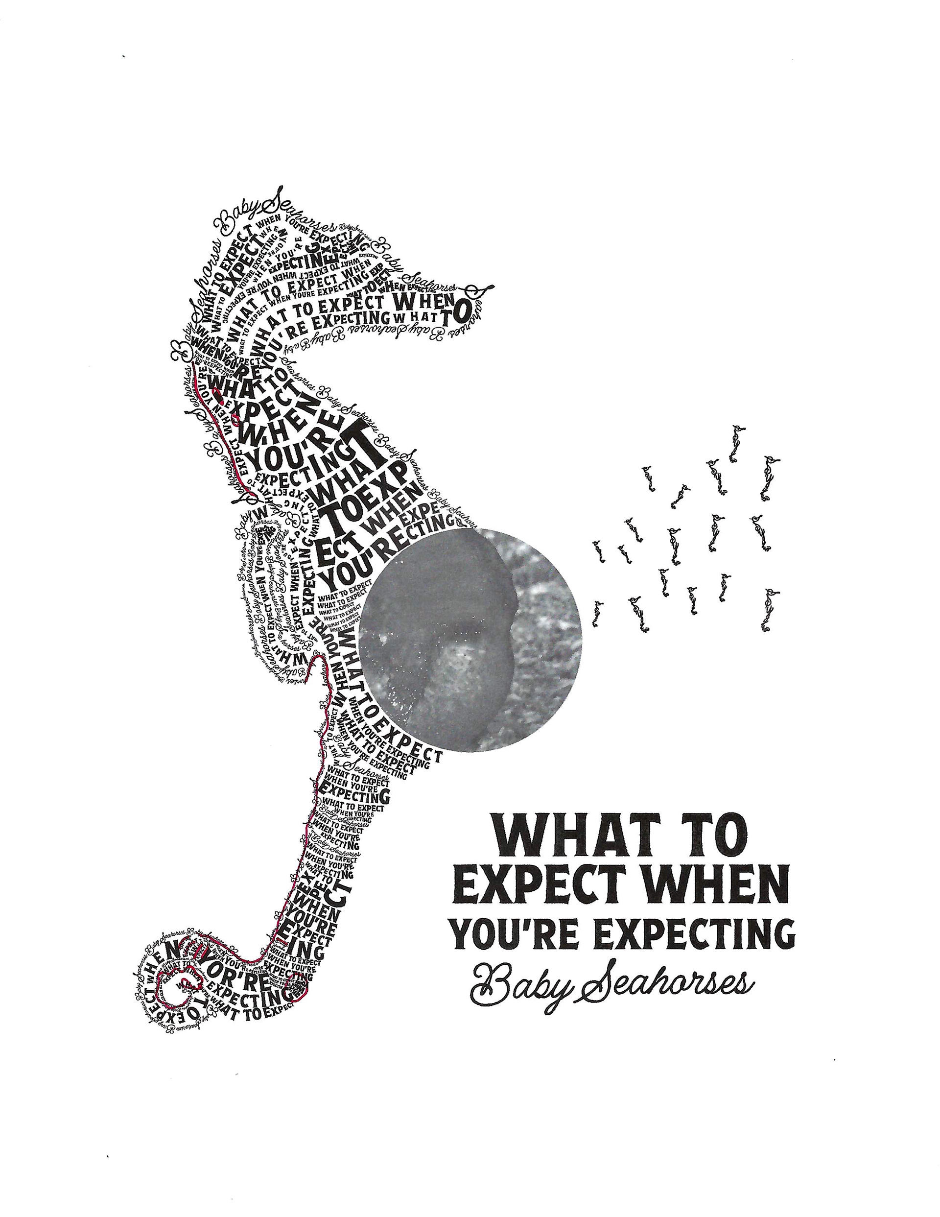
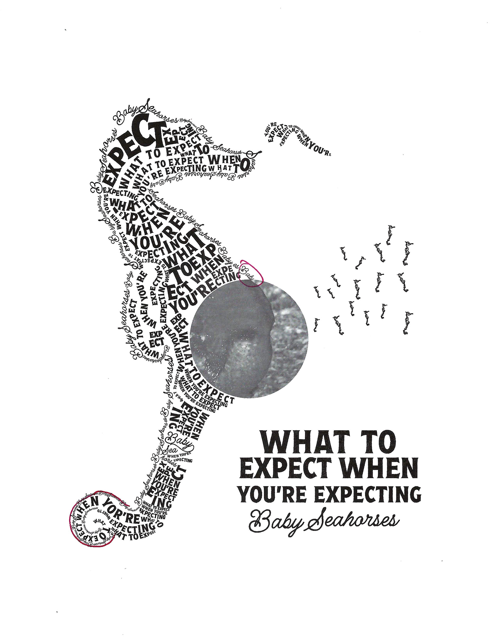
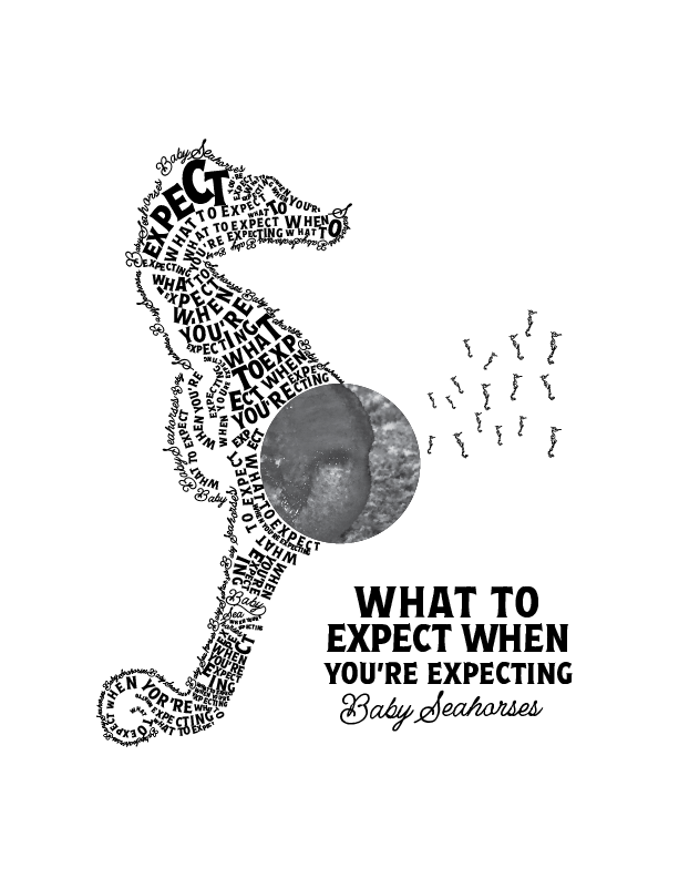
I started on my computer progressions in adobe Illustrator. Using the script font created an outline around the whole seahorse and the tail. Next I proceeded to the horizontal lines across his body. I filled in the entire seahorse and it looked amazing--on the computer. I created the second option with more negative space. Once printed it was apparent that it wasn't going to work as I unfortunately started out way to small. Using size 2 point font in some cases. After the critique on Monday I was worried I'd have to start all over. But I was able to use my current design and just enlarge the letters. Which involved a lot of moving things around but in the end it turned out pretty well. It was also suggested that I move the copy and make better use of the frame. I think it is an improvement.
FINAL DESIGN
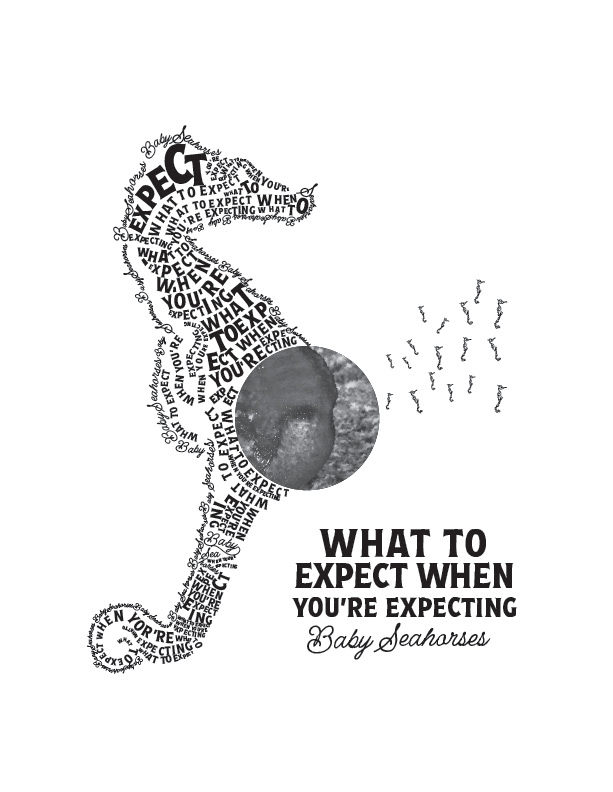
I'm pleased with the overall shape. It is obviously a seahorse. I like the outer lines. I made the capital letters bigger to be the bumps of the seahorse. I don't think some of the interior sections are very good but overall they create the texture that I was hoping to achieve. My favorite part is the group of baby seahorses. I received permission to break the rules and stack my letters. I also like how the swirl of the tail turned out. If I could do this again I would have printed it several times during the design process to see how it looked instead of just zooming in on my computer. I would have realized the type was too small and not working out sooner. This would have saved me HOURS.
The time crunch between the Monday critique and the Tuesday final presentation left me feeling like I was in the last minute of a cooking show, racing against the clock to get everything done. So in the future, I will not leave my mounting and printing to the last minute. I think that as students, we spend so much time on the project the presentation board is an afterthought. To streamline the process, I'm going to prepare my mat boards ahead of time, enabling me to easily affix the final design once it's printed. This approach will not only help me manage my time better but also provide a break from computer work. I'm considering getting a laptop so I can work at school between my classes because once I get home I have other responsibilities. I just ordered a wide format printer that will accommodate the needs I will have later in the semester and save me those trips to Office Depot.
In Summary, the process of creating my Pregnant Daddy Seahorse complete with its adorable tiny seahorse offspring was a creative challenge that deepened my appreciation for seahorses and the versatility of typography, all while testing my patience. Mistakes were made, and lessons were learned that will benefit me in future projects, and for that it was worthwhile.
