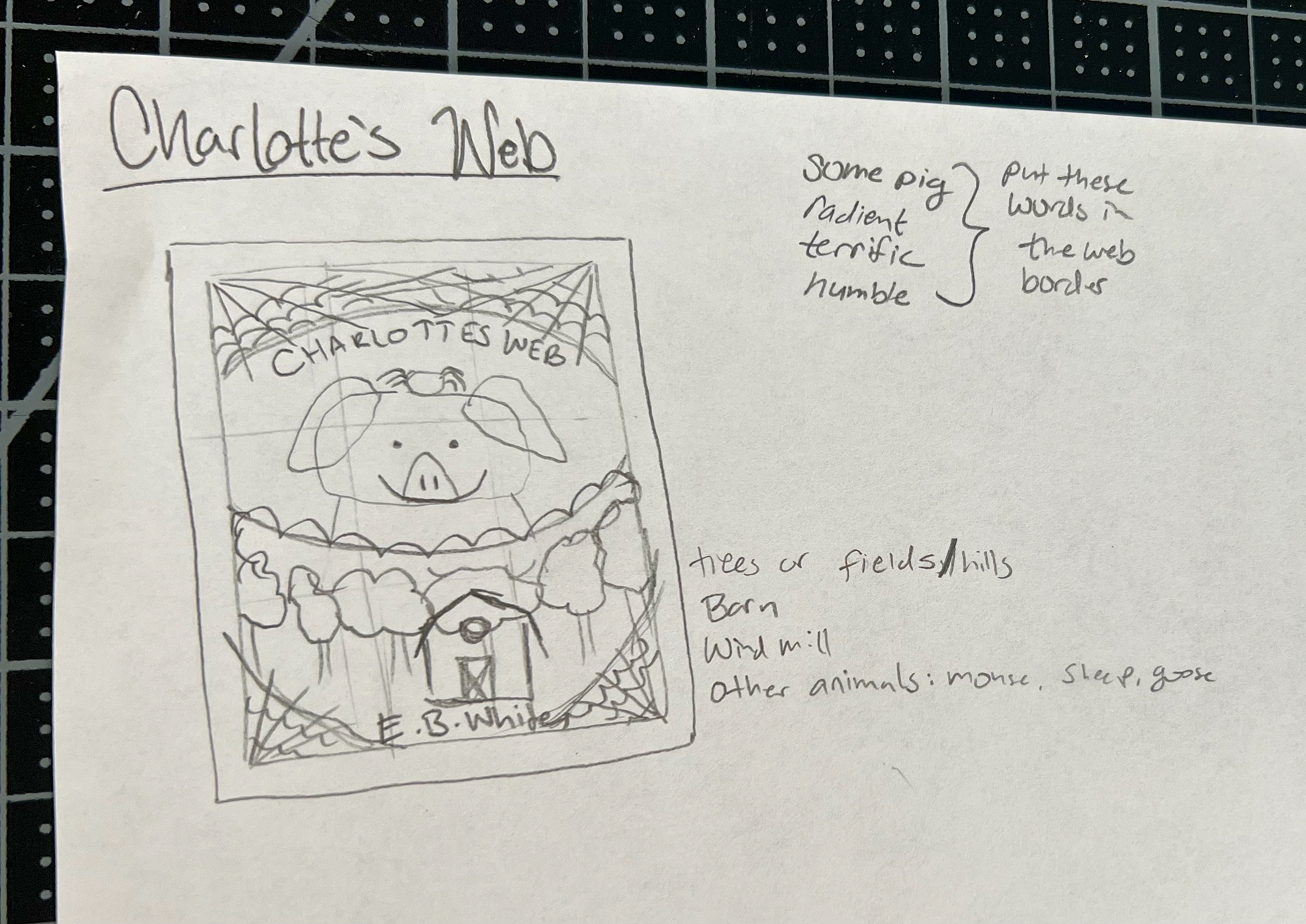
Assignment: To demonstrate skills learned in class create artwork for a children's story using original art. The specifications required an 8" x 10" inch print with a full bleed, layers, and sub-layer organization.


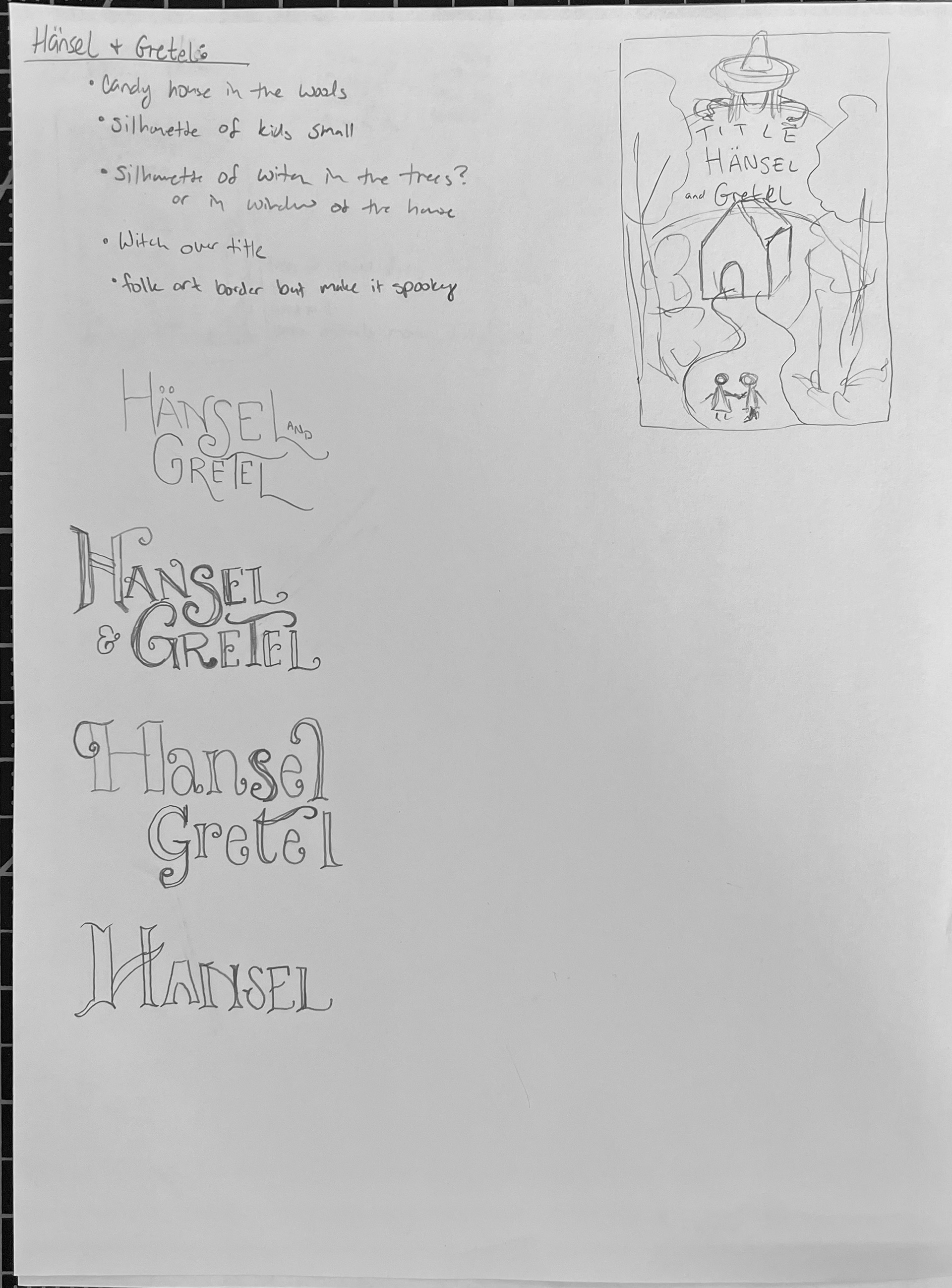
For this project, I set out to design a cover for a children's book. To gather inspiration, I searched through various book covers on Pinterest and created a pinboard of the ones that caught my eye. After sketching some rough thumbnails, I decided to pursue the concept of Hansel and Gretel, with a focus on the witch and the forest.
Using a larger rough sketch, placed the design in Illustrator. I used a combination of pen and blob brushes in Illustrator to create the shapes needed to bring my vision to life. I found a picture on a hat website of a woman modeling a hat. I wanted the witch's hat to obscure her face to evoke a sense of mystery. I intended to incorporate a folk art style infused with Wiccan symbols, spooky elements, and birds, while also embracing the creepiness of Grimm Fairytales. Unfortunately, despite my best efforts, I found that due to the constraints of time and my current skill level, I was unable to fully bring my creative vision to life. It was disappointing to realize that I was not yet able to fully express the ideas I had envisioned, and it left me feeling frustrated and discouraged. Although I put in a lot of effort to create an authentic gingerbread house, I'm still not completely satisfied with it. I spent a lot of time studying multiple images to ensure that the frosting and piping details were accurate, but I'm not pleased.
To create the characters, I outlined the silhouette of a boy and girl in traditional folk clothing and modified it slightly to make it look like the boy was pointing toward the gingerbread house. As my project progressed, I found it necessary to refine the composition of the cover to better convey the message I had envisioned. I opted to alter the placement of the children to strengthen the connection between them and the gingerbread house. By positioning the children on opposite sides of the image and having them hold hands while gazing toward the house, I was able to effectively capture a feeling of wonder and eagerness that will undoubtedly appeal to the target audience.
In terms of typography, I deliberately chose a black letter font for the title, and structured the layout to effectively contrast the eerie woods with the inviting gingerbread house. To ensure the titles stood out, I placed them on a banner shape. While I am content with the final outcome, I had initially aimed to create a more intricate design that better aligned with my creative vision.
