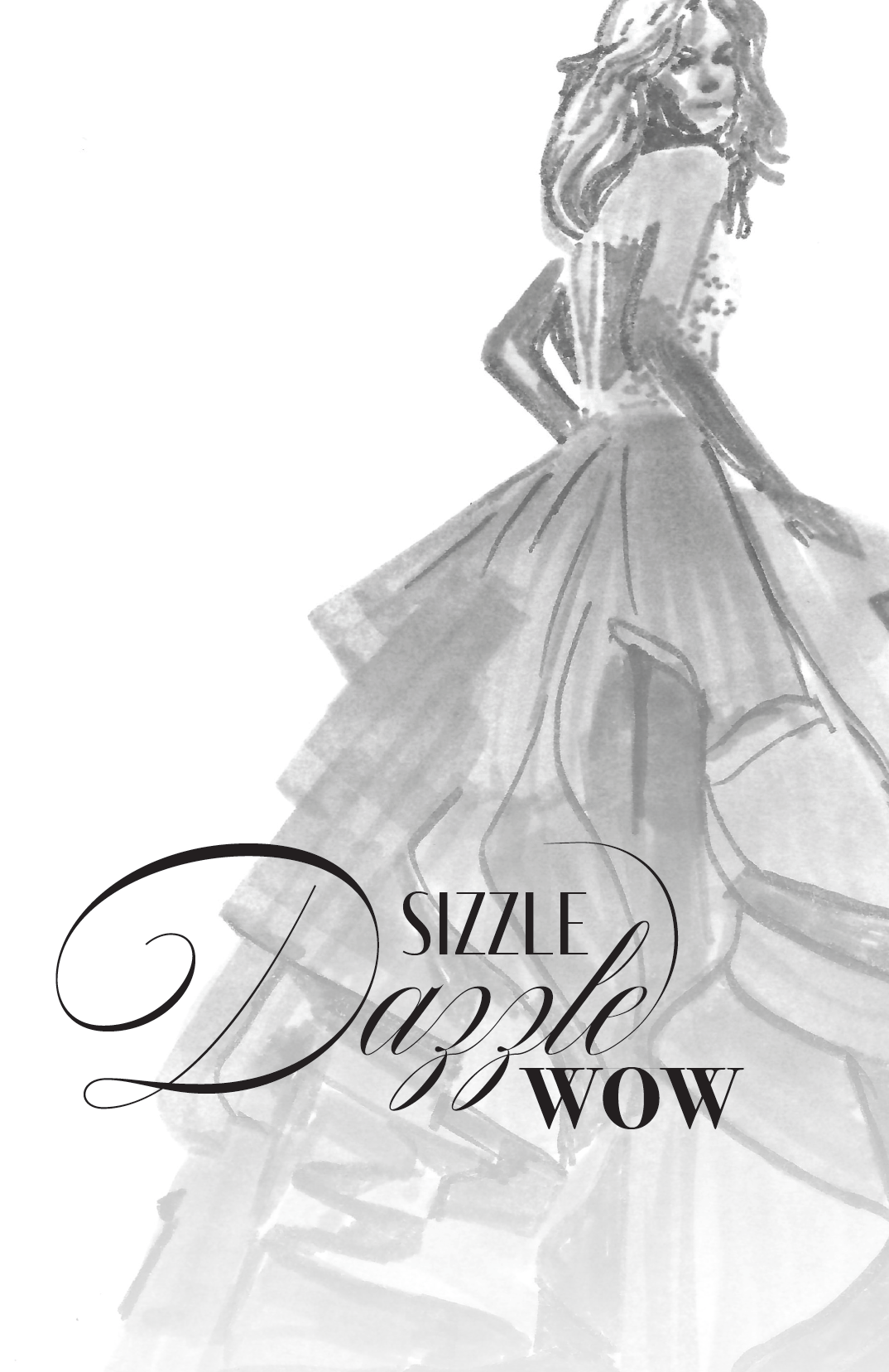
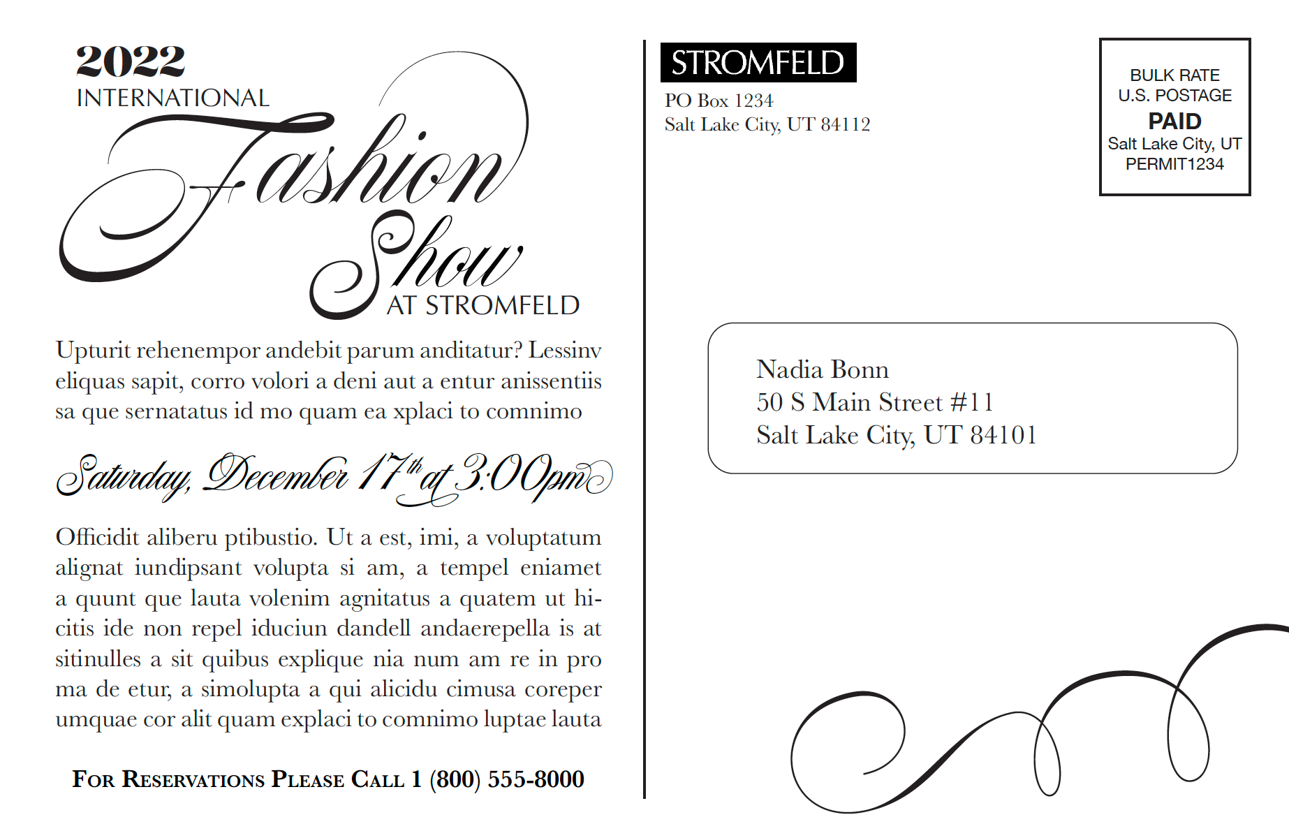
The assignment was to design a postcard mailer for a high-end department store, which would serve as an announcement for their upcoming fashion show. The final design had to fit within the dimensions of 8.5in x 5.5in, incorporate the store's provided logo, and feature the catchy slogan "sizzle dazzle wow" on the front, with details about the event on the back. The creation of a photo marker indication was also necessary.

Front

Back
I began my creative process by sourcing fashion photos that were suitable for the front of my postcard. After careful consideration, I selected several viable options and sketched out preliminary thumbnails. From there, I refined the top five concepts into tighter thumbnails, and ultimately chose two designs to develop into intermediate comps. Although the two designs were markedly different, I opted for one that allowed for the use of multiple typefaces and finding a cohesive way to integrate them.
Following the decision, I proceeded to create a final hand comp on dot grid paper, meticulously selecting the precise typefaces that best aligned with my design vision. I then translated the concept into a digital layout using Adobe InDesign. However, achieving a two-sided print proved to be challenging, and I had to resort to printing and manually gluing the two pages back to back.
During the critique, constructive feedback prompted me to enhance the contrast and visibility of the type against the darker photo indication. Addressing this concern, I added a gradient to the lower half of the postcard, effectively resolving the issue. The choice of words, "Sizzle, Dazzle, WOW," presented a creative challenge due to their similarity, but I acknowledged the need to accommodate specific client requirements and made it work accordingly.
Despite the challenges, I found this project immensely enjoyable and a valuable opportunity to refine my skills in preparation for my desired career path in advertising.
