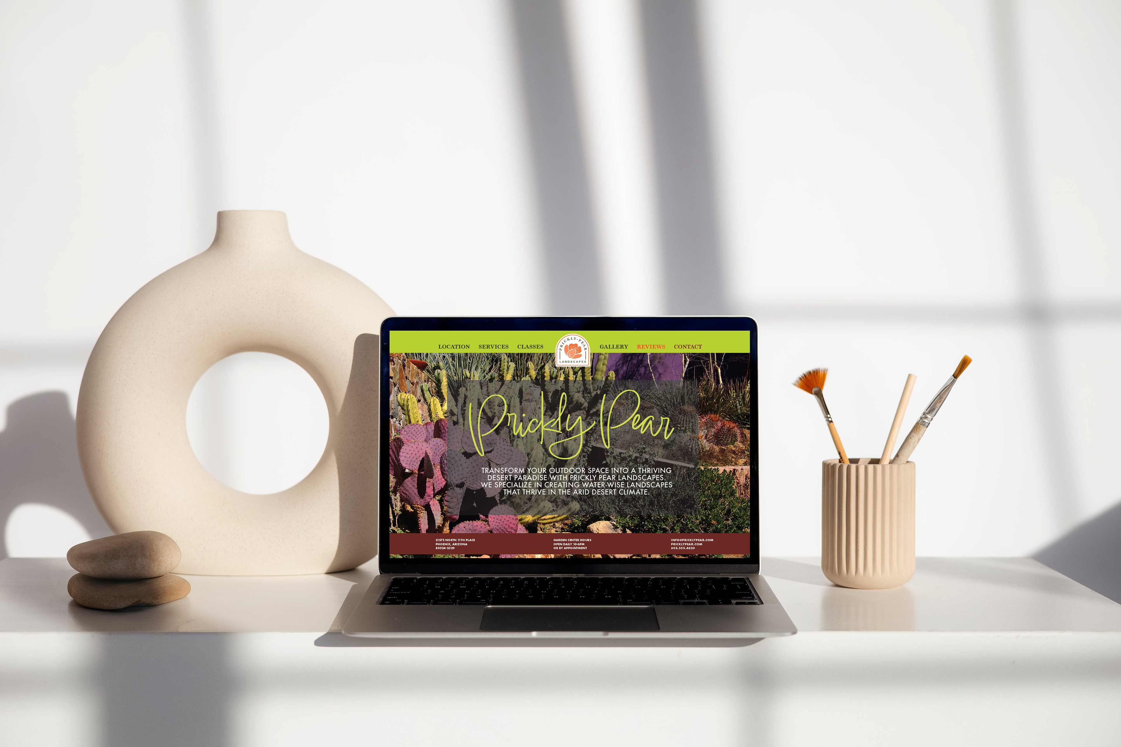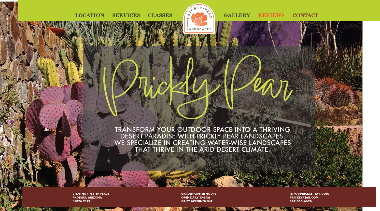

For the Prickly Pear Landscapes homepage, I made sure the typefaces and colors matched the brochure, annual report, and the rest of the collateral. The splash page showcases captivating desert cacti, emphasizing the company's xeriscaping specialty. The navigation bar is a vibrant lemon-lime green with dark green text, turning orange when hovered over and dark red when clicked, aligning with the bottom bar that includes contact information and garden center hours on a maroon background
The website features dedicated pages for Services, Locations, Classes, Gallery, Reviews, and a Contact page. In the Services section, users will find details about what Prickly Pear can offer potential clients. The Locations page provides information about different garden centers, while the Classes page lists weekly workshop schedules. The Gallery section displays past landscaping projects, and Reviews offer a space for potential clients to read positive feedback from past satisfied clients. The Contact page provides various ways to get in touch.
