

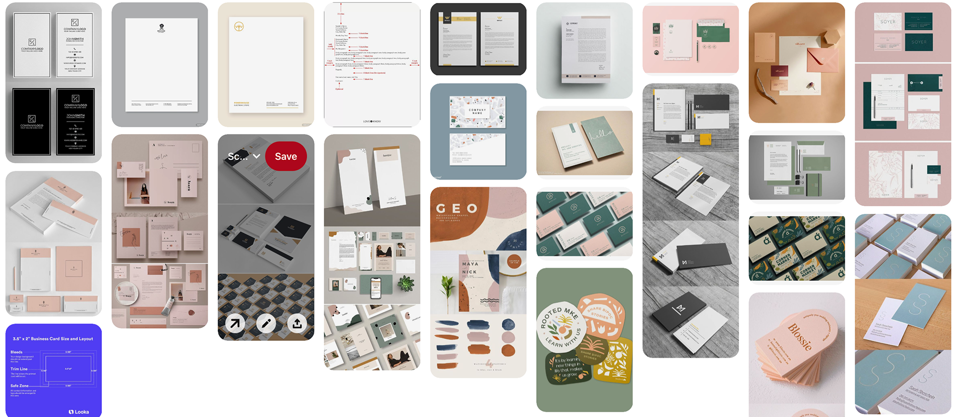
Research
Sketches & doodles
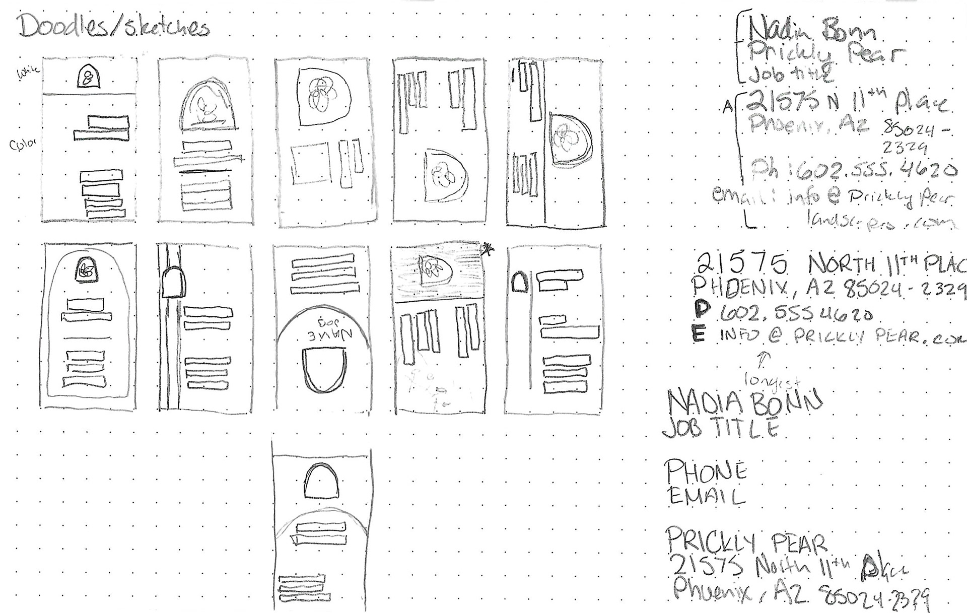
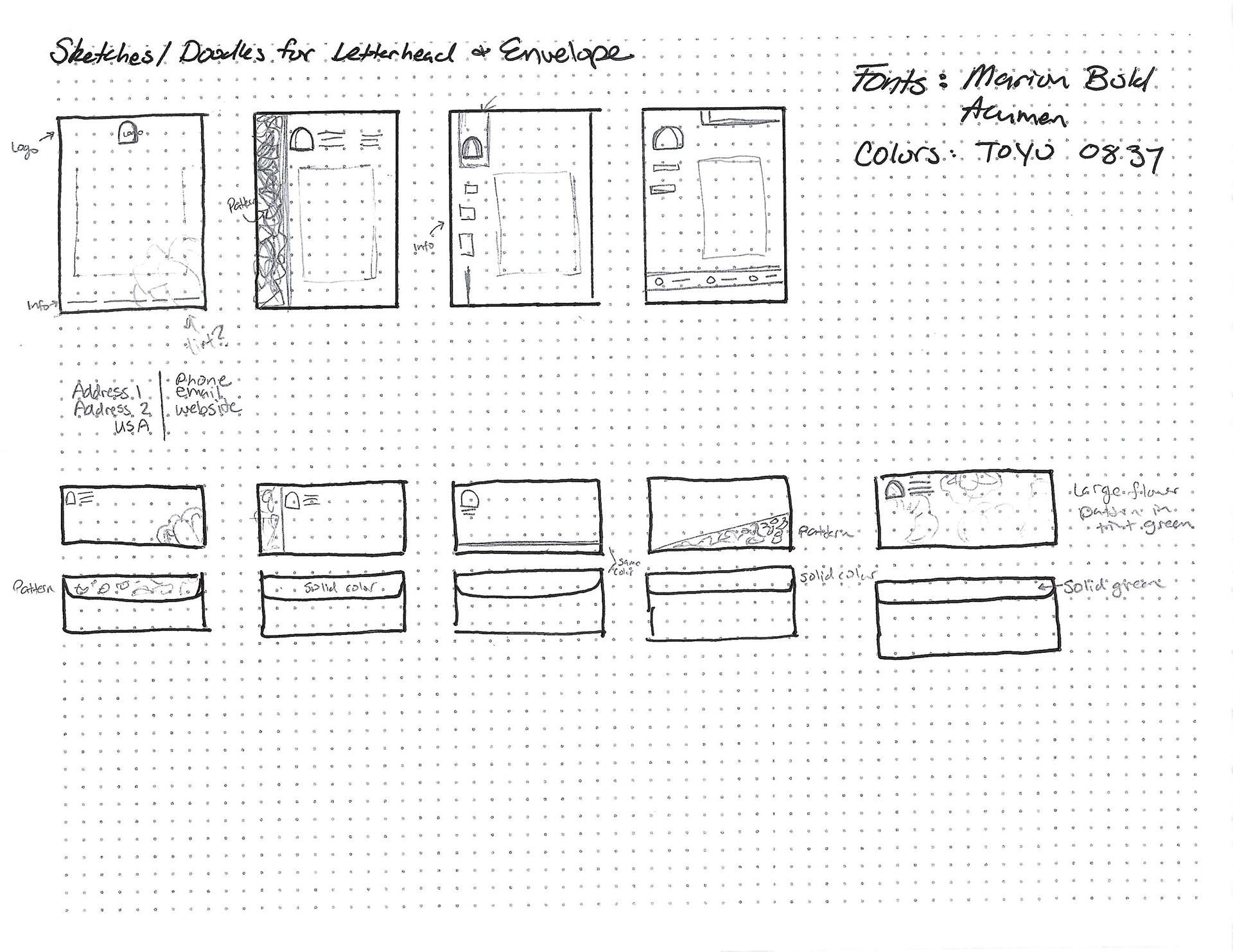
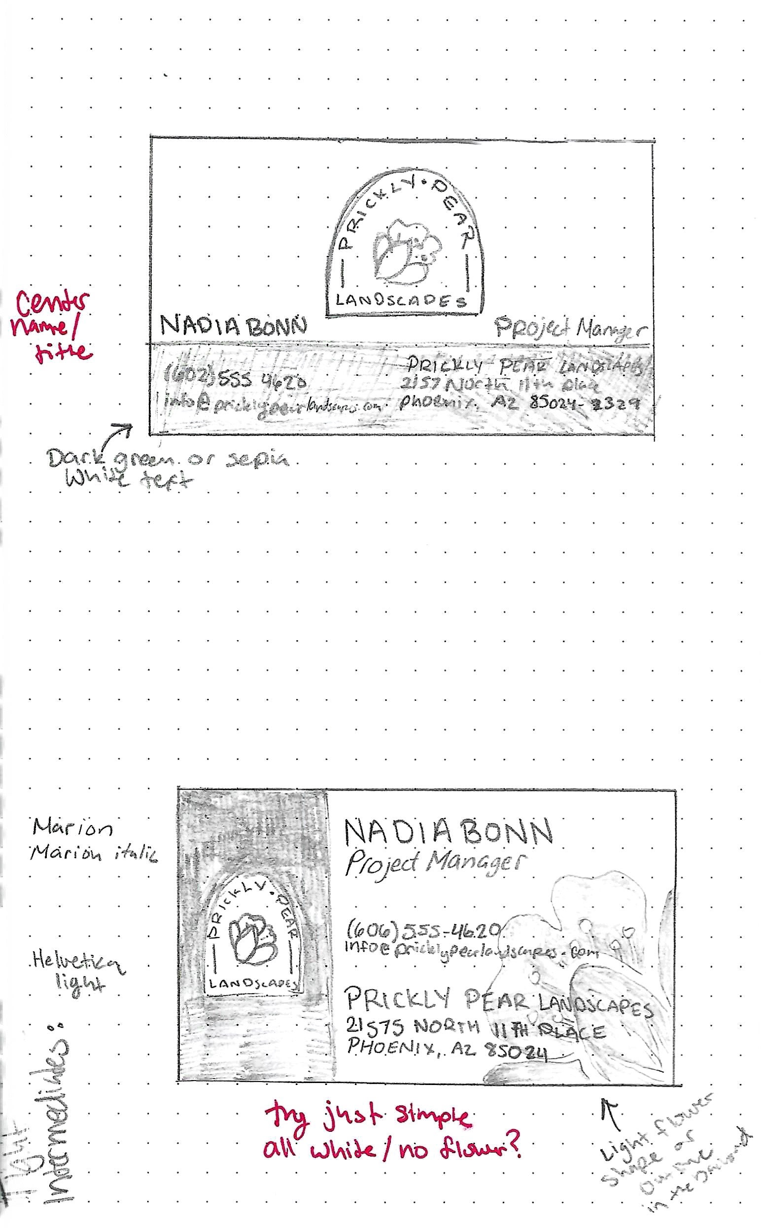
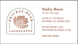
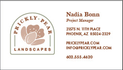
I started by sketching different layouts for my business card. The email address was the longest line, so I had to keep that in mind. Also, my name is short, so I needed to design it for longer names if needed. I knew that I wanted to incorporate the flower in the logo as well as the arch.
Tight Thumbnails
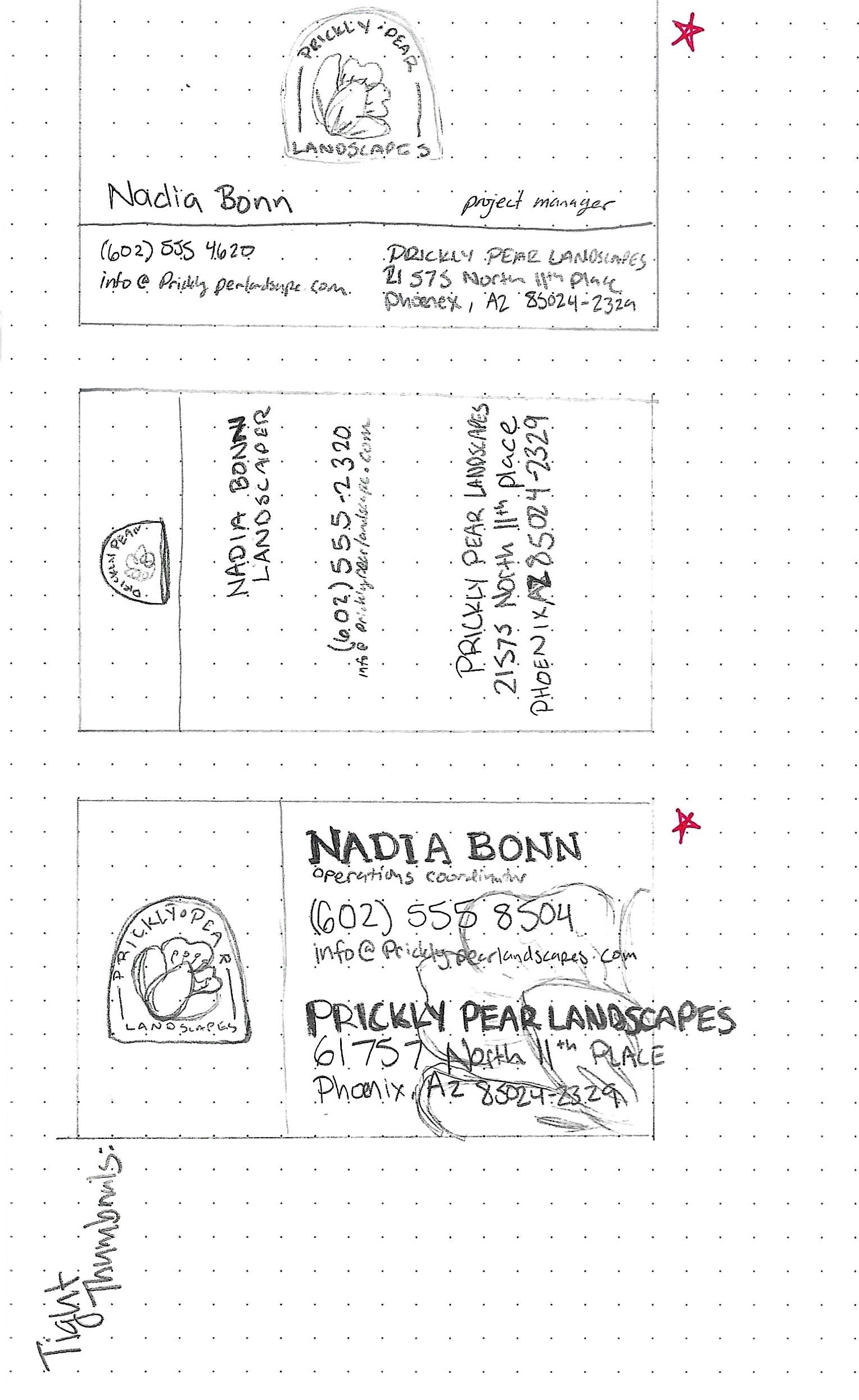
These are the designs I chose to expand upon. I don't like the second one. I will redraw the first and third when I do the intermediate sketches.
Intermediates
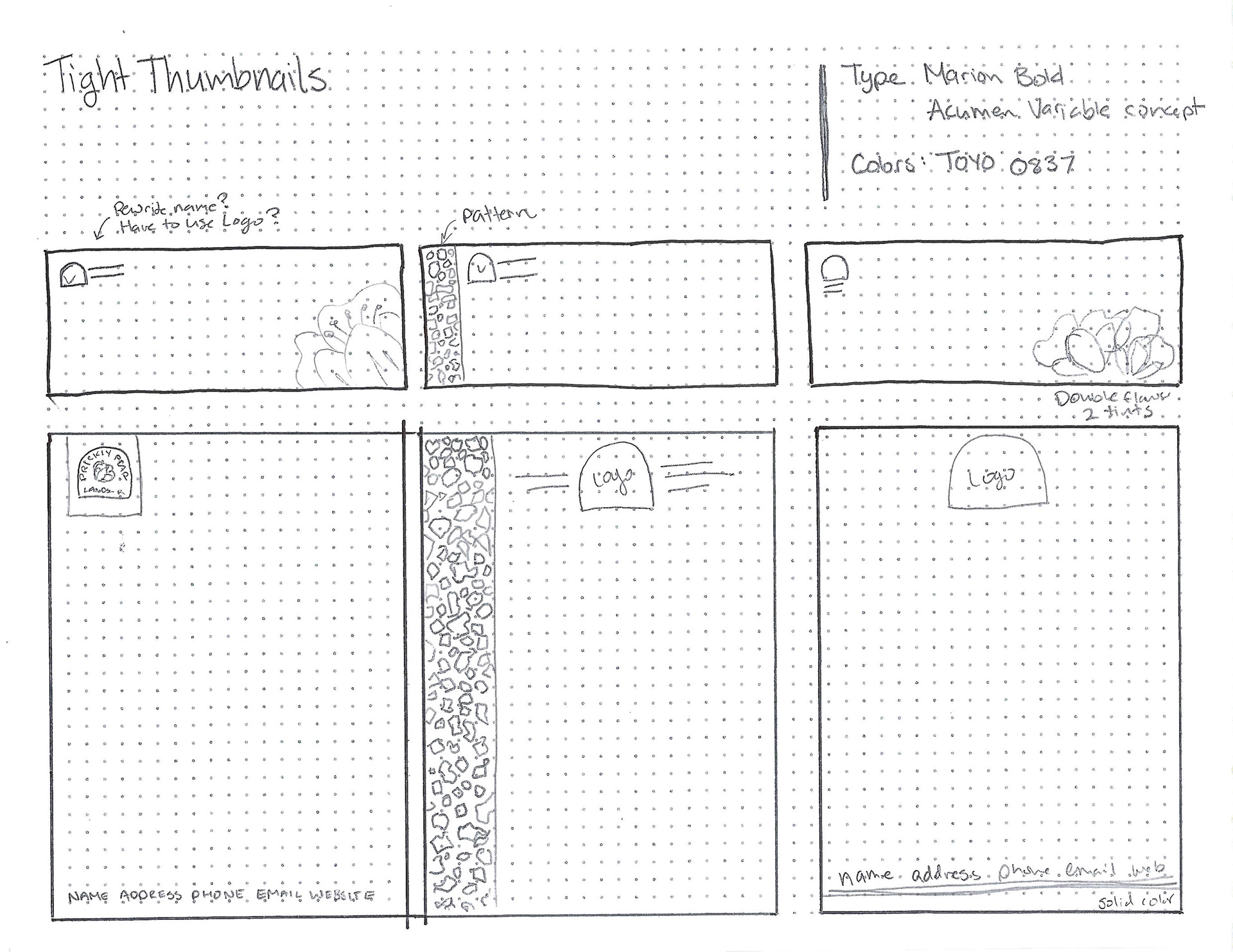
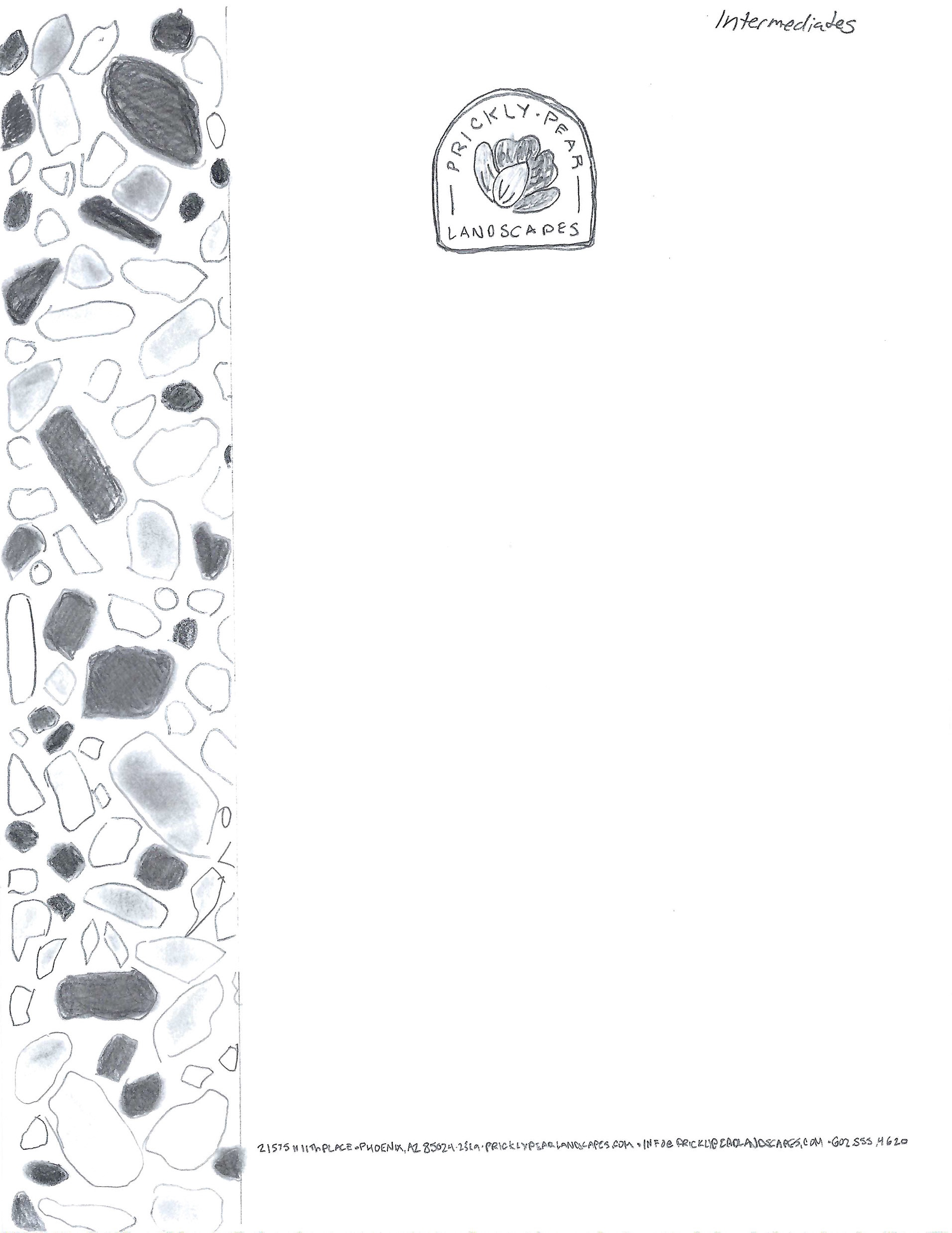
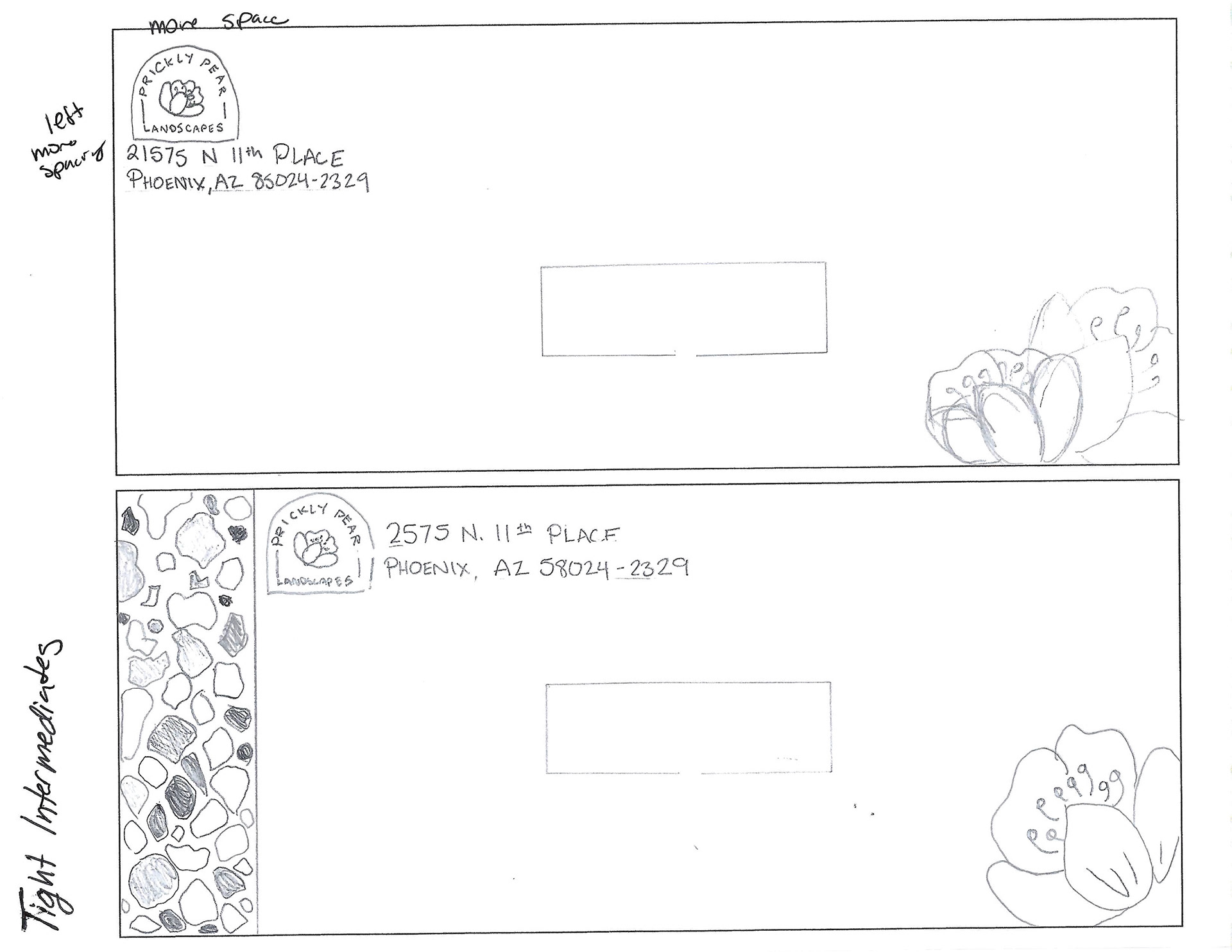
Once I drew these intermediate drawings I decided that I needed to try making it more simple and save my exciting designs for the kit cover and brochure.

Final Hand Comp
Color Studies
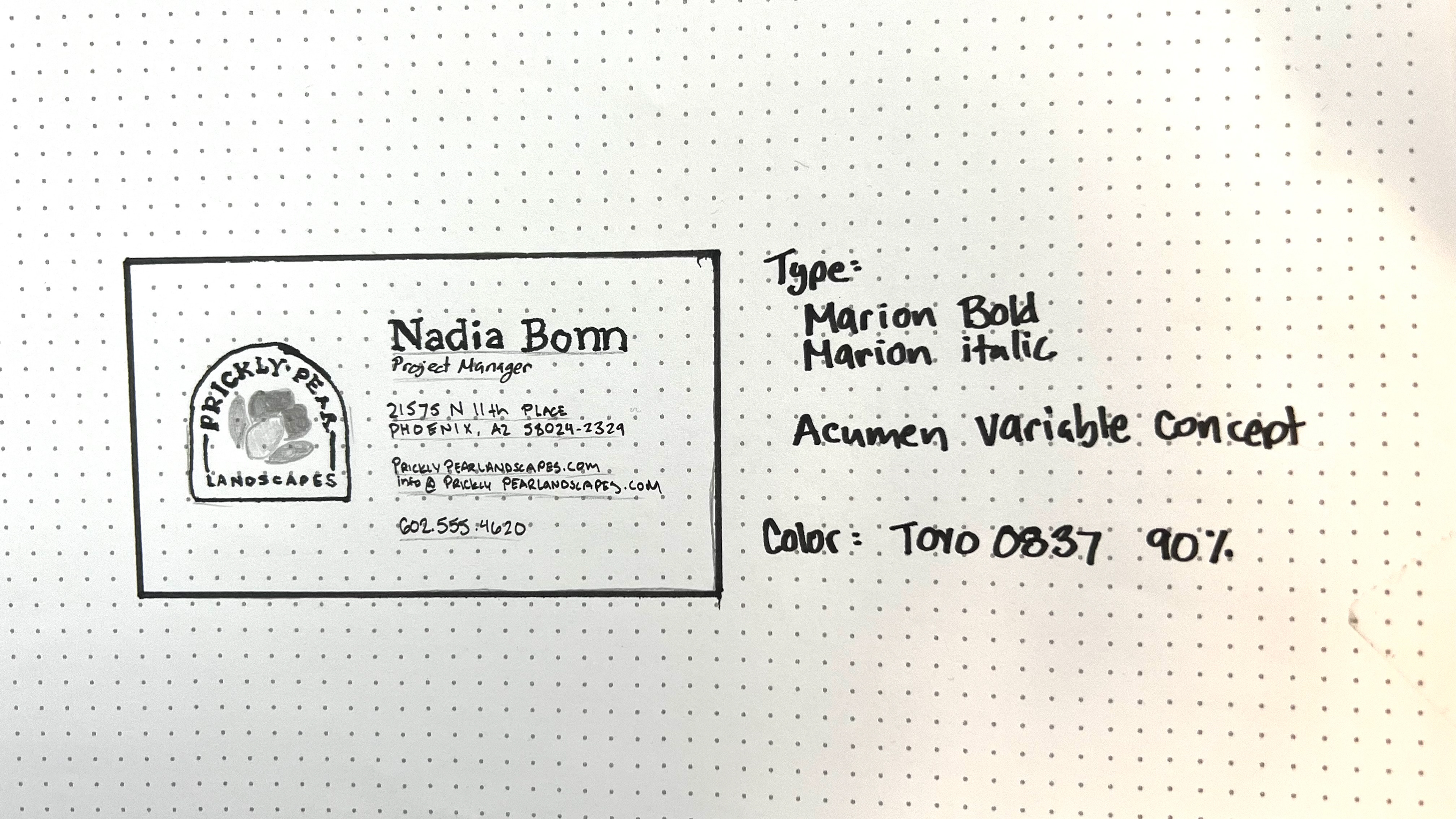
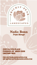
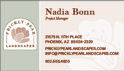
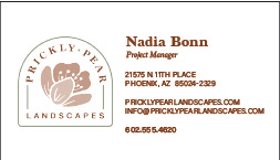
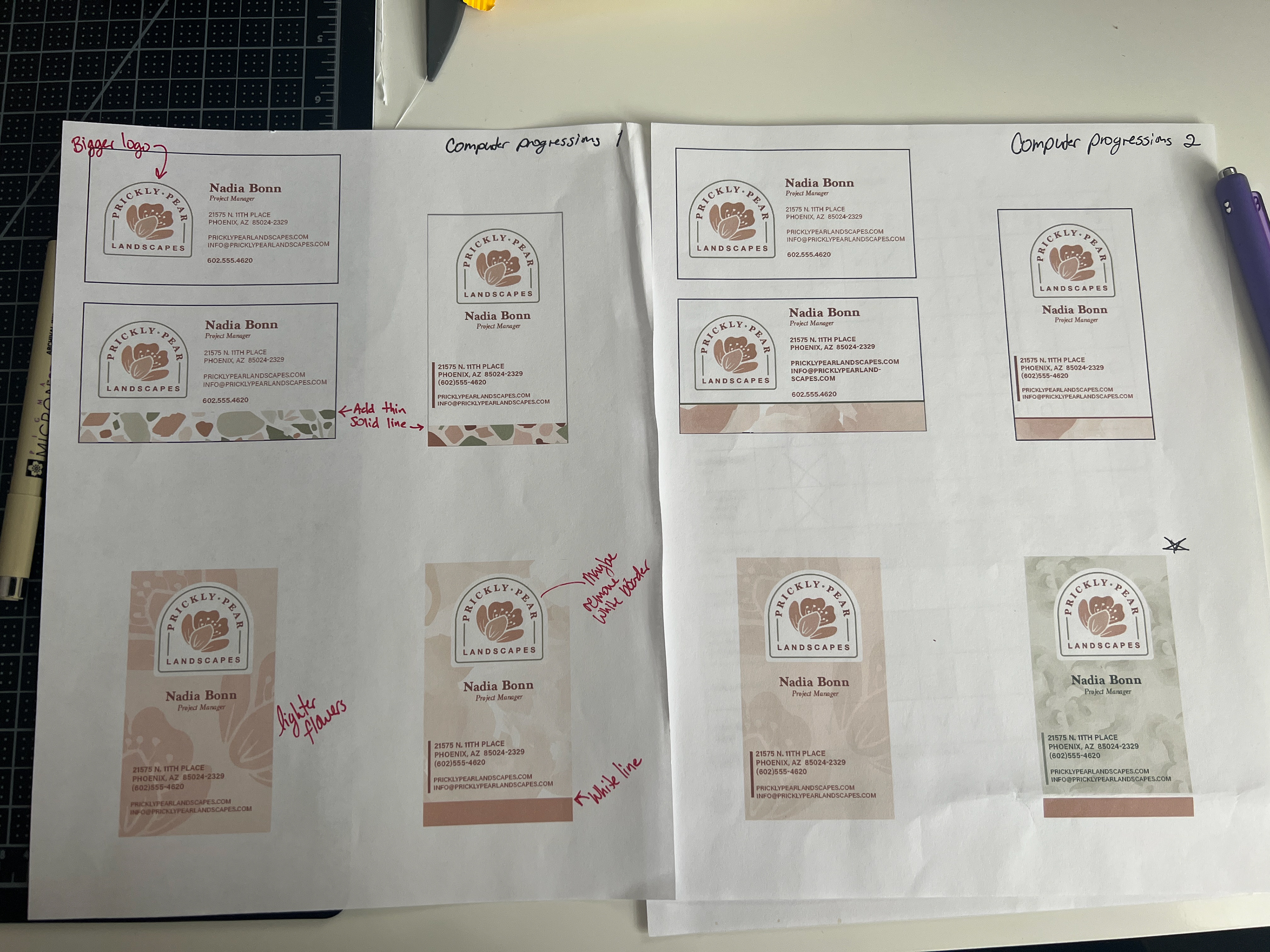
After the critique, I was urged to try a vertical layout. A center alignment was also suggested. I also made a brand guide to make sure I had a sense of continuity. I started creating patterns.






Computer Progressions

Revision
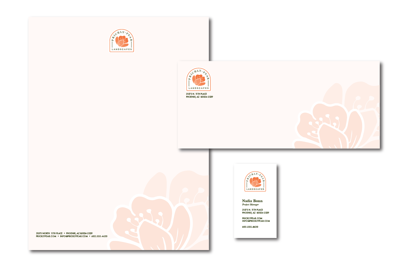
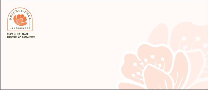
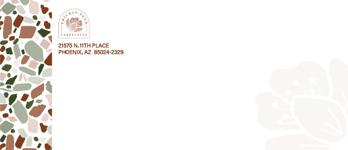
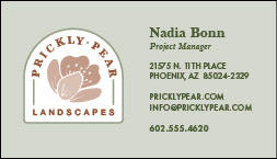
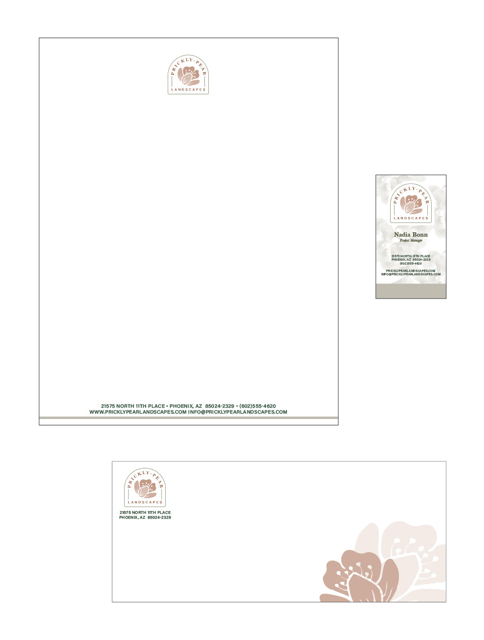
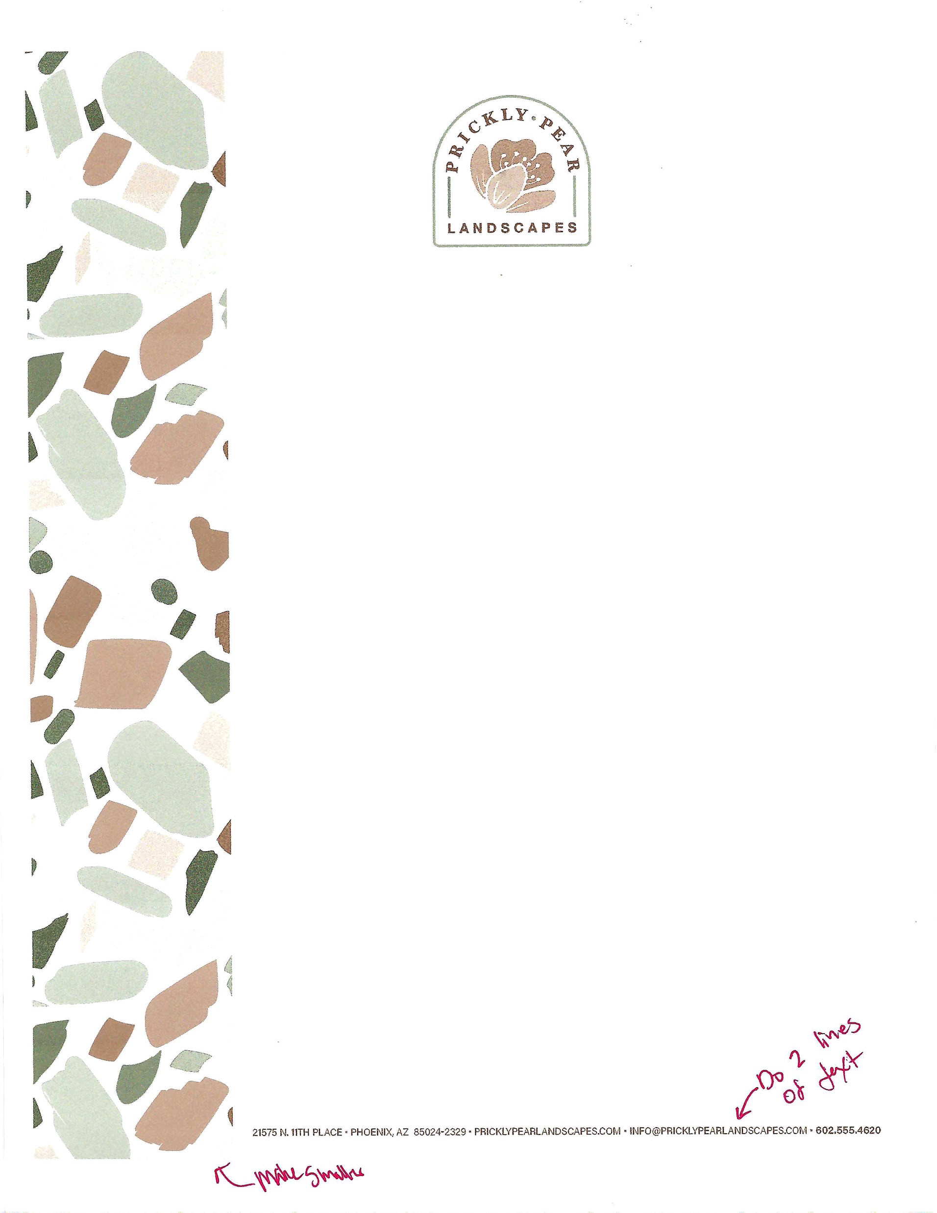
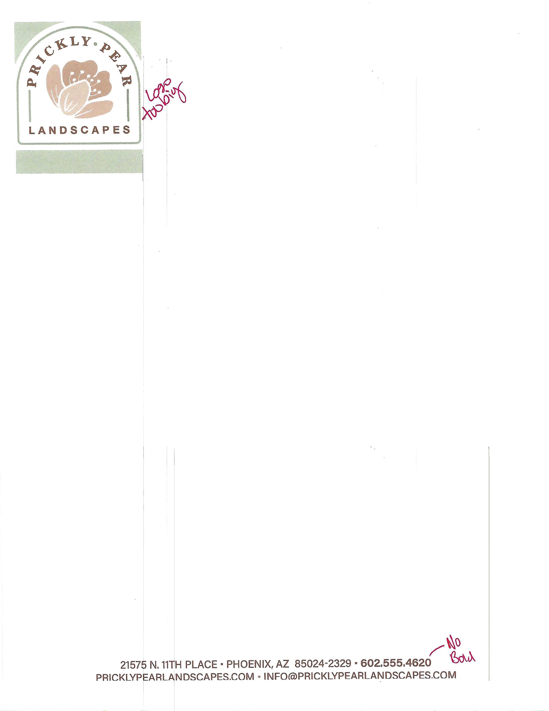
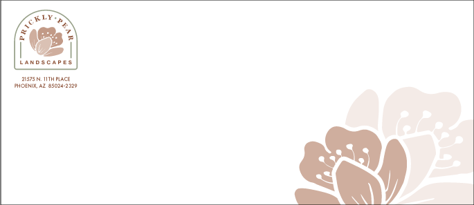
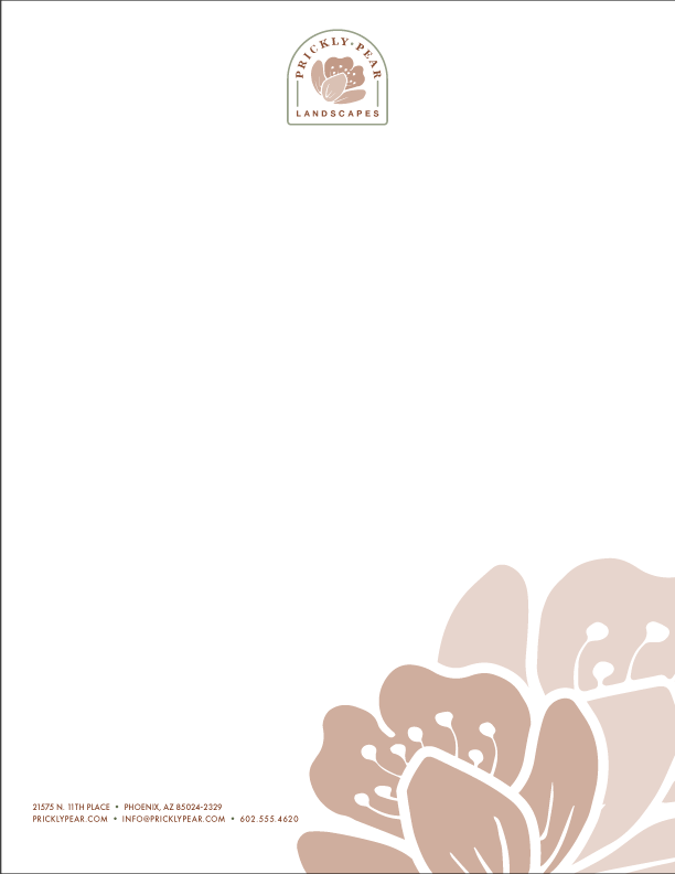
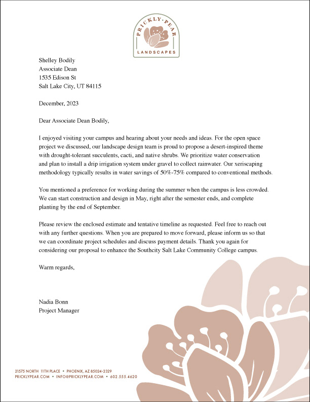
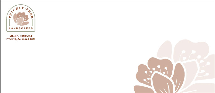
In the last round of revisions, I made a few small but important changes to improve the document's overall look and readability. First, I replaced the Acumen font with Futura in the address and contact information section. Thankfully, the teacher shortened the website address to make it more concise, which made it much easier to work with. To enhance the design and carry the theme through all pieces of collateral, I included flowers at the bottom of the letterhead. I applied left justification to all elements of the document except for the envelope.
Business Letter

Color Revision

