Objective
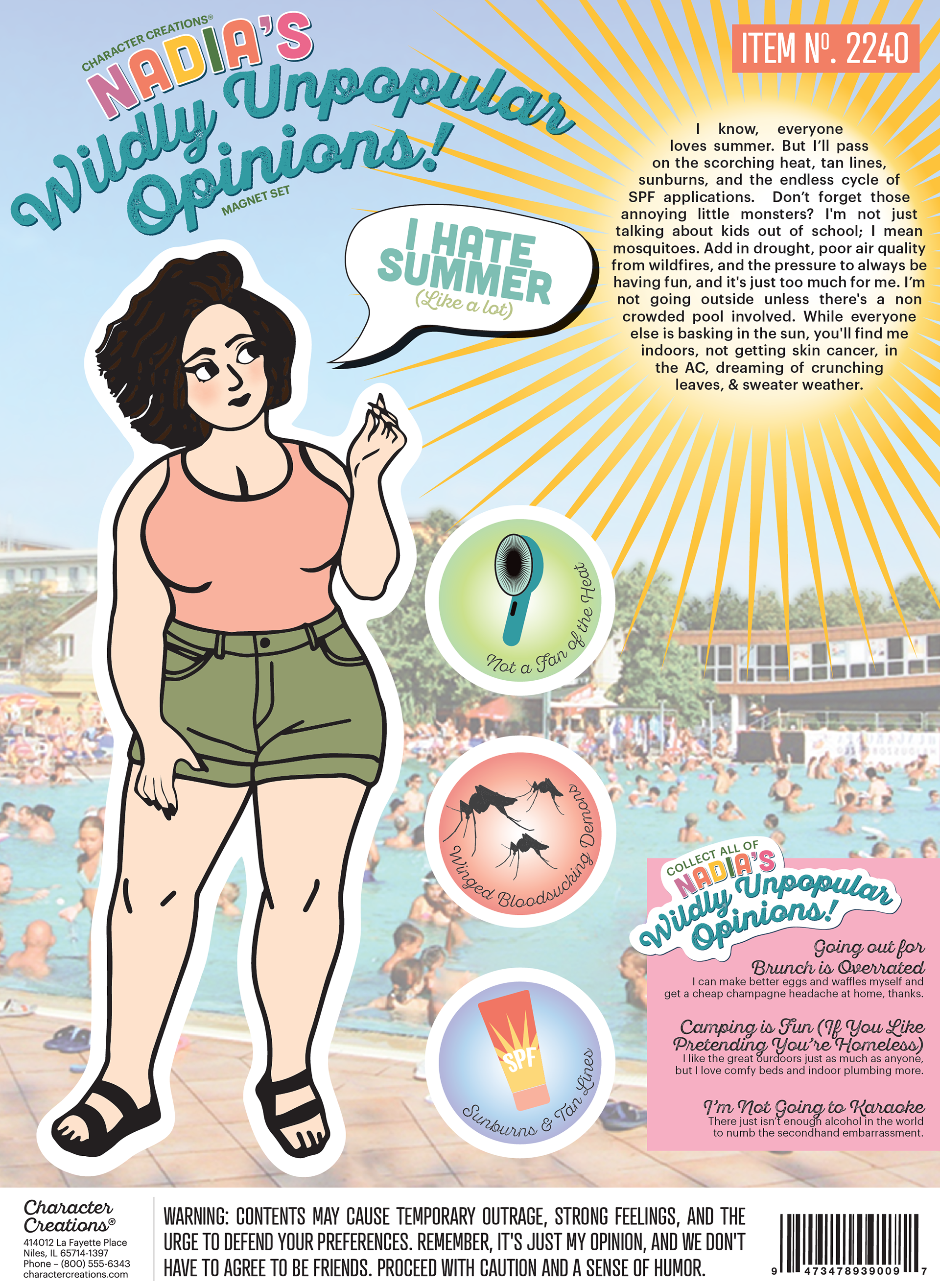
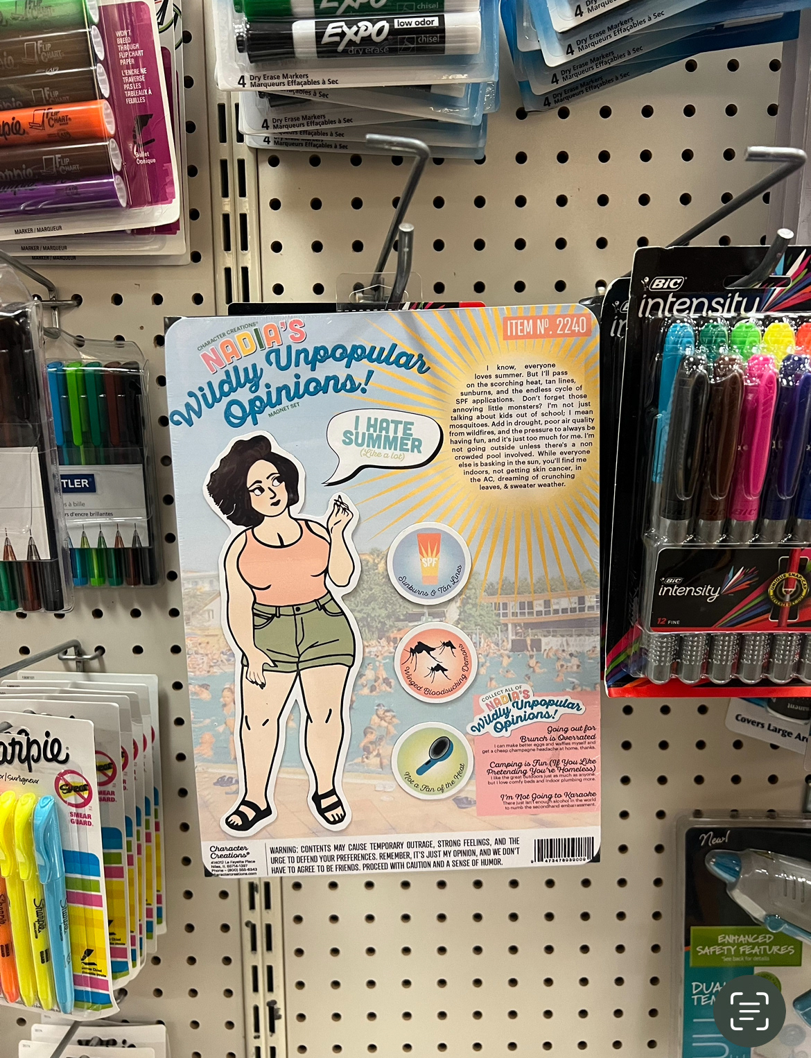
For the Magnet Project, my task was to create a figure of myself along with additional elements to complement the design. The design included an eye-catching header at the top, as well as a hangtag for displaying it in a store. The figure of myself had to be at least 8 inches tall and resemble me, including similar physical features such as hair color and eye color. The project required output as a background and magnet elements with bleed and cut marks. Finally, the finished project was printed, adhered to a magnetic backing, and wrapped in plastic.

Research
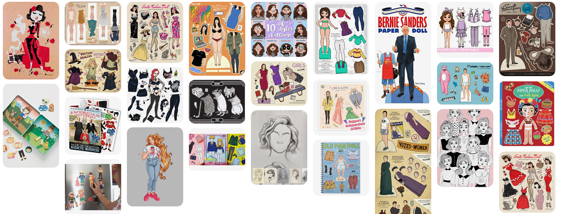
I found lots of funny inspiration online. So much I'm actually disappointed my fridge isn't magnetic. Alas, these helped me gather ideas on how to craft the clothing and accessories for my characters, as well as how to arrange them for the display. Additionally, I explored various animation and comic styles during my search for creative inspiration.
Sketches & Doodles
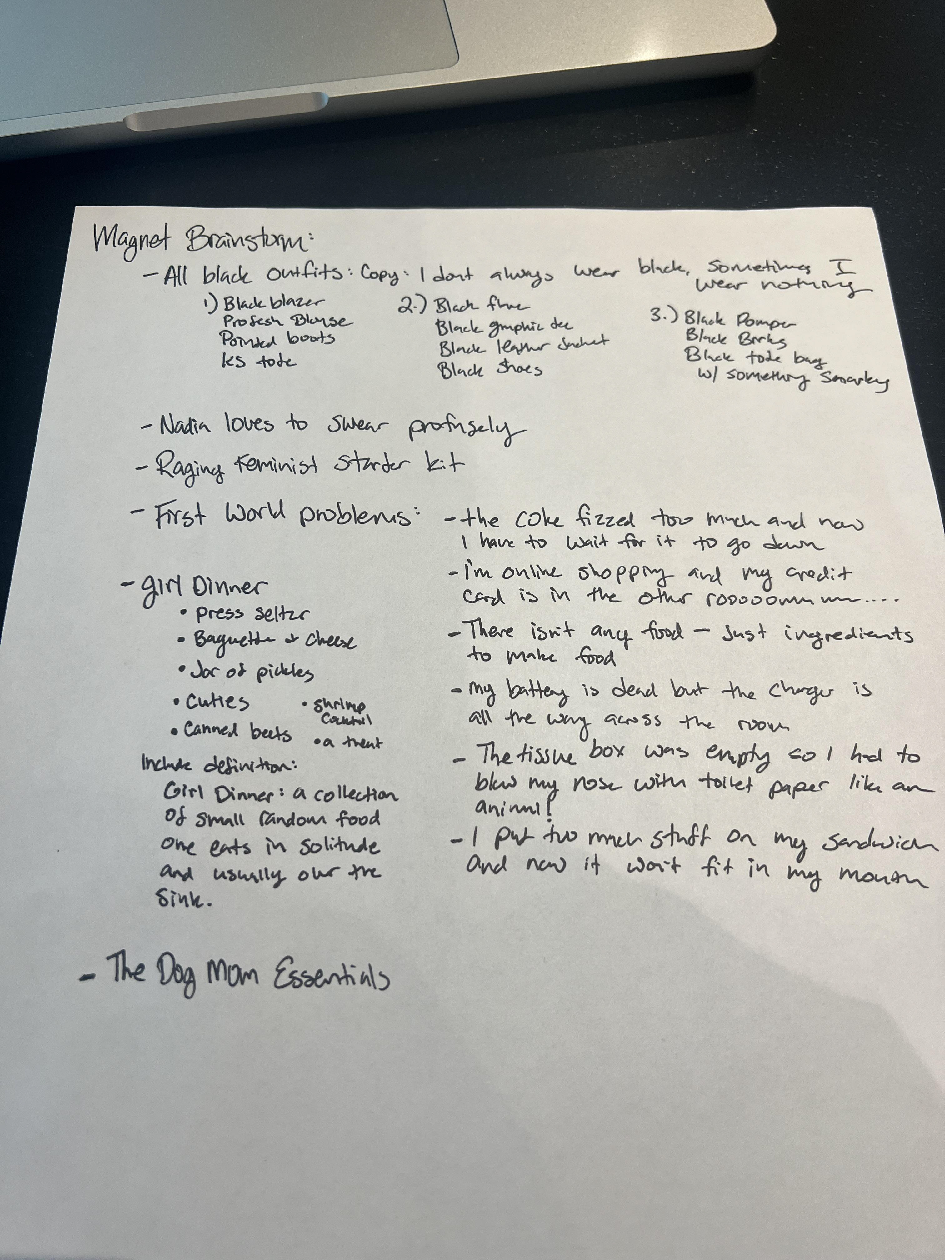
I had more than a few ideas some with up to 10 little accessories. I started sketching and decided that I needed to scale it back and do something more simple. I needed to limit myself to three additional accessories and decided that clothing would be difficult. I also thought to simplify I might need to use photographs.
Thumbnails
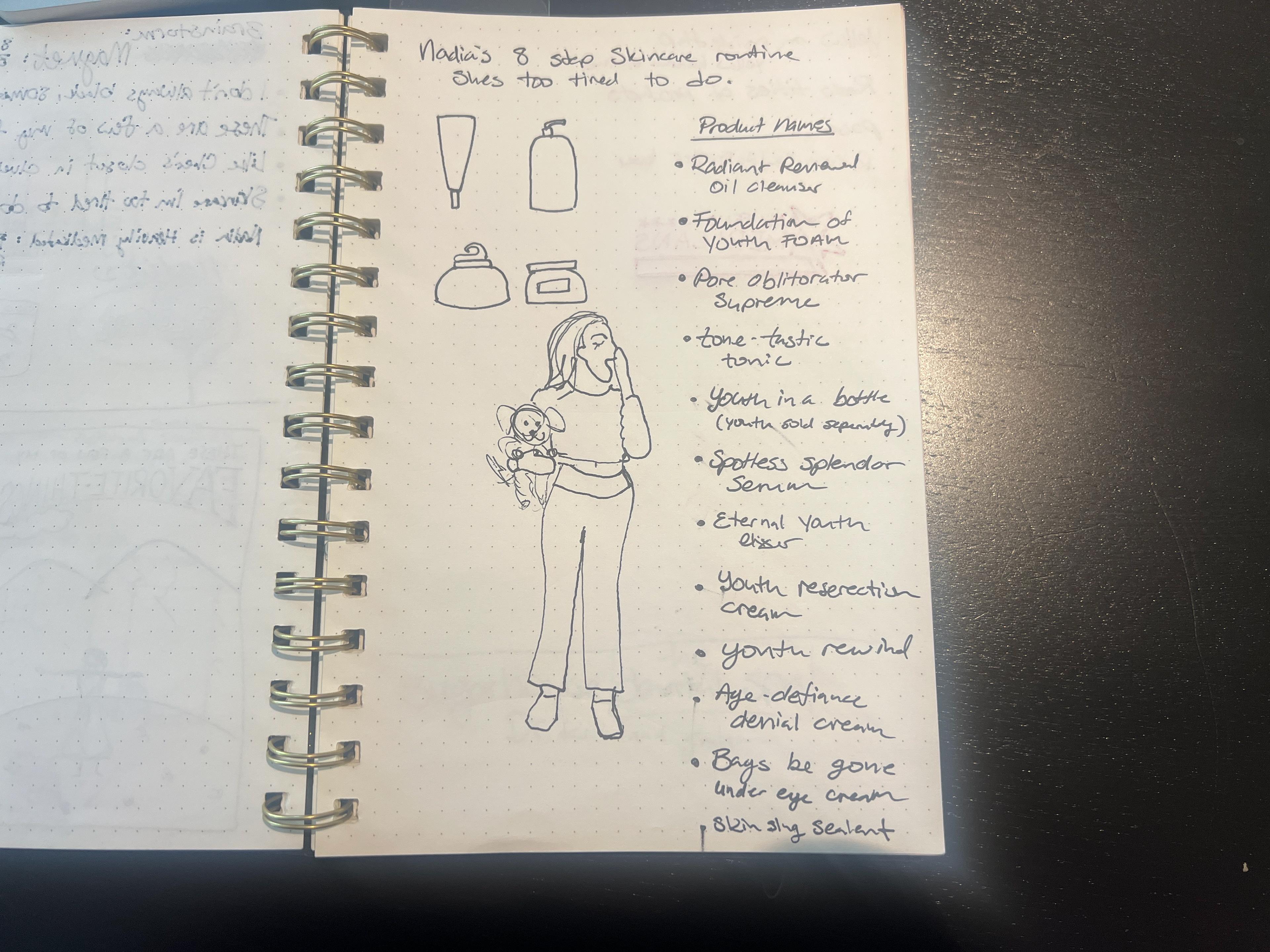
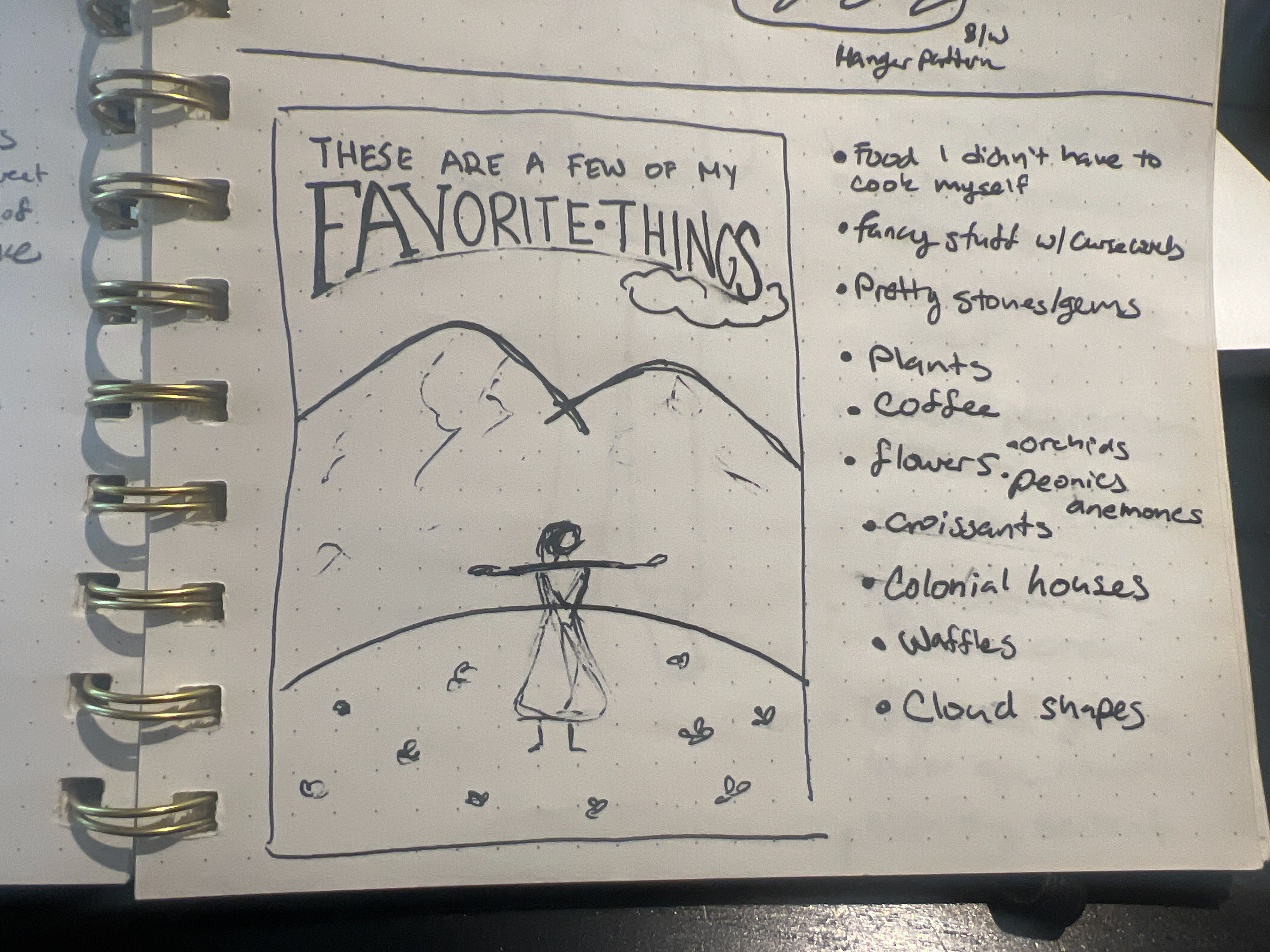
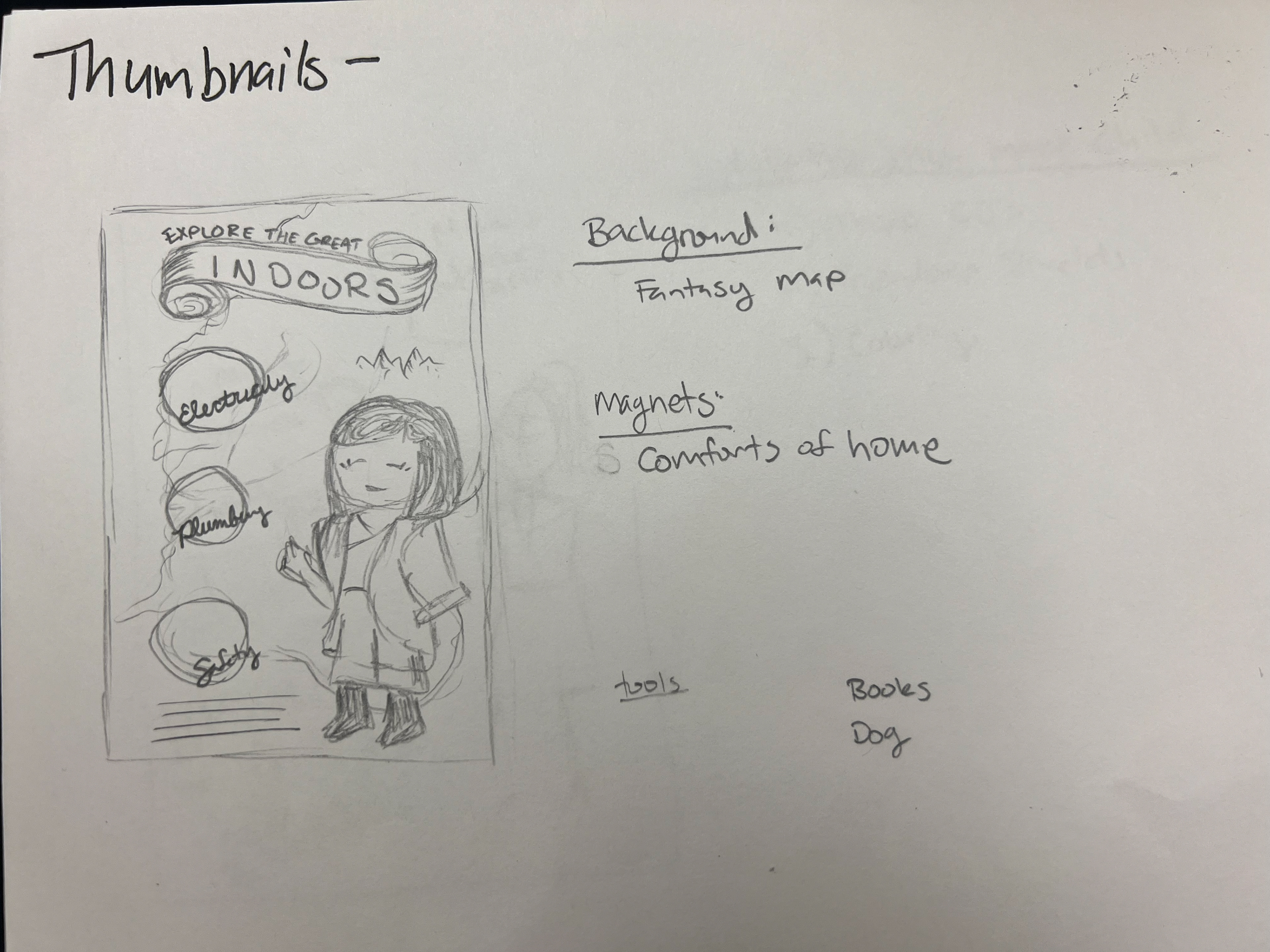
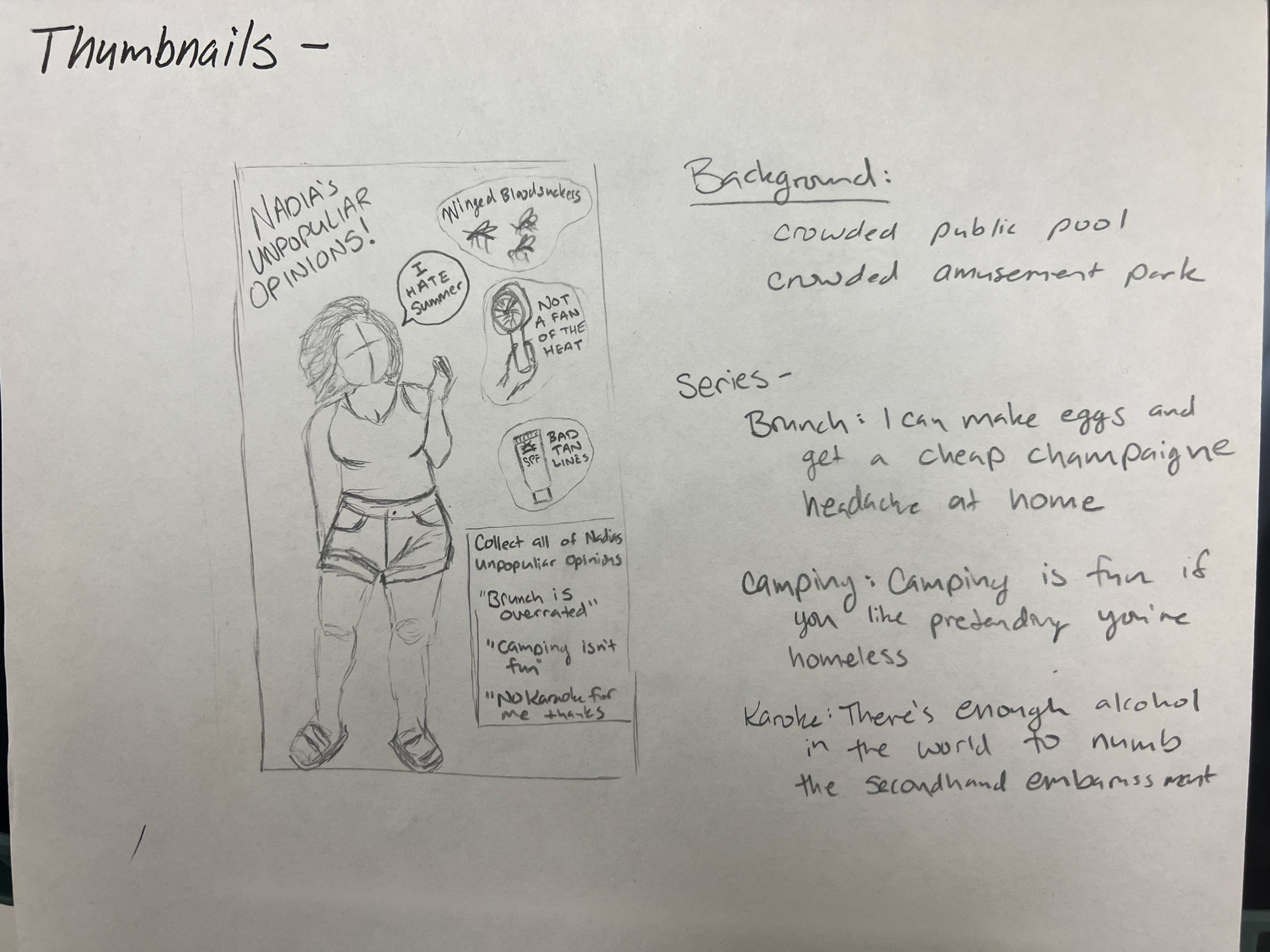
Here are my three thumbnails, each representing a different creative concept:
Indulging my inner child: This idea captures a photo of myself as a child, surrounded by elements that I still love and enjoy today. These include pop music, coloring, and the art of making friendship bracelets. It's a nostalgic and playful theme which will be made of photos maybe with a cartoon background.
Explore in the Great Indoors: For this concept, I envisioned myself as an explorer and the background would be a fantasy map. I had to consult with my Dungeons and Dragons (DND) loving friends on the character design., I created a theme called "Explore the Great Indoors." The outfit combines elements of a fantasy character embarking on an epic quest, but with a humorous twist—wearing cozy pajamas and wielding a remote control or a similarly at home item.
Unpopular opinions collection: The final thumbnail showcases a collection of my unpopular opinions. It represents reaching an age where I have the wisdom and confidence to no longer tolerate things that don't resonate with me. One of these unpopular opinions, for example, is about summer not being my favorite season, despite its popularity.
Intermediate Thumbnails
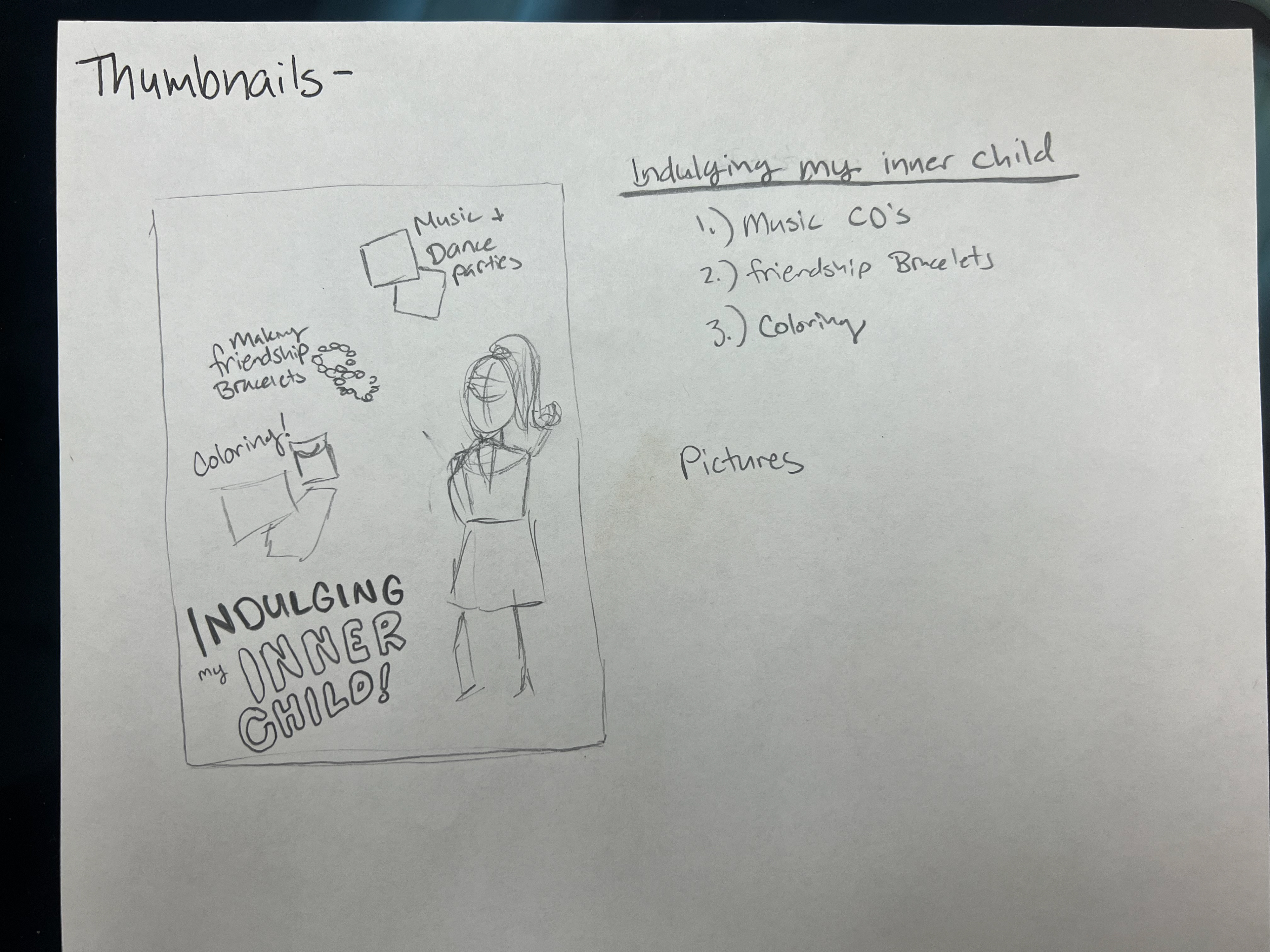
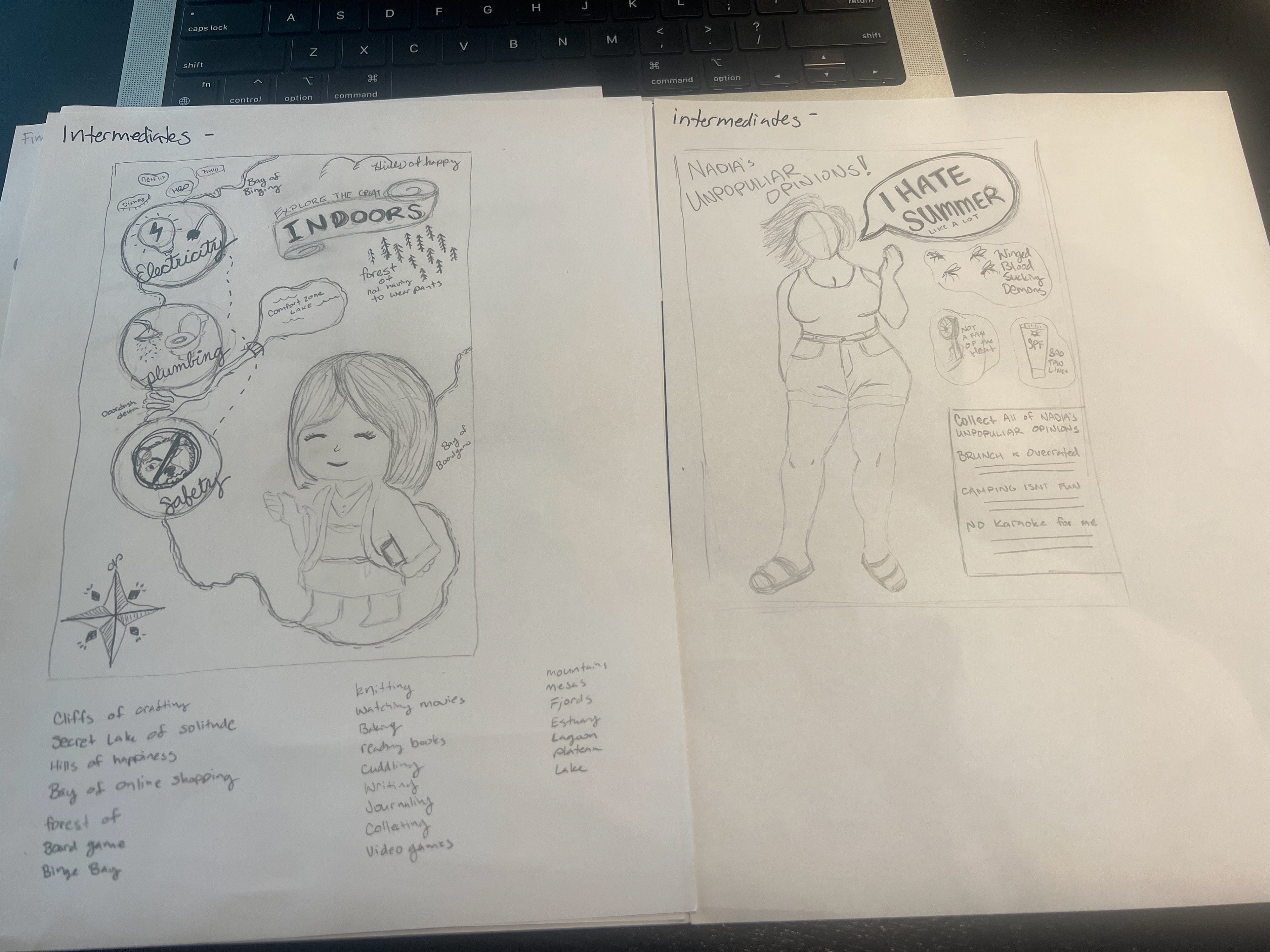
For the intermediates l, I worked on expanding the "Explore the Great Indoors" idea. I began by sketching out a fantasy map, which I learned how to do by watching a YouTube tutorial that taught me the basics. I brainstormed names for various geographical locations to include on the map, adding depth to the imaginary world. When it came to designing my character, I wanted to create a bathrobe-like outfit that still drew inspiration from wizard robes and other fantasy elements. While this could have been a very enjoyable process, I found myself struggling to inject humor into the design and come up with clever things. I love for creating designs that appear legitimate at first glance but reveal humorous details upon closer inspection, and I wanted to incorporate that comedic element into this project as well. but alas its the end of the semester and I'm running low on creativity. This might be a fun concept to revisit in the future. I decided to do the unpopular opinions idea for this project.
Final Hand Comp
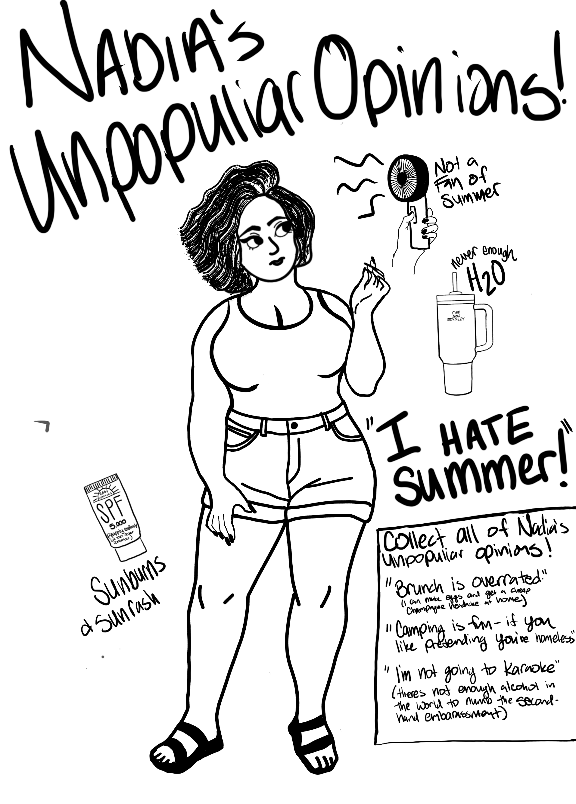
For my final hand comp I used procreate on my iPad. With the intention of importing the drawings into illustrator
Computer Progressions:
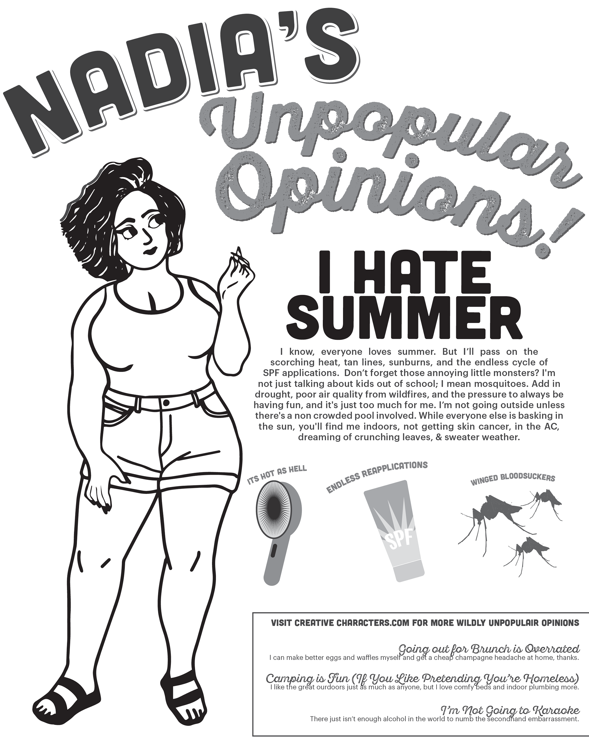
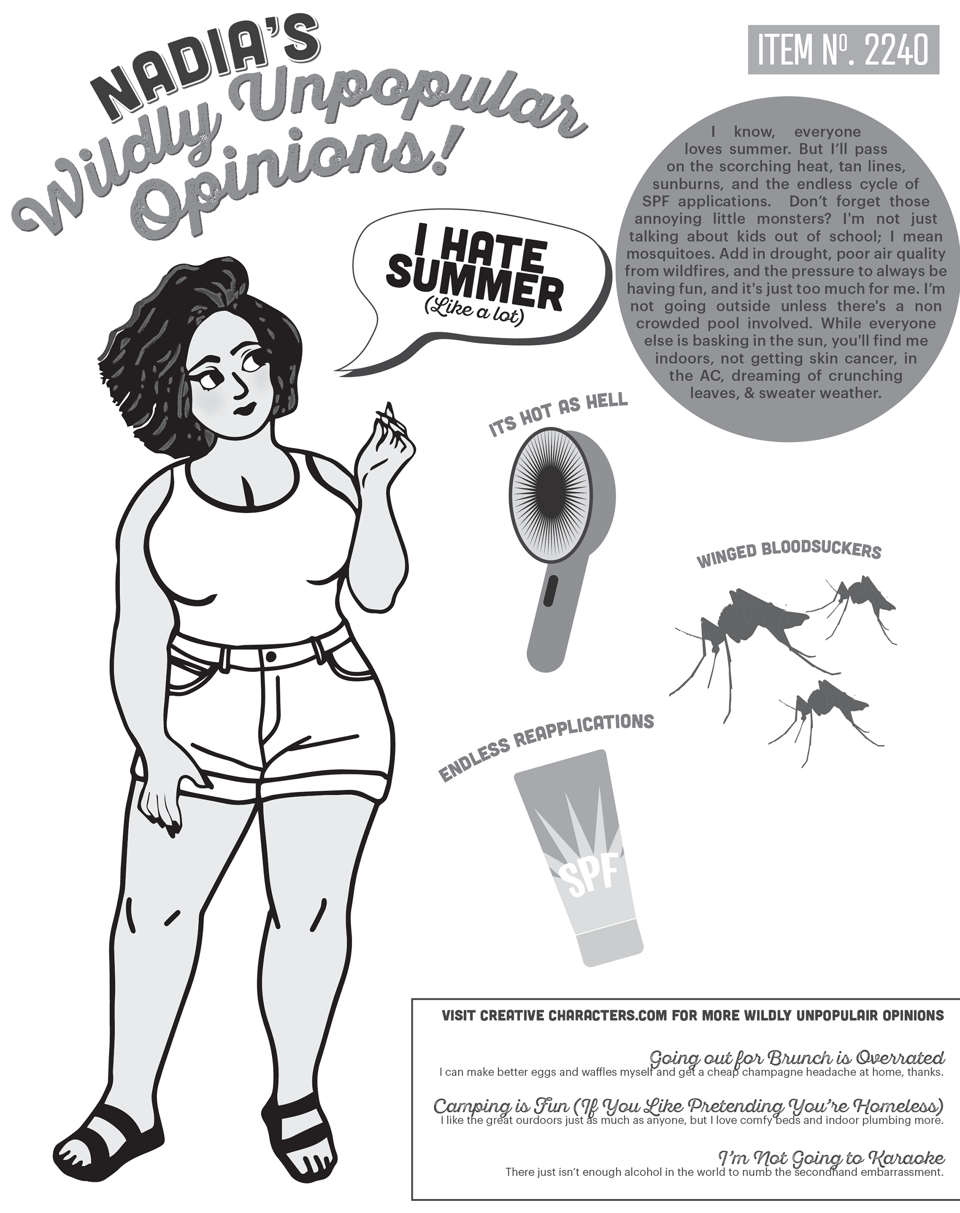
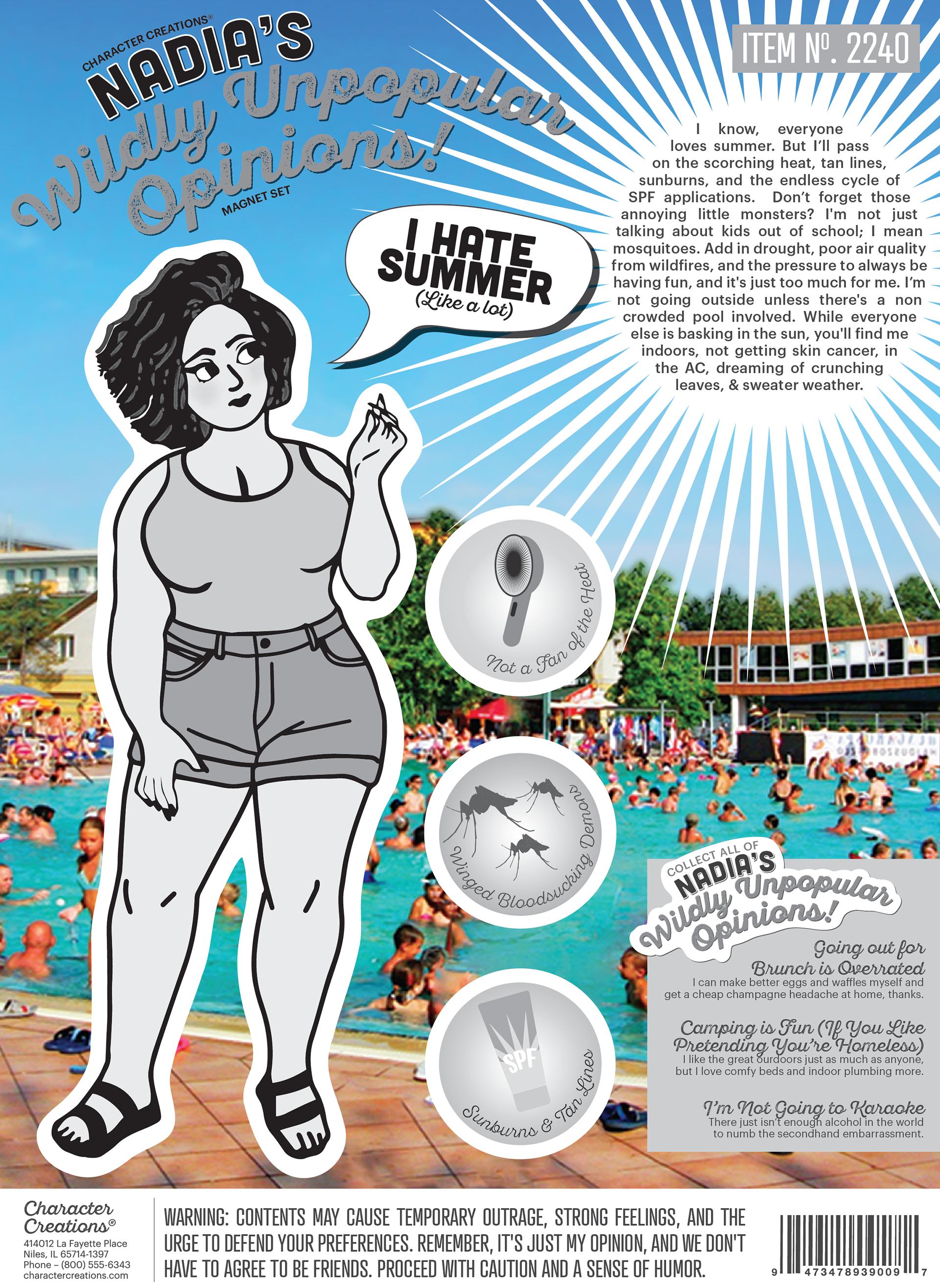
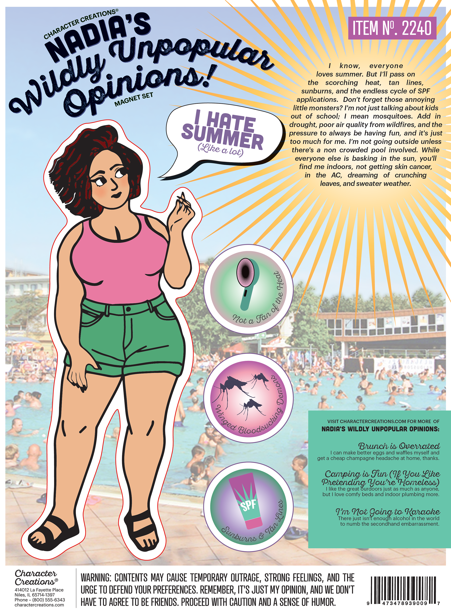
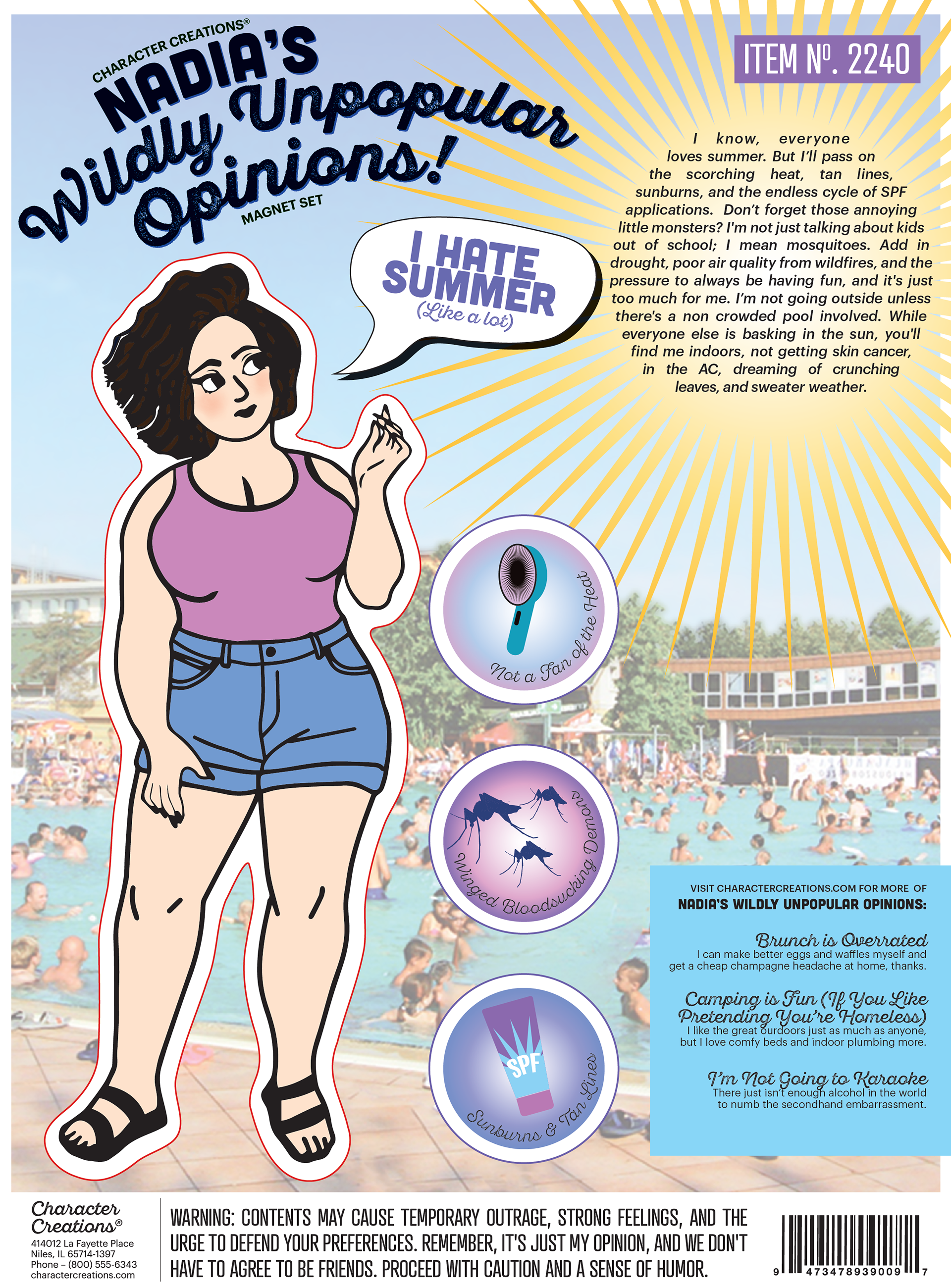
I imported the illustration into the computer and recreated the accessories in Illustrator using the shape builder tool. However, I faced challenges with the placement of elements; they seemed too large and competed for attention as the focal point. To address this, I experimented with a word bubble and decided to place the three additional elements in circles.
When I found a crowded public pool image and edited it in Photoshop, I made sure my elements didn't obscure it, which was also a challenge. I condensed the copy and created a header directing the audience to visit the company website to purchase more of Nadia's unpopular opinions.
I felt like a statement as bold as hating everyone's favorite season needed an explanation so I included copy defending my reasoning. I am happy with the decision to place it inside the sun.
Color Studies:
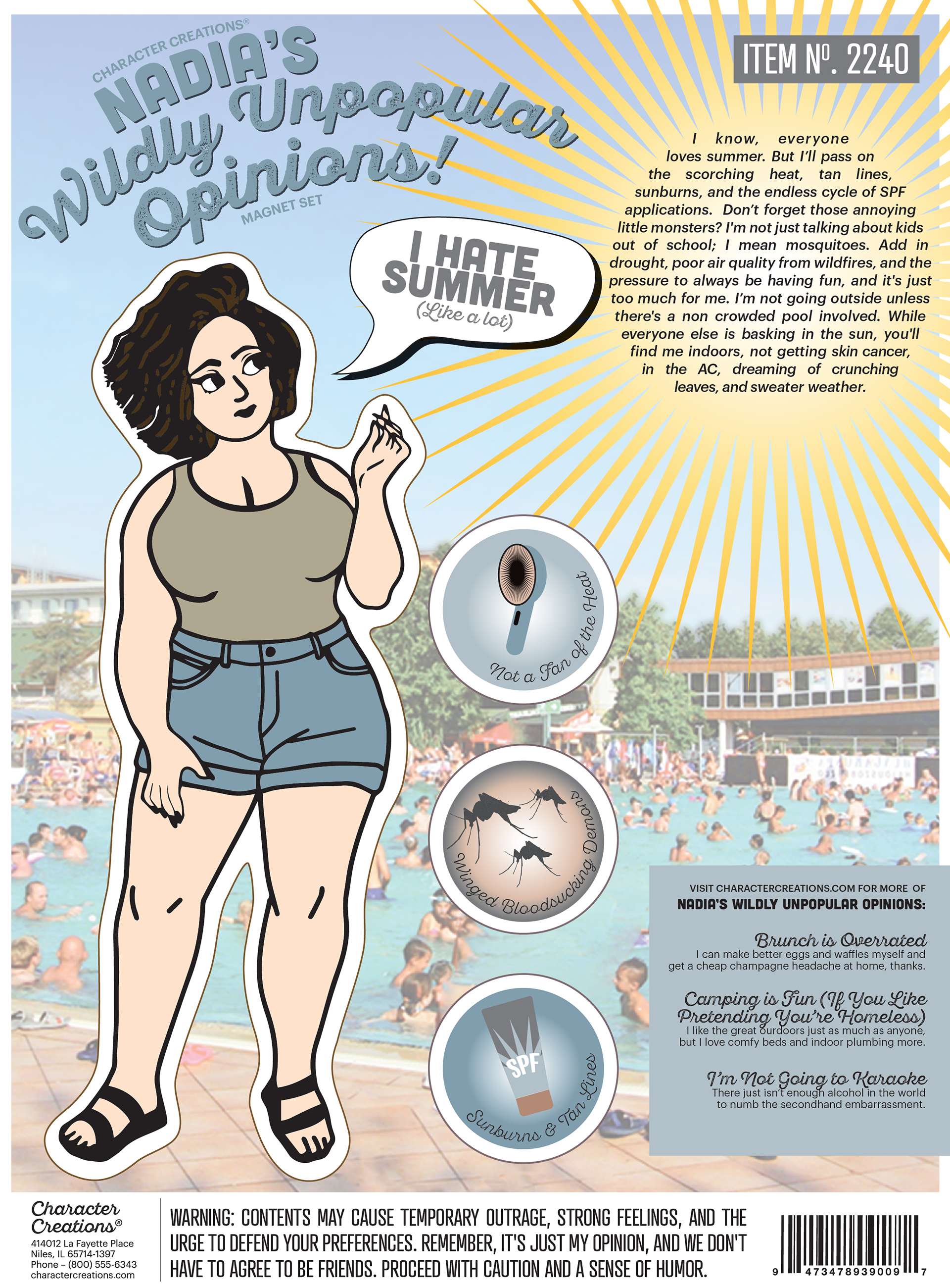
Here are my color studies, where I explored different color options for the clothing and skin tone. Initially, I experimented with making the shorts blue to resemble denim shorts. However, I ultimately decided to stick with the color scheme of my trusty olive green Eddie Bauer shorts, which I've cherished for the past 8 years. Additionally, I toyed with different skin tones but settled on a fair skin tone, reflecting my commitment to practicing sun safety and avoiding excessive sun exposure. I decided the background image of the crowded public pool should be lighter so the character would show better. So I reduced the opacity to 35%.

Final Clean Design:
I'm delighted with the final outcome; the main character is so cute and I love her. The skills I've gained from this assignment are perfect for creating more magnet paper dolls. I'm thinking of expanding Nadia's collection of wildly unpopular opinions; the "brunch is overrated" one would be very funny. It could also serve as a fun leave-behind piece showcasing my graphic design skills to future employers. Additionally, I'm contemplating transforming these designs into custom cards or gifts for my friends and family. After all, who wouldn't love a personalized paper doll magnet??
